Exalt Studio
exalt-studio.com
Turn complex software into clear, scalable product systems.
exalt-studio.com

AI Breakdown
Design export
# Design brief: the Exalt Studio design language

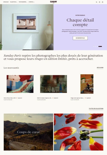
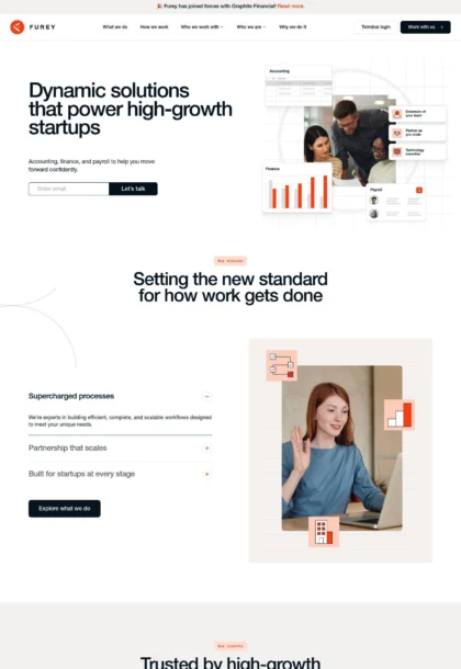
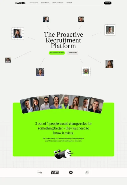
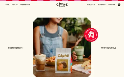
Below is a complete design specification measured from a real, published web page. Use it as a design language for the user's product. It is not a page to reproduce.

## Reference images

- Full page: https://cdn.designmunk.com/2026/09/05135015/exalt-studio.webp
- Above the fold: https://cdn.designmunk.com/2026/09/05135015/exalt-studio.webp
- On DesignMunk: https://designmunk.com/exalt-studio/

Study these for hierarchy, rhythm, spacing and density. Where an image and the written spec disagree, the spec wins: the tokens were read from the page's own CSS, the images are one rendering of it.

## Before you start

Ask the user what they are building, who it is for, and what brand assets they already have — name, colours, typefaces. Wait for their answers before writing anything. Everything below is then applied to their product, not to the reference.

## Design specification

# Exalt Studio: Pill CTAs on a Painted Blue Hero

## Overview

Exalt Studio targets B2B AI and SaaS teams, presenting a confident yet restrained system that foregrounds clarity over decoration. The interface is light-mode, spacious, and text-led with decisive headlines and compact controls. Interaction density is moderate: large section paddings support narrative scanning while 36px controls keep forms and CTAs efficient. When tokens don't specify, prefer quiet white surfaces, minimal borders, and generous breathing room.

## Colors

- **primary (#161218):** Core ink for headlines, body text and icons; ensure legible contrast on white.
- **secondary (#848486):** Muted text for captions, meta and subdued UI copy.
- **neutral (#ffffff):** Base canvas for pages, cards and buttons.
- **border (#e5e7eb):** Single-pixel dividers and subtle card outlines; also useful for hairline separators.
- **brand-cerebellum-grey (#cccbcc):** Soft accent gray for logos, muted chips or de-emphasized UI states.
- **surface ({colors.neutral} → #ffffff):** Generic surface token; match page and card backgrounds.
- **on-surface ({colors.primary} → #161218):** Text and icon color when placed on any surface token.

## Typography

- Asta Sans (Google; freely loadable). Used for all headlines: 60px/600/-0.03em (headline-lg) for the hero; 52px/600/-0.03em (headline-md) for major section leads; 40px/600/-0.03em (headline-sm) for subheads; 18px/600 for micro-heads and overlines. If Google Fonts cannot load, fall back to system-ui, Segoe UI, Roboto, Helvetica, Arial.
- DM Mono (Google; freely loadable). Body copy, meta and interface text use body-md at 16px/500/1.5 with +0.015em tracking, giving a technical tone aligned with B2B software. Fallbacks: ui-monospace, SFMono-Regular, Menlo, Consolas, monospace.
Use tight tracking in headlines and the slightly expanded mono in body to maintain the clear-craft contrast throughout the page.

## Layout

Spacing follows a simple scale: 12px (xs) for tight gaps, 24px (sm) for intra-component padding, 48px (md) for block spacing, 64px (lg) for section padding, and 136px (xl) for hero/band top-bottom paddings. A responsive 12-column grid suits the content; cards typically span 3–4 columns on desktop and stack on mobile with sm or md gaps. Keep copy line lengths moderate; the mono body benefits from 60–72ch measures. Use consistent vertical rhythm by snapping margins to sm/md multiples and reserving xl for major bands.

## Elevation & Depth

All measured shadows are none; hierarchy is expressed through type scale, whitespace and hairline borders. Use border (#e5e7eb) for card outlines and section dividers. Tonal shifts are minimal—stay on white surfaces with on-surface text unless the art direction (e.g., hero illustration) supplies contrast.

## Shapes

Two radii define the language: sm at 8px for cards and UI containers, and full at 9999px for pill-shaped buttons and chips. Avoid intermediate radii; the contrast between subtle-cornered blocks and fully rounded controls is intentional and should signal interactivity.

## Components

- button-primary: White background (#ffffff), ink text (#161218), 36px height, 0–16px horizontal padding, full (9999px) radius. Use for primary CTAs like "Book intro call".
- button-secondary: Transparent background with neutral text (#ffffff) when used on dark imagery, 36px height, 16px horizontal padding, full radius. If placed on light surfaces, switch text to #161218 and add a 1px border (#e5e7eb) for definition.
- button-link: Text-only action in #161218 with no radius; reserve for inline links and tertiary calls.
- card: White surface (#ffffff) with ink text (#161218), 8px radius and 16px internal padding; add a 1px border (#e5e7eb) when separation is needed.

### Hero Banner with Painted Sky
- Layout: xl (136px) vertical padding; headline-lg at 60px, supporting paragraph in DM Mono 16px. Two CTAs aligned left.
- Colors: Text in #ffffff when placed over dark artwork; otherwise default to #161218 on white.

### Trusted-by Logo Strip
- Grid of monochrome client logos on a dark/blue band; spacing sm–md between items. Use brand-cerebellum-grey (#cccbcc) for subdued logos.

### Process Steps (01–04)
- Each step: overline in headline-xs (18px/600), step number in DM Mono, title in headline-sm (40px/600), one-sentence body in DM Mono 16px. Vertical spacing sm between lines, md between steps.

### Services List with Inline CTAs
- Four–five service blocks. Title in headline-sm, description in DM Mono 16px, trailing link as button-link with arrow. Use md internal spacing and lg band padding.

### Testimonial Blockquote
- Quote set in headline-sm for emphasis; attribution in DM Mono 16px/secondary (#848486). Card container with 8px radius and 16px padding on white.

### Selected Work Grid
- Cards use the card token: 8px radius, 16px padding, optional border. Title in headline-xs or headline-sm; metadata (tags, funding) in DM Mono/secondary. Grid gap sm–md.

### FAQ Accordion
- Question in headline-xs (18px/600); answer in DM Mono 16px. Divider lines use #e5e7eb; expand/collapse chevron as button-link style.

### Footer Columns
- Multi-column list of links with DM Mono 16px; headings in headline-xs; top border #e5e7eb and lg padding.

## Do's and Don'ts

- Do keep surfaces white (#ffffff) and use hairline borders (#e5e7eb) instead of shadows.
- Do pair Asta Sans headlines with DM Mono body at 16px/500; avoid mixing other families.
- Do use only two radii: 8px for containers and 9999px for interactive pills.
- Don't introduce colored fills for cards; keep them on white with ink text.
- Don't add intermediate spacing values—compose layouts from xs/sm/md/lg/xl only.
- Don't rely on low-contrast secondary actions over busy imagery; add a border or move to a white surface.

## Agent Prompt Guide

Quick color reference — text: #161218, background: #ffffff, border: #e5e7eb, accent gray: #cccbcc (secondary text #848486).

1) Build a hero section with two CTAs:
- Canvas: white (#ffffff) with a full-width hero image overlay. Left-align content in a max-width container.
- H1: Asta Sans, 60px, 600, line-height 1.2, letter-spacing -0.03em, color #ffffff if over dark art (otherwise #161218).
- Paragraph: DM Mono, 16px, 500, line-height 1.5, letter-spacing 0.015em, color #ffffff or #161218 to match contrast.
- Primary button: 36px height, 16px horizontal padding, radius 9999px, background #ffffff, text #161218.
- Secondary button: 36px height, 16px padding, radius 9999px, transparent background, text #ffffff; add 1px border in #ffffff if needed.
- Spacing: xl (136px) top and bottom of the hero content block.

2) Create a 4-card "Selected Work" grid:
- Each card: background #ffffff, text #161218, radius 8px, padding 16px, 1px border #e5e7eb.
- Title: Asta Sans 40px/600 or 18px/600 depending on card size.
- Meta tags: DM Mono 16px/500, color #848486.
- Grid: 12 columns, cards span 3 columns on desktop; gap sm (24px).

3) Design the 4-step Process band:
- Band padding: lg (64px) top and bottom.
- Step number: DM Mono 16px/500, color #848486.
- Step title: Asta Sans 40px/600, -0.03em.
- Body: DM Mono 16px/500, 1.5 line-height.
- Use dividers in #e5e7eb or md (48px) gaps between steps.

4) Ship a CTA footer section:
- Container on white (#ffffff) with lg (64px) vertical padding.
- Headline: Asta Sans 52px/600, -0.03em, color #161218.
- Supporting copy: DM Mono 16px/500, color #161218.
- Primary button: as above (36px height, #ffffff background, #161218 text, radius 9999px).
- Add a top border #e5e7eb to separate from previous content.

## Similar Brands

- MetaLab — Similar type-first, calm presentation; MetaLab uses more color accents and denser case content.
- Clay — Polished agency work with big imagery; Clay leans heavier on gradients and motion compared to Exalt's flat UI.
- Ramotion — Product-focused case studies and clear CTAs; uses more color variety and iconography.
- Instrument — Spacious layouts and disciplined typography; more editorial photography and storytelling than this utilitarian approach.
- Funsize — B2B product design emphasis with structured process sections; generally warmer palette and friendlier tone.

## Tokens

### CSS custom properties

```css
:root {
  /* Colors */
  --color-primary: #161218;
  --color-secondary: #848486;
  --color-neutral: #ffffff;
  --color-border: #e5e7eb;
  --color-brand-cerebellum-grey: #cccbcc;
  --color-surface: var(--color-neutral);
  --color-on-surface: var(--color-primary);

  /* Typography */
  --text-headline-lg-size: 60px;
  --text-headline-lg-weight: 600;
  --text-headline-lg-leading: 1.2;
  --text-headline-lg-tracking: -0.03em;
  --text-headline-md-size: 52px;
  --text-headline-md-weight: 600;
  --text-headline-md-leading: 1.12;
  --text-headline-md-tracking: -0.03em;
  --text-headline-sm-size: 40px;
  --text-headline-sm-weight: 600;
  --text-headline-sm-leading: 1.2;
  --text-headline-sm-tracking: -0.03em;
  --text-headline-xs-size: 18px;
  --text-headline-xs-weight: 600;
  --text-headline-xs-leading: 1.22;
  --text-body-md-size: 16px;
  --text-body-md-weight: 500;
  --text-body-md-leading: 1.5;
  --text-body-md-tracking: 0.015em;
  --font-asta-sans: "Asta Sans";
  --font-dm-mono: "DM Mono";

  /* Rounded */
  --radius-sm: 8px;
  --radius-full: 9999px;

  /* Spacing */
  --spacing-xs: 12px;
  --spacing-sm: 24px;
  --spacing-md: 48px;
  --spacing-lg: 64px;
  --spacing-xl: 136px;

  /* Components */
  --button-primary-background-color: var(--color-neutral);
  --button-primary-text-color: var(--color-primary);
  --button-primary-rounded: var(--radius-full);
  --button-primary-padding: 0px 16px;
  --button-primary-height: 36px;
  --button-secondary-text-color: var(--color-neutral);
  --button-secondary-rounded: var(--radius-full);
  --button-secondary-padding: 0px 16px;
  --button-secondary-height: 36px;
  --button-link-text-color: var(--color-primary);
  --button-link-rounded: 0px;
  --card-background-color: var(--color-neutral);
  --card-text-color: var(--color-primary);
  --card-rounded: var(--radius-sm);
  --card-padding: 16px;
}
```

### Tailwind theme

```css
@theme {
  --color-primary: #161218;
  --color-secondary: #848486;
  --color-neutral: #ffffff;
  --color-border: #e5e7eb;
  --color-brand-cerebellum-grey: #cccbcc;
  --color-surface: #ffffff;
  --color-on-surface: #161218;
  --font-headline-lg: "Asta Sans";
  --font-headline-md: "Asta Sans";
  --font-headline-sm: "Asta Sans";
  --font-headline-xs: "Asta Sans";
  --font-body-md: "DM Mono";
  --text-headline-lg: 60px;
  --text-headline-md: 52px;
  --text-headline-sm: 40px;
  --text-headline-xs: 18px;
  --text-body-md: 16px;
  --tracking-headline-lg: -0.03em;
  --tracking-headline-md: -0.03em;
  --tracking-headline-sm: -0.03em;
  --tracking-body-md: 0.015em;
  --font-weight-headline-lg: 600;
  --font-weight-headline-md: 600;
  --font-weight-headline-sm: 600;
  --font-weight-headline-xs: 600;
  --font-weight-body-md: 500;
  --radius-sm: 8px;
  --radius-full: 9999px;
  --spacing-xs: 12px;
  --spacing-sm: 24px;
  --spacing-md: 48px;
  --spacing-lg: 64px;
  --spacing-xl: 136px;
}
```

### Design tokens (DTCG)

```json
{
    "$schema": "https://www.designtokens.org/schemas/2025.10/format.json",
    "color": {
        "$type": "color",
        "primary": {
            "$value": {
                "colorSpace": "srgb",
                "components": [
                    0.086,
                    0.071,
                    0.094
                ],
                "hex": "#161218"
            }
        },
        "secondary": {
            "$value": {
                "colorSpace": "srgb",
                "components": [
                    0.518,
                    0.518,
                    0.525
                ],
                "hex": "#848486"
            }
        },
        "neutral": {
            "$value": {
                "colorSpace": "srgb",
                "components": [
                    1,
                    1,
                    1
                ],
                "hex": "#ffffff"
            }
        },
        "border": {
            "$value": {
                "colorSpace": "srgb",
                "components": [
                    0.898,
                    0.906,
                    0.922
                ],
                "hex": "#e5e7eb"
            }
        },
        "brand-cerebellum-grey": {
            "$value": {
                "colorSpace": "srgb",
                "components": [
                    0.8,
                    0.796,
                    0.8
                ],
                "hex": "#cccbcc"
            }
        },
        "surface": {
            "$value": {
                "colorSpace": "srgb",
                "components": [
                    1,
                    1,
                    1
                ],
                "hex": "#ffffff"
            }
        },
        "on-surface": {
            "$value": {
                "colorSpace": "srgb",
                "components": [
                    0.086,
                    0.071,
                    0.094
                ],
                "hex": "#161218"
            }
        }
    },
    "spacing": {
        "$type": "dimension",
        "xs": {
            "$value": {
                "value": 12,
                "unit": "px"
            }
        },
        "sm": {
            "$value": {
                "value": 24,
                "unit": "px"
            }
        },
        "md": {
            "$value": {
                "value": 48,
                "unit": "px"
            }
        },
        "lg": {
            "$value": {
                "value": 64,
                "unit": "px"
            }
        },
        "xl": {
            "$value": {
                "value": 136,
                "unit": "px"
            }
        }
    },
    "rounded": {
        "$type": "dimension",
        "sm": {
            "$value": {
                "value": 8,
                "unit": "px"
            }
        },
        "full": {
            "$value": {
                "value": 9999,
                "unit": "px"
            }
        }
    },
    "typography": {
        "headline-lg": {
            "$type": "typography",
            "$value": {
                "fontFamily": "Asta Sans",
                "fontSize": {
                    "value": 60,
                    "unit": "px"
                },
                "fontWeight": 600,
                "letterSpacing": {
                    "value": -0.03,
                    "unit": "em"
                }
            }
        },
        "headline-md": {
            "$type": "typography",
            "$value": {
                "fontFamily": "Asta Sans",
                "fontSize": {
                    "value": 52,
                    "unit": "px"
                },
                "fontWeight": 600,
                "letterSpacing": {
                    "value": -0.03,
                    "unit": "em"
                }
            }
        },
        "headline-sm": {
            "$type": "typography",
            "$value": {
                "fontFamily": "Asta Sans",
                "fontSize": {
                    "value": 40,
                    "unit": "px"
                },
                "fontWeight": 600,
                "letterSpacing": {
                    "value": -0.03,
                    "unit": "em"
                }
            }
        },
        "headline-xs": {
            "$type": "typography",
            "$value": {
                "fontFamily": "Asta Sans",
                "fontSize": {
                    "value": 18,
                    "unit": "px"
                },
                "fontWeight": 600
            }
        },
        "body-md": {
            "$type": "typography",
            "$value": {
                "fontFamily": "DM Mono",
                "fontSize": {
                    "value": 16,
                    "unit": "px"
                },
                "fontWeight": 500,
                "letterSpacing": {
                    "value": 0.015,
                    "unit": "em"
                }
            }
        }
    }
}
```

## Rules

- **Fonts.** If the specification names a custom or self-hosted family, use one of the substitutes it names. Never reference a typeface you cannot actually load — it will fall back to a system font and undo the typography.
- **Colour.** Derive the palette from the user's brand. Use the token values as a guide to *relationships* — contrast, tint, how many accents carry the page — not as hex codes to paste.
- **Never reproduce** the wordmark, mascot, logo, brand name, illustrations, icon set, screenshots or any copy from the reference.
- **Never present the result as Exalt Studio**, or imply any connection to it.
- If something is unspecified, choose clarity and legibility over decoration.
---
version: alpha
name: Exalt Studio
description: Turn complex software into clear, scalable product systems.
colors:
  primary: "#161218"
  secondary: "#848486"
  neutral: "#ffffff"
  border: "#e5e7eb"
  brand-cerebellum-grey: "#cccbcc"
  surface: "{colors.neutral}"
  on-surface: "{colors.primary}"
typography:
  headline-lg:
    fontFamily: Asta Sans
    fontSize: 60px
    fontWeight: 600
    lineHeight: 1.2
    letterSpacing: -0.03em
  headline-md:
    fontFamily: Asta Sans
    fontSize: 52px
    fontWeight: 600
    lineHeight: 1.12
    letterSpacing: -0.03em
  headline-sm:
    fontFamily: Asta Sans
    fontSize: 40px
    fontWeight: 600
    lineHeight: 1.2
    letterSpacing: -0.03em
  headline-xs:
    fontFamily: Asta Sans
    fontSize: 18px
    fontWeight: 600
    lineHeight: 1.22
  body-md:
    fontFamily: DM Mono
    fontSize: 16px
    fontWeight: 500
    lineHeight: 1.5
    letterSpacing: 0.015em
rounded:
  sm: 8px
  full: 9999px
spacing:
  xs: 12px
  sm: 24px
  md: 48px
  lg: 64px
  xl: 136px
components:
  button-primary:
    backgroundColor: "{colors.neutral}"
    textColor: "{colors.primary}"
    rounded: "{rounded.full}"
    padding: 0px 16px
    height: 36px
  button-secondary:
    textColor: "{colors.neutral}"
    rounded: "{rounded.full}"
    padding: 0px 16px
    height: 36px
  button-link:
    textColor: "{colors.primary}"
    rounded: 0px
  card:
    backgroundColor: "{colors.neutral}"
    textColor: "{colors.primary}"
    rounded: "{rounded.sm}"
    padding: 16px
---

# Exalt Studio: Pill CTAs on a Painted Blue Hero

## Overview

Exalt Studio targets B2B AI and SaaS teams, presenting a confident yet restrained system that foregrounds clarity over decoration. The interface is light-mode, spacious, and text-led with decisive headlines and compact controls. Interaction density is moderate: large section paddings support narrative scanning while 36px controls keep forms and CTAs efficient. When tokens don't specify, prefer quiet white surfaces, minimal borders, and generous breathing room.

## Colors

- **primary (#161218):** Core ink for headlines, body text and icons; ensure legible contrast on white.
- **secondary (#848486):** Muted text for captions, meta and subdued UI copy.
- **neutral (#ffffff):** Base canvas for pages, cards and buttons.
- **border (#e5e7eb):** Single-pixel dividers and subtle card outlines; also useful for hairline separators.
- **brand-cerebellum-grey (#cccbcc):** Soft accent gray for logos, muted chips or de-emphasized UI states.
- **surface ({colors.neutral} → #ffffff):** Generic surface token; match page and card backgrounds.
- **on-surface ({colors.primary} → #161218):** Text and icon color when placed on any surface token.

## Typography

- Asta Sans (Google; freely loadable). Used for all headlines: 60px/600/-0.03em (headline-lg) for the hero; 52px/600/-0.03em (headline-md) for major section leads; 40px/600/-0.03em (headline-sm) for subheads; 18px/600 for micro-heads and overlines. If Google Fonts cannot load, fall back to system-ui, Segoe UI, Roboto, Helvetica, Arial.
- DM Mono (Google; freely loadable). Body copy, meta and interface text use body-md at 16px/500/1.5 with +0.015em tracking, giving a technical tone aligned with B2B software. Fallbacks: ui-monospace, SFMono-Regular, Menlo, Consolas, monospace.
Use tight tracking in headlines and the slightly expanded mono in body to maintain the clear-craft contrast throughout the page.

## Layout

Spacing follows a simple scale: 12px (xs) for tight gaps, 24px (sm) for intra-component padding, 48px (md) for block spacing, 64px (lg) for section padding, and 136px (xl) for hero/band top-bottom paddings. A responsive 12-column grid suits the content; cards typically span 3–4 columns on desktop and stack on mobile with sm or md gaps. Keep copy line lengths moderate; the mono body benefits from 60–72ch measures. Use consistent vertical rhythm by snapping margins to sm/md multiples and reserving xl for major bands.

## Elevation & Depth

All measured shadows are none; hierarchy is expressed through type scale, whitespace and hairline borders. Use border (#e5e7eb) for card outlines and section dividers. Tonal shifts are minimal—stay on white surfaces with on-surface text unless the art direction (e.g., hero illustration) supplies contrast.

## Shapes

Two radii define the language: sm at 8px for cards and UI containers, and full at 9999px for pill-shaped buttons and chips. Avoid intermediate radii; the contrast between subtle-cornered blocks and fully rounded controls is intentional and should signal interactivity.

## Components

- button-primary: White background (#ffffff), ink text (#161218), 36px height, 0–16px horizontal padding, full (9999px) radius. Use for primary CTAs like "Book intro call".
- button-secondary: Transparent background with neutral text (#ffffff) when used on dark imagery, 36px height, 16px horizontal padding, full radius. If placed on light surfaces, switch text to #161218 and add a 1px border (#e5e7eb) for definition.
- button-link: Text-only action in #161218 with no radius; reserve for inline links and tertiary calls.
- card: White surface (#ffffff) with ink text (#161218), 8px radius and 16px internal padding; add a 1px border (#e5e7eb) when separation is needed.

### Hero Banner with Painted Sky
- Layout: xl (136px) vertical padding; headline-lg at 60px, supporting paragraph in DM Mono 16px. Two CTAs aligned left.
- Colors: Text in #ffffff when placed over dark artwork; otherwise default to #161218 on white.

### Trusted-by Logo Strip
- Grid of monochrome client logos on a dark/blue band; spacing sm–md between items. Use brand-cerebellum-grey (#cccbcc) for subdued logos.

### Process Steps (01–04)
- Each step: overline in headline-xs (18px/600), step number in DM Mono, title in headline-sm (40px/600), one-sentence body in DM Mono 16px. Vertical spacing sm between lines, md between steps.

### Services List with Inline CTAs
- Four–five service blocks. Title in headline-sm, description in DM Mono 16px, trailing link as button-link with arrow. Use md internal spacing and lg band padding.

### Testimonial Blockquote
- Quote set in headline-sm for emphasis; attribution in DM Mono 16px/secondary (#848486). Card container with 8px radius and 16px padding on white.

### Selected Work Grid
- Cards use the card token: 8px radius, 16px padding, optional border. Title in headline-xs or headline-sm; metadata (tags, funding) in DM Mono/secondary. Grid gap sm–md.

### FAQ Accordion
- Question in headline-xs (18px/600); answer in DM Mono 16px. Divider lines use #e5e7eb; expand/collapse chevron as button-link style.

### Footer Columns
- Multi-column list of links with DM Mono 16px; headings in headline-xs; top border #e5e7eb and lg padding.

## Do's and Don'ts

- Do keep surfaces white (#ffffff) and use hairline borders (#e5e7eb) instead of shadows.
- Do pair Asta Sans headlines with DM Mono body at 16px/500; avoid mixing other families.
- Do use only two radii: 8px for containers and 9999px for interactive pills.
- Don't introduce colored fills for cards; keep them on white with ink text.
- Don't add intermediate spacing values—compose layouts from xs/sm/md/lg/xl only.
- Don't rely on low-contrast secondary actions over busy imagery; add a border or move to a white surface.

## Agent Prompt Guide

Quick color reference — text: #161218, background: #ffffff, border: #e5e7eb, accent gray: #cccbcc (secondary text #848486).

1) Build a hero section with two CTAs:
- Canvas: white (#ffffff) with a full-width hero image overlay. Left-align content in a max-width container.
- H1: Asta Sans, 60px, 600, line-height 1.2, letter-spacing -0.03em, color #ffffff if over dark art (otherwise #161218).
- Paragraph: DM Mono, 16px, 500, line-height 1.5, letter-spacing 0.015em, color #ffffff or #161218 to match contrast.
- Primary button: 36px height, 16px horizontal padding, radius 9999px, background #ffffff, text #161218.
- Secondary button: 36px height, 16px padding, radius 9999px, transparent background, text #ffffff; add 1px border in #ffffff if needed.
- Spacing: xl (136px) top and bottom of the hero content block.

2) Create a 4-card "Selected Work" grid:
- Each card: background #ffffff, text #161218, radius 8px, padding 16px, 1px border #e5e7eb.
- Title: Asta Sans 40px/600 or 18px/600 depending on card size.
- Meta tags: DM Mono 16px/500, color #848486.
- Grid: 12 columns, cards span 3 columns on desktop; gap sm (24px).

3) Design the 4-step Process band:
- Band padding: lg (64px) top and bottom.
- Step number: DM Mono 16px/500, color #848486.
- Step title: Asta Sans 40px/600, -0.03em.
- Body: DM Mono 16px/500, 1.5 line-height.
- Use dividers in #e5e7eb or md (48px) gaps between steps.

4) Ship a CTA footer section:
- Container on white (#ffffff) with lg (64px) vertical padding.
- Headline: Asta Sans 52px/600, -0.03em, color #161218.
- Supporting copy: DM Mono 16px/500, color #161218.
- Primary button: as above (36px height, #ffffff background, #161218 text, radius 9999px).
- Add a top border #e5e7eb to separate from previous content.

## Similar Brands

- MetaLab — Similar type-first, calm presentation; MetaLab uses more color accents and denser case content.
- Clay — Polished agency work with big imagery; Clay leans heavier on gradients and motion compared to Exalt's flat UI.
- Ramotion — Product-focused case studies and clear CTAs; uses more color variety and iconography.
- Instrument — Spacious layouts and disciplined typography; more editorial photography and storytelling than this utilitarian approach.
- Funsize — B2B product design emphasis with structured process sections; generally warmer palette and friendlier tone.
:root {
  /* Colors */
  --color-primary: #161218;
  --color-secondary: #848486;
  --color-neutral: #ffffff;
  --color-border: #e5e7eb;
  --color-brand-cerebellum-grey: #cccbcc;
  --color-surface: var(--color-neutral);
  --color-on-surface: var(--color-primary);

  /* Typography */
  --text-headline-lg-size: 60px;
  --text-headline-lg-weight: 600;
  --text-headline-lg-leading: 1.2;
  --text-headline-lg-tracking: -0.03em;
  --text-headline-md-size: 52px;
  --text-headline-md-weight: 600;
  --text-headline-md-leading: 1.12;
  --text-headline-md-tracking: -0.03em;
  --text-headline-sm-size: 40px;
  --text-headline-sm-weight: 600;
  --text-headline-sm-leading: 1.2;
  --text-headline-sm-tracking: -0.03em;
  --text-headline-xs-size: 18px;
  --text-headline-xs-weight: 600;
  --text-headline-xs-leading: 1.22;
  --text-body-md-size: 16px;
  --text-body-md-weight: 500;
  --text-body-md-leading: 1.5;
  --text-body-md-tracking: 0.015em;
  --font-asta-sans: "Asta Sans";
  --font-dm-mono: "DM Mono";

  /* Rounded */
  --radius-sm: 8px;
  --radius-full: 9999px;

  /* Spacing */
  --spacing-xs: 12px;
  --spacing-sm: 24px;
  --spacing-md: 48px;
  --spacing-lg: 64px;
  --spacing-xl: 136px;

  /* Components */
  --button-primary-background-color: var(--color-neutral);
  --button-primary-text-color: var(--color-primary);
  --button-primary-rounded: var(--radius-full);
  --button-primary-padding: 0px 16px;
  --button-primary-height: 36px;
  --button-secondary-text-color: var(--color-neutral);
  --button-secondary-rounded: var(--radius-full);
  --button-secondary-padding: 0px 16px;
  --button-secondary-height: 36px;
  --button-link-text-color: var(--color-primary);
  --button-link-rounded: 0px;
  --card-background-color: var(--color-neutral);
  --card-text-color: var(--color-primary);
  --card-rounded: var(--radius-sm);
  --card-padding: 16px;
}
{
  "$schema": "https://www.designtokens.org/schemas/2025.10/format.json",
  "$description": "Turn complex software into clear, scalable product systems.",
  "color": {
    "$type": "color",
    "primary": {
      "$value": {
        "colorSpace": "srgb",
        "components": [
          0.086,
          0.071,
          0.094
        ],
        "hex": "#161218"
      }
    },
    "secondary": {
      "$value": {
        "colorSpace": "srgb",
        "components": [
          0.518,
          0.518,
          0.525
        ],
        "hex": "#848486"
      }
    },
    "neutral": {
      "$value": {
        "colorSpace": "srgb",
        "components": [
          1,
          1,
          1
        ],
        "hex": "#ffffff"
      }
    },
    "border": {
      "$value": {
        "colorSpace": "srgb",
        "components": [
          0.898,
          0.906,
          0.922
        ],
        "hex": "#e5e7eb"
      }
    },
    "brand-cerebellum-grey": {
      "$value": {
        "colorSpace": "srgb",
        "components": [
          0.8,
          0.796,
          0.8
        ],
        "hex": "#cccbcc"
      }
    },
    "surface": {
      "$value": {
        "colorSpace": "srgb",
        "components": [
          1,
          1,
          1
        ],
        "hex": "#ffffff"
      }
    },
    "on-surface": {
      "$value": {
        "colorSpace": "srgb",
        "components": [
          0.086,
          0.071,
          0.094
        ],
        "hex": "#161218"
      }
    }
  },
  "spacing": {
    "$type": "dimension",
    "xs": {
      "$value": {
        "value": 12,
        "unit": "px"
      }
    },
    "sm": {
      "$value": {
        "value": 24,
        "unit": "px"
      }
    },
    "md": {
      "$value": {
        "value": 48,
        "unit": "px"
      }
    },
    "lg": {
      "$value": {
        "value": 64,
        "unit": "px"
      }
    },
    "xl": {
      "$value": {
        "value": 136,
        "unit": "px"
      }
    }
  },
  "rounded": {
    "$type": "dimension",
    "sm": {
      "$value": {
        "value": 8,
        "unit": "px"
      }
    },
    "full": {
      "$value": {
        "value": 9999,
        "unit": "px"
      }
    }
  },
  "typography": {
    "headline-lg": {
      "$type": "typography",
      "$value": {
        "fontFamily": "Asta Sans",
        "fontSize": {
          "value": 60,
          "unit": "px"
        },
        "fontWeight": 600,
        "letterSpacing": {
          "value": -0.03,
          "unit": "em"
        }
      }
    },
    "headline-md": {
      "$type": "typography",
      "$value": {
        "fontFamily": "Asta Sans",
        "fontSize": {
          "value": 52,
          "unit": "px"
        },
        "fontWeight": 600,
        "letterSpacing": {
          "value": -0.03,
          "unit": "em"
        }
      }
    },
    "headline-sm": {
      "$type": "typography",
      "$value": {
        "fontFamily": "Asta Sans",
        "fontSize": {
          "value": 40,
          "unit": "px"
        },
        "fontWeight": 600,
        "letterSpacing": {
          "value": -0.03,
          "unit": "em"
        }
      }
    },
    "headline-xs": {
      "$type": "typography",
      "$value": {
        "fontFamily": "Asta Sans",
        "fontSize": {
          "value": 18,
          "unit": "px"
        },
        "fontWeight": 600
      }
    },
    "body-md": {
      "$type": "typography",
      "$value": {
        "fontFamily": "DM Mono",
        "fontSize": {
          "value": 16,
          "unit": "px"
        },
        "fontWeight": 500,
        "letterSpacing": {
          "value": 0.015,
          "unit": "em"
        }
      }
    }
  }
}
@theme {
--color-primary: #161218;
--color-secondary: #848486;
--color-neutral: #ffffff;
--color-border: #e5e7eb;
--color-brand-cerebellum-grey: #cccbcc;
--color-surface: #ffffff;
--color-on-surface: #161218;
--font-headline-lg: "Asta Sans";
--font-headline-md: "Asta Sans";
--font-headline-sm: "Asta Sans";
--font-headline-xs: "Asta Sans";
--font-body-md: "DM Mono";
--text-headline-lg: 60px;
--text-headline-md: 52px;
--text-headline-sm: 40px;
--text-headline-xs: 18px;
--text-body-md: 16px;
--tracking-headline-lg: -0.03em;
--tracking-headline-md: -0.03em;
--tracking-headline-sm: -0.03em;
--tracking-body-md: 0.015em;
--font-weight-headline-lg: 600;
--font-weight-headline-md: 600;
--font-weight-headline-sm: 600;
--font-weight-headline-xs: 600;
--font-weight-body-md: 500;
--radius-sm: 8px;
--radius-full: 9999px;
--spacing-xs: 12px;
--spacing-sm: 24px;
--spacing-md: 48px;
--spacing-lg: 64px;
--spacing-xl: 136px;
} # Design brief: the Exalt Studio design language
Below is a complete design specification measured from a real, published web page. Use it as a design language for the user's product. It is not a page to reproduce.
## Reference images
- Full page: https://cdn.designmunk.com/2026/09/05135015/exalt-studio.webp
- Above the fold: https://cdn.designmunk.com/2026/09/05135015/exalt-studio.webp
- On DesignMunk: https://designmunk.com/exalt-studio/
Study these for hierarchy, rhythm, spacing and density. Where an image and the written spec disagree, the spec wins: the tokens were read from the page's own CSS, the images are one rendering of it.
## Before you start
Ask the user what they are building, who it is for, and what brand assets they already have — name, colours, typefaces. Wait for their answers before writing anything. Everything below is then applied to their product, not to the reference.
## Design specification
# Exalt Studio: Pill CTAs on a Painted Blue Hero
## Overview
Exalt Studio targets B2B AI and SaaS teams, presenting a confident yet restrained system that foregrounds clarity over decoration. The interface is light-mode, spacious, and text-led with decisive headlines and compact controls. Interaction density is moderate: large section paddings support narrative scanning while 36px controls keep forms and CTAs efficient. When tokens don't specify, prefer quiet white surfaces, minimal borders, and generous breathing room.
## Colors
- **primary (#161218):** Core ink for headlines, body text and icons; ensure legible contrast on white.
- **secondary (#848486):** Muted text for captions, meta and subdued UI copy.
- **neutral (#ffffff):** Base canvas for pages, cards and buttons.
- **border (#e5e7eb):** Single-pixel dividers and subtle card outlines; also useful for hairline separators.
- **brand-cerebellum-grey (#cccbcc):** Soft accent gray for logos, muted chips or de-emphasized UI states.
- **surface ({colors.neutral} → #ffffff):** Generic surface token; match page and card backgrounds.
- **on-surface ({colors.primary} → #161218):** Text and icon color when placed on any surface token.
## Typography
- Asta Sans (Google; freely loadable). Used for all headlines: 60px/600/-0.03em (headline-lg) for the hero; 52px/600/-0.03em (headline-md) for major section leads; 40px/600/-0.03em (headline-sm) for subheads; 18px/600 for micro-heads and overlines. If Google Fonts cannot load, fall back to system-ui, Segoe UI, Roboto, Helvetica, Arial.
- DM Mono (Google; freely loadable). Body copy, meta and interface text use body-md at 16px/500/1.5 with +0.015em tracking, giving a technical tone aligned with B2B software. Fallbacks: ui-monospace, SFMono-Regular, Menlo, Consolas, monospace.
Use tight tracking in headlines and the slightly expanded mono in body to maintain the clear-craft contrast throughout the page.
## Layout
Spacing follows a simple scale: 12px (xs) for tight gaps, 24px (sm) for intra-component padding, 48px (md) for block spacing, 64px (lg) for section padding, and 136px (xl) for hero/band top-bottom paddings. A responsive 12-column grid suits the content; cards typically span 3–4 columns on desktop and stack on mobile with sm or md gaps. Keep copy line lengths moderate; the mono body benefits from 60–72ch measures. Use consistent vertical rhythm by snapping margins to sm/md multiples and reserving xl for major bands.
## Elevation & Depth
All measured shadows are none; hierarchy is expressed through type scale, whitespace and hairline borders. Use border (#e5e7eb) for card outlines and section dividers. Tonal shifts are minimal—stay on white surfaces with on-surface text unless the art direction (e.g., hero illustration) supplies contrast.
## Shapes
Two radii define the language: sm at 8px for cards and UI containers, and full at 9999px for pill-shaped buttons and chips. Avoid intermediate radii; the contrast between subtle-cornered blocks and fully rounded controls is intentional and should signal interactivity.
## Components
- button-primary: White background (#ffffff), ink text (#161218), 36px height, 0–16px horizontal padding, full (9999px) radius. Use for primary CTAs like "Book intro call".
- button-secondary: Transparent background with neutral text (#ffffff) when used on dark imagery, 36px height, 16px horizontal padding, full radius. If placed on light surfaces, switch text to #161218 and add a 1px border (#e5e7eb) for definition.
- button-link: Text-only action in #161218 with no radius; reserve for inline links and tertiary calls.
- card: White surface (#ffffff) with ink text (#161218), 8px radius and 16px internal padding; add a 1px border (#e5e7eb) when separation is needed.
### Hero Banner with Painted Sky
- Layout: xl (136px) vertical padding; headline-lg at 60px, supporting paragraph in DM Mono 16px. Two CTAs aligned left.
- Colors: Text in #ffffff when placed over dark artwork; otherwise default to #161218 on white.
### Trusted-by Logo Strip
- Grid of monochrome client logos on a dark/blue band; spacing sm–md between items. Use brand-cerebellum-grey (#cccbcc) for subdued logos.
### Process Steps (01–04)
- Each step: overline in headline-xs (18px/600), step number in DM Mono, title in headline-sm (40px/600), one-sentence body in DM Mono 16px. Vertical spacing sm between lines, md between steps.
### Services List with Inline CTAs
- Four–five service blocks. Title in headline-sm, description in DM Mono 16px, trailing link as button-link with arrow. Use md internal spacing and lg band padding.
### Testimonial Blockquote
- Quote set in headline-sm for emphasis; attribution in DM Mono 16px/secondary (#848486). Card container with 8px radius and 16px padding on white.
### Selected Work Grid
- Cards use the card token: 8px radius, 16px padding, optional border. Title in headline-xs or headline-sm; metadata (tags, funding) in DM Mono/secondary. Grid gap sm–md.
### FAQ Accordion
- Question in headline-xs (18px/600); answer in DM Mono 16px. Divider lines use #e5e7eb; expand/collapse chevron as button-link style.
### Footer Columns
- Multi-column list of links with DM Mono 16px; headings in headline-xs; top border #e5e7eb and lg padding.
## Do's and Don'ts
- Do keep surfaces white (#ffffff) and use hairline borders (#e5e7eb) instead of shadows.
- Do pair Asta Sans headlines with DM Mono body at 16px/500; avoid mixing other families.
- Do use only two radii: 8px for containers and 9999px for interactive pills.
- Don't introduce colored fills for cards; keep them on white with ink text.
- Don't add intermediate spacing values—compose layouts from xs/sm/md/lg/xl only.
- Don't rely on low-contrast secondary actions over busy imagery; add a border or move to a white surface.
## Agent Prompt Guide
Quick color reference — text: #161218, background: #ffffff, border: #e5e7eb, accent gray: #cccbcc (secondary text #848486).
1) Build a hero section with two CTAs:
- Canvas: white (#ffffff) with a full-width hero image overlay. Left-align content in a max-width container.
- H1: Asta Sans, 60px, 600, line-height 1.2, letter-spacing -0.03em, color #ffffff if over dark art (otherwise #161218).
- Paragraph: DM Mono, 16px, 500, line-height 1.5, letter-spacing 0.015em, color #ffffff or #161218 to match contrast.
- Primary button: 36px height, 16px horizontal padding, radius 9999px, background #ffffff, text #161218.
- Secondary button: 36px height, 16px padding, radius 9999px, transparent background, text #ffffff; add 1px border in #ffffff if needed.
- Spacing: xl (136px) top and bottom of the hero content block.
2) Create a 4-card "Selected Work" grid:
- Each card: background #ffffff, text #161218, radius 8px, padding 16px, 1px border #e5e7eb.
- Title: Asta Sans 40px/600 or 18px/600 depending on card size.
- Meta tags: DM Mono 16px/500, color #848486.
- Grid: 12 columns, cards span 3 columns on desktop; gap sm (24px).
3) Design the 4-step Process band:
- Band padding: lg (64px) top and bottom.
- Step number: DM Mono 16px/500, color #848486.
- Step title: Asta Sans 40px/600, -0.03em.
- Body: DM Mono 16px/500, 1.5 line-height.
- Use dividers in #e5e7eb or md (48px) gaps between steps.
4) Ship a CTA footer section:
- Container on white (#ffffff) with lg (64px) vertical padding.
- Headline: Asta Sans 52px/600, -0.03em, color #161218.
- Supporting copy: DM Mono 16px/500, color #161218.
- Primary button: as above (36px height, #ffffff background, #161218 text, radius 9999px).
- Add a top border #e5e7eb to separate from previous content.
## Tokens
### CSS custom properties
```css
:root {
/* Colors */
--color-primary: #161218;
--color-secondary: #848486;
--color-neutral: #ffffff;
--color-border: #e5e7eb;
--color-brand-cerebellum-grey: #cccbcc;
--color-surface: var(--color-neutral);
--color-on-surface: var(--color-primary);
/* Typography */
--text-headline-lg-size: 60px;
--text-headline-lg-weight: 600;
--text-headline-lg-leading: 1.2;
--text-headline-lg-tracking: -0.03em;
--text-headline-md-size: 52px;
--text-headline-md-weight: 600;
--text-headline-md-leading: 1.12;
--text-headline-md-tracking: -0.03em;
--text-headline-sm-size: 40px;
--text-headline-sm-weight: 600;
--text-headline-sm-leading: 1.2;
--text-headline-sm-tracking: -0.03em;
--text-headline-xs-size: 18px;
--text-headline-xs-weight: 600;
--text-headline-xs-leading: 1.22;
--text-body-md-size: 16px;
--text-body-md-weight: 500;
--text-body-md-leading: 1.5;
--text-body-md-tracking: 0.015em;
--font-asta-sans: "Asta Sans";
--font-dm-mono: "DM Mono";
/* Rounded */
--radius-sm: 8px;
--radius-full: 9999px;
/* Spacing */
--spacing-xs: 12px;
--spacing-sm: 24px;
--spacing-md: 48px;
--spacing-lg: 64px;
--spacing-xl: 136px;
/* Components */
--button-primary-background-color: var(--color-neutral);
--button-primary-text-color: var(--color-primary);
--button-primary-rounded: var(--radius-full);
--button-primary-padding: 0px 16px;
--button-primary-height: 36px;
--button-secondary-text-color: var(--color-neutral);
--button-secondary-rounded: var(--radius-full);
--button-secondary-padding: 0px 16px;
--button-secondary-height: 36px;
--button-link-text-color: var(--color-primary);
--button-link-rounded: 0px;
--card-background-color: var(--color-neutral);
--card-text-color: var(--color-primary);
--card-rounded: var(--radius-sm);
--card-padding: 16px;
}
```
## Rules
- **Fonts.** If the specification names a custom or self-hosted family, use one of the substitutes it names. Never reference a typeface you cannot actually load — it will fall back to a system font and undo the typography.
- **Colour.** Derive the palette from the user's brand. Use the token values as a guide to *relationships* — contrast, tint, how many accents carry the page — not as hex codes to paste.
- **Never reproduce** the wordmark, mascot, logo, brand name, illustrations, icon set, screenshots or any copy from the reference.
- **Never present the result as Exalt Studio**, or imply any connection to it.
- If something is unspecified, choose clarity and legibility over decoration.