esigna.app

AI Breakdown
Design export
# Design brief: the Esigna design language

Below is a complete design specification measured from a real, published web page. Use it as a design language for the user's product. It is not a page to reproduce.

## Reference images

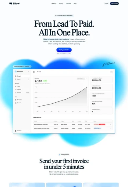
- Full page: https://cdn.designmunk.com/2026/10/03063414/esigna-app-featured.webp
- Above the fold: https://cdn.designmunk.com/2026/10/03063414/esigna-app-featured-1440x900.webp
- On DesignMunk: https://designmunk.com/esigna/

Study these for hierarchy, rhythm, spacing and density. Where an image and the written spec disagree, the spec wins: the tokens were read from the page's own CSS, the images are one rendering of it.

## Before you start

Ask the user what they are building, who it is for, and what brand assets they already have — name, colours, typefaces. Wait for their answers before writing anything. Everything below is then applied to their product, not to the reference.

## Design specification

# Esigna: Oversized Serif Hero and Live Editor Preview

## Overview

Editorial, trustworthy and minimal. The interface relies on a near-black ink for text over a warm parchment surface, using type, whitespace and subtle borders for hierarchy. The voice is professional rather than playful; spacing is generous and sections read as calm, self-contained blocks. Serif display headlines signal craft; sans-serif body keeps instructions clear.

## Page Structure

- Global nav: slim top bar, brand mark at far left, compact text links, and a right-aligned primary pill for the key action.
- Hero: oversized serif display headline with an italic subline, short supporting copy centered, then two CTAs (primary pill and quiet secondary) beneath.
- Live editor showcase: a wide, rounded demo frame spanning the content width, showing the editor toolbar, fields and a sample signature.
- Client compatibility strip: a single row of email-client names/logos presented inline beneath the demo.
- Paste-from-email section: explanatory copy with a walkthrough showing a pasted signature becoming structured fields and multiple templates redrawing.
- Four-step paste flow: a horizontal row of numbered steps (01–04) with short labels and two CTAs following.
- How it works: three sequential panels (01 Template, 02 Details, 03 Install) with labels, small previews and copy.
- What you get: a grid of concise feature tiles with short headings (Email-safe HTML, Dark mode, Framed headshot, Accent color, Links, Exports).
- In the inbox: a preview area with app/device tabs and a large email mockup card demonstrating the signature in context.
- Templates gallery: rows of template cards with specimen signatures and labels; a start CTA precedes the grid.
- FAQ: accordion list of questions with compact answers.
- Pricing: two plan cards (Free and one-time plan) side-by-side with button CTAs and a short reassurance line.
- Footer: multi-column text links for product, install guides, languages, account and company policies.

## Colors

- Primary (#1c1a17): Near-black ink for headlines, body text, and key icons.
- Secondary (#040404): Deepest black reserved for rare emphases or UI chrome that must read as absolute.
- Tertiary (#a5582e): Copper accent used sparingly for highlights or small state badges.
- Neutral (#f5f4f1): Warm parchment background for page sections.
- brand-dover-grey (#848484): Muted grey for secondary metadata and helper text.
- brand-cerebral-grey (#cccccc): Light grey for dividers, hairline borders and subtle UI boundaries.
- surface (#f5f4f1): Section surface color; same as Neutral for consistency across large backgrounds.
- on-surface (#1c1a17): Default text and icon color when placed on the surface.

## Typography

- Newsreader (Google, serif): Display workhorse for headlines. headline-lg at 84px/400 with tight -0.032em tracking suits the hero; headline-md at 57px/400 (-0.022em) for section leads. Freely available via Google Fonts. Substitutes: Source Serif 4, Cormorant Garamond, or system Georgia when web fonts are unavailable.
- Geist (Google, sans-serif): UI and body. headline-sm at 39px/400 and headline-xs at 26px/400 cover subheads; body-md at 18px/1.6 is the default paragraph size. Freely available via Google Fonts. Substitutes: Inter, IBM Plex Sans, or system UI (Segoe UI/SF Pro/Roboto).
- Geist Mono (Google, monospace): Occasional code-like specimens inside template examples. Freely available via Google Fonts. Substitutes: JetBrains Mono, Roboto Mono, or SF Mono.

## Layout

- Spacing scale favors air: xs 2px for hairlines, sm 10px for tight UI, md 20px for intra-component padding, lg 48px and xl 64px for section rhythm.
- Sections stack vertically on the Neutral surface with centered content blocks. Cards and mockups sit on white to create tonal separation without heavy borders.
- Split sections pair text and media; grids use evenly spaced cards with md (20px) inner padding and lg/xl gaps between groups.
- Buttons maintain a fixed 36px height; align CTAs in rows beneath headings to preserve vertical rhythm.

## Elevation & Depth

- Shadows are minimal: only a soft sm shadow (rgba(28,26,23,0.04) 0 1px 2px) appears on floating elements. Larger elevations are none.
- Depth is expressed through tone (white cards on a parchment surface), fine borders in brand-cerebral-grey (#cccccc), and generous whitespace.
- Emphasis escalates via type scale and contrast rather than glow or blur.

## Shapes

- Corners: cards and large frames use sm radius at 14px for a soft, modern rectangle.
- Pills: interactive chips and primary/secondary buttons use full radius (9999px) for a friendly, tappable feel.
- Imagery and avatar frames inherit the same radius family for consistency (rounded squares or circles as needed).

## Components

### Primary Button
- Background #1c1a17, text #ffffff, height 36px, padding 12px 16px, radius 9999px. Use for the main action in a section.

### Secondary Button
- Text color #3f3b36, height 36px, padding 12px 16px, radius 9999px. No fill by default; sits on the surface quietly next to the primary.

### Link Button
- Text color #3f3b36, square corners (0px). Use for tertiary inline actions.

### Card
- Background #ffffff, text #1c1a17, radius 14px, padding 8px. Place on the Neutral surface to create contrast.

### Editor Demo Frame
- Wide white card (14px radius) containing the signature editor UI. Apply the sm shadow for subtle lift and md (20px) internal padding; caption chip centered above.

### Client Compatibility Strip
- Single-row icon/text list of email clients. Use Geist body-md at 18px with brand-dover-grey for inactive states; equal md gaps between items.

### Paste-from-Email Explainer
- Split layout: left column explanatory copy, right column animated or stepped cards showing fields populating. Use headline-sm (39px) for the heading and md spacing between steps.

### How-It-Works Stepper
- Three panels labeled 01–03. Each panel is a white card at 14px radius with a small preview and body copy underneath; lg gaps between panels.

### Feature Checklist Grid
- Compact white tiles with a short subhead (headline-xs, 26px) and one paragraph (18px). Icons or specimen blocks sit top-left; use brand-cerebral-grey borders.

### Inbox Preview
- Tab row for apps/devices over a large email mockup card. Tabs are text buttons; the mockup card is white with 14px radius and md padding.

### Templates Gallery Card
- Repeating cards showing a specimen signature and a template label. Use white cards on the Neutral surface with md internal padding and sm shadow only if focus is needed.

### Pricing Plan Card
- Two side-by-side white cards, 14px radius, thin #cccccc borders, headline-sm for plan titles, and a primary pill CTA in each.

## Do's and Don'ts

- Do use Newsreader for display (84px or 57px) and Geist for all supporting text (18px); mixing them the other way around weakens hierarchy.
- Do place white cards on the Neutral (#f5f4f1) surface to create depth without heavy shadows.
- Do keep CTAs at 36px tall with full-pill radius; pair a black primary with a quiet secondary when two actions appear together.
- Do reserve the Copper accent (#a5582e) for small highlights; links and most UI should stay in near-black.
- Don't introduce large drop shadows; the system reads flat and editorial.
- Don't change the card radius or invent new sizes; stick to 14px for blocks and 9999px for pills.

## Agent Prompt Guide

Quick color reference — Text: #1c1a17 · Background: #f5f4f1 · Card: #ffffff · Border: #cccccc · Accent: #a5582e

1) Build the hero
- Background #f5f4f1. Center a headline in Newsreader, 84px, weight 400, letter-spacing -0.032em, color #1c1a17. Add a subline in Newsreader or Geist at 26px, color #1c1a17 at 80% opacity. Place two CTAs below: primary pill (bg #1c1a17, text #ffffff, height 36px, padding 12px 16px, radius 9999px) and secondary pill (text #3f3b36, radius 9999px). Use lg (48px) gaps between lines.

2) Add the editor demo frame
- On the hero's next section, center a white card (#ffffff)  with 14px radius and md (20px) padding, apply sm shadow (rgba(28,26,23,0.04) 0 1px 2px). Heading in Geist 26px above it; caption chip can use accent #a5582e sparingly.

3) Three-step "How it works" row
- Create three equal white cards (#ffffff), 14px radius, thin borders #cccccc, lg (48px) gaps. Titles in Geist 26px/400, body in Geist 18px/1.6, color #1c1a17. Add a primary pill CTA below the row.

4) Feature checklist grid
- Grid of small tiles on #f5f4f1. Each tile: white background, 14px radius, md padding, border #cccccc. Subhead in Geist 26px; copy in Geist 18px. Use icons or specimens in #848484.

5) Pricing two-up
- Two white cards, 14px radius, border #cccccc, lg gap. Plan names in Geist 39px/400, price in Newsreader 57px/400, body in Geist 18px. Primary pill (bg #1c1a17, text #ffffff) as the action.

## Similar Brands

- Notion: restrained monochrome palette and pill CTAs; Esigna leans more editorial with a serif display and warmer background.
- Linear: similarly crisp, type-led UI with minimal color; Esigna adds a serif headline and warmer neutrals for a less technical feel.
- Ghost (CMS): uses strong typography and white cards on soft backgrounds; Esigna is flatter with fewer shadows and tighter component radii.
- Framer: product-in-the-page demos and generous spacing; Esigna is quieter with near-black text and a parchment surface.

## Tokens

### CSS custom properties

```css
:root {
  /* Colors */
  --color-primary: #1c1a17;
  --color-secondary: #040404;
  --color-tertiary: #a5582e;
  --color-neutral: #f5f4f1;
  --color-brand-dover-grey: #848484;
  --color-brand-cerebral-grey: #cccccc;
  --color-surface: var(--color-neutral);
  --color-on-surface: var(--color-primary);

  /* Typography */
  --text-headline-lg-size: 84px;
  --text-headline-lg-weight: 400;
  --text-headline-lg-leading: 1;
  --text-headline-lg-tracking: -0.032em;
  --text-headline-md-size: 57px;
  --text-headline-md-weight: 400;
  --text-headline-md-leading: 1.02;
  --text-headline-md-tracking: -0.022em;
  --text-headline-sm-size: 39px;
  --text-headline-sm-weight: 400;
  --text-headline-sm-leading: 1.21;
  --text-headline-sm-tracking: -0.004em;
  --text-headline-xs-size: 26px;
  --text-headline-xs-weight: 400;
  --text-headline-xs-leading: 1.19;
  --text-body-md-size: 18px;
  --text-body-md-weight: 400;
  --text-body-md-leading: 1.6;
  --font-newsreader: "Newsreader";
  --font-geist: "Geist";

  /* Rounded */
  --radius-sm: 14px;
  --radius-full: 9999px;

  /* Spacing */
  --spacing-xs: 2px;
  --spacing-sm: 10px;
  --spacing-md: 20px;
  --spacing-lg: 48px;
  --spacing-xl: 64px;

  /* Components */
  --button-primary-background-color: var(--color-primary);
  --button-primary-text-color: #ffffff;
  --button-primary-rounded: var(--radius-full);
  --button-primary-padding: 12px 16px;
  --button-primary-height: 36px;
  --button-secondary-text-color: #3f3b36;
  --button-secondary-rounded: var(--radius-full);
  --button-secondary-padding: 12px 16px;
  --button-secondary-height: 36px;
  --button-link-text-color: #3f3b36;
  --button-link-rounded: 0px;
  --card-background-color: #ffffff;
  --card-text-color: var(--color-primary);
  --card-rounded: var(--radius-sm);
  --card-padding: 8px;
}
```

### Tailwind theme

```css
@theme {
  --color-primary: #1c1a17;
  --color-secondary: #040404;
  --color-tertiary: #a5582e;
  --color-neutral: #f5f4f1;
  --color-brand-dover-grey: #848484;
  --color-brand-cerebral-grey: #cccccc;
  --color-surface: #f5f4f1;
  --color-on-surface: #1c1a17;
  --font-headline-lg: "Newsreader";
  --font-headline-md: "Newsreader";
  --font-headline-sm: "Geist";
  --font-headline-xs: "Geist";
  --font-body-md: "Geist";
  --text-headline-lg: 84px;
  --text-headline-md: 57px;
  --text-headline-sm: 39px;
  --text-headline-xs: 26px;
  --text-body-md: 18px;
  --tracking-headline-lg: -0.032em;
  --tracking-headline-md: -0.022em;
  --tracking-headline-sm: -0.004em;
  --font-weight-headline-lg: 400;
  --font-weight-headline-md: 400;
  --font-weight-headline-sm: 400;
  --font-weight-headline-xs: 400;
  --font-weight-body-md: 400;
  --radius-sm: 14px;
  --radius-full: 9999px;
  --spacing-xs: 2px;
  --spacing-sm: 10px;
  --spacing-md: 20px;
  --spacing-lg: 48px;
  --spacing-xl: 64px;
}
```

### Design tokens (DTCG)

```json
{
    "$schema": "https://www.designtokens.org/schemas/2025.10/format.json",
    "color": {
        "$type": "color",
        "primary": {
            "$value": {
                "colorSpace": "srgb",
                "components": [
                    0.11,
                    0.102,
                    0.09
                ],
                "hex": "#1c1a17"
            }
        },
        "secondary": {
            "$value": {
                "colorSpace": "srgb",
                "components": [
                    0.016,
                    0.016,
                    0.016
                ],
                "hex": "#040404"
            }
        },
        "tertiary": {
            "$value": {
                "colorSpace": "srgb",
                "components": [
                    0.647,
                    0.345,
                    0.18
                ],
                "hex": "#a5582e"
            }
        },
        "neutral": {
            "$value": {
                "colorSpace": "srgb",
                "components": [
                    0.961,
                    0.957,
                    0.945
                ],
                "hex": "#f5f4f1"
            }
        },
        "brand-dover-grey": {
            "$value": {
                "colorSpace": "srgb",
                "components": [
                    0.518,
                    0.518,
                    0.518
                ],
                "hex": "#848484"
            }
        },
        "brand-cerebral-grey": {
            "$value": {
                "colorSpace": "srgb",
                "components": [
                    0.8,
                    0.8,
                    0.8
                ],
                "hex": "#cccccc"
            }
        },
        "surface": {
            "$value": {
                "colorSpace": "srgb",
                "components": [
                    0.961,
                    0.957,
                    0.945
                ],
                "hex": "#f5f4f1"
            }
        },
        "on-surface": {
            "$value": {
                "colorSpace": "srgb",
                "components": [
                    0.11,
                    0.102,
                    0.09
                ],
                "hex": "#1c1a17"
            }
        }
    },
    "spacing": {
        "$type": "dimension",
        "xs": {
            "$value": {
                "value": 2,
                "unit": "px"
            }
        },
        "sm": {
            "$value": {
                "value": 10,
                "unit": "px"
            }
        },
        "md": {
            "$value": {
                "value": 20,
                "unit": "px"
            }
        },
        "lg": {
            "$value": {
                "value": 48,
                "unit": "px"
            }
        },
        "xl": {
            "$value": {
                "value": 64,
                "unit": "px"
            }
        }
    },
    "rounded": {
        "$type": "dimension",
        "sm": {
            "$value": {
                "value": 14,
                "unit": "px"
            }
        },
        "full": {
            "$value": {
                "value": 9999,
                "unit": "px"
            }
        }
    },
    "typography": {
        "headline-lg": {
            "$type": "typography",
            "$value": {
                "fontFamily": "Newsreader",
                "fontSize": {
                    "value": 84,
                    "unit": "px"
                },
                "fontWeight": 400,
                "letterSpacing": {
                    "value": -0.032,
                    "unit": "em"
                }
            }
        },
        "headline-md": {
            "$type": "typography",
            "$value": {
                "fontFamily": "Newsreader",
                "fontSize": {
                    "value": 57,
                    "unit": "px"
                },
                "fontWeight": 400,
                "letterSpacing": {
                    "value": -0.022,
                    "unit": "em"
                }
            }
        },
        "headline-sm": {
            "$type": "typography",
            "$value": {
                "fontFamily": "Geist",
                "fontSize": {
                    "value": 39,
                    "unit": "px"
                },
                "fontWeight": 400,
                "letterSpacing": {
                    "value": -0.004,
                    "unit": "em"
                }
            }
        },
        "headline-xs": {
            "$type": "typography",
            "$value": {
                "fontFamily": "Geist",
                "fontSize": {
                    "value": 26,
                    "unit": "px"
                },
                "fontWeight": 400
            }
        },
        "body-md": {
            "$type": "typography",
            "$value": {
                "fontFamily": "Geist",
                "fontSize": {
                    "value": 18,
                    "unit": "px"
                },
                "fontWeight": 400
            }
        }
    }
}
```

## Rules

- **Fonts.** If the specification names a custom or self-hosted family, use one of the substitutes it names. Never reference a typeface you cannot actually load — it will fall back to a system font and undo the typography.
- **Colour.** Derive the palette from the user's brand. Use the token values as a guide to *relationships* — contrast, tint, how many accents carry the page — not as hex codes to paste.
- **Never reproduce** the wordmark, mascot, logo, brand name, illustrations, icon set, screenshots or any copy from the reference.
- **Never present the result as Esigna**, or imply any connection to it.
- If something is unspecified, choose clarity and legibility over decoration.
---
version: alpha
name: Esigna
description: A professional email signature, made in minutes.
colors:
  primary: "#1c1a17"
  secondary: "#040404"
  tertiary: "#a5582e"
  neutral: "#f5f4f1"
  brand-dover-grey: "#848484"
  brand-cerebral-grey: "#cccccc"
  surface: "{colors.neutral}"
  on-surface: "{colors.primary}"
typography:
  headline-lg:
    fontFamily: Newsreader
    fontSize: 84px
    fontWeight: 400
    lineHeight: 1
    letterSpacing: -0.032em
  headline-md:
    fontFamily: Newsreader
    fontSize: 57px
    fontWeight: 400
    lineHeight: 1.02
    letterSpacing: -0.022em
  headline-sm:
    fontFamily: Geist
    fontSize: 39px
    fontWeight: 400
    lineHeight: 1.21
    letterSpacing: -0.004em
  headline-xs:
    fontFamily: Geist
    fontSize: 26px
    fontWeight: 400
    lineHeight: 1.19
  body-md:
    fontFamily: Geist
    fontSize: 18px
    fontWeight: 400
    lineHeight: 1.6
rounded:
  sm: 14px
  full: 9999px
spacing:
  xs: 2px
  sm: 10px
  md: 20px
  lg: 48px
  xl: 64px
components:
  button-primary:
    backgroundColor: "{colors.primary}"
    textColor: "#ffffff"
    rounded: "{rounded.full}"
    padding: 12px 16px
    height: 36px
  button-secondary:
    textColor: "#3f3b36"
    rounded: "{rounded.full}"
    padding: 12px 16px
    height: 36px
  button-link:
    textColor: "#3f3b36"
    rounded: 0px
  card:
    backgroundColor: "#ffffff"
    textColor: "{colors.primary}"
    rounded: "{rounded.sm}"
    padding: 8px
---

# Esigna: Oversized Serif Hero and Live Editor Preview

## Overview

Editorial, trustworthy and minimal. The interface relies on a near-black ink for text over a warm parchment surface, using type, whitespace and subtle borders for hierarchy. The voice is professional rather than playful; spacing is generous and sections read as calm, self-contained blocks. Serif display headlines signal craft; sans-serif body keeps instructions clear.

## Page Structure

- Global nav: slim top bar, brand mark at far left, compact text links, and a right-aligned primary pill for the key action.
- Hero: oversized serif display headline with an italic subline, short supporting copy centered, then two CTAs (primary pill and quiet secondary) beneath.
- Live editor showcase: a wide, rounded demo frame spanning the content width, showing the editor toolbar, fields and a sample signature.
- Client compatibility strip: a single row of email-client names/logos presented inline beneath the demo.
- Paste-from-email section: explanatory copy with a walkthrough showing a pasted signature becoming structured fields and multiple templates redrawing.
- Four-step paste flow: a horizontal row of numbered steps (01–04) with short labels and two CTAs following.
- How it works: three sequential panels (01 Template, 02 Details, 03 Install) with labels, small previews and copy.
- What you get: a grid of concise feature tiles with short headings (Email-safe HTML, Dark mode, Framed headshot, Accent color, Links, Exports).
- In the inbox: a preview area with app/device tabs and a large email mockup card demonstrating the signature in context.
- Templates gallery: rows of template cards with specimen signatures and labels; a start CTA precedes the grid.
- FAQ: accordion list of questions with compact answers.
- Pricing: two plan cards (Free and one-time plan) side-by-side with button CTAs and a short reassurance line.
- Footer: multi-column text links for product, install guides, languages, account and company policies.

## Colors

- Primary (#1c1a17): Near-black ink for headlines, body text, and key icons.
- Secondary (#040404): Deepest black reserved for rare emphases or UI chrome that must read as absolute.
- Tertiary (#a5582e): Copper accent used sparingly for highlights or small state badges.
- Neutral (#f5f4f1): Warm parchment background for page sections.
- brand-dover-grey (#848484): Muted grey for secondary metadata and helper text.
- brand-cerebral-grey (#cccccc): Light grey for dividers, hairline borders and subtle UI boundaries.
- surface (#f5f4f1): Section surface color; same as Neutral for consistency across large backgrounds.
- on-surface (#1c1a17): Default text and icon color when placed on the surface.

## Typography

- Newsreader (Google, serif): Display workhorse for headlines. headline-lg at 84px/400 with tight -0.032em tracking suits the hero; headline-md at 57px/400 (-0.022em) for section leads. Freely available via Google Fonts. Substitutes: Source Serif 4, Cormorant Garamond, or system Georgia when web fonts are unavailable.
- Geist (Google, sans-serif): UI and body. headline-sm at 39px/400 and headline-xs at 26px/400 cover subheads; body-md at 18px/1.6 is the default paragraph size. Freely available via Google Fonts. Substitutes: Inter, IBM Plex Sans, or system UI (Segoe UI/SF Pro/Roboto).
- Geist Mono (Google, monospace): Occasional code-like specimens inside template examples. Freely available via Google Fonts. Substitutes: JetBrains Mono, Roboto Mono, or SF Mono.

## Layout

- Spacing scale favors air: xs 2px for hairlines, sm 10px for tight UI, md 20px for intra-component padding, lg 48px and xl 64px for section rhythm.
- Sections stack vertically on the Neutral surface with centered content blocks. Cards and mockups sit on white to create tonal separation without heavy borders.
- Split sections pair text and media; grids use evenly spaced cards with md (20px) inner padding and lg/xl gaps between groups.
- Buttons maintain a fixed 36px height; align CTAs in rows beneath headings to preserve vertical rhythm.

## Elevation & Depth

- Shadows are minimal: only a soft sm shadow (rgba(28,26,23,0.04) 0 1px 2px) appears on floating elements. Larger elevations are none.
- Depth is expressed through tone (white cards on a parchment surface), fine borders in brand-cerebral-grey (#cccccc), and generous whitespace.
- Emphasis escalates via type scale and contrast rather than glow or blur.

## Shapes

- Corners: cards and large frames use sm radius at 14px for a soft, modern rectangle.
- Pills: interactive chips and primary/secondary buttons use full radius (9999px) for a friendly, tappable feel.
- Imagery and avatar frames inherit the same radius family for consistency (rounded squares or circles as needed).

## Components

### Primary Button
- Background #1c1a17, text #ffffff, height 36px, padding 12px 16px, radius 9999px. Use for the main action in a section.

### Secondary Button
- Text color #3f3b36, height 36px, padding 12px 16px, radius 9999px. No fill by default; sits on the surface quietly next to the primary.

### Link Button
- Text color #3f3b36, square corners (0px). Use for tertiary inline actions.

### Card
- Background #ffffff, text #1c1a17, radius 14px, padding 8px. Place on the Neutral surface to create contrast.

### Editor Demo Frame
- Wide white card (14px radius) containing the signature editor UI. Apply the sm shadow for subtle lift and md (20px) internal padding; caption chip centered above.

### Client Compatibility Strip
- Single-row icon/text list of email clients. Use Geist body-md at 18px with brand-dover-grey for inactive states; equal md gaps between items.

### Paste-from-Email Explainer
- Split layout: left column explanatory copy, right column animated or stepped cards showing fields populating. Use headline-sm (39px) for the heading and md spacing between steps.

### How-It-Works Stepper
- Three panels labeled 01–03. Each panel is a white card at 14px radius with a small preview and body copy underneath; lg gaps between panels.

### Feature Checklist Grid
- Compact white tiles with a short subhead (headline-xs, 26px) and one paragraph (18px). Icons or specimen blocks sit top-left; use brand-cerebral-grey borders.

### Inbox Preview
- Tab row for apps/devices over a large email mockup card. Tabs are text buttons; the mockup card is white with 14px radius and md padding.

### Templates Gallery Card
- Repeating cards showing a specimen signature and a template label. Use white cards on the Neutral surface with md internal padding and sm shadow only if focus is needed.

### Pricing Plan Card
- Two side-by-side white cards, 14px radius, thin #cccccc borders, headline-sm for plan titles, and a primary pill CTA in each.

## Do's and Don'ts

- Do use Newsreader for display (84px or 57px) and Geist for all supporting text (18px); mixing them the other way around weakens hierarchy.
- Do place white cards on the Neutral (#f5f4f1) surface to create depth without heavy shadows.
- Do keep CTAs at 36px tall with full-pill radius; pair a black primary with a quiet secondary when two actions appear together.
- Do reserve the Copper accent (#a5582e) for small highlights; links and most UI should stay in near-black.
- Don't introduce large drop shadows; the system reads flat and editorial.
- Don't change the card radius or invent new sizes; stick to 14px for blocks and 9999px for pills.

## Agent Prompt Guide

Quick color reference — Text: #1c1a17 · Background: #f5f4f1 · Card: #ffffff · Border: #cccccc · Accent: #a5582e

1) Build the hero
- Background #f5f4f1. Center a headline in Newsreader, 84px, weight 400, letter-spacing -0.032em, color #1c1a17. Add a subline in Newsreader or Geist at 26px, color #1c1a17 at 80% opacity. Place two CTAs below: primary pill (bg #1c1a17, text #ffffff, height 36px, padding 12px 16px, radius 9999px) and secondary pill (text #3f3b36, radius 9999px). Use lg (48px) gaps between lines.

2) Add the editor demo frame
- On the hero's next section, center a white card (#ffffff)  with 14px radius and md (20px) padding, apply sm shadow (rgba(28,26,23,0.04) 0 1px 2px). Heading in Geist 26px above it; caption chip can use accent #a5582e sparingly.

3) Three-step "How it works" row
- Create three equal white cards (#ffffff), 14px radius, thin borders #cccccc, lg (48px) gaps. Titles in Geist 26px/400, body in Geist 18px/1.6, color #1c1a17. Add a primary pill CTA below the row.

4) Feature checklist grid
- Grid of small tiles on #f5f4f1. Each tile: white background, 14px radius, md padding, border #cccccc. Subhead in Geist 26px; copy in Geist 18px. Use icons or specimens in #848484.

5) Pricing two-up
- Two white cards, 14px radius, border #cccccc, lg gap. Plan names in Geist 39px/400, price in Newsreader 57px/400, body in Geist 18px. Primary pill (bg #1c1a17, text #ffffff) as the action.

## Similar Brands

- Notion: restrained monochrome palette and pill CTAs; Esigna leans more editorial with a serif display and warmer background.
- Linear: similarly crisp, type-led UI with minimal color; Esigna adds a serif headline and warmer neutrals for a less technical feel.
- Ghost (CMS): uses strong typography and white cards on soft backgrounds; Esigna is flatter with fewer shadows and tighter component radii.
- Framer: product-in-the-page demos and generous spacing; Esigna is quieter with near-black text and a parchment surface.
:root {
  /* Colors */
  --color-primary: #1c1a17;
  --color-secondary: #040404;
  --color-tertiary: #a5582e;
  --color-neutral: #f5f4f1;
  --color-brand-dover-grey: #848484;
  --color-brand-cerebral-grey: #cccccc;
  --color-surface: var(--color-neutral);
  --color-on-surface: var(--color-primary);

  /* Typography */
  --text-headline-lg-size: 84px;
  --text-headline-lg-weight: 400;
  --text-headline-lg-leading: 1;
  --text-headline-lg-tracking: -0.032em;
  --text-headline-md-size: 57px;
  --text-headline-md-weight: 400;
  --text-headline-md-leading: 1.02;
  --text-headline-md-tracking: -0.022em;
  --text-headline-sm-size: 39px;
  --text-headline-sm-weight: 400;
  --text-headline-sm-leading: 1.21;
  --text-headline-sm-tracking: -0.004em;
  --text-headline-xs-size: 26px;
  --text-headline-xs-weight: 400;
  --text-headline-xs-leading: 1.19;
  --text-body-md-size: 18px;
  --text-body-md-weight: 400;
  --text-body-md-leading: 1.6;
  --font-newsreader: "Newsreader";
  --font-geist: "Geist";

  /* Rounded */
  --radius-sm: 14px;
  --radius-full: 9999px;

  /* Spacing */
  --spacing-xs: 2px;
  --spacing-sm: 10px;
  --spacing-md: 20px;
  --spacing-lg: 48px;
  --spacing-xl: 64px;

  /* Components */
  --button-primary-background-color: var(--color-primary);
  --button-primary-text-color: #ffffff;
  --button-primary-rounded: var(--radius-full);
  --button-primary-padding: 12px 16px;
  --button-primary-height: 36px;
  --button-secondary-text-color: #3f3b36;
  --button-secondary-rounded: var(--radius-full);
  --button-secondary-padding: 12px 16px;
  --button-secondary-height: 36px;
  --button-link-text-color: #3f3b36;
  --button-link-rounded: 0px;
  --card-background-color: #ffffff;
  --card-text-color: var(--color-primary);
  --card-rounded: var(--radius-sm);
  --card-padding: 8px;
}
{
  "$schema": "https://www.designtokens.org/schemas/2025.10/format.json",
  "$description": "A professional email signature, made in minutes.",
  "color": {
    "$type": "color",
    "primary": {
      "$value": {
        "colorSpace": "srgb",
        "components": [
          0.11,
          0.102,
          0.09
        ],
        "hex": "#1c1a17"
      }
    },
    "secondary": {
      "$value": {
        "colorSpace": "srgb",
        "components": [
          0.016,
          0.016,
          0.016
        ],
        "hex": "#040404"
      }
    },
    "tertiary": {
      "$value": {
        "colorSpace": "srgb",
        "components": [
          0.647,
          0.345,
          0.18
        ],
        "hex": "#a5582e"
      }
    },
    "neutral": {
      "$value": {
        "colorSpace": "srgb",
        "components": [
          0.961,
          0.957,
          0.945
        ],
        "hex": "#f5f4f1"
      }
    },
    "brand-dover-grey": {
      "$value": {
        "colorSpace": "srgb",
        "components": [
          0.518,
          0.518,
          0.518
        ],
        "hex": "#848484"
      }
    },
    "brand-cerebral-grey": {
      "$value": {
        "colorSpace": "srgb",
        "components": [
          0.8,
          0.8,
          0.8
        ],
        "hex": "#cccccc"
      }
    },
    "surface": {
      "$value": {
        "colorSpace": "srgb",
        "components": [
          0.961,
          0.957,
          0.945
        ],
        "hex": "#f5f4f1"
      }
    },
    "on-surface": {
      "$value": {
        "colorSpace": "srgb",
        "components": [
          0.11,
          0.102,
          0.09
        ],
        "hex": "#1c1a17"
      }
    }
  },
  "spacing": {
    "$type": "dimension",
    "xs": {
      "$value": {
        "value": 2,
        "unit": "px"
      }
    },
    "sm": {
      "$value": {
        "value": 10,
        "unit": "px"
      }
    },
    "md": {
      "$value": {
        "value": 20,
        "unit": "px"
      }
    },
    "lg": {
      "$value": {
        "value": 48,
        "unit": "px"
      }
    },
    "xl": {
      "$value": {
        "value": 64,
        "unit": "px"
      }
    }
  },
  "rounded": {
    "$type": "dimension",
    "sm": {
      "$value": {
        "value": 14,
        "unit": "px"
      }
    },
    "full": {
      "$value": {
        "value": 9999,
        "unit": "px"
      }
    }
  },
  "typography": {
    "headline-lg": {
      "$type": "typography",
      "$value": {
        "fontFamily": "Newsreader",
        "fontSize": {
          "value": 84,
          "unit": "px"
        },
        "fontWeight": 400,
        "letterSpacing": {
          "value": -0.032,
          "unit": "em"
        }
      }
    },
    "headline-md": {
      "$type": "typography",
      "$value": {
        "fontFamily": "Newsreader",
        "fontSize": {
          "value": 57,
          "unit": "px"
        },
        "fontWeight": 400,
        "letterSpacing": {
          "value": -0.022,
          "unit": "em"
        }
      }
    },
    "headline-sm": {
      "$type": "typography",
      "$value": {
        "fontFamily": "Geist",
        "fontSize": {
          "value": 39,
          "unit": "px"
        },
        "fontWeight": 400,
        "letterSpacing": {
          "value": -0.004,
          "unit": "em"
        }
      }
    },
    "headline-xs": {
      "$type": "typography",
      "$value": {
        "fontFamily": "Geist",
        "fontSize": {
          "value": 26,
          "unit": "px"
        },
        "fontWeight": 400
      }
    },
    "body-md": {
      "$type": "typography",
      "$value": {
        "fontFamily": "Geist",
        "fontSize": {
          "value": 18,
          "unit": "px"
        },
        "fontWeight": 400
      }
    }
  }
}
@theme {
--color-primary: #1c1a17;
--color-secondary: #040404;
--color-tertiary: #a5582e;
--color-neutral: #f5f4f1;
--color-brand-dover-grey: #848484;
--color-brand-cerebral-grey: #cccccc;
--color-surface: #f5f4f1;
--color-on-surface: #1c1a17;
--font-headline-lg: "Newsreader";
--font-headline-md: "Newsreader";
--font-headline-sm: "Geist";
--font-headline-xs: "Geist";
--font-body-md: "Geist";
--text-headline-lg: 84px;
--text-headline-md: 57px;
--text-headline-sm: 39px;
--text-headline-xs: 26px;
--text-body-md: 18px;
--tracking-headline-lg: -0.032em;
--tracking-headline-md: -0.022em;
--tracking-headline-sm: -0.004em;
--font-weight-headline-lg: 400;
--font-weight-headline-md: 400;
--font-weight-headline-sm: 400;
--font-weight-headline-xs: 400;
--font-weight-body-md: 400;
--radius-sm: 14px;
--radius-full: 9999px;
--spacing-xs: 2px;
--spacing-sm: 10px;
--spacing-md: 20px;
--spacing-lg: 48px;
--spacing-xl: 64px;
} # Design brief: the Esigna design language
Below is a complete design specification measured from a real, published web page. Use it as a design language for the user's product. It is not a page to reproduce.
## Reference images
- Full page: https://cdn.designmunk.com/2026/10/03063414/esigna-app-featured.webp
- Above the fold: https://cdn.designmunk.com/2026/10/03063414/esigna-app-featured-1440x900.webp
- On DesignMunk: https://designmunk.com/esigna/
Study these for hierarchy, rhythm, spacing and density. Where an image and the written spec disagree, the spec wins: the tokens were read from the page's own CSS, the images are one rendering of it.
## Before you start
Ask the user what they are building, who it is for, and what brand assets they already have — name, colours, typefaces. Wait for their answers before writing anything. Everything below is then applied to their product, not to the reference.
## Design specification
# Esigna: Oversized Serif Hero and Live Editor Preview
## Overview
Editorial, trustworthy and minimal. The interface relies on a near-black ink for text over a warm parchment surface, using type, whitespace and subtle borders for hierarchy. The voice is professional rather than playful; spacing is generous and sections read as calm, self-contained blocks. Serif display headlines signal craft; sans-serif body keeps instructions clear.
## Page Structure
- Global nav: slim top bar, brand mark at far left, compact text links, and a right-aligned primary pill for the key action.
- Hero: oversized serif display headline with an italic subline, short supporting copy centered, then two CTAs (primary pill and quiet secondary) beneath.
- Live editor showcase: a wide, rounded demo frame spanning the content width, showing the editor toolbar, fields and a sample signature.
- Client compatibility strip: a single row of email-client names/logos presented inline beneath the demo.
- Paste-from-email section: explanatory copy with a walkthrough showing a pasted signature becoming structured fields and multiple templates redrawing.
- Four-step paste flow: a horizontal row of numbered steps (01–04) with short labels and two CTAs following.
- How it works: three sequential panels (01 Template, 02 Details, 03 Install) with labels, small previews and copy.
- What you get: a grid of concise feature tiles with short headings (Email-safe HTML, Dark mode, Framed headshot, Accent color, Links, Exports).
- In the inbox: a preview area with app/device tabs and a large email mockup card demonstrating the signature in context.
- Templates gallery: rows of template cards with specimen signatures and labels; a start CTA precedes the grid.
- FAQ: accordion list of questions with compact answers.
- Pricing: two plan cards (Free and one-time plan) side-by-side with button CTAs and a short reassurance line.
- Footer: multi-column text links for product, install guides, languages, account and company policies.
## Colors
- Primary (#1c1a17): Near-black ink for headlines, body text, and key icons.
- Secondary (#040404): Deepest black reserved for rare emphases or UI chrome that must read as absolute.
- Tertiary (#a5582e): Copper accent used sparingly for highlights or small state badges.
- Neutral (#f5f4f1): Warm parchment background for page sections.
- brand-dover-grey (#848484): Muted grey for secondary metadata and helper text.
- brand-cerebral-grey (#cccccc): Light grey for dividers, hairline borders and subtle UI boundaries.
- surface (#f5f4f1): Section surface color; same as Neutral for consistency across large backgrounds.
- on-surface (#1c1a17): Default text and icon color when placed on the surface.
## Typography
- Newsreader (Google, serif): Display workhorse for headlines. headline-lg at 84px/400 with tight -0.032em tracking suits the hero; headline-md at 57px/400 (-0.022em) for section leads. Freely available via Google Fonts. Substitutes: Source Serif 4, Cormorant Garamond, or system Georgia when web fonts are unavailable.
- Geist (Google, sans-serif): UI and body. headline-sm at 39px/400 and headline-xs at 26px/400 cover subheads; body-md at 18px/1.6 is the default paragraph size. Freely available via Google Fonts. Substitutes: Inter, IBM Plex Sans, or system UI (Segoe UI/SF Pro/Roboto).
- Geist Mono (Google, monospace): Occasional code-like specimens inside template examples. Freely available via Google Fonts. Substitutes: JetBrains Mono, Roboto Mono, or SF Mono.
## Layout
- Spacing scale favors air: xs 2px for hairlines, sm 10px for tight UI, md 20px for intra-component padding, lg 48px and xl 64px for section rhythm.
- Sections stack vertically on the Neutral surface with centered content blocks. Cards and mockups sit on white to create tonal separation without heavy borders.
- Split sections pair text and media; grids use evenly spaced cards with md (20px) inner padding and lg/xl gaps between groups.
- Buttons maintain a fixed 36px height; align CTAs in rows beneath headings to preserve vertical rhythm.
## Elevation & Depth
- Shadows are minimal: only a soft sm shadow (rgba(28,26,23,0.04) 0 1px 2px) appears on floating elements. Larger elevations are none.
- Depth is expressed through tone (white cards on a parchment surface), fine borders in brand-cerebral-grey (#cccccc), and generous whitespace.
- Emphasis escalates via type scale and contrast rather than glow or blur.
## Shapes
- Corners: cards and large frames use sm radius at 14px for a soft, modern rectangle.
- Pills: interactive chips and primary/secondary buttons use full radius (9999px) for a friendly, tappable feel.
- Imagery and avatar frames inherit the same radius family for consistency (rounded squares or circles as needed).
## Components
### Primary Button
- Background #1c1a17, text #ffffff, height 36px, padding 12px 16px, radius 9999px. Use for the main action in a section.
### Secondary Button
- Text color #3f3b36, height 36px, padding 12px 16px, radius 9999px. No fill by default; sits on the surface quietly next to the primary.
### Link Button
- Text color #3f3b36, square corners (0px). Use for tertiary inline actions.
### Card
- Background #ffffff, text #1c1a17, radius 14px, padding 8px. Place on the Neutral surface to create contrast.
### Editor Demo Frame
- Wide white card (14px radius) containing the signature editor UI. Apply the sm shadow for subtle lift and md (20px) internal padding; caption chip centered above.
### Client Compatibility Strip
- Single-row icon/text list of email clients. Use Geist body-md at 18px with brand-dover-grey for inactive states; equal md gaps between items.
### Paste-from-Email Explainer
- Split layout: left column explanatory copy, right column animated or stepped cards showing fields populating. Use headline-sm (39px) for the heading and md spacing between steps.
### How-It-Works Stepper
- Three panels labeled 01–03. Each panel is a white card at 14px radius with a small preview and body copy underneath; lg gaps between panels.
### Feature Checklist Grid
- Compact white tiles with a short subhead (headline-xs, 26px) and one paragraph (18px). Icons or specimen blocks sit top-left; use brand-cerebral-grey borders.
### Inbox Preview
- Tab row for apps/devices over a large email mockup card. Tabs are text buttons; the mockup card is white with 14px radius and md padding.
### Templates Gallery Card
- Repeating cards showing a specimen signature and a template label. Use white cards on the Neutral surface with md internal padding and sm shadow only if focus is needed.
### Pricing Plan Card
- Two side-by-side white cards, 14px radius, thin #cccccc borders, headline-sm for plan titles, and a primary pill CTA in each.
## Do's and Don'ts
- Do use Newsreader for display (84px or 57px) and Geist for all supporting text (18px); mixing them the other way around weakens hierarchy.
- Do place white cards on the Neutral (#f5f4f1) surface to create depth without heavy shadows.
- Do keep CTAs at 36px tall with full-pill radius; pair a black primary with a quiet secondary when two actions appear together.
- Do reserve the Copper accent (#a5582e) for small highlights; links and most UI should stay in near-black.
- Don't introduce large drop shadows; the system reads flat and editorial.
- Don't change the card radius or invent new sizes; stick to 14px for blocks and 9999px for pills.
## Agent Prompt Guide
Quick color reference — Text: #1c1a17 · Background: #f5f4f1 · Card: #ffffff · Border: #cccccc · Accent: #a5582e
1) Build the hero
- Background #f5f4f1. Center a headline in Newsreader, 84px, weight 400, letter-spacing -0.032em, color #1c1a17. Add a subline in Newsreader or Geist at 26px, color #1c1a17 at 80% opacity. Place two CTAs below: primary pill (bg #1c1a17, text #ffffff, height 36px, padding 12px 16px, radius 9999px) and secondary pill (text #3f3b36, radius 9999px). Use lg (48px) gaps between lines.
2) Add the editor demo frame
- On the hero's next section, center a white card (#ffffff) with 14px radius and md (20px) padding, apply sm shadow (rgba(28,26,23,0.04) 0 1px 2px). Heading in Geist 26px above it; caption chip can use accent #a5582e sparingly.
3) Three-step "How it works" row
- Create three equal white cards (#ffffff), 14px radius, thin borders #cccccc, lg (48px) gaps. Titles in Geist 26px/400, body in Geist 18px/1.6, color #1c1a17. Add a primary pill CTA below the row.
4) Feature checklist grid
- Grid of small tiles on #f5f4f1. Each tile: white background, 14px radius, md padding, border #cccccc. Subhead in Geist 26px; copy in Geist 18px. Use icons or specimens in #848484.
5) Pricing two-up
- Two white cards, 14px radius, border #cccccc, lg gap. Plan names in Geist 39px/400, price in Newsreader 57px/400, body in Geist 18px. Primary pill (bg #1c1a17, text #ffffff) as the action.
## Tokens
### CSS custom properties
```css
:root {
/* Colors */
--color-primary: #1c1a17;
--color-secondary: #040404;
--color-tertiary: #a5582e;
--color-neutral: #f5f4f1;
--color-brand-dover-grey: #848484;
--color-brand-cerebral-grey: #cccccc;
--color-surface: var(--color-neutral);
--color-on-surface: var(--color-primary);
/* Typography */
--text-headline-lg-size: 84px;
--text-headline-lg-weight: 400;
--text-headline-lg-leading: 1;
--text-headline-lg-tracking: -0.032em;
--text-headline-md-size: 57px;
--text-headline-md-weight: 400;
--text-headline-md-leading: 1.02;
--text-headline-md-tracking: -0.022em;
--text-headline-sm-size: 39px;
--text-headline-sm-weight: 400;
--text-headline-sm-leading: 1.21;
--text-headline-sm-tracking: -0.004em;
--text-headline-xs-size: 26px;
--text-headline-xs-weight: 400;
--text-headline-xs-leading: 1.19;
--text-body-md-size: 18px;
--text-body-md-weight: 400;
--text-body-md-leading: 1.6;
--font-newsreader: "Newsreader";
--font-geist: "Geist";
/* Rounded */
--radius-sm: 14px;
--radius-full: 9999px;
/* Spacing */
--spacing-xs: 2px;
--spacing-sm: 10px;
--spacing-md: 20px;
--spacing-lg: 48px;
--spacing-xl: 64px;
/* Components */
--button-primary-background-color: var(--color-primary);
--button-primary-text-color: #ffffff;
--button-primary-rounded: var(--radius-full);
--button-primary-padding: 12px 16px;
--button-primary-height: 36px;
--button-secondary-text-color: #3f3b36;
--button-secondary-rounded: var(--radius-full);
--button-secondary-padding: 12px 16px;
--button-secondary-height: 36px;
--button-link-text-color: #3f3b36;
--button-link-rounded: 0px;
--card-background-color: #ffffff;
--card-text-color: var(--color-primary);
--card-rounded: var(--radius-sm);
--card-padding: 8px;
}
```
## Rules
- **Fonts.** If the specification names a custom or self-hosted family, use one of the substitutes it names. Never reference a typeface you cannot actually load — it will fall back to a system font and undo the typography.
- **Colour.** Derive the palette from the user's brand. Use the token values as a guide to *relationships* — contrast, tint, how many accents carry the page — not as hex codes to paste.
- **Never reproduce** the wordmark, mascot, logo, brand name, illustrations, icon set, screenshots or any copy from the reference.
- **Never present the result as Esigna**, or imply any connection to it.
- If something is unspecified, choose clarity and legibility over decoration.