




Differ
getdiffer.com
Adaptive software that shapes itself—build one codebase, endless variants.
getdiffer.com
AI Breakdown
Design export
# Design brief: the Differ design language

Below is a complete design specification measured from a real, published web page. Use it as a design language for the user's product. It is not a page to reproduce.

## Reference images

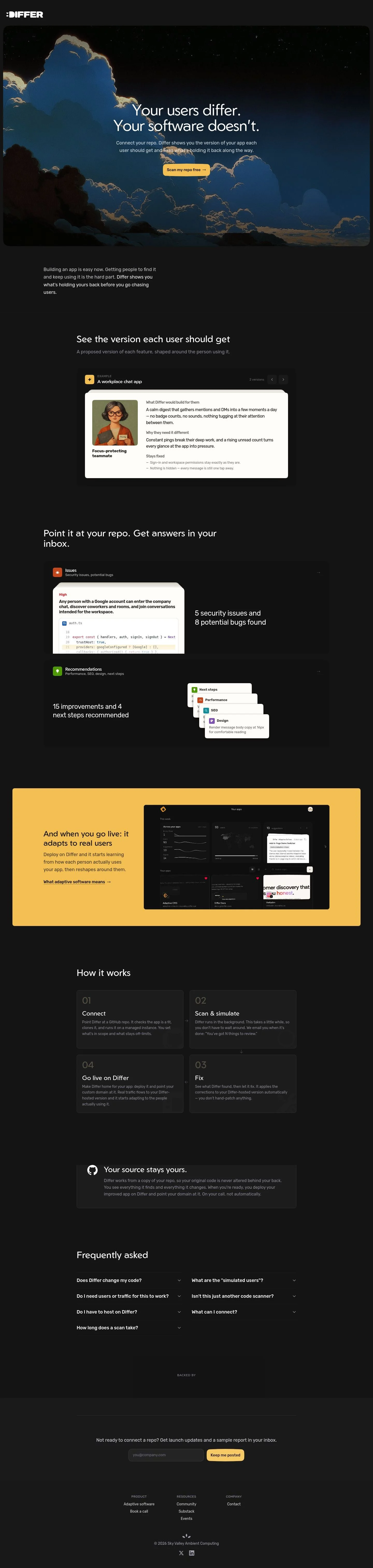
- Full page: https://cdn.designmunk.com/2026/09/04164611/getdiffer-com-featured.webp
- Above the fold: https://cdn.designmunk.com/2026/09/04164611/getdiffer-com-featured.webp
- On DesignMunk: https://designmunk.com/differ/

Study these for hierarchy, rhythm, spacing and density. Where an image and the written spec disagree, the spec wins: the tokens were read from the page's own CSS, the images are one rendering of it.

## Before you start

Ask the user what they are building, who it is for, and what brand assets they already have — name, colours, typefaces. Wait for their answers before writing anything. Everything below is then applied to their product, not to the reference.

## Design specification

# Differ: Night-sky Hero With Warm Amber CTA

## Overview

Differ is a developer tool with a cinematic dark theme. The UI should feel focused, confident, and calm: sparse color, generous breathing room, and one dominant action. Weight stays light, spacing is measured rather than airy, and copy blocks remain short. When tokens don't dictate, prefer dark surfaces with high-contrast type and a single warm accent.

## Colors

- **primary (#ffffff):** Primary ink for text and icons on dark surfaces.
- **secondary (#f2ac0c):** Warm amber accent for key actions, highlights, and emphasis.
- **tertiary (#f6c864):** Lighter amber for hovers, subtle badges, or secondary emphasis.
- **neutral (#1a1a1a):** Base dark canvas; default page background.
- **border (#e2e8f0):** Hairline dividers and input borders; keep usage minimal on dark.
- **brand-autumn-leaf-brown (#7c5c14):** Deep accent for pressed states or data visuals adjacent to amber.
- **surface ({colors.neutral} → #1a1a1a):** Elevated panels and hero containers.
- **on-surface ({colors.primary} → #ffffff):** Text and icon color on surfaces.

## Typography

- Geom: Display family for headlines. Freely available via Google Fonts. Use headline-lg at 60px/300 for the main hero, headline-md at 44px/300 for section entries, and headline-sm at 33px/300 for subheads. Suitable substitutes: Poppins, Montserrat, or Outfit.
- Rubik: UI and body family. Freely available via Google Fonts. Use headline-xs at 24px/300 for tertiary headings and body-md at 18px/300 for paragraphs, lists, and component text. Suitable substitutes: Inter, IBM Plex Sans, or Source Sans 3.
- Keep weights light (300) unless legibility requires 400 on small sizes. Preserve the negative tracking on large Geom to maintain the crisp, modern tone.

## Layout

Spacing scale is pragmatic: 6 / 16 / 28 / 36 / 48. Use xl (48px) for section paddings and major vertical rhythm, lg (36px) for intra-section blocks, md (28px) to separate heading from body, sm (16px) for component gutters, and xs (6px) for microgaps. Prefer a centered content column with clear breaks between sections; rely on spacing and typography rather than lines. Keep paragraphs short and align actions directly beneath explanatory copy.

## Elevation & Depth

Depth is restrained. Only the sm shadow is used for gentle lift on hero and cards; other shadow sizes are none. When separation is needed, use tonal shifts between surface (#1a1a1a) and background along with the border color (#e2e8f0) as a light hairline. Avoid stacked shadows or heavy glows.

## Shapes

Two radii communicate hierarchy: sm at 4px for interactive controls and compact elements; md at 14px for cards, hero containers, and major panels. A zero-radius variant exists for link-style buttons to keep inline text crisp.

## Components

- Button — Primary: Filled button with background #ffffff and text #1a1a1a. Rounded 4px, height 40px, padding 8px 16px. Use for the single, dominant action.
- Button — Secondary: Text-only/outline-friendly control with text #ffffff, rounded 4px, height 40px, padding 8px 16px. Pair with the border color for an outline when needed.
- Button — Link: Inline action with text #ffffff and 0px radius; keep it minimal.
- Card: Light background #fefdfb, text #1a1a1a, rounded 14px, padding 14.4px 16px; apply the sm shadow for slight lift.

Distinctive on this page:

### Cinematic Hero Panel
- Dark surface (#1a1a1a) with md radius (14px) and sm shadow. Headline uses Geom 60px/300; supporting copy in Rubik 18px. Primary CTA placed immediately beneath copy.

### Problem Statement Intro
- A compact text block under the hero with Rubik 18px and a single paragraph break (md 28px) to frame the product's promise.

### Persona Example Card
- "A workplace chat app" with a 24px Rubik subhead and short bullets. Use sm 16px gutters and md 28px spacing between label, description, and "Stays fixed" list.

### Issues & Code Panel
- Two-column feel: an "Issues" label and a code excerpt. Keep code on a dark surface with hairline border (#e2e8f0) and 16px padding; annotate with short, bold problem statements before the snippet.

### Recommendations List
- Labeled lines for Next steps, Performance, SEO, Design. Set labels in Rubik 24px or Geom 33px for scan-ability, with 16px bullet spacing.

### How It Works Stepper (01–04)
- Numbered steps with headline-xs (24px) subheads and Rubik 18px descriptions. Use lg 36px between steps and xl 48px before/after the section.

### Email Capture Bar
- Single-line input and button; 16px internal padding, 4px radius on controls, and on-surface text (#ffffff) for labels.

### Footer Columns
- Three compact link groups with 16px vertical spacing and 28px section separation; keep contrast high on dark background.

## Do's and Don'ts

- Do reserve secondary (#f2ac0c) for the one action that matters most on a view.
- Do keep display text in Geom at 300 weight; step down to 400 only for tiny sizes.
- Do use xl (48px) and lg (36px) spacing to mark clear section breaks.
- Don't stack multiple shadows; use only the sm shadow token for lift.
- Don't mix radii on a single block; sm (4px) for controls, md (14px) for containers.
- Don't introduce additional accent colors; tertiary (#f6c864) is the only lighter variant allowed.

## Agent Prompt Guide

Quick reference — Text: #ffffff; Background: #1a1a1a; Border: #e2e8f0; Accent: #f2ac0c.

1) Build a dark hero
- Background: #1a1a1a panel with 14px radius and the "sm" shadow.
- Headline: Geom 60px, weight 300, line-height 1, letter-spacing -0.025em, color #ffffff.
- Subtext: Rubik 18px, weight 300, color #ffffff at 80%.
- Primary button: height 40px, padding 8px 16px, radius 4px; background #ffffff, text #1a1a1a.
- Section padding: 48px top/bottom.

2) Issues + code sample block
- Container: dark surface #1a1a1a with 16px padding and a 1px border #e2e8f0, radius 14px.
- Subhead: Rubik 24px/300, color #ffffff.
- Problem line: Geom 33px/300 for the main issue, followed by Rubik 18px details.
- Use 28px spacing between subhead, issue, and code.

3) Recommendations list
- Title: Geom 44px/300, color #ffffff.
- Items: labels (Next steps, Performance, SEO, Design) as Rubik 24px/300, details in Rubik 18px/300.
- List spacing: 16px between items; 36px above and below the list.

4) How-it-works stepper (01–04)
- Section header: Geom 44px/300.
- Step number: Rubik 24px/300; step title directly below.
- Body: Rubik 18px/300 with 28px between steps and 48px section padding.

5) Email capture bar on dark
- Input + button row with 16px internal padding, controls at 40px height, 4px radius.
- Button fill: #f2ac0c, text #1a1a1a; supporting caption in Rubik 18px.

## Similar Brands

- Vercel — Dark UI with sparse color and high-contrast typography; Differ is warmer with amber CTAs versus Vercel's monochrome.
- Linear — Minimal, developer-forward layouts; Differ uses a more narrative, example-led middle section.
- Sentry — Developer proof via issues and stack traces; Differ's version adds recommendations and next steps in the same view.
- Supabase — Dark theme and clean sans-serif pairings; Differ is more cinematic with artwork-led hero and rounded hero container.

## Tokens

### CSS custom properties

```css
:root {
  /* Colors */
  --color-primary: #ffffff;
  --color-secondary: #f2ac0c;
  --color-tertiary: #f6c864;
  --color-neutral: #1a1a1a;
  --color-border: #e2e8f0;
  --color-brand-autumn-leaf-brown: #7c5c14;
  --color-surface: var(--color-neutral);
  --color-on-surface: var(--color-primary);

  /* Typography */
  --text-headline-lg-size: 60px;
  --text-headline-lg-weight: 300;
  --text-headline-lg-leading: 1;
  --text-headline-lg-tracking: -0.025em;
  --text-headline-md-size: 44px;
  --text-headline-md-weight: 300;
  --text-headline-md-leading: 1.2;
  --text-headline-sm-size: 33px;
  --text-headline-sm-weight: 300;
  --text-headline-sm-leading: 1.21;
  --text-headline-sm-tracking: -0.014em;
  --text-headline-xs-size: 24px;
  --text-headline-xs-weight: 300;
  --text-headline-xs-leading: 1.21;
  --text-body-md-size: 18px;
  --text-body-md-weight: 300;
  --text-body-md-leading: 1.63;
  --font-geom: "Geom";
  --font-rubik: "Rubik";

  /* Rounded */
  --radius-sm: 4px;
  --radius-md: 14px;

  /* Spacing */
  --spacing-xs: 6px;
  --spacing-sm: 16px;
  --spacing-md: 28px;
  --spacing-lg: 36px;
  --spacing-xl: 48px;

  /* Components */
  --button-primary-background-color: var(--color-primary);
  --button-primary-text-color: var(--color-neutral);
  --button-primary-rounded: var(--radius-sm);
  --button-primary-padding: 8px 16px;
  --button-primary-height: 40px;
  --button-secondary-text-color: var(--color-primary);
  --button-secondary-rounded: var(--radius-sm);
  --button-secondary-padding: 8px 16px;
  --button-secondary-height: 40px;
  --button-link-text-color: var(--color-primary);
  --button-link-rounded: 0px;
  --card-background-color: #fefdfb;
  --card-text-color: var(--color-neutral);
  --card-rounded: var(--radius-md);
  --card-padding: 14.4px 16px;
}
```

### Tailwind theme

```css
@theme {
  --color-primary: #ffffff;
  --color-secondary: #f2ac0c;
  --color-tertiary: #f6c864;
  --color-neutral: #1a1a1a;
  --color-border: #e2e8f0;
  --color-brand-autumn-leaf-brown: #7c5c14;
  --color-surface: #1a1a1a;
  --color-on-surface: #ffffff;
  --font-headline-lg: "Geom";
  --font-headline-md: "Geom";
  --font-headline-sm: "Geom";
  --font-headline-xs: "Rubik";
  --font-body-md: "Rubik";
  --text-headline-lg: 60px;
  --text-headline-md: 44px;
  --text-headline-sm: 33px;
  --text-headline-xs: 24px;
  --text-body-md: 18px;
  --tracking-headline-lg: -0.025em;
  --tracking-headline-sm: -0.014em;
  --font-weight-headline-lg: 300;
  --font-weight-headline-md: 300;
  --font-weight-headline-sm: 300;
  --font-weight-headline-xs: 300;
  --font-weight-body-md: 300;
  --radius-sm: 4px;
  --radius-md: 14px;
  --spacing-xs: 6px;
  --spacing-sm: 16px;
  --spacing-md: 28px;
  --spacing-lg: 36px;
  --spacing-xl: 48px;
}
```

### Design tokens (DTCG)

```json
{
    "$schema": "https://www.designtokens.org/schemas/2025.10/format.json",
    "color": {
        "$type": "color",
        "primary": {
            "$value": {
                "colorSpace": "srgb",
                "components": [
                    1,
                    1,
                    1
                ],
                "hex": "#ffffff"
            }
        },
        "secondary": {
            "$value": {
                "colorSpace": "srgb",
                "components": [
                    0.949,
                    0.675,
                    0.047
                ],
                "hex": "#f2ac0c"
            }
        },
        "tertiary": {
            "$value": {
                "colorSpace": "srgb",
                "components": [
                    0.965,
                    0.784,
                    0.392
                ],
                "hex": "#f6c864"
            }
        },
        "neutral": {
            "$value": {
                "colorSpace": "srgb",
                "components": [
                    0.102,
                    0.102,
                    0.102
                ],
                "hex": "#1a1a1a"
            }
        },
        "border": {
            "$value": {
                "colorSpace": "srgb",
                "components": [
                    0.886,
                    0.91,
                    0.941
                ],
                "hex": "#e2e8f0"
            }
        },
        "brand-autumn-leaf-brown": {
            "$value": {
                "colorSpace": "srgb",
                "components": [
                    0.486,
                    0.361,
                    0.078
                ],
                "hex": "#7c5c14"
            }
        },
        "surface": {
            "$value": {
                "colorSpace": "srgb",
                "components": [
                    0.102,
                    0.102,
                    0.102
                ],
                "hex": "#1a1a1a"
            }
        },
        "on-surface": {
            "$value": {
                "colorSpace": "srgb",
                "components": [
                    1,
                    1,
                    1
                ],
                "hex": "#ffffff"
            }
        }
    },
    "spacing": {
        "$type": "dimension",
        "xs": {
            "$value": {
                "value": 6,
                "unit": "px"
            }
        },
        "sm": {
            "$value": {
                "value": 16,
                "unit": "px"
            }
        },
        "md": {
            "$value": {
                "value": 28,
                "unit": "px"
            }
        },
        "lg": {
            "$value": {
                "value": 36,
                "unit": "px"
            }
        },
        "xl": {
            "$value": {
                "value": 48,
                "unit": "px"
            }
        }
    },
    "rounded": {
        "$type": "dimension",
        "sm": {
            "$value": {
                "value": 4,
                "unit": "px"
            }
        },
        "md": {
            "$value": {
                "value": 14,
                "unit": "px"
            }
        }
    },
    "typography": {
        "headline-lg": {
            "$type": "typography",
            "$value": {
                "fontFamily": "Geom",
                "fontSize": {
                    "value": 60,
                    "unit": "px"
                },
                "fontWeight": 300,
                "letterSpacing": {
                    "value": -0.025,
                    "unit": "em"
                }
            }
        },
        "headline-md": {
            "$type": "typography",
            "$value": {
                "fontFamily": "Geom",
                "fontSize": {
                    "value": 44,
                    "unit": "px"
                },
                "fontWeight": 300
            }
        },
        "headline-sm": {
            "$type": "typography",
            "$value": {
                "fontFamily": "Geom",
                "fontSize": {
                    "value": 33,
                    "unit": "px"
                },
                "fontWeight": 300,
                "letterSpacing": {
                    "value": -0.014,
                    "unit": "em"
                }
            }
        },
        "headline-xs": {
            "$type": "typography",
            "$value": {
                "fontFamily": "Rubik",
                "fontSize": {
                    "value": 24,
                    "unit": "px"
                },
                "fontWeight": 300
            }
        },
        "body-md": {
            "$type": "typography",
            "$value": {
                "fontFamily": "Rubik",
                "fontSize": {
                    "value": 18,
                    "unit": "px"
                },
                "fontWeight": 300
            }
        }
    }
}
```

## Rules

- **Fonts.** If the specification names a custom or self-hosted family, use one of the substitutes it names. Never reference a typeface you cannot actually load — it will fall back to a system font and undo the typography.
- **Colour.** Derive the palette from the user's brand. Use the token values as a guide to *relationships* — contrast, tint, how many accents carry the page — not as hex codes to paste.
- **Never reproduce** the wordmark, mascot, logo, brand name, illustrations, icon set, screenshots or any copy from the reference.
- **Never present the result as Differ**, or imply any connection to it.
- If something is unspecified, choose clarity and legibility over decoration.
---
version: alpha
name: Differ
description: Adaptive software that shapes itself—build one codebase, endless variants.
colors:
  primary: "#ffffff"
  secondary: "#f2ac0c"
  tertiary: "#f6c864"
  neutral: "#1a1a1a"
  border: "#e2e8f0"
  brand-autumn-leaf-brown: "#7c5c14"
  surface: "{colors.neutral}"
  on-surface: "{colors.primary}"
typography:
  headline-lg:
    fontFamily: Geom
    fontSize: 60px
    fontWeight: 300
    lineHeight: 1
    letterSpacing: -0.025em
  headline-md:
    fontFamily: Geom
    fontSize: 44px
    fontWeight: 300
    lineHeight: 1.2
  headline-sm:
    fontFamily: Geom
    fontSize: 33px
    fontWeight: 300
    lineHeight: 1.21
    letterSpacing: -0.014em
  headline-xs:
    fontFamily: Rubik
    fontSize: 24px
    fontWeight: 300
    lineHeight: 1.21
  body-md:
    fontFamily: Rubik
    fontSize: 18px
    fontWeight: 300
    lineHeight: 1.63
rounded:
  sm: 4px
  md: 14px
spacing:
  xs: 6px
  sm: 16px
  md: 28px
  lg: 36px
  xl: 48px
components:
  button-primary:
    backgroundColor: "{colors.primary}"
    textColor: "{colors.neutral}"
    rounded: "{rounded.sm}"
    padding: 8px 16px
    height: 40px
  button-secondary:
    textColor: "{colors.primary}"
    rounded: "{rounded.sm}"
    padding: 8px 16px
    height: 40px
  button-link:
    textColor: "{colors.primary}"
    rounded: 0px
  card:
    backgroundColor: "#fefdfb"
    textColor: "{colors.neutral}"
    rounded: "{rounded.md}"
    padding: 14.4px 16px
---

# Differ: Night-sky Hero With Warm Amber CTA

## Overview

Differ is a developer tool with a cinematic dark theme. The UI should feel focused, confident, and calm: sparse color, generous breathing room, and one dominant action. Weight stays light, spacing is measured rather than airy, and copy blocks remain short. When tokens don't dictate, prefer dark surfaces with high-contrast type and a single warm accent.

## Colors

- **primary (#ffffff):** Primary ink for text and icons on dark surfaces.
- **secondary (#f2ac0c):** Warm amber accent for key actions, highlights, and emphasis.
- **tertiary (#f6c864):** Lighter amber for hovers, subtle badges, or secondary emphasis.
- **neutral (#1a1a1a):** Base dark canvas; default page background.
- **border (#e2e8f0):** Hairline dividers and input borders; keep usage minimal on dark.
- **brand-autumn-leaf-brown (#7c5c14):** Deep accent for pressed states or data visuals adjacent to amber.
- **surface ({colors.neutral} → #1a1a1a):** Elevated panels and hero containers.
- **on-surface ({colors.primary} → #ffffff):** Text and icon color on surfaces.

## Typography

- Geom: Display family for headlines. Freely available via Google Fonts. Use headline-lg at 60px/300 for the main hero, headline-md at 44px/300 for section entries, and headline-sm at 33px/300 for subheads. Suitable substitutes: Poppins, Montserrat, or Outfit.
- Rubik: UI and body family. Freely available via Google Fonts. Use headline-xs at 24px/300 for tertiary headings and body-md at 18px/300 for paragraphs, lists, and component text. Suitable substitutes: Inter, IBM Plex Sans, or Source Sans 3.
- Keep weights light (300) unless legibility requires 400 on small sizes. Preserve the negative tracking on large Geom to maintain the crisp, modern tone.

## Layout

Spacing scale is pragmatic: 6 / 16 / 28 / 36 / 48. Use xl (48px) for section paddings and major vertical rhythm, lg (36px) for intra-section blocks, md (28px) to separate heading from body, sm (16px) for component gutters, and xs (6px) for microgaps. Prefer a centered content column with clear breaks between sections; rely on spacing and typography rather than lines. Keep paragraphs short and align actions directly beneath explanatory copy.

## Elevation & Depth

Depth is restrained. Only the sm shadow is used for gentle lift on hero and cards; other shadow sizes are none. When separation is needed, use tonal shifts between surface (#1a1a1a) and background along with the border color (#e2e8f0) as a light hairline. Avoid stacked shadows or heavy glows.

## Shapes

Two radii communicate hierarchy: sm at 4px for interactive controls and compact elements; md at 14px for cards, hero containers, and major panels. A zero-radius variant exists for link-style buttons to keep inline text crisp.

## Components

- Button — Primary: Filled button with background #ffffff and text #1a1a1a. Rounded 4px, height 40px, padding 8px 16px. Use for the single, dominant action.
- Button — Secondary: Text-only/outline-friendly control with text #ffffff, rounded 4px, height 40px, padding 8px 16px. Pair with the border color for an outline when needed.
- Button — Link: Inline action with text #ffffff and 0px radius; keep it minimal.
- Card: Light background #fefdfb, text #1a1a1a, rounded 14px, padding 14.4px 16px; apply the sm shadow for slight lift.

Distinctive on this page:

### Cinematic Hero Panel
- Dark surface (#1a1a1a) with md radius (14px) and sm shadow. Headline uses Geom 60px/300; supporting copy in Rubik 18px. Primary CTA placed immediately beneath copy.

### Problem Statement Intro
- A compact text block under the hero with Rubik 18px and a single paragraph break (md 28px) to frame the product's promise.

### Persona Example Card
- "A workplace chat app" with a 24px Rubik subhead and short bullets. Use sm 16px gutters and md 28px spacing between label, description, and "Stays fixed" list.

### Issues & Code Panel
- Two-column feel: an "Issues" label and a code excerpt. Keep code on a dark surface with hairline border (#e2e8f0) and 16px padding; annotate with short, bold problem statements before the snippet.

### Recommendations List
- Labeled lines for Next steps, Performance, SEO, Design. Set labels in Rubik 24px or Geom 33px for scan-ability, with 16px bullet spacing.

### How It Works Stepper (01–04)
- Numbered steps with headline-xs (24px) subheads and Rubik 18px descriptions. Use lg 36px between steps and xl 48px before/after the section.

### Email Capture Bar
- Single-line input and button; 16px internal padding, 4px radius on controls, and on-surface text (#ffffff) for labels.

### Footer Columns
- Three compact link groups with 16px vertical spacing and 28px section separation; keep contrast high on dark background.

## Do's and Don'ts

- Do reserve secondary (#f2ac0c) for the one action that matters most on a view.
- Do keep display text in Geom at 300 weight; step down to 400 only for tiny sizes.
- Do use xl (48px) and lg (36px) spacing to mark clear section breaks.
- Don't stack multiple shadows; use only the sm shadow token for lift.
- Don't mix radii on a single block; sm (4px) for controls, md (14px) for containers.
- Don't introduce additional accent colors; tertiary (#f6c864) is the only lighter variant allowed.

## Agent Prompt Guide

Quick reference — Text: #ffffff; Background: #1a1a1a; Border: #e2e8f0; Accent: #f2ac0c.

1) Build a dark hero
- Background: #1a1a1a panel with 14px radius and the "sm" shadow.
- Headline: Geom 60px, weight 300, line-height 1, letter-spacing -0.025em, color #ffffff.
- Subtext: Rubik 18px, weight 300, color #ffffff at 80%.
- Primary button: height 40px, padding 8px 16px, radius 4px; background #ffffff, text #1a1a1a.
- Section padding: 48px top/bottom.

2) Issues + code sample block
- Container: dark surface #1a1a1a with 16px padding and a 1px border #e2e8f0, radius 14px.
- Subhead: Rubik 24px/300, color #ffffff.
- Problem line: Geom 33px/300 for the main issue, followed by Rubik 18px details.
- Use 28px spacing between subhead, issue, and code.

3) Recommendations list
- Title: Geom 44px/300, color #ffffff.
- Items: labels (Next steps, Performance, SEO, Design) as Rubik 24px/300, details in Rubik 18px/300.
- List spacing: 16px between items; 36px above and below the list.

4) How-it-works stepper (01–04)
- Section header: Geom 44px/300.
- Step number: Rubik 24px/300; step title directly below.
- Body: Rubik 18px/300 with 28px between steps and 48px section padding.

5) Email capture bar on dark
- Input + button row with 16px internal padding, controls at 40px height, 4px radius.
- Button fill: #f2ac0c, text #1a1a1a; supporting caption in Rubik 18px.

## Similar Brands

- Vercel — Dark UI with sparse color and high-contrast typography; Differ is warmer with amber CTAs versus Vercel's monochrome.
- Linear — Minimal, developer-forward layouts; Differ uses a more narrative, example-led middle section.
- Sentry — Developer proof via issues and stack traces; Differ's version adds recommendations and next steps in the same view.
- Supabase — Dark theme and clean sans-serif pairings; Differ is more cinematic with artwork-led hero and rounded hero container.
:root {
  /* Colors */
  --color-primary: #ffffff;
  --color-secondary: #f2ac0c;
  --color-tertiary: #f6c864;
  --color-neutral: #1a1a1a;
  --color-border: #e2e8f0;
  --color-brand-autumn-leaf-brown: #7c5c14;
  --color-surface: var(--color-neutral);
  --color-on-surface: var(--color-primary);

  /* Typography */
  --text-headline-lg-size: 60px;
  --text-headline-lg-weight: 300;
  --text-headline-lg-leading: 1;
  --text-headline-lg-tracking: -0.025em;
  --text-headline-md-size: 44px;
  --text-headline-md-weight: 300;
  --text-headline-md-leading: 1.2;
  --text-headline-sm-size: 33px;
  --text-headline-sm-weight: 300;
  --text-headline-sm-leading: 1.21;
  --text-headline-sm-tracking: -0.014em;
  --text-headline-xs-size: 24px;
  --text-headline-xs-weight: 300;
  --text-headline-xs-leading: 1.21;
  --text-body-md-size: 18px;
  --text-body-md-weight: 300;
  --text-body-md-leading: 1.63;
  --font-geom: "Geom";
  --font-rubik: "Rubik";

  /* Rounded */
  --radius-sm: 4px;
  --radius-md: 14px;

  /* Spacing */
  --spacing-xs: 6px;
  --spacing-sm: 16px;
  --spacing-md: 28px;
  --spacing-lg: 36px;
  --spacing-xl: 48px;

  /* Components */
  --button-primary-background-color: var(--color-primary);
  --button-primary-text-color: var(--color-neutral);
  --button-primary-rounded: var(--radius-sm);
  --button-primary-padding: 8px 16px;
  --button-primary-height: 40px;
  --button-secondary-text-color: var(--color-primary);
  --button-secondary-rounded: var(--radius-sm);
  --button-secondary-padding: 8px 16px;
  --button-secondary-height: 40px;
  --button-link-text-color: var(--color-primary);
  --button-link-rounded: 0px;
  --card-background-color: #fefdfb;
  --card-text-color: var(--color-neutral);
  --card-rounded: var(--radius-md);
  --card-padding: 14.4px 16px;
}
{
  "$schema": "https://www.designtokens.org/schemas/2025.10/format.json",
  "$description": "Adaptive software that shapes itself—build one codebase, endless variants.",
  "color": {
    "$type": "color",
    "primary": {
      "$value": {
        "colorSpace": "srgb",
        "components": [
          1,
          1,
          1
        ],
        "hex": "#ffffff"
      }
    },
    "secondary": {
      "$value": {
        "colorSpace": "srgb",
        "components": [
          0.949,
          0.675,
          0.047
        ],
        "hex": "#f2ac0c"
      }
    },
    "tertiary": {
      "$value": {
        "colorSpace": "srgb",
        "components": [
          0.965,
          0.784,
          0.392
        ],
        "hex": "#f6c864"
      }
    },
    "neutral": {
      "$value": {
        "colorSpace": "srgb",
        "components": [
          0.102,
          0.102,
          0.102
        ],
        "hex": "#1a1a1a"
      }
    },
    "border": {
      "$value": {
        "colorSpace": "srgb",
        "components": [
          0.886,
          0.91,
          0.941
        ],
        "hex": "#e2e8f0"
      }
    },
    "brand-autumn-leaf-brown": {
      "$value": {
        "colorSpace": "srgb",
        "components": [
          0.486,
          0.361,
          0.078
        ],
        "hex": "#7c5c14"
      }
    },
    "surface": {
      "$value": {
        "colorSpace": "srgb",
        "components": [
          0.102,
          0.102,
          0.102
        ],
        "hex": "#1a1a1a"
      }
    },
    "on-surface": {
      "$value": {
        "colorSpace": "srgb",
        "components": [
          1,
          1,
          1
        ],
        "hex": "#ffffff"
      }
    }
  },
  "spacing": {
    "$type": "dimension",
    "xs": {
      "$value": {
        "value": 6,
        "unit": "px"
      }
    },
    "sm": {
      "$value": {
        "value": 16,
        "unit": "px"
      }
    },
    "md": {
      "$value": {
        "value": 28,
        "unit": "px"
      }
    },
    "lg": {
      "$value": {
        "value": 36,
        "unit": "px"
      }
    },
    "xl": {
      "$value": {
        "value": 48,
        "unit": "px"
      }
    }
  },
  "rounded": {
    "$type": "dimension",
    "sm": {
      "$value": {
        "value": 4,
        "unit": "px"
      }
    },
    "md": {
      "$value": {
        "value": 14,
        "unit": "px"
      }
    }
  },
  "typography": {
    "headline-lg": {
      "$type": "typography",
      "$value": {
        "fontFamily": "Geom",
        "fontSize": {
          "value": 60,
          "unit": "px"
        },
        "fontWeight": 300,
        "letterSpacing": {
          "value": -0.025,
          "unit": "em"
        }
      }
    },
    "headline-md": {
      "$type": "typography",
      "$value": {
        "fontFamily": "Geom",
        "fontSize": {
          "value": 44,
          "unit": "px"
        },
        "fontWeight": 300
      }
    },
    "headline-sm": {
      "$type": "typography",
      "$value": {
        "fontFamily": "Geom",
        "fontSize": {
          "value": 33,
          "unit": "px"
        },
        "fontWeight": 300,
        "letterSpacing": {
          "value": -0.014,
          "unit": "em"
        }
      }
    },
    "headline-xs": {
      "$type": "typography",
      "$value": {
        "fontFamily": "Rubik",
        "fontSize": {
          "value": 24,
          "unit": "px"
        },
        "fontWeight": 300
      }
    },
    "body-md": {
      "$type": "typography",
      "$value": {
        "fontFamily": "Rubik",
        "fontSize": {
          "value": 18,
          "unit": "px"
        },
        "fontWeight": 300
      }
    }
  }
}
@theme {
--color-primary: #ffffff;
--color-secondary: #f2ac0c;
--color-tertiary: #f6c864;
--color-neutral: #1a1a1a;
--color-border: #e2e8f0;
--color-brand-autumn-leaf-brown: #7c5c14;
--color-surface: #1a1a1a;
--color-on-surface: #ffffff;
--font-headline-lg: "Geom";
--font-headline-md: "Geom";
--font-headline-sm: "Geom";
--font-headline-xs: "Rubik";
--font-body-md: "Rubik";
--text-headline-lg: 60px;
--text-headline-md: 44px;
--text-headline-sm: 33px;
--text-headline-xs: 24px;
--text-body-md: 18px;
--tracking-headline-lg: -0.025em;
--tracking-headline-sm: -0.014em;
--font-weight-headline-lg: 300;
--font-weight-headline-md: 300;
--font-weight-headline-sm: 300;
--font-weight-headline-xs: 300;
--font-weight-body-md: 300;
--radius-sm: 4px;
--radius-md: 14px;
--spacing-xs: 6px;
--spacing-sm: 16px;
--spacing-md: 28px;
--spacing-lg: 36px;
--spacing-xl: 48px;
} # Design brief: the Differ design language
Below is a complete design specification measured from a real, published web page. Use it as a design language for the user's product. It is not a page to reproduce.
## Reference images
- Full page: https://cdn.designmunk.com/2026/09/04164611/getdiffer-com-featured.webp
- Above the fold: https://cdn.designmunk.com/2026/09/04164611/getdiffer-com-featured.webp
- On DesignMunk: https://designmunk.com/differ/
Study these for hierarchy, rhythm, spacing and density. Where an image and the written spec disagree, the spec wins: the tokens were read from the page's own CSS, the images are one rendering of it.
## Before you start
Ask the user what they are building, who it is for, and what brand assets they already have — name, colours, typefaces. Wait for their answers before writing anything. Everything below is then applied to their product, not to the reference.
## Design specification
# Differ: Night-sky Hero With Warm Amber CTA
## Overview
Differ is a developer tool with a cinematic dark theme. The UI should feel focused, confident, and calm: sparse color, generous breathing room, and one dominant action. Weight stays light, spacing is measured rather than airy, and copy blocks remain short. When tokens don't dictate, prefer dark surfaces with high-contrast type and a single warm accent.
## Colors
- **primary (#ffffff):** Primary ink for text and icons on dark surfaces.
- **secondary (#f2ac0c):** Warm amber accent for key actions, highlights, and emphasis.
- **tertiary (#f6c864):** Lighter amber for hovers, subtle badges, or secondary emphasis.
- **neutral (#1a1a1a):** Base dark canvas; default page background.
- **border (#e2e8f0):** Hairline dividers and input borders; keep usage minimal on dark.
- **brand-autumn-leaf-brown (#7c5c14):** Deep accent for pressed states or data visuals adjacent to amber.
- **surface ({colors.neutral} → #1a1a1a):** Elevated panels and hero containers.
- **on-surface ({colors.primary} → #ffffff):** Text and icon color on surfaces.
## Typography
- Geom: Display family for headlines. Freely available via Google Fonts. Use headline-lg at 60px/300 for the main hero, headline-md at 44px/300 for section entries, and headline-sm at 33px/300 for subheads. Suitable substitutes: Poppins, Montserrat, or Outfit.
- Rubik: UI and body family. Freely available via Google Fonts. Use headline-xs at 24px/300 for tertiary headings and body-md at 18px/300 for paragraphs, lists, and component text. Suitable substitutes: Inter, IBM Plex Sans, or Source Sans 3.
- Keep weights light (300) unless legibility requires 400 on small sizes. Preserve the negative tracking on large Geom to maintain the crisp, modern tone.
## Layout
Spacing scale is pragmatic: 6 / 16 / 28 / 36 / 48. Use xl (48px) for section paddings and major vertical rhythm, lg (36px) for intra-section blocks, md (28px) to separate heading from body, sm (16px) for component gutters, and xs (6px) for microgaps. Prefer a centered content column with clear breaks between sections; rely on spacing and typography rather than lines. Keep paragraphs short and align actions directly beneath explanatory copy.
## Elevation & Depth
Depth is restrained. Only the sm shadow is used for gentle lift on hero and cards; other shadow sizes are none. When separation is needed, use tonal shifts between surface (#1a1a1a) and background along with the border color (#e2e8f0) as a light hairline. Avoid stacked shadows or heavy glows.
## Shapes
Two radii communicate hierarchy: sm at 4px for interactive controls and compact elements; md at 14px for cards, hero containers, and major panels. A zero-radius variant exists for link-style buttons to keep inline text crisp.
## Components
- Button — Primary: Filled button with background #ffffff and text #1a1a1a. Rounded 4px, height 40px, padding 8px 16px. Use for the single, dominant action.
- Button — Secondary: Text-only/outline-friendly control with text #ffffff, rounded 4px, height 40px, padding 8px 16px. Pair with the border color for an outline when needed.
- Button — Link: Inline action with text #ffffff and 0px radius; keep it minimal.
- Card: Light background #fefdfb, text #1a1a1a, rounded 14px, padding 14.4px 16px; apply the sm shadow for slight lift.
Distinctive on this page:
### Cinematic Hero Panel
- Dark surface (#1a1a1a) with md radius (14px) and sm shadow. Headline uses Geom 60px/300; supporting copy in Rubik 18px. Primary CTA placed immediately beneath copy.
### Problem Statement Intro
- A compact text block under the hero with Rubik 18px and a single paragraph break (md 28px) to frame the product's promise.
### Persona Example Card
- "A workplace chat app" with a 24px Rubik subhead and short bullets. Use sm 16px gutters and md 28px spacing between label, description, and "Stays fixed" list.
### Issues & Code Panel
- Two-column feel: an "Issues" label and a code excerpt. Keep code on a dark surface with hairline border (#e2e8f0) and 16px padding; annotate with short, bold problem statements before the snippet.
### Recommendations List
- Labeled lines for Next steps, Performance, SEO, Design. Set labels in Rubik 24px or Geom 33px for scan-ability, with 16px bullet spacing.
### How It Works Stepper (01–04)
- Numbered steps with headline-xs (24px) subheads and Rubik 18px descriptions. Use lg 36px between steps and xl 48px before/after the section.
### Email Capture Bar
- Single-line input and button; 16px internal padding, 4px radius on controls, and on-surface text (#ffffff) for labels.
### Footer Columns
- Three compact link groups with 16px vertical spacing and 28px section separation; keep contrast high on dark background.
## Do's and Don'ts
- Do reserve secondary (#f2ac0c) for the one action that matters most on a view.
- Do keep display text in Geom at 300 weight; step down to 400 only for tiny sizes.
- Do use xl (48px) and lg (36px) spacing to mark clear section breaks.
- Don't stack multiple shadows; use only the sm shadow token for lift.
- Don't mix radii on a single block; sm (4px) for controls, md (14px) for containers.
- Don't introduce additional accent colors; tertiary (#f6c864) is the only lighter variant allowed.
## Agent Prompt Guide
Quick reference — Text: #ffffff; Background: #1a1a1a; Border: #e2e8f0; Accent: #f2ac0c.
1) Build a dark hero
- Background: #1a1a1a panel with 14px radius and the "sm" shadow.
- Headline: Geom 60px, weight 300, line-height 1, letter-spacing -0.025em, color #ffffff.
- Subtext: Rubik 18px, weight 300, color #ffffff at 80%.
- Primary button: height 40px, padding 8px 16px, radius 4px; background #ffffff, text #1a1a1a.
- Section padding: 48px top/bottom.
2) Issues + code sample block
- Container: dark surface #1a1a1a with 16px padding and a 1px border #e2e8f0, radius 14px.
- Subhead: Rubik 24px/300, color #ffffff.
- Problem line: Geom 33px/300 for the main issue, followed by Rubik 18px details.
- Use 28px spacing between subhead, issue, and code.
3) Recommendations list
- Title: Geom 44px/300, color #ffffff.
- Items: labels (Next steps, Performance, SEO, Design) as Rubik 24px/300, details in Rubik 18px/300.
- List spacing: 16px between items; 36px above and below the list.
4) How-it-works stepper (01–04)
- Section header: Geom 44px/300.
- Step number: Rubik 24px/300; step title directly below.
- Body: Rubik 18px/300 with 28px between steps and 48px section padding.
5) Email capture bar on dark
- Input + button row with 16px internal padding, controls at 40px height, 4px radius.
- Button fill: #f2ac0c, text #1a1a1a; supporting caption in Rubik 18px.
## Tokens
### CSS custom properties
```css
:root {
/* Colors */
--color-primary: #ffffff;
--color-secondary: #f2ac0c;
--color-tertiary: #f6c864;
--color-neutral: #1a1a1a;
--color-border: #e2e8f0;
--color-brand-autumn-leaf-brown: #7c5c14;
--color-surface: var(--color-neutral);
--color-on-surface: var(--color-primary);
/* Typography */
--text-headline-lg-size: 60px;
--text-headline-lg-weight: 300;
--text-headline-lg-leading: 1;
--text-headline-lg-tracking: -0.025em;
--text-headline-md-size: 44px;
--text-headline-md-weight: 300;
--text-headline-md-leading: 1.2;
--text-headline-sm-size: 33px;
--text-headline-sm-weight: 300;
--text-headline-sm-leading: 1.21;
--text-headline-sm-tracking: -0.014em;
--text-headline-xs-size: 24px;
--text-headline-xs-weight: 300;
--text-headline-xs-leading: 1.21;
--text-body-md-size: 18px;
--text-body-md-weight: 300;
--text-body-md-leading: 1.63;
--font-geom: "Geom";
--font-rubik: "Rubik";
/* Rounded */
--radius-sm: 4px;
--radius-md: 14px;
/* Spacing */
--spacing-xs: 6px;
--spacing-sm: 16px;
--spacing-md: 28px;
--spacing-lg: 36px;
--spacing-xl: 48px;
/* Components */
--button-primary-background-color: var(--color-primary);
--button-primary-text-color: var(--color-neutral);
--button-primary-rounded: var(--radius-sm);
--button-primary-padding: 8px 16px;
--button-primary-height: 40px;
--button-secondary-text-color: var(--color-primary);
--button-secondary-rounded: var(--radius-sm);
--button-secondary-padding: 8px 16px;
--button-secondary-height: 40px;
--button-link-text-color: var(--color-primary);
--button-link-rounded: 0px;
--card-background-color: #fefdfb;
--card-text-color: var(--color-neutral);
--card-rounded: var(--radius-md);
--card-padding: 14.4px 16px;
}
```
## Rules
- **Fonts.** If the specification names a custom or self-hosted family, use one of the substitutes it names. Never reference a typeface you cannot actually load — it will fall back to a system font and undo the typography.
- **Colour.** Derive the palette from the user's brand. Use the token values as a guide to *relationships* — contrast, tint, how many accents carry the page — not as hex codes to paste.
- **Never reproduce** the wordmark, mascot, logo, brand name, illustrations, icon set, screenshots or any copy from the reference.
- **Never present the result as Differ**, or imply any connection to it.
- If something is unspecified, choose clarity and legibility over decoration.