Dapper Careers
dapper.agency
We build high-performing marketing engines for B2B brands
dapper.agency
AI Breakdown
Design export
# Design brief: the Dapper Careers design language

Below is a complete design specification measured from a real, published web page. Use it as a design language for the user's product. It is not a page to reproduce.

## Reference images

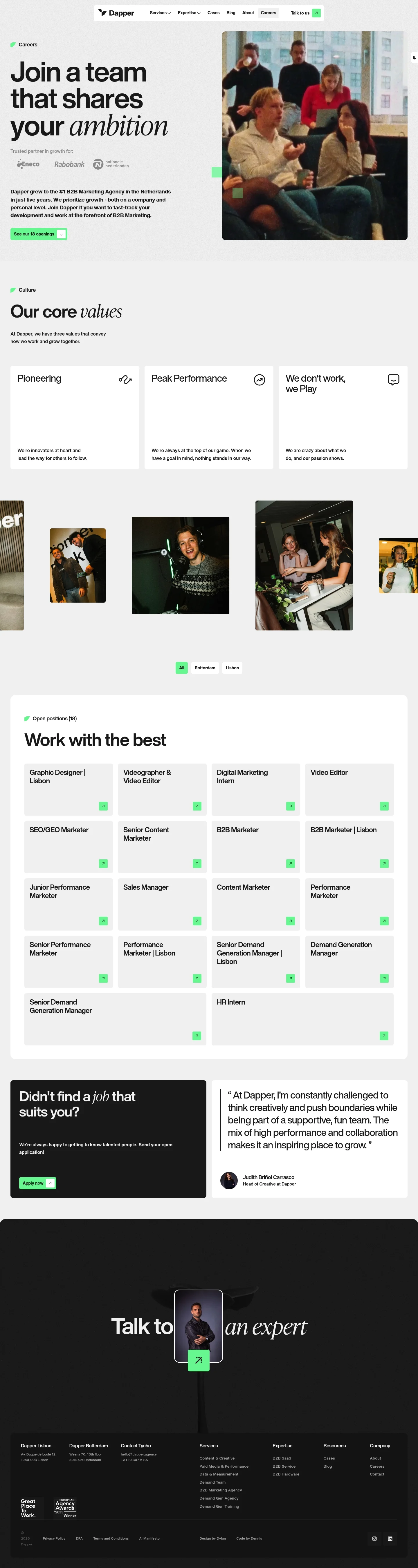
- Full page: https://cdn.designmunk.com/2026/09/12080302/dapper-agency-jobs-featured.webp
- Above the fold: https://cdn.designmunk.com/2026/09/12080302/dapper-agency-jobs-featured.webp
- On DesignMunk: https://designmunk.com/dapper-careers-page/

Study these for hierarchy, rhythm, spacing and density. Where an image and the written spec disagree, the spec wins: the tokens were read from the page's own CSS, the images are one rendering of it.

## Before you start

Ask the user what they are building, who it is for, and what brand assets they already have — name, colours, typefaces. Wait for their answers before writing anything. Everything below is then applied to their product, not to the reference.

## Design specification

# Dapper: Grotesk Headlines With One Italic Hook

## Overview

A high-confidence B2B agency voice aimed at candidates and prospective clients. The interface is monochrome with a single mint accent, prioritizing clarity and pace over decoration. Layouts are spacious, copy-forward, and anchored by large headlines and generous body size for easy scanning. Use the system to feel modern, direct, and performance-oriented rather than playful.

## Colors

- **primary (#212121):** Core ink for headlines, body text, and icons.
- **secondary (#040404):** Deeper black for logos, emphasis, and hover/active states.
- **tertiary (#74f5a1):** Accent mint for primary CTAs, counters, and subtle highlights.
- **neutral (#f3f3f3):** Page background and section surfaces; keeps contrast high without stark white.
- **surface (#f3f3f3):** Card and panel backgrounds when a contained surface is needed.
- **on-surface (#212121):** Default text color on neutral surfaces; ensures WCAG-friendly contrast.

## Typography

- Helvetica Now Display — used for headline-lg (128px/700/-0.03em), headline-md (80px/700/-0.02em), headline-sm (24px/700/-0.01em), headline-xs (22px/700/-0.02em). Proprietary/self-hosted; agents should not attempt to load it directly. Practical substitutes: Inter (Google), Manrope (Google), IBM Plex Sans (Google).
- Helvetica Now Text — body-md (20px/500/1.76/-0.022em) for paragraphs, list items, and long-form content. Proprietary/self-hosted. Substitutes: Inter (Google), IBM Plex Sans (Google), Manrope (Google).
- Emphasis is achieved with weight, scale, and occasional italic styling in headlines. Maintain negative tracking on large display sizes to match the compact look.

## Layout

Spacing follows a simple step system: xs 12px, sm 20px, md 40px, lg 80px, xl 96px. Build vertical rhythm on multiples of 40px; reserve lg/xl for section paddings and hero blocks. Desktop pages commonly split into two columns (copy left, image or media right) and collapse to a single column on small screens with md (40px) gaps. Lists (e.g., job openings) use consistent md row spacing for scanability.

## Elevation & Depth

Shadows are not used. Hierarchy is conveyed through scale, weight, and tonal contrast: #212121 text on #f3f3f3 surfaces, with the mint accent drawing action. Separation between blocks relies on whitespace and occasional borders; prefer spacing increases over dividers.

## Shapes

Two radii define tone: sm 4px for utility elements and secondary buttons, md 8px for primary actions and cards. Square edges (0px) indicate bare links and text-level interactions. Use the larger radius to signal the main path and soften CTAs without making them playful.

## Components

Buttons and card primitives are standardized:
- Primary Button — #74f5a1 background, #212121 text, 56px height, md 8px radius, 20px×28px padding.
- Secondary Button — text-only style with #212121 ink, sm 4px radius, 56px height, 20px×28px padding.
- Link Button — text-level, 0px radius; treat as inline action.
- Card — #f3f3f3 background, #212121 text, md 8px radius, 16px padding.

### Global Navigation Bar
Compact top bar with brand mark left, service menus center, and a mint-accent "Talk to us" CTA. Use body-md for items; keep spacing sm–md between links.

### Careers Hero
Left-aligned multi-line headline using headline-lg (128px). Right column holds a photo. Body copy below uses body-md; primary CTA uses the mint button.

### Partner Logos Strip
A quiet row under the hero showing client logos on the neutral surface. Keep logos in #040404 or muted greys; spacing md between marks.

### Values Trio
Three stacked or three-across cards (viewport dependent) with headline-sm titles and brief body-md copy. Use md radius if cards are surfaced; md 40px gaps.

### Job Filters
A compact control row: "All / Rotterdam / Lisbon" with an openings count. Use body-md, primary ink, and md spacing below before the list.

### Job Listing Item
Each role is a link block: title in headline-sm, meta (type/location) in body-md. No shadows; rely on md vertical spacing and hover color shift if needed.

### Testimonial Block
Quote set in body-md with a bolded attribution line using headline-xs. Keep ample lg spacing above and below to distinguish from listings.

### Contact & Offices Panel
Two columns: office addresses and a contact card with email/phone. Use body-md with md gaps; primary links styled as link buttons.

## Do's and Don'ts

- Do reserve #74f5a1 for primary CTAs, counters, and small highlights; keep links and headings in #212121.
- Do use headline-lg (128px) or headline-md (80px) for major section entries; keep body at 20px for readability.
- Do space lists and sections on md (40px) increments; use lg/xl only for page-level blocks.
- Don't introduce shadows; use whitespace and clear typographic hierarchy instead.
- Don't mix radii on a single component—primary actions use 8px, secondary 4px, links 0px.
- Don't place secondary CTAs ahead of primary content; keep the mint button close to the most relevant copy.

## Agent Prompt Guide

Quick color reference — Text: #212121; Background: #f3f3f3; Border: #212121; Accent: #74f5a1.

1) Build a two-column hero on #f3f3f3. Left column: H1 using Inter as a stand-in for Helvetica Now Display at 128px, weight 700, letter-spacing -0.03em, color #212121; one italicized word for emphasis. Body paragraph in Inter 20px/1.76, color #212121. Primary CTA button: 56px height, 20px×28px padding, 8px radius, background #74f5a1, text #212121. Right column: image.

2) Create a "Values" row of three cards on #f3f3f3. Each card: background #f3f3f3, 16px padding, 8px radius. Title in Inter 24px/700, -0.01em, color #212121. Copy in Inter 20px/1.76. Use 40px gaps between cards and 80px top/bottom padding.

3) Job list section with filters. Section heading in Inter 80px/700, -0.02em, color #212121. Filter links in Inter 20px; selected state uses underline or bold. List items: title in 24px/700, meta in 20px normal; 40px vertical spacing between items; no shadows; optional 1px border in #212121 at low opacity.

4) Contact panel. Two columns on #f3f3f3 with 40px column gap. Subheads in Inter 22px/700, -0.02em; addresses in 20px/1.76. Include a link-style button (0px radius, #212121 text) and a primary mint CTA if needed.

5) Footer on #f3f3f3 with multi-column link lists. Headings in 22px/700, links in 20px. Maintain 40px row spacing and keep all text #212121; accent only for an optional CTA.

## Similar Brands

- Instrument — similarly restrained palette and big grotesk type; Instrument leans more toward photography and softer accent colors.
- Huge — bold typography and minimal color; Huge uses more motion and denser grid systems.
- Media.Monks (ex-Jam3) — monochrome body with high-impact accents; they employ heavier visuals and animation compared to Dapper's static calm.
- Dept — European agency minimalism with bright accents; Dept often uses more modular card surfaces and interactive flourishes than Dapper.

## Tokens

### CSS custom properties

```css
:root {
  /* Colors */
  --color-primary: #212121;
  --color-secondary: #040404;
  --color-tertiary: #74f5a1;
  --color-neutral: #f3f3f3;
  --color-surface: var(--color-neutral);
  --color-on-surface: var(--color-primary);

  /* Typography */
  --text-headline-lg-size: 128px;
  --text-headline-lg-weight: 700;
  --text-headline-lg-leading: 1.2;
  --text-headline-lg-tracking: -0.03em;
  --text-headline-md-size: 80px;
  --text-headline-md-weight: 700;
  --text-headline-md-leading: 1.1;
  --text-headline-md-tracking: -0.02em;
  --text-headline-sm-size: 24px;
  --text-headline-sm-weight: 700;
  --text-headline-sm-leading: 1.3;
  --text-headline-sm-tracking: -0.01em;
  --text-headline-xs-size: 22px;
  --text-headline-xs-weight: 700;
  --text-headline-xs-leading: 1;
  --text-headline-xs-tracking: -0.02em;
  --text-body-md-size: 20px;
  --text-body-md-weight: 500;
  --text-body-md-leading: 1.76;
  --text-body-md-tracking: -0.022em;
  --font-helvetica-now-display: "Helvetica Now Display";
  --font-helvetica-now-text: "Helvetica Now Text";

  /* Rounded */
  --radius-sm: 4px;
  --radius-md: 8px;

  /* Spacing */
  --spacing-xs: 12px;
  --spacing-sm: 20px;
  --spacing-md: 40px;
  --spacing-lg: 80px;
  --spacing-xl: 96px;

  /* Components */
  --button-primary-background-color: var(--color-tertiary);
  --button-primary-text-color: var(--color-primary);
  --button-primary-rounded: var(--radius-md);
  --button-primary-padding: 20px 28px;
  --button-primary-height: 56px;
  --button-secondary-text-color: var(--color-primary);
  --button-secondary-rounded: var(--radius-sm);
  --button-secondary-padding: 20px 28px;
  --button-secondary-height: 56px;
  --button-link-text-color: var(--color-primary);
  --button-link-rounded: 0px;
  --card-background-color: var(--color-neutral);
  --card-text-color: var(--color-primary);
  --card-rounded: var(--radius-md);
  --card-padding: 16px;
}
```

### Tailwind theme

```css
@theme {
  --color-primary: #212121;
  --color-secondary: #040404;
  --color-tertiary: #74f5a1;
  --color-neutral: #f3f3f3;
  --color-surface: #f3f3f3;
  --color-on-surface: #212121;
  --font-headline-lg: "Helvetica Now Display";
  --font-headline-md: "Helvetica Now Display";
  --font-headline-sm: "Helvetica Now Display";
  --font-headline-xs: "Helvetica Now Display";
  --font-body-md: "Helvetica Now Text";
  --text-headline-lg: 128px;
  --text-headline-md: 80px;
  --text-headline-sm: 24px;
  --text-headline-xs: 22px;
  --text-body-md: 20px;
  --tracking-headline-lg: -0.03em;
  --tracking-headline-md: -0.02em;
  --tracking-headline-sm: -0.01em;
  --tracking-headline-xs: -0.02em;
  --tracking-body-md: -0.022em;
  --font-weight-headline-lg: 700;
  --font-weight-headline-md: 700;
  --font-weight-headline-sm: 700;
  --font-weight-headline-xs: 700;
  --font-weight-body-md: 500;
  --radius-sm: 4px;
  --radius-md: 8px;
  --spacing-xs: 12px;
  --spacing-sm: 20px;
  --spacing-md: 40px;
  --spacing-lg: 80px;
  --spacing-xl: 96px;
}
```

### Design tokens (DTCG)

```json
{
    "$schema": "https://www.designtokens.org/schemas/2025.10/format.json",
    "color": {
        "$type": "color",
        "primary": {
            "$value": {
                "colorSpace": "srgb",
                "components": [
                    0.129,
                    0.129,
                    0.129
                ],
                "hex": "#212121"
            }
        },
        "secondary": {
            "$value": {
                "colorSpace": "srgb",
                "components": [
                    0.016,
                    0.016,
                    0.016
                ],
                "hex": "#040404"
            }
        },
        "tertiary": {
            "$value": {
                "colorSpace": "srgb",
                "components": [
                    0.455,
                    0.961,
                    0.631
                ],
                "hex": "#74f5a1"
            }
        },
        "neutral": {
            "$value": {
                "colorSpace": "srgb",
                "components": [
                    0.953,
                    0.953,
                    0.953
                ],
                "hex": "#f3f3f3"
            }
        },
        "surface": {
            "$value": {
                "colorSpace": "srgb",
                "components": [
                    0.953,
                    0.953,
                    0.953
                ],
                "hex": "#f3f3f3"
            }
        },
        "on-surface": {
            "$value": {
                "colorSpace": "srgb",
                "components": [
                    0.129,
                    0.129,
                    0.129
                ],
                "hex": "#212121"
            }
        }
    },
    "spacing": {
        "$type": "dimension",
        "xs": {
            "$value": {
                "value": 12,
                "unit": "px"
            }
        },
        "sm": {
            "$value": {
                "value": 20,
                "unit": "px"
            }
        },
        "md": {
            "$value": {
                "value": 40,
                "unit": "px"
            }
        },
        "lg": {
            "$value": {
                "value": 80,
                "unit": "px"
            }
        },
        "xl": {
            "$value": {
                "value": 96,
                "unit": "px"
            }
        }
    },
    "rounded": {
        "$type": "dimension",
        "sm": {
            "$value": {
                "value": 4,
                "unit": "px"
            }
        },
        "md": {
            "$value": {
                "value": 8,
                "unit": "px"
            }
        }
    },
    "typography": {
        "headline-lg": {
            "$type": "typography",
            "$value": {
                "fontFamily": "Helvetica Now Display",
                "fontSize": {
                    "value": 128,
                    "unit": "px"
                },
                "fontWeight": 700,
                "letterSpacing": {
                    "value": -0.03,
                    "unit": "em"
                }
            }
        },
        "headline-md": {
            "$type": "typography",
            "$value": {
                "fontFamily": "Helvetica Now Display",
                "fontSize": {
                    "value": 80,
                    "unit": "px"
                },
                "fontWeight": 700,
                "letterSpacing": {
                    "value": -0.02,
                    "unit": "em"
                }
            }
        },
        "headline-sm": {
            "$type": "typography",
            "$value": {
                "fontFamily": "Helvetica Now Display",
                "fontSize": {
                    "value": 24,
                    "unit": "px"
                },
                "fontWeight": 700,
                "letterSpacing": {
                    "value": -0.01,
                    "unit": "em"
                }
            }
        },
        "headline-xs": {
            "$type": "typography",
            "$value": {
                "fontFamily": "Helvetica Now Display",
                "fontSize": {
                    "value": 22,
                    "unit": "px"
                },
                "fontWeight": 700,
                "letterSpacing": {
                    "value": -0.02,
                    "unit": "em"
                }
            }
        },
        "body-md": {
            "$type": "typography",
            "$value": {
                "fontFamily": "Helvetica Now Text",
                "fontSize": {
                    "value": 20,
                    "unit": "px"
                },
                "fontWeight": 500,
                "letterSpacing": {
                    "value": -0.022,
                    "unit": "em"
                }
            }
        }
    }
}
```

## Rules

- **Fonts.** If the specification names a custom or self-hosted family, use one of the substitutes it names. Never reference a typeface you cannot actually load — it will fall back to a system font and undo the typography.
- **Colour.** Derive the palette from the user's brand. Use the token values as a guide to *relationships* — contrast, tint, how many accents carry the page — not as hex codes to paste.
- **Never reproduce** the wordmark, mascot, logo, brand name, illustrations, icon set, screenshots or any copy from the reference.
- **Never present the result as Dapper Careers**, or imply any connection to it.
- If something is unspecified, choose clarity and legibility over decoration.
---
version: alpha
name: Dapper
description: We build high-performing marketing engines for B2B brands
colors:
  primary: "#212121"
  secondary: "#040404"
  tertiary: "#74f5a1"
  neutral: "#f3f3f3"
  surface: "{colors.neutral}"
  on-surface: "{colors.primary}"
typography:
  headline-lg:
    fontFamily: Helvetica Now Display
    fontSize: 128px
    fontWeight: 700
    lineHeight: 1.2
    letterSpacing: -0.03em
  headline-md:
    fontFamily: Helvetica Now Display
    fontSize: 80px
    fontWeight: 700
    lineHeight: 1.1
    letterSpacing: -0.02em
  headline-sm:
    fontFamily: Helvetica Now Display
    fontSize: 24px
    fontWeight: 700
    lineHeight: 1.3
    letterSpacing: -0.01em
  headline-xs:
    fontFamily: Helvetica Now Display
    fontSize: 22px
    fontWeight: 700
    lineHeight: 1
    letterSpacing: -0.02em
  body-md:
    fontFamily: Helvetica Now Text
    fontSize: 20px
    fontWeight: 500
    lineHeight: 1.76
    letterSpacing: -0.022em
rounded:
  sm: 4px
  md: 8px
spacing:
  xs: 12px
  sm: 20px
  md: 40px
  lg: 80px
  xl: 96px
components:
  button-primary:
    backgroundColor: "{colors.tertiary}"
    textColor: "{colors.primary}"
    rounded: "{rounded.md}"
    padding: 20px 28px
    height: 56px
  button-secondary:
    textColor: "{colors.primary}"
    rounded: "{rounded.sm}"
    padding: 20px 28px
    height: 56px
  button-link:
    textColor: "{colors.primary}"
    rounded: 0px
  card:
    backgroundColor: "{colors.neutral}"
    textColor: "{colors.primary}"
    rounded: "{rounded.md}"
    padding: 16px
---

# Dapper: Grotesk Headlines With One Italic Hook

## Overview

A high-confidence B2B agency voice aimed at candidates and prospective clients. The interface is monochrome with a single mint accent, prioritizing clarity and pace over decoration. Layouts are spacious, copy-forward, and anchored by large headlines and generous body size for easy scanning. Use the system to feel modern, direct, and performance-oriented rather than playful.

## Colors

- **primary (#212121):** Core ink for headlines, body text, and icons.
- **secondary (#040404):** Deeper black for logos, emphasis, and hover/active states.
- **tertiary (#74f5a1):** Accent mint for primary CTAs, counters, and subtle highlights.
- **neutral (#f3f3f3):** Page background and section surfaces; keeps contrast high without stark white.
- **surface (#f3f3f3):** Card and panel backgrounds when a contained surface is needed.
- **on-surface (#212121):** Default text color on neutral surfaces; ensures WCAG-friendly contrast.

## Typography

- Helvetica Now Display — used for headline-lg (128px/700/-0.03em), headline-md (80px/700/-0.02em), headline-sm (24px/700/-0.01em), headline-xs (22px/700/-0.02em). Proprietary/self-hosted; agents should not attempt to load it directly. Practical substitutes: Inter (Google), Manrope (Google), IBM Plex Sans (Google).
- Helvetica Now Text — body-md (20px/500/1.76/-0.022em) for paragraphs, list items, and long-form content. Proprietary/self-hosted. Substitutes: Inter (Google), IBM Plex Sans (Google), Manrope (Google).
- Emphasis is achieved with weight, scale, and occasional italic styling in headlines. Maintain negative tracking on large display sizes to match the compact look.

## Layout

Spacing follows a simple step system: xs 12px, sm 20px, md 40px, lg 80px, xl 96px. Build vertical rhythm on multiples of 40px; reserve lg/xl for section paddings and hero blocks. Desktop pages commonly split into two columns (copy left, image or media right) and collapse to a single column on small screens with md (40px) gaps. Lists (e.g., job openings) use consistent md row spacing for scanability.

## Elevation & Depth

Shadows are not used. Hierarchy is conveyed through scale, weight, and tonal contrast: #212121 text on #f3f3f3 surfaces, with the mint accent drawing action. Separation between blocks relies on whitespace and occasional borders; prefer spacing increases over dividers.

## Shapes

Two radii define tone: sm 4px for utility elements and secondary buttons, md 8px for primary actions and cards. Square edges (0px) indicate bare links and text-level interactions. Use the larger radius to signal the main path and soften CTAs without making them playful.

## Components

Buttons and card primitives are standardized:
- Primary Button — #74f5a1 background, #212121 text, 56px height, md 8px radius, 20px×28px padding.
- Secondary Button — text-only style with #212121 ink, sm 4px radius, 56px height, 20px×28px padding.
- Link Button — text-level, 0px radius; treat as inline action.
- Card — #f3f3f3 background, #212121 text, md 8px radius, 16px padding.

### Global Navigation Bar
Compact top bar with brand mark left, service menus center, and a mint-accent "Talk to us" CTA. Use body-md for items; keep spacing sm–md between links.

### Careers Hero
Left-aligned multi-line headline using headline-lg (128px). Right column holds a photo. Body copy below uses body-md; primary CTA uses the mint button.

### Partner Logos Strip
A quiet row under the hero showing client logos on the neutral surface. Keep logos in #040404 or muted greys; spacing md between marks.

### Values Trio
Three stacked or three-across cards (viewport dependent) with headline-sm titles and brief body-md copy. Use md radius if cards are surfaced; md 40px gaps.

### Job Filters
A compact control row: "All / Rotterdam / Lisbon" with an openings count. Use body-md, primary ink, and md spacing below before the list.

### Job Listing Item
Each role is a link block: title in headline-sm, meta (type/location) in body-md. No shadows; rely on md vertical spacing and hover color shift if needed.

### Testimonial Block
Quote set in body-md with a bolded attribution line using headline-xs. Keep ample lg spacing above and below to distinguish from listings.

### Contact & Offices Panel
Two columns: office addresses and a contact card with email/phone. Use body-md with md gaps; primary links styled as link buttons.

## Do's and Don'ts

- Do reserve #74f5a1 for primary CTAs, counters, and small highlights; keep links and headings in #212121.
- Do use headline-lg (128px) or headline-md (80px) for major section entries; keep body at 20px for readability.
- Do space lists and sections on md (40px) increments; use lg/xl only for page-level blocks.
- Don't introduce shadows; use whitespace and clear typographic hierarchy instead.
- Don't mix radii on a single component—primary actions use 8px, secondary 4px, links 0px.
- Don't place secondary CTAs ahead of primary content; keep the mint button close to the most relevant copy.

## Agent Prompt Guide

Quick color reference — Text: #212121; Background: #f3f3f3; Border: #212121; Accent: #74f5a1.

1) Build a two-column hero on #f3f3f3. Left column: H1 using Inter as a stand-in for Helvetica Now Display at 128px, weight 700, letter-spacing -0.03em, color #212121; one italicized word for emphasis. Body paragraph in Inter 20px/1.76, color #212121. Primary CTA button: 56px height, 20px×28px padding, 8px radius, background #74f5a1, text #212121. Right column: image.

2) Create a "Values" row of three cards on #f3f3f3. Each card: background #f3f3f3, 16px padding, 8px radius. Title in Inter 24px/700, -0.01em, color #212121. Copy in Inter 20px/1.76. Use 40px gaps between cards and 80px top/bottom padding.

3) Job list section with filters. Section heading in Inter 80px/700, -0.02em, color #212121. Filter links in Inter 20px; selected state uses underline or bold. List items: title in 24px/700, meta in 20px normal; 40px vertical spacing between items; no shadows; optional 1px border in #212121 at low opacity.

4) Contact panel. Two columns on #f3f3f3 with 40px column gap. Subheads in Inter 22px/700, -0.02em; addresses in 20px/1.76. Include a link-style button (0px radius, #212121 text) and a primary mint CTA if needed.

5) Footer on #f3f3f3 with multi-column link lists. Headings in 22px/700, links in 20px. Maintain 40px row spacing and keep all text #212121; accent only for an optional CTA.

## Similar Brands

- Instrument — similarly restrained palette and big grotesk type; Instrument leans more toward photography and softer accent colors.
- Huge — bold typography and minimal color; Huge uses more motion and denser grid systems.
- Media.Monks (ex-Jam3) — monochrome body with high-impact accents; they employ heavier visuals and animation compared to Dapper's static calm.
- Dept — European agency minimalism with bright accents; Dept often uses more modular card surfaces and interactive flourishes than Dapper.
:root {
  /* Colors */
  --color-primary: #212121;
  --color-secondary: #040404;
  --color-tertiary: #74f5a1;
  --color-neutral: #f3f3f3;
  --color-surface: var(--color-neutral);
  --color-on-surface: var(--color-primary);

  /* Typography */
  --text-headline-lg-size: 128px;
  --text-headline-lg-weight: 700;
  --text-headline-lg-leading: 1.2;
  --text-headline-lg-tracking: -0.03em;
  --text-headline-md-size: 80px;
  --text-headline-md-weight: 700;
  --text-headline-md-leading: 1.1;
  --text-headline-md-tracking: -0.02em;
  --text-headline-sm-size: 24px;
  --text-headline-sm-weight: 700;
  --text-headline-sm-leading: 1.3;
  --text-headline-sm-tracking: -0.01em;
  --text-headline-xs-size: 22px;
  --text-headline-xs-weight: 700;
  --text-headline-xs-leading: 1;
  --text-headline-xs-tracking: -0.02em;
  --text-body-md-size: 20px;
  --text-body-md-weight: 500;
  --text-body-md-leading: 1.76;
  --text-body-md-tracking: -0.022em;
  --font-helvetica-now-display: "Helvetica Now Display";
  --font-helvetica-now-text: "Helvetica Now Text";

  /* Rounded */
  --radius-sm: 4px;
  --radius-md: 8px;

  /* Spacing */
  --spacing-xs: 12px;
  --spacing-sm: 20px;
  --spacing-md: 40px;
  --spacing-lg: 80px;
  --spacing-xl: 96px;

  /* Components */
  --button-primary-background-color: var(--color-tertiary);
  --button-primary-text-color: var(--color-primary);
  --button-primary-rounded: var(--radius-md);
  --button-primary-padding: 20px 28px;
  --button-primary-height: 56px;
  --button-secondary-text-color: var(--color-primary);
  --button-secondary-rounded: var(--radius-sm);
  --button-secondary-padding: 20px 28px;
  --button-secondary-height: 56px;
  --button-link-text-color: var(--color-primary);
  --button-link-rounded: 0px;
  --card-background-color: var(--color-neutral);
  --card-text-color: var(--color-primary);
  --card-rounded: var(--radius-md);
  --card-padding: 16px;
}
{
  "$schema": "https://www.designtokens.org/schemas/2025.10/format.json",
  "$description": "We build high-performing marketing engines for B2B brands",
  "color": {
    "$type": "color",
    "primary": {
      "$value": {
        "colorSpace": "srgb",
        "components": [
          0.129,
          0.129,
          0.129
        ],
        "hex": "#212121"
      }
    },
    "secondary": {
      "$value": {
        "colorSpace": "srgb",
        "components": [
          0.016,
          0.016,
          0.016
        ],
        "hex": "#040404"
      }
    },
    "tertiary": {
      "$value": {
        "colorSpace": "srgb",
        "components": [
          0.455,
          0.961,
          0.631
        ],
        "hex": "#74f5a1"
      }
    },
    "neutral": {
      "$value": {
        "colorSpace": "srgb",
        "components": [
          0.953,
          0.953,
          0.953
        ],
        "hex": "#f3f3f3"
      }
    },
    "surface": {
      "$value": {
        "colorSpace": "srgb",
        "components": [
          0.953,
          0.953,
          0.953
        ],
        "hex": "#f3f3f3"
      }
    },
    "on-surface": {
      "$value": {
        "colorSpace": "srgb",
        "components": [
          0.129,
          0.129,
          0.129
        ],
        "hex": "#212121"
      }
    }
  },
  "spacing": {
    "$type": "dimension",
    "xs": {
      "$value": {
        "value": 12,
        "unit": "px"
      }
    },
    "sm": {
      "$value": {
        "value": 20,
        "unit": "px"
      }
    },
    "md": {
      "$value": {
        "value": 40,
        "unit": "px"
      }
    },
    "lg": {
      "$value": {
        "value": 80,
        "unit": "px"
      }
    },
    "xl": {
      "$value": {
        "value": 96,
        "unit": "px"
      }
    }
  },
  "rounded": {
    "$type": "dimension",
    "sm": {
      "$value": {
        "value": 4,
        "unit": "px"
      }
    },
    "md": {
      "$value": {
        "value": 8,
        "unit": "px"
      }
    }
  },
  "typography": {
    "headline-lg": {
      "$type": "typography",
      "$value": {
        "fontFamily": "Helvetica Now Display",
        "fontSize": {
          "value": 128,
          "unit": "px"
        },
        "fontWeight": 700,
        "letterSpacing": {
          "value": -0.03,
          "unit": "em"
        }
      }
    },
    "headline-md": {
      "$type": "typography",
      "$value": {
        "fontFamily": "Helvetica Now Display",
        "fontSize": {
          "value": 80,
          "unit": "px"
        },
        "fontWeight": 700,
        "letterSpacing": {
          "value": -0.02,
          "unit": "em"
        }
      }
    },
    "headline-sm": {
      "$type": "typography",
      "$value": {
        "fontFamily": "Helvetica Now Display",
        "fontSize": {
          "value": 24,
          "unit": "px"
        },
        "fontWeight": 700,
        "letterSpacing": {
          "value": -0.01,
          "unit": "em"
        }
      }
    },
    "headline-xs": {
      "$type": "typography",
      "$value": {
        "fontFamily": "Helvetica Now Display",
        "fontSize": {
          "value": 22,
          "unit": "px"
        },
        "fontWeight": 700,
        "letterSpacing": {
          "value": -0.02,
          "unit": "em"
        }
      }
    },
    "body-md": {
      "$type": "typography",
      "$value": {
        "fontFamily": "Helvetica Now Text",
        "fontSize": {
          "value": 20,
          "unit": "px"
        },
        "fontWeight": 500,
        "letterSpacing": {
          "value": -0.022,
          "unit": "em"
        }
      }
    }
  }
}
@theme {
--color-primary: #212121;
--color-secondary: #040404;
--color-tertiary: #74f5a1;
--color-neutral: #f3f3f3;
--color-surface: #f3f3f3;
--color-on-surface: #212121;
--font-headline-lg: "Helvetica Now Display";
--font-headline-md: "Helvetica Now Display";
--font-headline-sm: "Helvetica Now Display";
--font-headline-xs: "Helvetica Now Display";
--font-body-md: "Helvetica Now Text";
--text-headline-lg: 128px;
--text-headline-md: 80px;
--text-headline-sm: 24px;
--text-headline-xs: 22px;
--text-body-md: 20px;
--tracking-headline-lg: -0.03em;
--tracking-headline-md: -0.02em;
--tracking-headline-sm: -0.01em;
--tracking-headline-xs: -0.02em;
--tracking-body-md: -0.022em;
--font-weight-headline-lg: 700;
--font-weight-headline-md: 700;
--font-weight-headline-sm: 700;
--font-weight-headline-xs: 700;
--font-weight-body-md: 500;
--radius-sm: 4px;
--radius-md: 8px;
--spacing-xs: 12px;
--spacing-sm: 20px;
--spacing-md: 40px;
--spacing-lg: 80px;
--spacing-xl: 96px;
} # Design brief: the Dapper Careers design language
Below is a complete design specification measured from a real, published web page. Use it as a design language for the user's product. It is not a page to reproduce.
## Reference images
- Full page: https://cdn.designmunk.com/2026/09/12080302/dapper-agency-jobs-featured.webp
- Above the fold: https://cdn.designmunk.com/2026/09/12080302/dapper-agency-jobs-featured.webp
- On DesignMunk: https://designmunk.com/dapper-careers-page/
Study these for hierarchy, rhythm, spacing and density. Where an image and the written spec disagree, the spec wins: the tokens were read from the page's own CSS, the images are one rendering of it.
## Before you start
Ask the user what they are building, who it is for, and what brand assets they already have — name, colours, typefaces. Wait for their answers before writing anything. Everything below is then applied to their product, not to the reference.
## Design specification
# Dapper: Grotesk Headlines With One Italic Hook
## Overview
A high-confidence B2B agency voice aimed at candidates and prospective clients. The interface is monochrome with a single mint accent, prioritizing clarity and pace over decoration. Layouts are spacious, copy-forward, and anchored by large headlines and generous body size for easy scanning. Use the system to feel modern, direct, and performance-oriented rather than playful.
## Colors
- **primary (#212121):** Core ink for headlines, body text, and icons.
- **secondary (#040404):** Deeper black for logos, emphasis, and hover/active states.
- **tertiary (#74f5a1):** Accent mint for primary CTAs, counters, and subtle highlights.
- **neutral (#f3f3f3):** Page background and section surfaces; keeps contrast high without stark white.
- **surface (#f3f3f3):** Card and panel backgrounds when a contained surface is needed.
- **on-surface (#212121):** Default text color on neutral surfaces; ensures WCAG-friendly contrast.
## Typography
- Helvetica Now Display — used for headline-lg (128px/700/-0.03em), headline-md (80px/700/-0.02em), headline-sm (24px/700/-0.01em), headline-xs (22px/700/-0.02em). Proprietary/self-hosted; agents should not attempt to load it directly. Practical substitutes: Inter (Google), Manrope (Google), IBM Plex Sans (Google).
- Helvetica Now Text — body-md (20px/500/1.76/-0.022em) for paragraphs, list items, and long-form content. Proprietary/self-hosted. Substitutes: Inter (Google), IBM Plex Sans (Google), Manrope (Google).
- Emphasis is achieved with weight, scale, and occasional italic styling in headlines. Maintain negative tracking on large display sizes to match the compact look.
## Layout
Spacing follows a simple step system: xs 12px, sm 20px, md 40px, lg 80px, xl 96px. Build vertical rhythm on multiples of 40px; reserve lg/xl for section paddings and hero blocks. Desktop pages commonly split into two columns (copy left, image or media right) and collapse to a single column on small screens with md (40px) gaps. Lists (e.g., job openings) use consistent md row spacing for scanability.
## Elevation & Depth
Shadows are not used. Hierarchy is conveyed through scale, weight, and tonal contrast: #212121 text on #f3f3f3 surfaces, with the mint accent drawing action. Separation between blocks relies on whitespace and occasional borders; prefer spacing increases over dividers.
## Shapes
Two radii define tone: sm 4px for utility elements and secondary buttons, md 8px for primary actions and cards. Square edges (0px) indicate bare links and text-level interactions. Use the larger radius to signal the main path and soften CTAs without making them playful.
## Components
Buttons and card primitives are standardized:
- Primary Button — #74f5a1 background, #212121 text, 56px height, md 8px radius, 20px×28px padding.
- Secondary Button — text-only style with #212121 ink, sm 4px radius, 56px height, 20px×28px padding.
- Link Button — text-level, 0px radius; treat as inline action.
- Card — #f3f3f3 background, #212121 text, md 8px radius, 16px padding.
### Global Navigation Bar
Compact top bar with brand mark left, service menus center, and a mint-accent "Talk to us" CTA. Use body-md for items; keep spacing sm–md between links.
### Careers Hero
Left-aligned multi-line headline using headline-lg (128px). Right column holds a photo. Body copy below uses body-md; primary CTA uses the mint button.
### Partner Logos Strip
A quiet row under the hero showing client logos on the neutral surface. Keep logos in #040404 or muted greys; spacing md between marks.
### Values Trio
Three stacked or three-across cards (viewport dependent) with headline-sm titles and brief body-md copy. Use md radius if cards are surfaced; md 40px gaps.
### Job Filters
A compact control row: "All / Rotterdam / Lisbon" with an openings count. Use body-md, primary ink, and md spacing below before the list.
### Job Listing Item
Each role is a link block: title in headline-sm, meta (type/location) in body-md. No shadows; rely on md vertical spacing and hover color shift if needed.
### Testimonial Block
Quote set in body-md with a bolded attribution line using headline-xs. Keep ample lg spacing above and below to distinguish from listings.
### Contact & Offices Panel
Two columns: office addresses and a contact card with email/phone. Use body-md with md gaps; primary links styled as link buttons.
## Do's and Don'ts
- Do reserve #74f5a1 for primary CTAs, counters, and small highlights; keep links and headings in #212121.
- Do use headline-lg (128px) or headline-md (80px) for major section entries; keep body at 20px for readability.
- Do space lists and sections on md (40px) increments; use lg/xl only for page-level blocks.
- Don't introduce shadows; use whitespace and clear typographic hierarchy instead.
- Don't mix radii on a single component—primary actions use 8px, secondary 4px, links 0px.
- Don't place secondary CTAs ahead of primary content; keep the mint button close to the most relevant copy.
## Agent Prompt Guide
Quick color reference — Text: #212121; Background: #f3f3f3; Border: #212121; Accent: #74f5a1.
1) Build a two-column hero on #f3f3f3. Left column: H1 using Inter as a stand-in for Helvetica Now Display at 128px, weight 700, letter-spacing -0.03em, color #212121; one italicized word for emphasis. Body paragraph in Inter 20px/1.76, color #212121. Primary CTA button: 56px height, 20px×28px padding, 8px radius, background #74f5a1, text #212121. Right column: image.
2) Create a "Values" row of three cards on #f3f3f3. Each card: background #f3f3f3, 16px padding, 8px radius. Title in Inter 24px/700, -0.01em, color #212121. Copy in Inter 20px/1.76. Use 40px gaps between cards and 80px top/bottom padding.
3) Job list section with filters. Section heading in Inter 80px/700, -0.02em, color #212121. Filter links in Inter 20px; selected state uses underline or bold. List items: title in 24px/700, meta in 20px normal; 40px vertical spacing between items; no shadows; optional 1px border in #212121 at low opacity.
4) Contact panel. Two columns on #f3f3f3 with 40px column gap. Subheads in Inter 22px/700, -0.02em; addresses in 20px/1.76. Include a link-style button (0px radius, #212121 text) and a primary mint CTA if needed.
5) Footer on #f3f3f3 with multi-column link lists. Headings in 22px/700, links in 20px. Maintain 40px row spacing and keep all text #212121; accent only for an optional CTA.
## Tokens
### CSS custom properties
```css
:root {
/* Colors */
--color-primary: #212121;
--color-secondary: #040404;
--color-tertiary: #74f5a1;
--color-neutral: #f3f3f3;
--color-surface: var(--color-neutral);
--color-on-surface: var(--color-primary);
/* Typography */
--text-headline-lg-size: 128px;
--text-headline-lg-weight: 700;
--text-headline-lg-leading: 1.2;
--text-headline-lg-tracking: -0.03em;
--text-headline-md-size: 80px;
--text-headline-md-weight: 700;
--text-headline-md-leading: 1.1;
--text-headline-md-tracking: -0.02em;
--text-headline-sm-size: 24px;
--text-headline-sm-weight: 700;
--text-headline-sm-leading: 1.3;
--text-headline-sm-tracking: -0.01em;
--text-headline-xs-size: 22px;
--text-headline-xs-weight: 700;
--text-headline-xs-leading: 1;
--text-headline-xs-tracking: -0.02em;
--text-body-md-size: 20px;
--text-body-md-weight: 500;
--text-body-md-leading: 1.76;
--text-body-md-tracking: -0.022em;
--font-helvetica-now-display: "Helvetica Now Display";
--font-helvetica-now-text: "Helvetica Now Text";
/* Rounded */
--radius-sm: 4px;
--radius-md: 8px;
/* Spacing */
--spacing-xs: 12px;
--spacing-sm: 20px;
--spacing-md: 40px;
--spacing-lg: 80px;
--spacing-xl: 96px;
/* Components */
--button-primary-background-color: var(--color-tertiary);
--button-primary-text-color: var(--color-primary);
--button-primary-rounded: var(--radius-md);
--button-primary-padding: 20px 28px;
--button-primary-height: 56px;
--button-secondary-text-color: var(--color-primary);
--button-secondary-rounded: var(--radius-sm);
--button-secondary-padding: 20px 28px;
--button-secondary-height: 56px;
--button-link-text-color: var(--color-primary);
--button-link-rounded: 0px;
--card-background-color: var(--color-neutral);
--card-text-color: var(--color-primary);
--card-rounded: var(--radius-md);
--card-padding: 16px;
}
```
## Rules
- **Fonts.** If the specification names a custom or self-hosted family, use one of the substitutes it names. Never reference a typeface you cannot actually load — it will fall back to a system font and undo the typography.
- **Colour.** Derive the palette from the user's brand. Use the token values as a guide to *relationships* — contrast, tint, how many accents carry the page — not as hex codes to paste.
- **Never reproduce** the wordmark, mascot, logo, brand name, illustrations, icon set, screenshots or any copy from the reference.
- **Never present the result as Dapper Careers**, or imply any connection to it.
- If something is unspecified, choose clarity and legibility over decoration.