Colejames About
colejames.io
Top 1% AI & Data talent—48-hour hiring turnaround, measurable ROI.
colejames.io
AI Breakdown
Design export
# Design brief: the Colejames About design language

Below is a complete design specification measured from a real, published web page. Use it as a design language for the user's product. It is not a page to reproduce.

## Reference images

- Full page: https://cdn.designmunk.com/2026/09/10153857/colejames-io-about-featured.webp
- Above the fold: https://cdn.designmunk.com/2026/09/10153857/colejames-io-about-featured.webp
- On DesignMunk: https://designmunk.com/colejames-about-page/

Study these for hierarchy, rhythm, spacing and density. Where an image and the written spec disagree, the spec wins: the tokens were read from the page's own CSS, the images are one rendering of it.

## Before you start

Ask the user what they are building, who it is for, and what brand assets they already have — name, colours, typefaces. Wait for their answers before writing anything. Everything below is then applied to their product, not to the reference.

## Design specification

# Cole-James: Lavender Headlines on a Halo-Lit Dark Canvas

## Overview

Cole-James uses a dark, minimal interface intended for executive buyers. The tone is professional, calm, and precise—confidence without noise. Layouts are spacious, with large headlines and measured paragraph widths to keep dense content readable. A single lavender text color drives hierarchy against a near-black surface for fast scanning in a dark mode environment.

## Colors

- **Primary (#b2afca):** Lavender text for headlines and body; default foreground on dark.
- **Secondary (#ececf4):** Soft highlight for subtle accents, glows, and light UI chrome.
- **Neutral (#100f15):** Base canvas for pages, cards, and overlays in dark mode.
- **Border (#3c3953):** Low-contrast dividers, rules, and hairlines separating sections.
- **Brand-astrogranite (#74747b):** Muted grey-violet accent; use for decorative gradients or subdued labels.
- **Surface ({colors.neutral}):** Surface alias mapping to #100f15 for containers and page background.
- **On-surface ({colors.primary}):** Foreground alias mapping to #b2afca for all text on dark.

## Typography

All typography is Manrope. It is freely available from Google Fonts and can be loaded directly. Roles:
- Headline LG (56px/1.2, 400, -0.02em): Primary H1 in the hero and key CTAs.
- Headline MD (42px/1.6, 400, -0.027em): Section openers and large subheads.
- Headline SM (32px/1.19, 400, -0.013em): Card titles and mid-page headings.
- Headline XS (24px/1.21, 400): Minor section headers and emphasized labels.
- Body MD (18px/1.5, 400): All body copy and long-form testimonials.
Recommended substitutes if Manrope is unavailable: Inter, Plus Jakarta Sans, or IBM Plex Sans—choose regular weights with similar optical size and keep tracking tight as specified.

## Layout

Spacing follows a generous vertical rhythm: xs 8px, sm 16px, md 40px, lg 72px, xl 112px. Use lg–xl for section spacing, md for intra-section grouping, and sm for control padding around elements. A centered, fluid grid works best—12 columns with comfortable gutters, limiting text blocks to readable widths. Keep hero and CTA areas vertically roomy (lg to xl) to preserve the calm, premium feel.

## Elevation & Depth

The system is mostly flat. Shadows are reserved: sm provides a subtle stacked depth when needed; md/lg/xl are none. Prefer separation by tone and space—use #3c3953 borders at 1px for rules and section dividers, and rely on the dark surface (#100f15) with lavender text (#b2afca). Occasional ambient glows can use desaturated secondary/brand-astrogranite tints at very low opacity.

## Shapes

Two radii define the language: 12px (sm) for buttons and small controls; 48px (md) for large containers and feature cards. The larger radius reads as premium and soft; use it selectively on hero cards, CTA panels, and prominent content blocks to avoid over-rounding.

## Components

Buttons and cards
- Primary Button: 48px tall, 12px radius; background #d6d5e2, text #100f15; padding 12px 24px. Use for the main "Schedule call" action.
- Secondary Button: 48px tall, 12px radius; background #100f15, text #f6f6f9 (on dark). Place on dark cards where a subdued action is needed.
- Link Button: Text-only in #b2afca, radius 0; reserve for tertiary actions.
- Card: Background #100f15, text #b2afca, 48px radius, 32px internal padding.

Distinctive sections on this page
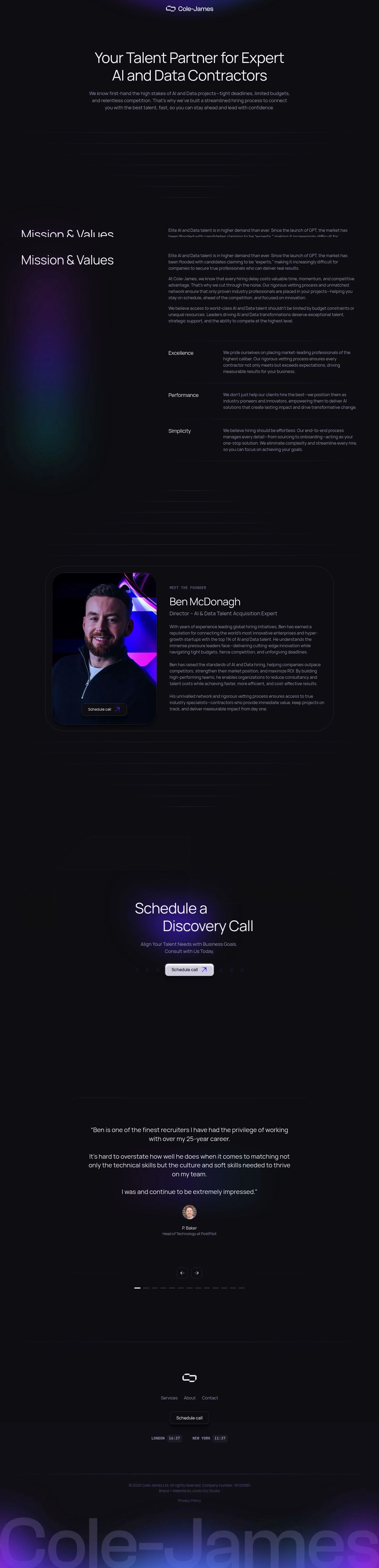
### Centered Brand Lockup
- Minimal nav with the Cole-James mark centered. Use body text color #b2afca on #100f15. Horizontal spacing sm–md; keep links to essentials (Services, About, Contact, Schedule call).
### Hero Statement
- H1 in Headline LG (56px/400/-0.02em) centered, followed by a Body MD paragraph at 18px/1.5. Vertical spacing: md between lines, lg–xl to the next section. Primary CTA uses the primary button spec.
### Spectral Rule Divider
- A stack of horizontal rules after the hero. Implement with 1px lines in #3c3953 at decreasing opacity and md spacing to create motion without shadows.
### Mission & Values
- Section header in Headline MD (42px). Three value items ("Excellence, Performance, Simplicity") set in Headline XS (24px) with 18px body copy. Grid: 3 columns on desktop, 1 column stacked with md gaps on mobile.
### Founder Bio Block
- Content card with 48px radius and 32px padding. Header "Ben McDonagh" in Headline SM (32px) and role in Body MD. Use lg spacing above/below to create a focal break.
### Discovery Call CTA
- Two stacked headlines ("Schedule a" + "Discovery Call") using Headline MD or SM depending on viewport; pair with the primary button. Maintain lg–xl vertical padding.
### Testimonial Quotes
- Long-form quotes in Body MD (18px/1.5) with author lines separated by a thin #3c3953 rule. Use md spacing between quotes; avoid cards to preserve flow.
### Timezone Footer
- Subsection showing "london / new york" times as small text chips; use Body MD with subdued labels in #74747b and rules in #3c3953.

## Do's and Don'ts

- Do keep all foreground text in #b2afca on #100f15; reserve #ececf4 for subtle accents only.
- Do use 48px height, 12px radius, and 12px × 24px padding for buttons to maintain rhythm.
- Do space sections with lg (72px) or xl (112px) and keep paragraphs at Body MD 18px/1.5.
- Don't introduce bright brand colors; the palette is monochrome-lavender and should stay restrained.
- Don't apply heavy drop shadows; if depth is necessary, use the sm shadow or a #3c3953 divider instead.
- Don't mix font families or weights liberally; headlines and body remain Manrope 400 with the specified tracking.

## Agent Prompt Guide

Quick reference — text/background/border/accent
- Text: #b2afca
- Background: #100f15
- Border: #3c3953
- Accent: #ececf4

1) Build a centered hero
- Canvas #100f15. H1 set in Manrope 56px, weight 400, letter-spacing -0.02em, color #b2afca. Body paragraph Manrope 18px/1.5, color #b2afca at 92% opacity. Primary button 48px tall, 12px radius, background #d6d5e2, text #100f15, padding 12px 24px. Vertical spacing: md (40px) between H1 and copy, lg (72px) to the next section.

2) Create a 3-column "Values" block
- Section header Manrope 42px/1.6, -0.027em, color #b2afca. Grid: 3 columns with md (40px) gaps. Each item title Manrope 24px/1.21; body Manrope 18px/1.5. Use 1px dividers in #3c3953 between items on desktop; stack to 1 column on mobile.

3) Founder bio card
- Container 48px radius, background #100f15, padding 32px. Title Manrope 32px/1.19, color #b2afca; role line in 18px/1.5. Add a thin top border #3c3953. Place lg (72px) spacing above and below.

4) Testimonials list
- For each quote, set Manrope 18px/1.5 in #b2afca. Separate entries with a 1px rule in #3c3953 and md (40px) vertical gaps. Attribution line can use #74747b for a softer tone.

5) Footer with timezones
- Two small stacks ("london", "new york") in Manrope 18px. Labels #74747b, values #b2afca. Use sm (16px) internal spacing, and a top border #3c3953 to separate from content.

## Similar Brands

- Toptal — Shares the sober, text-first approach; Toptal leans brighter with blue accents where Cole-James stays lavender-monochrome.
- Braintrust — Dark interface and strong typography; Braintrust uses more illustration and badges, while this page relies on long testimonials.
- Andela — Minimal hiring narrative on dark backgrounds; Andela introduces more color variety and photography than Cole-James' restrained palette.
- Gun.io — Developer-focused recruiting with large headlines; Gun.io uses higher contrast and bolder weights, versus Cole-James' steady 400 weight.
- Arc.dev — Talent marketplace with dark modes and centered CTAs; Arc layers more UI patterns, whereas this page prefers simple sections and repeated CTAs.

## Tokens

### CSS custom properties

```css
:root {
  /* Colors */
  --color-primary: #b2afca;
  --color-secondary: #ececf4;
  --color-neutral: #100f15;
  --color-border: #3c3953;
  --color-brand-astrogranite: #74747b;
  --color-surface: var(--color-neutral);
  --color-on-surface: var(--color-primary);

  /* Typography */
  --text-headline-lg-size: 56px;
  --text-headline-lg-weight: 400;
  --text-headline-lg-leading: 1.2;
  --text-headline-lg-tracking: -0.02em;
  --text-headline-md-size: 42px;
  --text-headline-md-weight: 400;
  --text-headline-md-leading: 1.6;
  --text-headline-md-tracking: -0.027em;
  --text-headline-sm-size: 32px;
  --text-headline-sm-weight: 400;
  --text-headline-sm-leading: 1.19;
  --text-headline-sm-tracking: -0.013em;
  --text-headline-xs-size: 24px;
  --text-headline-xs-weight: 400;
  --text-headline-xs-leading: 1.21;
  --text-body-md-size: 18px;
  --text-body-md-weight: 400;
  --text-body-md-leading: 1.5;
  --font-manrope: "Manrope";

  /* Rounded */
  --radius-sm: 12px;
  --radius-md: 48px;

  /* Spacing */
  --spacing-xs: 8px;
  --spacing-sm: 16px;
  --spacing-md: 40px;
  --spacing-lg: 72px;
  --spacing-xl: 112px;

  /* Components */
  --button-primary-background-color: #d6d5e2;
  --button-primary-text-color: var(--color-neutral);
  --button-primary-rounded: var(--radius-sm);
  --button-primary-padding: 12px 24px;
  --button-primary-height: 48px;
  --button-secondary-background-color: var(--color-neutral);
  --button-secondary-text-color: #f6f6f9;
  --button-secondary-rounded: var(--radius-sm);
  --button-secondary-padding: 12px 24px;
  --button-secondary-height: 48px;
  --button-link-text-color: var(--color-primary);
  --button-link-rounded: 0px;
  --card-background-color: var(--color-neutral);
  --card-text-color: var(--color-primary);
  --card-rounded: var(--radius-md);
  --card-padding: 32px;
}
```

### Tailwind theme

```css
@theme {
  --color-primary: #b2afca;
  --color-secondary: #ececf4;
  --color-neutral: #100f15;
  --color-border: #3c3953;
  --color-brand-astrogranite: #74747b;
  --color-surface: #100f15;
  --color-on-surface: #b2afca;
  --font-headline-lg: "Manrope";
  --font-headline-md: "Manrope";
  --font-headline-sm: "Manrope";
  --font-headline-xs: "Manrope";
  --font-body-md: "Manrope";
  --text-headline-lg: 56px;
  --text-headline-md: 42px;
  --text-headline-sm: 32px;
  --text-headline-xs: 24px;
  --text-body-md: 18px;
  --tracking-headline-lg: -0.02em;
  --tracking-headline-md: -0.027em;
  --tracking-headline-sm: -0.013em;
  --font-weight-headline-lg: 400;
  --font-weight-headline-md: 400;
  --font-weight-headline-sm: 400;
  --font-weight-headline-xs: 400;
  --font-weight-body-md: 400;
  --radius-sm: 12px;
  --radius-md: 48px;
  --spacing-xs: 8px;
  --spacing-sm: 16px;
  --spacing-md: 40px;
  --spacing-lg: 72px;
  --spacing-xl: 112px;
}
```

### Design tokens (DTCG)

```json
{
    "$schema": "https://www.designtokens.org/schemas/2025.10/format.json",
    "color": {
        "$type": "color",
        "primary": {
            "$value": {
                "colorSpace": "srgb",
                "components": [
                    0.698,
                    0.686,
                    0.792
                ],
                "hex": "#b2afca"
            }
        },
        "secondary": {
            "$value": {
                "colorSpace": "srgb",
                "components": [
                    0.925,
                    0.925,
                    0.957
                ],
                "hex": "#ececf4"
            }
        },
        "neutral": {
            "$value": {
                "colorSpace": "srgb",
                "components": [
                    0.063,
                    0.059,
                    0.082
                ],
                "hex": "#100f15"
            }
        },
        "border": {
            "$value": {
                "colorSpace": "srgb",
                "components": [
                    0.235,
                    0.224,
                    0.325
                ],
                "hex": "#3c3953"
            }
        },
        "brand-astrogranite": {
            "$value": {
                "colorSpace": "srgb",
                "components": [
                    0.455,
                    0.455,
                    0.482
                ],
                "hex": "#74747b"
            }
        },
        "surface": {
            "$value": {
                "colorSpace": "srgb",
                "components": [
                    0.063,
                    0.059,
                    0.082
                ],
                "hex": "#100f15"
            }
        },
        "on-surface": {
            "$value": {
                "colorSpace": "srgb",
                "components": [
                    0.698,
                    0.686,
                    0.792
                ],
                "hex": "#b2afca"
            }
        }
    },
    "spacing": {
        "$type": "dimension",
        "xs": {
            "$value": {
                "value": 8,
                "unit": "px"
            }
        },
        "sm": {
            "$value": {
                "value": 16,
                "unit": "px"
            }
        },
        "md": {
            "$value": {
                "value": 40,
                "unit": "px"
            }
        },
        "lg": {
            "$value": {
                "value": 72,
                "unit": "px"
            }
        },
        "xl": {
            "$value": {
                "value": 112,
                "unit": "px"
            }
        }
    },
    "rounded": {
        "$type": "dimension",
        "sm": {
            "$value": {
                "value": 12,
                "unit": "px"
            }
        },
        "md": {
            "$value": {
                "value": 48,
                "unit": "px"
            }
        }
    },
    "typography": {
        "headline-lg": {
            "$type": "typography",
            "$value": {
                "fontFamily": "Manrope",
                "fontSize": {
                    "value": 56,
                    "unit": "px"
                },
                "fontWeight": 400,
                "letterSpacing": {
                    "value": -0.02,
                    "unit": "em"
                }
            }
        },
        "headline-md": {
            "$type": "typography",
            "$value": {
                "fontFamily": "Manrope",
                "fontSize": {
                    "value": 42,
                    "unit": "px"
                },
                "fontWeight": 400,
                "letterSpacing": {
                    "value": -0.027,
                    "unit": "em"
                }
            }
        },
        "headline-sm": {
            "$type": "typography",
            "$value": {
                "fontFamily": "Manrope",
                "fontSize": {
                    "value": 32,
                    "unit": "px"
                },
                "fontWeight": 400,
                "letterSpacing": {
                    "value": -0.013,
                    "unit": "em"
                }
            }
        },
        "headline-xs": {
            "$type": "typography",
            "$value": {
                "fontFamily": "Manrope",
                "fontSize": {
                    "value": 24,
                    "unit": "px"
                },
                "fontWeight": 400
            }
        },
        "body-md": {
            "$type": "typography",
            "$value": {
                "fontFamily": "Manrope",
                "fontSize": {
                    "value": 18,
                    "unit": "px"
                },
                "fontWeight": 400
            }
        }
    }
}
```

## Rules

- **Fonts.** If the specification names a custom or self-hosted family, use one of the substitutes it names. Never reference a typeface you cannot actually load — it will fall back to a system font and undo the typography.
- **Colour.** Derive the palette from the user's brand. Use the token values as a guide to *relationships* — contrast, tint, how many accents carry the page — not as hex codes to paste.
- **Never reproduce** the wordmark, mascot, logo, brand name, illustrations, icon set, screenshots or any copy from the reference.
- **Never present the result as Colejames About**, or imply any connection to it.
- If something is unspecified, choose clarity and legibility over decoration.
---
version: alpha
name: Colejames
description: Top 1% AI & Data talent—48-hour hiring turnaround, measurable ROI.
colors:
  primary: "#b2afca"
  secondary: "#ececf4"
  neutral: "#100f15"
  border: "#3c3953"
  brand-astrogranite: "#74747b"
  surface: "{colors.neutral}"
  on-surface: "{colors.primary}"
typography:
  headline-lg:
    fontFamily: Manrope
    fontSize: 56px
    fontWeight: 400
    lineHeight: 1.2
    letterSpacing: -0.02em
  headline-md:
    fontFamily: Manrope
    fontSize: 42px
    fontWeight: 400
    lineHeight: 1.6
    letterSpacing: -0.027em
  headline-sm:
    fontFamily: Manrope
    fontSize: 32px
    fontWeight: 400
    lineHeight: 1.19
    letterSpacing: -0.013em
  headline-xs:
    fontFamily: Manrope
    fontSize: 24px
    fontWeight: 400
    lineHeight: 1.21
  body-md:
    fontFamily: Manrope
    fontSize: 18px
    fontWeight: 400
    lineHeight: 1.5
rounded:
  sm: 12px
  md: 48px
spacing:
  xs: 8px
  sm: 16px
  md: 40px
  lg: 72px
  xl: 112px
components:
  button-primary:
    backgroundColor: "#d6d5e2"
    textColor: "{colors.neutral}"
    rounded: "{rounded.sm}"
    padding: 12px 24px
    height: 48px
  button-secondary:
    backgroundColor: "{colors.neutral}"
    textColor: "#f6f6f9"
    rounded: "{rounded.sm}"
    padding: 12px 24px
    height: 48px
  button-link:
    textColor: "{colors.primary}"
    rounded: 0px
  card:
    backgroundColor: "{colors.neutral}"
    textColor: "{colors.primary}"
    rounded: "{rounded.md}"
    padding: 32px
---

# Cole-James: Lavender Headlines on a Halo-Lit Dark Canvas

## Overview

Cole-James uses a dark, minimal interface intended for executive buyers. The tone is professional, calm, and precise—confidence without noise. Layouts are spacious, with large headlines and measured paragraph widths to keep dense content readable. A single lavender text color drives hierarchy against a near-black surface for fast scanning in a dark mode environment.

## Colors

- **Primary (#b2afca):** Lavender text for headlines and body; default foreground on dark.
- **Secondary (#ececf4):** Soft highlight for subtle accents, glows, and light UI chrome.
- **Neutral (#100f15):** Base canvas for pages, cards, and overlays in dark mode.
- **Border (#3c3953):** Low-contrast dividers, rules, and hairlines separating sections.
- **Brand-astrogranite (#74747b):** Muted grey-violet accent; use for decorative gradients or subdued labels.
- **Surface ({colors.neutral}):** Surface alias mapping to #100f15 for containers and page background.
- **On-surface ({colors.primary}):** Foreground alias mapping to #b2afca for all text on dark.

## Typography

All typography is Manrope. It is freely available from Google Fonts and can be loaded directly. Roles:
- Headline LG (56px/1.2, 400, -0.02em): Primary H1 in the hero and key CTAs.
- Headline MD (42px/1.6, 400, -0.027em): Section openers and large subheads.
- Headline SM (32px/1.19, 400, -0.013em): Card titles and mid-page headings.
- Headline XS (24px/1.21, 400): Minor section headers and emphasized labels.
- Body MD (18px/1.5, 400): All body copy and long-form testimonials.
Recommended substitutes if Manrope is unavailable: Inter, Plus Jakarta Sans, or IBM Plex Sans—choose regular weights with similar optical size and keep tracking tight as specified.

## Layout

Spacing follows a generous vertical rhythm: xs 8px, sm 16px, md 40px, lg 72px, xl 112px. Use lg–xl for section spacing, md for intra-section grouping, and sm for control padding around elements. A centered, fluid grid works best—12 columns with comfortable gutters, limiting text blocks to readable widths. Keep hero and CTA areas vertically roomy (lg to xl) to preserve the calm, premium feel.

## Elevation & Depth

The system is mostly flat. Shadows are reserved: sm provides a subtle stacked depth when needed; md/lg/xl are none. Prefer separation by tone and space—use #3c3953 borders at 1px for rules and section dividers, and rely on the dark surface (#100f15) with lavender text (#b2afca). Occasional ambient glows can use desaturated secondary/brand-astrogranite tints at very low opacity.

## Shapes

Two radii define the language: 12px (sm) for buttons and small controls; 48px (md) for large containers and feature cards. The larger radius reads as premium and soft; use it selectively on hero cards, CTA panels, and prominent content blocks to avoid over-rounding.

## Components

Buttons and cards
- Primary Button: 48px tall, 12px radius; background #d6d5e2, text #100f15; padding 12px 24px. Use for the main "Schedule call" action.
- Secondary Button: 48px tall, 12px radius; background #100f15, text #f6f6f9 (on dark). Place on dark cards where a subdued action is needed.
- Link Button: Text-only in #b2afca, radius 0; reserve for tertiary actions.
- Card: Background #100f15, text #b2afca, 48px radius, 32px internal padding.

Distinctive sections on this page
### Centered Brand Lockup
- Minimal nav with the Cole-James mark centered. Use body text color #b2afca on #100f15. Horizontal spacing sm–md; keep links to essentials (Services, About, Contact, Schedule call).
### Hero Statement
- H1 in Headline LG (56px/400/-0.02em) centered, followed by a Body MD paragraph at 18px/1.5. Vertical spacing: md between lines, lg–xl to the next section. Primary CTA uses the primary button spec.
### Spectral Rule Divider
- A stack of horizontal rules after the hero. Implement with 1px lines in #3c3953 at decreasing opacity and md spacing to create motion without shadows.
### Mission & Values
- Section header in Headline MD (42px). Three value items ("Excellence, Performance, Simplicity") set in Headline XS (24px) with 18px body copy. Grid: 3 columns on desktop, 1 column stacked with md gaps on mobile.
### Founder Bio Block
- Content card with 48px radius and 32px padding. Header "Ben McDonagh" in Headline SM (32px) and role in Body MD. Use lg spacing above/below to create a focal break.
### Discovery Call CTA
- Two stacked headlines ("Schedule a" + "Discovery Call") using Headline MD or SM depending on viewport; pair with the primary button. Maintain lg–xl vertical padding.
### Testimonial Quotes
- Long-form quotes in Body MD (18px/1.5) with author lines separated by a thin #3c3953 rule. Use md spacing between quotes; avoid cards to preserve flow.
### Timezone Footer
- Subsection showing "london / new york" times as small text chips; use Body MD with subdued labels in #74747b and rules in #3c3953.

## Do's and Don'ts

- Do keep all foreground text in #b2afca on #100f15; reserve #ececf4 for subtle accents only.
- Do use 48px height, 12px radius, and 12px × 24px padding for buttons to maintain rhythm.
- Do space sections with lg (72px) or xl (112px) and keep paragraphs at Body MD 18px/1.5.
- Don't introduce bright brand colors; the palette is monochrome-lavender and should stay restrained.
- Don't apply heavy drop shadows; if depth is necessary, use the sm shadow or a #3c3953 divider instead.
- Don't mix font families or weights liberally; headlines and body remain Manrope 400 with the specified tracking.

## Agent Prompt Guide

Quick reference — text/background/border/accent
- Text: #b2afca
- Background: #100f15
- Border: #3c3953
- Accent: #ececf4

1) Build a centered hero
- Canvas #100f15. H1 set in Manrope 56px, weight 400, letter-spacing -0.02em, color #b2afca. Body paragraph Manrope 18px/1.5, color #b2afca at 92% opacity. Primary button 48px tall, 12px radius, background #d6d5e2, text #100f15, padding 12px 24px. Vertical spacing: md (40px) between H1 and copy, lg (72px) to the next section.

2) Create a 3-column "Values" block
- Section header Manrope 42px/1.6, -0.027em, color #b2afca. Grid: 3 columns with md (40px) gaps. Each item title Manrope 24px/1.21; body Manrope 18px/1.5. Use 1px dividers in #3c3953 between items on desktop; stack to 1 column on mobile.

3) Founder bio card
- Container 48px radius, background #100f15, padding 32px. Title Manrope 32px/1.19, color #b2afca; role line in 18px/1.5. Add a thin top border #3c3953. Place lg (72px) spacing above and below.

4) Testimonials list
- For each quote, set Manrope 18px/1.5 in #b2afca. Separate entries with a 1px rule in #3c3953 and md (40px) vertical gaps. Attribution line can use #74747b for a softer tone.

5) Footer with timezones
- Two small stacks ("london", "new york") in Manrope 18px. Labels #74747b, values #b2afca. Use sm (16px) internal spacing, and a top border #3c3953 to separate from content.

## Similar Brands

- Toptal — Shares the sober, text-first approach; Toptal leans brighter with blue accents where Cole-James stays lavender-monochrome.
- Braintrust — Dark interface and strong typography; Braintrust uses more illustration and badges, while this page relies on long testimonials.
- Andela — Minimal hiring narrative on dark backgrounds; Andela introduces more color variety and photography than Cole-James' restrained palette.
- Gun.io — Developer-focused recruiting with large headlines; Gun.io uses higher contrast and bolder weights, versus Cole-James' steady 400 weight.
- Arc.dev — Talent marketplace with dark modes and centered CTAs; Arc layers more UI patterns, whereas this page prefers simple sections and repeated CTAs.
:root {
  /* Colors */
  --color-primary: #b2afca;
  --color-secondary: #ececf4;
  --color-neutral: #100f15;
  --color-border: #3c3953;
  --color-brand-astrogranite: #74747b;
  --color-surface: var(--color-neutral);
  --color-on-surface: var(--color-primary);

  /* Typography */
  --text-headline-lg-size: 56px;
  --text-headline-lg-weight: 400;
  --text-headline-lg-leading: 1.2;
  --text-headline-lg-tracking: -0.02em;
  --text-headline-md-size: 42px;
  --text-headline-md-weight: 400;
  --text-headline-md-leading: 1.6;
  --text-headline-md-tracking: -0.027em;
  --text-headline-sm-size: 32px;
  --text-headline-sm-weight: 400;
  --text-headline-sm-leading: 1.19;
  --text-headline-sm-tracking: -0.013em;
  --text-headline-xs-size: 24px;
  --text-headline-xs-weight: 400;
  --text-headline-xs-leading: 1.21;
  --text-body-md-size: 18px;
  --text-body-md-weight: 400;
  --text-body-md-leading: 1.5;
  --font-manrope: "Manrope";

  /* Rounded */
  --radius-sm: 12px;
  --radius-md: 48px;

  /* Spacing */
  --spacing-xs: 8px;
  --spacing-sm: 16px;
  --spacing-md: 40px;
  --spacing-lg: 72px;
  --spacing-xl: 112px;

  /* Components */
  --button-primary-background-color: #d6d5e2;
  --button-primary-text-color: var(--color-neutral);
  --button-primary-rounded: var(--radius-sm);
  --button-primary-padding: 12px 24px;
  --button-primary-height: 48px;
  --button-secondary-background-color: var(--color-neutral);
  --button-secondary-text-color: #f6f6f9;
  --button-secondary-rounded: var(--radius-sm);
  --button-secondary-padding: 12px 24px;
  --button-secondary-height: 48px;
  --button-link-text-color: var(--color-primary);
  --button-link-rounded: 0px;
  --card-background-color: var(--color-neutral);
  --card-text-color: var(--color-primary);
  --card-rounded: var(--radius-md);
  --card-padding: 32px;
}
{
  "$schema": "https://www.designtokens.org/schemas/2025.10/format.json",
  "$description": "Top 1% AI & Data talent—48-hour hiring turnaround, measurable ROI.",
  "color": {
    "$type": "color",
    "primary": {
      "$value": {
        "colorSpace": "srgb",
        "components": [
          0.698,
          0.686,
          0.792
        ],
        "hex": "#b2afca"
      }
    },
    "secondary": {
      "$value": {
        "colorSpace": "srgb",
        "components": [
          0.925,
          0.925,
          0.957
        ],
        "hex": "#ececf4"
      }
    },
    "neutral": {
      "$value": {
        "colorSpace": "srgb",
        "components": [
          0.063,
          0.059,
          0.082
        ],
        "hex": "#100f15"
      }
    },
    "border": {
      "$value": {
        "colorSpace": "srgb",
        "components": [
          0.235,
          0.224,
          0.325
        ],
        "hex": "#3c3953"
      }
    },
    "brand-astrogranite": {
      "$value": {
        "colorSpace": "srgb",
        "components": [
          0.455,
          0.455,
          0.482
        ],
        "hex": "#74747b"
      }
    },
    "surface": {
      "$value": {
        "colorSpace": "srgb",
        "components": [
          0.063,
          0.059,
          0.082
        ],
        "hex": "#100f15"
      }
    },
    "on-surface": {
      "$value": {
        "colorSpace": "srgb",
        "components": [
          0.698,
          0.686,
          0.792
        ],
        "hex": "#b2afca"
      }
    }
  },
  "spacing": {
    "$type": "dimension",
    "xs": {
      "$value": {
        "value": 8,
        "unit": "px"
      }
    },
    "sm": {
      "$value": {
        "value": 16,
        "unit": "px"
      }
    },
    "md": {
      "$value": {
        "value": 40,
        "unit": "px"
      }
    },
    "lg": {
      "$value": {
        "value": 72,
        "unit": "px"
      }
    },
    "xl": {
      "$value": {
        "value": 112,
        "unit": "px"
      }
    }
  },
  "rounded": {
    "$type": "dimension",
    "sm": {
      "$value": {
        "value": 12,
        "unit": "px"
      }
    },
    "md": {
      "$value": {
        "value": 48,
        "unit": "px"
      }
    }
  },
  "typography": {
    "headline-lg": {
      "$type": "typography",
      "$value": {
        "fontFamily": "Manrope",
        "fontSize": {
          "value": 56,
          "unit": "px"
        },
        "fontWeight": 400,
        "letterSpacing": {
          "value": -0.02,
          "unit": "em"
        }
      }
    },
    "headline-md": {
      "$type": "typography",
      "$value": {
        "fontFamily": "Manrope",
        "fontSize": {
          "value": 42,
          "unit": "px"
        },
        "fontWeight": 400,
        "letterSpacing": {
          "value": -0.027,
          "unit": "em"
        }
      }
    },
    "headline-sm": {
      "$type": "typography",
      "$value": {
        "fontFamily": "Manrope",
        "fontSize": {
          "value": 32,
          "unit": "px"
        },
        "fontWeight": 400,
        "letterSpacing": {
          "value": -0.013,
          "unit": "em"
        }
      }
    },
    "headline-xs": {
      "$type": "typography",
      "$value": {
        "fontFamily": "Manrope",
        "fontSize": {
          "value": 24,
          "unit": "px"
        },
        "fontWeight": 400
      }
    },
    "body-md": {
      "$type": "typography",
      "$value": {
        "fontFamily": "Manrope",
        "fontSize": {
          "value": 18,
          "unit": "px"
        },
        "fontWeight": 400
      }
    }
  }
}
@theme {
--color-primary: #b2afca;
--color-secondary: #ececf4;
--color-neutral: #100f15;
--color-border: #3c3953;
--color-brand-astrogranite: #74747b;
--color-surface: #100f15;
--color-on-surface: #b2afca;
--font-headline-lg: "Manrope";
--font-headline-md: "Manrope";
--font-headline-sm: "Manrope";
--font-headline-xs: "Manrope";
--font-body-md: "Manrope";
--text-headline-lg: 56px;
--text-headline-md: 42px;
--text-headline-sm: 32px;
--text-headline-xs: 24px;
--text-body-md: 18px;
--tracking-headline-lg: -0.02em;
--tracking-headline-md: -0.027em;
--tracking-headline-sm: -0.013em;
--font-weight-headline-lg: 400;
--font-weight-headline-md: 400;
--font-weight-headline-sm: 400;
--font-weight-headline-xs: 400;
--font-weight-body-md: 400;
--radius-sm: 12px;
--radius-md: 48px;
--spacing-xs: 8px;
--spacing-sm: 16px;
--spacing-md: 40px;
--spacing-lg: 72px;
--spacing-xl: 112px;
} # Design brief: the Colejames About design language
Below is a complete design specification measured from a real, published web page. Use it as a design language for the user's product. It is not a page to reproduce.
## Reference images
- Full page: https://cdn.designmunk.com/2026/09/10153857/colejames-io-about-featured.webp
- Above the fold: https://cdn.designmunk.com/2026/09/10153857/colejames-io-about-featured.webp
- On DesignMunk: https://designmunk.com/colejames-about-page/
Study these for hierarchy, rhythm, spacing and density. Where an image and the written spec disagree, the spec wins: the tokens were read from the page's own CSS, the images are one rendering of it.
## Before you start
Ask the user what they are building, who it is for, and what brand assets they already have — name, colours, typefaces. Wait for their answers before writing anything. Everything below is then applied to their product, not to the reference.
## Design specification
# Cole-James: Lavender Headlines on a Halo-Lit Dark Canvas
## Overview
Cole-James uses a dark, minimal interface intended for executive buyers. The tone is professional, calm, and precise—confidence without noise. Layouts are spacious, with large headlines and measured paragraph widths to keep dense content readable. A single lavender text color drives hierarchy against a near-black surface for fast scanning in a dark mode environment.
## Colors
- **Primary (#b2afca):** Lavender text for headlines and body; default foreground on dark.
- **Secondary (#ececf4):** Soft highlight for subtle accents, glows, and light UI chrome.
- **Neutral (#100f15):** Base canvas for pages, cards, and overlays in dark mode.
- **Border (#3c3953):** Low-contrast dividers, rules, and hairlines separating sections.
- **Brand-astrogranite (#74747b):** Muted grey-violet accent; use for decorative gradients or subdued labels.
- **Surface ({colors.neutral}):** Surface alias mapping to #100f15 for containers and page background.
- **On-surface ({colors.primary}):** Foreground alias mapping to #b2afca for all text on dark.
## Typography
All typography is Manrope. It is freely available from Google Fonts and can be loaded directly. Roles:
- Headline LG (56px/1.2, 400, -0.02em): Primary H1 in the hero and key CTAs.
- Headline MD (42px/1.6, 400, -0.027em): Section openers and large subheads.
- Headline SM (32px/1.19, 400, -0.013em): Card titles and mid-page headings.
- Headline XS (24px/1.21, 400): Minor section headers and emphasized labels.
- Body MD (18px/1.5, 400): All body copy and long-form testimonials.
Recommended substitutes if Manrope is unavailable: Inter, Plus Jakarta Sans, or IBM Plex Sans—choose regular weights with similar optical size and keep tracking tight as specified.
## Layout
Spacing follows a generous vertical rhythm: xs 8px, sm 16px, md 40px, lg 72px, xl 112px. Use lg–xl for section spacing, md for intra-section grouping, and sm for control padding around elements. A centered, fluid grid works best—12 columns with comfortable gutters, limiting text blocks to readable widths. Keep hero and CTA areas vertically roomy (lg to xl) to preserve the calm, premium feel.
## Elevation & Depth
The system is mostly flat. Shadows are reserved: sm provides a subtle stacked depth when needed; md/lg/xl are none. Prefer separation by tone and space—use #3c3953 borders at 1px for rules and section dividers, and rely on the dark surface (#100f15) with lavender text (#b2afca). Occasional ambient glows can use desaturated secondary/brand-astrogranite tints at very low opacity.
## Shapes
Two radii define the language: 12px (sm) for buttons and small controls; 48px (md) for large containers and feature cards. The larger radius reads as premium and soft; use it selectively on hero cards, CTA panels, and prominent content blocks to avoid over-rounding.
## Components
Buttons and cards
- Primary Button: 48px tall, 12px radius; background #d6d5e2, text #100f15; padding 12px 24px. Use for the main "Schedule call" action.
- Secondary Button: 48px tall, 12px radius; background #100f15, text #f6f6f9 (on dark). Place on dark cards where a subdued action is needed.
- Link Button: Text-only in #b2afca, radius 0; reserve for tertiary actions.
- Card: Background #100f15, text #b2afca, 48px radius, 32px internal padding.
Distinctive sections on this page
### Centered Brand Lockup
- Minimal nav with the Cole-James mark centered. Use body text color #b2afca on #100f15. Horizontal spacing sm–md; keep links to essentials (Services, About, Contact, Schedule call).
### Hero Statement
- H1 in Headline LG (56px/400/-0.02em) centered, followed by a Body MD paragraph at 18px/1.5. Vertical spacing: md between lines, lg–xl to the next section. Primary CTA uses the primary button spec.
### Spectral Rule Divider
- A stack of horizontal rules after the hero. Implement with 1px lines in #3c3953 at decreasing opacity and md spacing to create motion without shadows.
### Mission & Values
- Section header in Headline MD (42px). Three value items ("Excellence, Performance, Simplicity") set in Headline XS (24px) with 18px body copy. Grid: 3 columns on desktop, 1 column stacked with md gaps on mobile.
### Founder Bio Block
- Content card with 48px radius and 32px padding. Header "Ben McDonagh" in Headline SM (32px) and role in Body MD. Use lg spacing above/below to create a focal break.
### Discovery Call CTA
- Two stacked headlines ("Schedule a" + "Discovery Call") using Headline MD or SM depending on viewport; pair with the primary button. Maintain lg–xl vertical padding.
### Testimonial Quotes
- Long-form quotes in Body MD (18px/1.5) with author lines separated by a thin #3c3953 rule. Use md spacing between quotes; avoid cards to preserve flow.
### Timezone Footer
- Subsection showing "london / new york" times as small text chips; use Body MD with subdued labels in #74747b and rules in #3c3953.
## Do's and Don'ts
- Do keep all foreground text in #b2afca on #100f15; reserve #ececf4 for subtle accents only.
- Do use 48px height, 12px radius, and 12px × 24px padding for buttons to maintain rhythm.
- Do space sections with lg (72px) or xl (112px) and keep paragraphs at Body MD 18px/1.5.
- Don't introduce bright brand colors; the palette is monochrome-lavender and should stay restrained.
- Don't apply heavy drop shadows; if depth is necessary, use the sm shadow or a #3c3953 divider instead.
- Don't mix font families or weights liberally; headlines and body remain Manrope 400 with the specified tracking.
## Agent Prompt Guide
Quick reference — text/background/border/accent
- Text: #b2afca
- Background: #100f15
- Border: #3c3953
- Accent: #ececf4
1) Build a centered hero
- Canvas #100f15. H1 set in Manrope 56px, weight 400, letter-spacing -0.02em, color #b2afca. Body paragraph Manrope 18px/1.5, color #b2afca at 92% opacity. Primary button 48px tall, 12px radius, background #d6d5e2, text #100f15, padding 12px 24px. Vertical spacing: md (40px) between H1 and copy, lg (72px) to the next section.
2) Create a 3-column "Values" block
- Section header Manrope 42px/1.6, -0.027em, color #b2afca. Grid: 3 columns with md (40px) gaps. Each item title Manrope 24px/1.21; body Manrope 18px/1.5. Use 1px dividers in #3c3953 between items on desktop; stack to 1 column on mobile.
3) Founder bio card
- Container 48px radius, background #100f15, padding 32px. Title Manrope 32px/1.19, color #b2afca; role line in 18px/1.5. Add a thin top border #3c3953. Place lg (72px) spacing above and below.
4) Testimonials list
- For each quote, set Manrope 18px/1.5 in #b2afca. Separate entries with a 1px rule in #3c3953 and md (40px) vertical gaps. Attribution line can use #74747b for a softer tone.
5) Footer with timezones
- Two small stacks ("london", "new york") in Manrope 18px. Labels #74747b, values #b2afca. Use sm (16px) internal spacing, and a top border #3c3953 to separate from content.
## Tokens
### CSS custom properties
```css
:root {
/* Colors */
--color-primary: #b2afca;
--color-secondary: #ececf4;
--color-neutral: #100f15;
--color-border: #3c3953;
--color-brand-astrogranite: #74747b;
--color-surface: var(--color-neutral);
--color-on-surface: var(--color-primary);
/* Typography */
--text-headline-lg-size: 56px;
--text-headline-lg-weight: 400;
--text-headline-lg-leading: 1.2;
--text-headline-lg-tracking: -0.02em;
--text-headline-md-size: 42px;
--text-headline-md-weight: 400;
--text-headline-md-leading: 1.6;
--text-headline-md-tracking: -0.027em;
--text-headline-sm-size: 32px;
--text-headline-sm-weight: 400;
--text-headline-sm-leading: 1.19;
--text-headline-sm-tracking: -0.013em;
--text-headline-xs-size: 24px;
--text-headline-xs-weight: 400;
--text-headline-xs-leading: 1.21;
--text-body-md-size: 18px;
--text-body-md-weight: 400;
--text-body-md-leading: 1.5;
--font-manrope: "Manrope";
/* Rounded */
--radius-sm: 12px;
--radius-md: 48px;
/* Spacing */
--spacing-xs: 8px;
--spacing-sm: 16px;
--spacing-md: 40px;
--spacing-lg: 72px;
--spacing-xl: 112px;
/* Components */
--button-primary-background-color: #d6d5e2;
--button-primary-text-color: var(--color-neutral);
--button-primary-rounded: var(--radius-sm);
--button-primary-padding: 12px 24px;
--button-primary-height: 48px;
--button-secondary-background-color: var(--color-neutral);
--button-secondary-text-color: #f6f6f9;
--button-secondary-rounded: var(--radius-sm);
--button-secondary-padding: 12px 24px;
--button-secondary-height: 48px;
--button-link-text-color: var(--color-primary);
--button-link-rounded: 0px;
--card-background-color: var(--color-neutral);
--card-text-color: var(--color-primary);
--card-rounded: var(--radius-md);
--card-padding: 32px;
}
```
## Rules
- **Fonts.** If the specification names a custom or self-hosted family, use one of the substitutes it names. Never reference a typeface you cannot actually load — it will fall back to a system font and undo the typography.
- **Colour.** Derive the palette from the user's brand. Use the token values as a guide to *relationships* — contrast, tint, how many accents carry the page — not as hex codes to paste.
- **Never reproduce** the wordmark, mascot, logo, brand name, illustrations, icon set, screenshots or any copy from the reference.
- **Never present the result as Colejames About**, or imply any connection to it.
- If something is unspecified, choose clarity and legibility over decoration.