
coframe.com

AI Breakdown
Design export
# Design brief: the Coframe design language

Below is a complete design specification measured from a real, published web page. Use it as a design language for the user's product. It is not a page to reproduce.

## Reference images

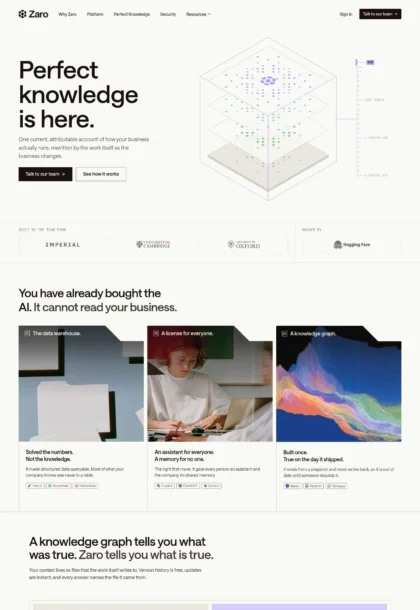
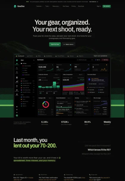
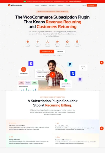
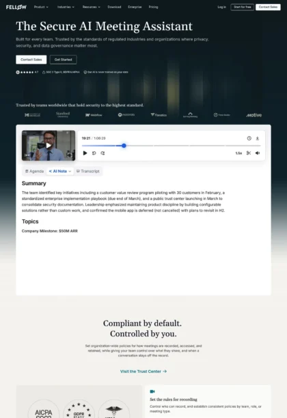
- Full page: https://cdn.designmunk.com/2026/09/04180634/coframe-com-featured.webp
- Above the fold: https://cdn.designmunk.com/2026/09/04180634/coframe-com-featured.webp
- On DesignMunk: https://designmunk.com/coframe/

Study these for hierarchy, rhythm, spacing and density. Where an image and the written spec disagree, the spec wins: the tokens were read from the page's own CSS, the images are one rendering of it.

## Before you start

Ask the user what they are building, who it is for, and what brand assets they already have — name, colours, typefaces. Wait for their answers before writing anything. Everything below is then applied to their product, not to the reference.

## Design specification

# Coframe: Dark Canvas With One Bright Action Per View

## Overview

Coframe presents an expert, AI-forward product in a dark, confident style. The experience is spacious and deliberate, emphasizing clarity over ornament. One high-contrast control or CTA anchors each section, with mid-weight type and concise copy guiding the scan. Use this when building flows that should feel capable, technical, and fast without looking aggressive.

## Colors

- Primary (#ffffff): Default text on dark surfaces and inverse elements.
- Secondary (#848c8c): Muted body text, captions, and supporting UI copy.
- Tertiary (#1f212f): Ink for text on light backgrounds and primary button fills.
- Neutral (#2d2860): Deep indigo canvas for sections and cards.
- brand-cool-elegance (#ceced0): Subtle borders, rings, and dividers on dark surfaces.
- Surface (#2d2860): Primary section background in dark mode.
- on-surface (#ffffff): Text and icon color when placed on Surface.

## Typography

All typography uses NB International Pro at weight 500 across headings and body for an even, modern tone. Sizes: 40px (headline-lg, -0.048em tracking), 33px (headline-md, -0.029em), 27px (headline-sm), 22px (headline-xs), and 18px (body-md).
Availability: NB International Pro is self-hosted (custom) and not generally obtainable by agents. Approved substitutes with similar proportions and tone: Inter (Google, variable or 500), IBM Plex Sans (Google, 500), Source Sans 3 (Google, 500). Use Inter 500 by default when the custom family is unavailable. Keep letter-spacing tight on large headlines and normal elsewhere.

## Layout

Spacing is blocky and generous. Use 64px–80px (lg–xl) paddings for section frames, 48px (md) for vertical rhythm within sections, 16px (sm) for element gaps, and 6px (xs) for micro spacing. Compose most sections as two columns (copy left, visual right) that collapse to a single column on small screens. Keep one prominent action per viewport; cluster secondary links below using the secondary color.

## Elevation & Depth

Depth is minimal. Shadows are largely absent; the only measured shadow is a light ring (sm) for subtle separation. Prefer tonal contrast (neutral #2d2860 vs. white type), thin borders using brand-cool-elegance (#ceced0), and whitespace to establish hierarchy. Reserve any glow effects for product imagery, not controls.

## Shapes

Two radii define the language: 10px (sm) for inputs, buttons, and small controls; 24px (md) for cards, large screenshots, and section containers. Use consistent radii within a component; avoid mixing both on the same surface.

## Components

Buttons and cards are the primary primitives.
- Button — Primary: background #1f212f, text #ffffff, 10px radius, 12px × 16px padding, 44px height. Use for dark CTAs on light surfaces.
- Button — Secondary: background #ffffff, text #1f212f, 10px radius, 12px × 16px padding, 44px height. Use as the main CTA on dark sections.
- Button — Link: text #ffffff, no radius; pair with underlines or icon carets.
- Card: background #2d2860, 24px radius, 64px padding. Use light text (#ffffff) on this dark surface for readability.

Distinctive components on this page:

### URL Analyzer Field
- 44px height input with 10px radius on a dark surface (#2d2860). Placeholder begins with "https://". Trailing action button uses the Secondary button (white) with an arrow icon.

### Hero Product Mockup Card
- Large 24px-radius container showcasing charts and variants; place on the right of the hero. Use the sm ring shadow for separation and keep margins at 48–64px.

### Process Tabs (Analyze / Approve / Test)
- Three horizontally arranged tabs. Active tab uses white text, subtle ring, and 24px radius; inactive tabs sit on the neutral background with secondary text.

### Comparison Grid (SaaS vs. Agencies)
- Three columns with 24px-radius tiles, 64px inner padding, checklist items set in body-md (18px). Headings in headline-xs (22px).

### Workflow Timeline
- Two stacked cards: "Current process" and "With Coframe". Use 24px-radius panels with 48px internal spacing and step rows separated by 16px.

### Security Proof Strip
- Three/four items for AI protection, SOC 2 Type II, and fallbacks. Each item uses a compact 24px-radius tile, headline-xs for titles, and body-md for detail.

### Testimonial Carousel
- Quote cards on a dark surface with 24px radius and sm ring. Quote in headline-sm (27px); name and role in body-md with secondary color.

### Blog Teasers Row
- Three 24px-radius tiles with 64px padding, headline-xs titles, and a "See all articles" link styled as Button—Link.

## Do's and Don'ts

- Do place a single high-contrast CTA (white on dark) per section; demote others to link style.
- Do use 64–80px paddings for sections and 48px for internal vertical rhythm to maintain the airy feel.
- Do keep headings at weight 500; avoid heavier bolds that break the tone.
- Don't apply heavy drop shadows; prefer the sm ring or a thin #ceced0 border.
- Don't mix 10px and 24px radii on the same surface; choose one per component.
- Don't set dark text on dark cards; use #ffffff on #2d2860 for accessibility.

## Agent Prompt Guide

Quick color reference — Text: #ffffff; Background: #2d2860; Border: #ceced0; Accent: #1f212f.

1) Build a dark hero
- Canvas: background #2d2860 with 80px top/bottom padding.
- Typography: Inter (as substitute for NB International Pro), headline 40px/1.1, weight 500, letter-spacing -0.048em; subhead 18px/1.5, weight 500, color #848c8c.
- Primary action: Secondary button (background #ffffff, text #1f212f, radius 10px, 44px height, 12px×16px padding).
- Right side: 24px-radius mockup card with a 1px #ceced0 ring using the sm shadow.

2) URL analyzer input
- Place a full-width input at 44px height, 10px radius on #2d2860.
- Left placeholder text "https://your.link" in Inter 18px, color #848c8c.
- Trailing action button: white background, #1f212f icon/text, 10px radius.
- Spacing: 16px gap to helper text in #848c8c.

3) Three-step process tabs
- Container with 64px padding and 24px radius (#2d2860).
- Each tab: 24px radius pill, 16px horizontal padding. Active tab uses #ffffff text and a subtle #ceced0 1px ring; inactive tabs use #848c8c text.
- Headline above in Inter 33px/1.33, weight 500.

4) Comparison grid
- Three tiles, each 24px radius, 64px internal padding, background #2d2860, 16px item gaps.
- Tile headings: Inter 22px/1.25, weight 500, color #ffffff.
- Checklist text: Inter 18px/1.5, color #848c8c; use #ceced0 bullets/borders.

5) Footer CTA band
- Section padding 64px, background #2d2860, headline 27px/1.33, weight 500.
- Primary button: white (#ffffff) with #1f212f text, radius 10px, height 44px; secondary link as text-only #ffffff.

## Similar Brands

- Optimizely: Similar CRO narrative and comparison grids; Optimizely leans brighter with more blues, while Coframe commits to dark mode and one high-contrast CTA.
- VWO: Shared testing/experimentation story and proof sections; VWO uses lighter backgrounds and more varied iconography.
- Mutiny: Personalization-first messaging with large testimonials; Mutiny keeps a lighter canvas and colorful accents versus Coframe's restrained palette.
- Linear: Comparable dark, spacious layouts and mid-weight type; Linear is more monochrome and denser in product UI imagery.
- OpenAI: Dark, minimal pages with large mid-weight headlines; OpenAI relies more on editorial whitespace and fewer componentized cards.

## Tokens

### CSS custom properties

```css
:root {
  /* Colors */
  --color-primary: #ffffff;
  --color-secondary: #848c8c;
  --color-tertiary: #1f212f;
  --color-neutral: #2d2860;
  --color-brand-cool-elegance: #ceced0;
  --color-surface: var(--color-neutral);
  --color-on-surface: var(--color-primary);

  /* Typography */
  --text-headline-lg-size: 40px;
  --text-headline-lg-weight: 500;
  --text-headline-lg-leading: 1.1;
  --text-headline-lg-tracking: -0.048em;
  --text-headline-md-size: 33px;
  --text-headline-md-weight: 500;
  --text-headline-md-leading: 1.33;
  --text-headline-md-tracking: -0.029em;
  --text-headline-sm-size: 27px;
  --text-headline-sm-weight: 500;
  --text-headline-sm-leading: 1.33;
  --text-headline-xs-size: 22px;
  --text-headline-xs-weight: 500;
  --text-headline-xs-leading: 1.25;
  --text-body-md-size: 18px;
  --text-body-md-weight: 500;
  --text-body-md-leading: 1.5;
  --font-nb-international-pro: "NB International Pro";

  /* Rounded */
  --radius-sm: 10px;
  --radius-md: 24px;

  /* Spacing */
  --spacing-xs: 6px;
  --spacing-sm: 16px;
  --spacing-md: 48px;
  --spacing-lg: 64px;
  --spacing-xl: 80px;

  /* Components */
  --button-primary-background-color: var(--color-tertiary);
  --button-primary-text-color: var(--color-primary);
  --button-primary-rounded: var(--radius-sm);
  --button-primary-padding: 12px 16px;
  --button-primary-height: 44px;
  --button-secondary-background-color: var(--color-primary);
  --button-secondary-text-color: var(--color-tertiary);
  --button-secondary-rounded: var(--radius-sm);
  --button-secondary-padding: 12px 16px;
  --button-secondary-height: 44px;
  --button-link-text-color: var(--color-primary);
  --button-link-rounded: 0px;
  --card-background-color: var(--color-neutral);
  --card-text-color: var(--color-tertiary);
  --card-rounded: var(--radius-md);
  --card-padding: 64px;
}
```

### Tailwind theme

```css
@theme {
  --color-primary: #ffffff;
  --color-secondary: #848c8c;
  --color-tertiary: #1f212f;
  --color-neutral: #2d2860;
  --color-brand-cool-elegance: #ceced0;
  --color-surface: #2d2860;
  --color-on-surface: #ffffff;
  --font-headline-lg: "NB International Pro";
  --font-headline-md: "NB International Pro";
  --font-headline-sm: "NB International Pro";
  --font-headline-xs: "NB International Pro";
  --font-body-md: "NB International Pro";
  --text-headline-lg: 40px;
  --text-headline-md: 33px;
  --text-headline-sm: 27px;
  --text-headline-xs: 22px;
  --text-body-md: 18px;
  --tracking-headline-lg: -0.048em;
  --tracking-headline-md: -0.029em;
  --font-weight-headline-lg: 500;
  --font-weight-headline-md: 500;
  --font-weight-headline-sm: 500;
  --font-weight-headline-xs: 500;
  --font-weight-body-md: 500;
  --radius-sm: 10px;
  --radius-md: 24px;
  --spacing-xs: 6px;
  --spacing-sm: 16px;
  --spacing-md: 48px;
  --spacing-lg: 64px;
  --spacing-xl: 80px;
}
```

### Design tokens (DTCG)

```json
{
    "$schema": "https://www.designtokens.org/schemas/2025.10/format.json",
    "color": {
        "$type": "color",
        "primary": {
            "$value": {
                "colorSpace": "srgb",
                "components": [
                    1,
                    1,
                    1
                ],
                "hex": "#ffffff"
            }
        },
        "secondary": {
            "$value": {
                "colorSpace": "srgb",
                "components": [
                    0.518,
                    0.549,
                    0.549
                ],
                "hex": "#848c8c"
            }
        },
        "tertiary": {
            "$value": {
                "colorSpace": "srgb",
                "components": [
                    0.122,
                    0.129,
                    0.184
                ],
                "hex": "#1f212f"
            }
        },
        "neutral": {
            "$value": {
                "colorSpace": "srgb",
                "components": [
                    0.176,
                    0.157,
                    0.376
                ],
                "hex": "#2d2860"
            }
        },
        "brand-cool-elegance": {
            "$value": {
                "colorSpace": "srgb",
                "components": [
                    0.808,
                    0.808,
                    0.816
                ],
                "hex": "#ceced0"
            }
        },
        "surface": {
            "$value": {
                "colorSpace": "srgb",
                "components": [
                    0.176,
                    0.157,
                    0.376
                ],
                "hex": "#2d2860"
            }
        },
        "on-surface": {
            "$value": {
                "colorSpace": "srgb",
                "components": [
                    1,
                    1,
                    1
                ],
                "hex": "#ffffff"
            }
        }
    },
    "spacing": {
        "$type": "dimension",
        "xs": {
            "$value": {
                "value": 6,
                "unit": "px"
            }
        },
        "sm": {
            "$value": {
                "value": 16,
                "unit": "px"
            }
        },
        "md": {
            "$value": {
                "value": 48,
                "unit": "px"
            }
        },
        "lg": {
            "$value": {
                "value": 64,
                "unit": "px"
            }
        },
        "xl": {
            "$value": {
                "value": 80,
                "unit": "px"
            }
        }
    },
    "rounded": {
        "$type": "dimension",
        "sm": {
            "$value": {
                "value": 10,
                "unit": "px"
            }
        },
        "md": {
            "$value": {
                "value": 24,
                "unit": "px"
            }
        }
    },
    "typography": {
        "headline-lg": {
            "$type": "typography",
            "$value": {
                "fontFamily": "NB International Pro",
                "fontSize": {
                    "value": 40,
                    "unit": "px"
                },
                "fontWeight": 500,
                "letterSpacing": {
                    "value": -0.048,
                    "unit": "em"
                }
            }
        },
        "headline-md": {
            "$type": "typography",
            "$value": {
                "fontFamily": "NB International Pro",
                "fontSize": {
                    "value": 33,
                    "unit": "px"
                },
                "fontWeight": 500,
                "letterSpacing": {
                    "value": -0.029,
                    "unit": "em"
                }
            }
        },
        "headline-sm": {
            "$type": "typography",
            "$value": {
                "fontFamily": "NB International Pro",
                "fontSize": {
                    "value": 27,
                    "unit": "px"
                },
                "fontWeight": 500
            }
        },
        "headline-xs": {
            "$type": "typography",
            "$value": {
                "fontFamily": "NB International Pro",
                "fontSize": {
                    "value": 22,
                    "unit": "px"
                },
                "fontWeight": 500
            }
        },
        "body-md": {
            "$type": "typography",
            "$value": {
                "fontFamily": "NB International Pro",
                "fontSize": {
                    "value": 18,
                    "unit": "px"
                },
                "fontWeight": 500
            }
        }
    }
}
```

## Rules

- **Fonts.** If the specification names a custom or self-hosted family, use one of the substitutes it names. Never reference a typeface you cannot actually load — it will fall back to a system font and undo the typography.
- **Colour.** Derive the palette from the user's brand. Use the token values as a guide to *relationships* — contrast, tint, how many accents carry the page — not as hex codes to paste.
- **Never reproduce** the wordmark, mascot, logo, brand name, illustrations, icon set, screenshots or any copy from the reference.
- **Never present the result as Coframe**, or imply any connection to it.
- If something is unspecified, choose clarity and legibility over decoration.
---
version: alpha
name: Coframe
description: Your website, optimizing itself on autopilot.
colors:
  primary: "#ffffff"
  secondary: "#848c8c"
  tertiary: "#1f212f"
  neutral: "#2d2860"
  brand-cool-elegance: "#ceced0"
  surface: "{colors.neutral}"
  on-surface: "{colors.primary}"
typography:
  headline-lg:
    fontFamily: NB International Pro
    fontSize: 40px
    fontWeight: 500
    lineHeight: 1.1
    letterSpacing: -0.048em
  headline-md:
    fontFamily: NB International Pro
    fontSize: 33px
    fontWeight: 500
    lineHeight: 1.33
    letterSpacing: -0.029em
  headline-sm:
    fontFamily: NB International Pro
    fontSize: 27px
    fontWeight: 500
    lineHeight: 1.33
  headline-xs:
    fontFamily: NB International Pro
    fontSize: 22px
    fontWeight: 500
    lineHeight: 1.25
  body-md:
    fontFamily: NB International Pro
    fontSize: 18px
    fontWeight: 500
    lineHeight: 1.5
rounded:
  sm: 10px
  md: 24px
spacing:
  xs: 6px
  sm: 16px
  md: 48px
  lg: 64px
  xl: 80px
components:
  button-primary:
    backgroundColor: "{colors.tertiary}"
    textColor: "{colors.primary}"
    rounded: "{rounded.sm}"
    padding: 12px 16px
    height: 44px
  button-secondary:
    backgroundColor: "{colors.primary}"
    textColor: "{colors.tertiary}"
    rounded: "{rounded.sm}"
    padding: 12px 16px
    height: 44px
  button-link:
    textColor: "{colors.primary}"
    rounded: 0px
  card:
    backgroundColor: "{colors.neutral}"
    textColor: "{colors.tertiary}"
    rounded: "{rounded.md}"
    padding: 64px
---

# Coframe: Dark Canvas With One Bright Action Per View

## Overview

Coframe presents an expert, AI-forward product in a dark, confident style. The experience is spacious and deliberate, emphasizing clarity over ornament. One high-contrast control or CTA anchors each section, with mid-weight type and concise copy guiding the scan. Use this when building flows that should feel capable, technical, and fast without looking aggressive.

## Colors

- Primary (#ffffff): Default text on dark surfaces and inverse elements.
- Secondary (#848c8c): Muted body text, captions, and supporting UI copy.
- Tertiary (#1f212f): Ink for text on light backgrounds and primary button fills.
- Neutral (#2d2860): Deep indigo canvas for sections and cards.
- brand-cool-elegance (#ceced0): Subtle borders, rings, and dividers on dark surfaces.
- Surface (#2d2860): Primary section background in dark mode.
- on-surface (#ffffff): Text and icon color when placed on Surface.

## Typography

All typography uses NB International Pro at weight 500 across headings and body for an even, modern tone. Sizes: 40px (headline-lg, -0.048em tracking), 33px (headline-md, -0.029em), 27px (headline-sm), 22px (headline-xs), and 18px (body-md).
Availability: NB International Pro is self-hosted (custom) and not generally obtainable by agents. Approved substitutes with similar proportions and tone: Inter (Google, variable or 500), IBM Plex Sans (Google, 500), Source Sans 3 (Google, 500). Use Inter 500 by default when the custom family is unavailable. Keep letter-spacing tight on large headlines and normal elsewhere.

## Layout

Spacing is blocky and generous. Use 64px–80px (lg–xl) paddings for section frames, 48px (md) for vertical rhythm within sections, 16px (sm) for element gaps, and 6px (xs) for micro spacing. Compose most sections as two columns (copy left, visual right) that collapse to a single column on small screens. Keep one prominent action per viewport; cluster secondary links below using the secondary color.

## Elevation & Depth

Depth is minimal. Shadows are largely absent; the only measured shadow is a light ring (sm) for subtle separation. Prefer tonal contrast (neutral #2d2860 vs. white type), thin borders using brand-cool-elegance (#ceced0), and whitespace to establish hierarchy. Reserve any glow effects for product imagery, not controls.

## Shapes

Two radii define the language: 10px (sm) for inputs, buttons, and small controls; 24px (md) for cards, large screenshots, and section containers. Use consistent radii within a component; avoid mixing both on the same surface.

## Components

Buttons and cards are the primary primitives.
- Button — Primary: background #1f212f, text #ffffff, 10px radius, 12px × 16px padding, 44px height. Use for dark CTAs on light surfaces.
- Button — Secondary: background #ffffff, text #1f212f, 10px radius, 12px × 16px padding, 44px height. Use as the main CTA on dark sections.
- Button — Link: text #ffffff, no radius; pair with underlines or icon carets.
- Card: background #2d2860, 24px radius, 64px padding. Use light text (#ffffff) on this dark surface for readability.

Distinctive components on this page:

### URL Analyzer Field
- 44px height input with 10px radius on a dark surface (#2d2860). Placeholder begins with "https://". Trailing action button uses the Secondary button (white) with an arrow icon.

### Hero Product Mockup Card
- Large 24px-radius container showcasing charts and variants; place on the right of the hero. Use the sm ring shadow for separation and keep margins at 48–64px.

### Process Tabs (Analyze / Approve / Test)
- Three horizontally arranged tabs. Active tab uses white text, subtle ring, and 24px radius; inactive tabs sit on the neutral background with secondary text.

### Comparison Grid (SaaS vs. Agencies)
- Three columns with 24px-radius tiles, 64px inner padding, checklist items set in body-md (18px). Headings in headline-xs (22px).

### Workflow Timeline
- Two stacked cards: "Current process" and "With Coframe". Use 24px-radius panels with 48px internal spacing and step rows separated by 16px.

### Security Proof Strip
- Three/four items for AI protection, SOC 2 Type II, and fallbacks. Each item uses a compact 24px-radius tile, headline-xs for titles, and body-md for detail.

### Testimonial Carousel
- Quote cards on a dark surface with 24px radius and sm ring. Quote in headline-sm (27px); name and role in body-md with secondary color.

### Blog Teasers Row
- Three 24px-radius tiles with 64px padding, headline-xs titles, and a "See all articles" link styled as Button—Link.

## Do's and Don'ts

- Do place a single high-contrast CTA (white on dark) per section; demote others to link style.
- Do use 64–80px paddings for sections and 48px for internal vertical rhythm to maintain the airy feel.
- Do keep headings at weight 500; avoid heavier bolds that break the tone.
- Don't apply heavy drop shadows; prefer the sm ring or a thin #ceced0 border.
- Don't mix 10px and 24px radii on the same surface; choose one per component.
- Don't set dark text on dark cards; use #ffffff on #2d2860 for accessibility.

## Agent Prompt Guide

Quick color reference — Text: #ffffff; Background: #2d2860; Border: #ceced0; Accent: #1f212f.

1) Build a dark hero
- Canvas: background #2d2860 with 80px top/bottom padding.
- Typography: Inter (as substitute for NB International Pro), headline 40px/1.1, weight 500, letter-spacing -0.048em; subhead 18px/1.5, weight 500, color #848c8c.
- Primary action: Secondary button (background #ffffff, text #1f212f, radius 10px, 44px height, 12px×16px padding).
- Right side: 24px-radius mockup card with a 1px #ceced0 ring using the sm shadow.

2) URL analyzer input
- Place a full-width input at 44px height, 10px radius on #2d2860.
- Left placeholder text "https://your.link" in Inter 18px, color #848c8c.
- Trailing action button: white background, #1f212f icon/text, 10px radius.
- Spacing: 16px gap to helper text in #848c8c.

3) Three-step process tabs
- Container with 64px padding and 24px radius (#2d2860).
- Each tab: 24px radius pill, 16px horizontal padding. Active tab uses #ffffff text and a subtle #ceced0 1px ring; inactive tabs use #848c8c text.
- Headline above in Inter 33px/1.33, weight 500.

4) Comparison grid
- Three tiles, each 24px radius, 64px internal padding, background #2d2860, 16px item gaps.
- Tile headings: Inter 22px/1.25, weight 500, color #ffffff.
- Checklist text: Inter 18px/1.5, color #848c8c; use #ceced0 bullets/borders.

5) Footer CTA band
- Section padding 64px, background #2d2860, headline 27px/1.33, weight 500.
- Primary button: white (#ffffff) with #1f212f text, radius 10px, height 44px; secondary link as text-only #ffffff.

## Similar Brands

- Optimizely: Similar CRO narrative and comparison grids; Optimizely leans brighter with more blues, while Coframe commits to dark mode and one high-contrast CTA.
- VWO: Shared testing/experimentation story and proof sections; VWO uses lighter backgrounds and more varied iconography.
- Mutiny: Personalization-first messaging with large testimonials; Mutiny keeps a lighter canvas and colorful accents versus Coframe's restrained palette.
- Linear: Comparable dark, spacious layouts and mid-weight type; Linear is more monochrome and denser in product UI imagery.
- OpenAI: Dark, minimal pages with large mid-weight headlines; OpenAI relies more on editorial whitespace and fewer componentized cards.
:root {
  /* Colors */
  --color-primary: #ffffff;
  --color-secondary: #848c8c;
  --color-tertiary: #1f212f;
  --color-neutral: #2d2860;
  --color-brand-cool-elegance: #ceced0;
  --color-surface: var(--color-neutral);
  --color-on-surface: var(--color-primary);

  /* Typography */
  --text-headline-lg-size: 40px;
  --text-headline-lg-weight: 500;
  --text-headline-lg-leading: 1.1;
  --text-headline-lg-tracking: -0.048em;
  --text-headline-md-size: 33px;
  --text-headline-md-weight: 500;
  --text-headline-md-leading: 1.33;
  --text-headline-md-tracking: -0.029em;
  --text-headline-sm-size: 27px;
  --text-headline-sm-weight: 500;
  --text-headline-sm-leading: 1.33;
  --text-headline-xs-size: 22px;
  --text-headline-xs-weight: 500;
  --text-headline-xs-leading: 1.25;
  --text-body-md-size: 18px;
  --text-body-md-weight: 500;
  --text-body-md-leading: 1.5;
  --font-nb-international-pro: "NB International Pro";

  /* Rounded */
  --radius-sm: 10px;
  --radius-md: 24px;

  /* Spacing */
  --spacing-xs: 6px;
  --spacing-sm: 16px;
  --spacing-md: 48px;
  --spacing-lg: 64px;
  --spacing-xl: 80px;

  /* Components */
  --button-primary-background-color: var(--color-tertiary);
  --button-primary-text-color: var(--color-primary);
  --button-primary-rounded: var(--radius-sm);
  --button-primary-padding: 12px 16px;
  --button-primary-height: 44px;
  --button-secondary-background-color: var(--color-primary);
  --button-secondary-text-color: var(--color-tertiary);
  --button-secondary-rounded: var(--radius-sm);
  --button-secondary-padding: 12px 16px;
  --button-secondary-height: 44px;
  --button-link-text-color: var(--color-primary);
  --button-link-rounded: 0px;
  --card-background-color: var(--color-neutral);
  --card-text-color: var(--color-tertiary);
  --card-rounded: var(--radius-md);
  --card-padding: 64px;
}
{
  "$schema": "https://www.designtokens.org/schemas/2025.10/format.json",
  "$description": "Your website, optimizing itself on autopilot.",
  "color": {
    "$type": "color",
    "primary": {
      "$value": {
        "colorSpace": "srgb",
        "components": [
          1,
          1,
          1
        ],
        "hex": "#ffffff"
      }
    },
    "secondary": {
      "$value": {
        "colorSpace": "srgb",
        "components": [
          0.518,
          0.549,
          0.549
        ],
        "hex": "#848c8c"
      }
    },
    "tertiary": {
      "$value": {
        "colorSpace": "srgb",
        "components": [
          0.122,
          0.129,
          0.184
        ],
        "hex": "#1f212f"
      }
    },
    "neutral": {
      "$value": {
        "colorSpace": "srgb",
        "components": [
          0.176,
          0.157,
          0.376
        ],
        "hex": "#2d2860"
      }
    },
    "brand-cool-elegance": {
      "$value": {
        "colorSpace": "srgb",
        "components": [
          0.808,
          0.808,
          0.816
        ],
        "hex": "#ceced0"
      }
    },
    "surface": {
      "$value": {
        "colorSpace": "srgb",
        "components": [
          0.176,
          0.157,
          0.376
        ],
        "hex": "#2d2860"
      }
    },
    "on-surface": {
      "$value": {
        "colorSpace": "srgb",
        "components": [
          1,
          1,
          1
        ],
        "hex": "#ffffff"
      }
    }
  },
  "spacing": {
    "$type": "dimension",
    "xs": {
      "$value": {
        "value": 6,
        "unit": "px"
      }
    },
    "sm": {
      "$value": {
        "value": 16,
        "unit": "px"
      }
    },
    "md": {
      "$value": {
        "value": 48,
        "unit": "px"
      }
    },
    "lg": {
      "$value": {
        "value": 64,
        "unit": "px"
      }
    },
    "xl": {
      "$value": {
        "value": 80,
        "unit": "px"
      }
    }
  },
  "rounded": {
    "$type": "dimension",
    "sm": {
      "$value": {
        "value": 10,
        "unit": "px"
      }
    },
    "md": {
      "$value": {
        "value": 24,
        "unit": "px"
      }
    }
  },
  "typography": {
    "headline-lg": {
      "$type": "typography",
      "$value": {
        "fontFamily": "NB International Pro",
        "fontSize": {
          "value": 40,
          "unit": "px"
        },
        "fontWeight": 500,
        "letterSpacing": {
          "value": -0.048,
          "unit": "em"
        }
      }
    },
    "headline-md": {
      "$type": "typography",
      "$value": {
        "fontFamily": "NB International Pro",
        "fontSize": {
          "value": 33,
          "unit": "px"
        },
        "fontWeight": 500,
        "letterSpacing": {
          "value": -0.029,
          "unit": "em"
        }
      }
    },
    "headline-sm": {
      "$type": "typography",
      "$value": {
        "fontFamily": "NB International Pro",
        "fontSize": {
          "value": 27,
          "unit": "px"
        },
        "fontWeight": 500
      }
    },
    "headline-xs": {
      "$type": "typography",
      "$value": {
        "fontFamily": "NB International Pro",
        "fontSize": {
          "value": 22,
          "unit": "px"
        },
        "fontWeight": 500
      }
    },
    "body-md": {
      "$type": "typography",
      "$value": {
        "fontFamily": "NB International Pro",
        "fontSize": {
          "value": 18,
          "unit": "px"
        },
        "fontWeight": 500
      }
    }
  }
}
@theme {
--color-primary: #ffffff;
--color-secondary: #848c8c;
--color-tertiary: #1f212f;
--color-neutral: #2d2860;
--color-brand-cool-elegance: #ceced0;
--color-surface: #2d2860;
--color-on-surface: #ffffff;
--font-headline-lg: "NB International Pro";
--font-headline-md: "NB International Pro";
--font-headline-sm: "NB International Pro";
--font-headline-xs: "NB International Pro";
--font-body-md: "NB International Pro";
--text-headline-lg: 40px;
--text-headline-md: 33px;
--text-headline-sm: 27px;
--text-headline-xs: 22px;
--text-body-md: 18px;
--tracking-headline-lg: -0.048em;
--tracking-headline-md: -0.029em;
--font-weight-headline-lg: 500;
--font-weight-headline-md: 500;
--font-weight-headline-sm: 500;
--font-weight-headline-xs: 500;
--font-weight-body-md: 500;
--radius-sm: 10px;
--radius-md: 24px;
--spacing-xs: 6px;
--spacing-sm: 16px;
--spacing-md: 48px;
--spacing-lg: 64px;
--spacing-xl: 80px;
} # Design brief: the Coframe design language
Below is a complete design specification measured from a real, published web page. Use it as a design language for the user's product. It is not a page to reproduce.
## Reference images
- Full page: https://cdn.designmunk.com/2026/09/04180634/coframe-com-featured.webp
- Above the fold: https://cdn.designmunk.com/2026/09/04180634/coframe-com-featured.webp
- On DesignMunk: https://designmunk.com/coframe/
Study these for hierarchy, rhythm, spacing and density. Where an image and the written spec disagree, the spec wins: the tokens were read from the page's own CSS, the images are one rendering of it.
## Before you start
Ask the user what they are building, who it is for, and what brand assets they already have — name, colours, typefaces. Wait for their answers before writing anything. Everything below is then applied to their product, not to the reference.
## Design specification
# Coframe: Dark Canvas With One Bright Action Per View
## Overview
Coframe presents an expert, AI-forward product in a dark, confident style. The experience is spacious and deliberate, emphasizing clarity over ornament. One high-contrast control or CTA anchors each section, with mid-weight type and concise copy guiding the scan. Use this when building flows that should feel capable, technical, and fast without looking aggressive.
## Colors
- Primary (#ffffff): Default text on dark surfaces and inverse elements.
- Secondary (#848c8c): Muted body text, captions, and supporting UI copy.
- Tertiary (#1f212f): Ink for text on light backgrounds and primary button fills.
- Neutral (#2d2860): Deep indigo canvas for sections and cards.
- brand-cool-elegance (#ceced0): Subtle borders, rings, and dividers on dark surfaces.
- Surface (#2d2860): Primary section background in dark mode.
- on-surface (#ffffff): Text and icon color when placed on Surface.
## Typography
All typography uses NB International Pro at weight 500 across headings and body for an even, modern tone. Sizes: 40px (headline-lg, -0.048em tracking), 33px (headline-md, -0.029em), 27px (headline-sm), 22px (headline-xs), and 18px (body-md).
Availability: NB International Pro is self-hosted (custom) and not generally obtainable by agents. Approved substitutes with similar proportions and tone: Inter (Google, variable or 500), IBM Plex Sans (Google, 500), Source Sans 3 (Google, 500). Use Inter 500 by default when the custom family is unavailable. Keep letter-spacing tight on large headlines and normal elsewhere.
## Layout
Spacing is blocky and generous. Use 64px–80px (lg–xl) paddings for section frames, 48px (md) for vertical rhythm within sections, 16px (sm) for element gaps, and 6px (xs) for micro spacing. Compose most sections as two columns (copy left, visual right) that collapse to a single column on small screens. Keep one prominent action per viewport; cluster secondary links below using the secondary color.
## Elevation & Depth
Depth is minimal. Shadows are largely absent; the only measured shadow is a light ring (sm) for subtle separation. Prefer tonal contrast (neutral #2d2860 vs. white type), thin borders using brand-cool-elegance (#ceced0), and whitespace to establish hierarchy. Reserve any glow effects for product imagery, not controls.
## Shapes
Two radii define the language: 10px (sm) for inputs, buttons, and small controls; 24px (md) for cards, large screenshots, and section containers. Use consistent radii within a component; avoid mixing both on the same surface.
## Components
Buttons and cards are the primary primitives.
- Button — Primary: background #1f212f, text #ffffff, 10px radius, 12px × 16px padding, 44px height. Use for dark CTAs on light surfaces.
- Button — Secondary: background #ffffff, text #1f212f, 10px radius, 12px × 16px padding, 44px height. Use as the main CTA on dark sections.
- Button — Link: text #ffffff, no radius; pair with underlines or icon carets.
- Card: background #2d2860, 24px radius, 64px padding. Use light text (#ffffff) on this dark surface for readability.
Distinctive components on this page:
### URL Analyzer Field
- 44px height input with 10px radius on a dark surface (#2d2860). Placeholder begins with "https://". Trailing action button uses the Secondary button (white) with an arrow icon.
### Hero Product Mockup Card
- Large 24px-radius container showcasing charts and variants; place on the right of the hero. Use the sm ring shadow for separation and keep margins at 48–64px.
### Process Tabs (Analyze / Approve / Test)
- Three horizontally arranged tabs. Active tab uses white text, subtle ring, and 24px radius; inactive tabs sit on the neutral background with secondary text.
### Comparison Grid (SaaS vs. Agencies)
- Three columns with 24px-radius tiles, 64px inner padding, checklist items set in body-md (18px). Headings in headline-xs (22px).
### Workflow Timeline
- Two stacked cards: "Current process" and "With Coframe". Use 24px-radius panels with 48px internal spacing and step rows separated by 16px.
### Security Proof Strip
- Three/four items for AI protection, SOC 2 Type II, and fallbacks. Each item uses a compact 24px-radius tile, headline-xs for titles, and body-md for detail.
### Testimonial Carousel
- Quote cards on a dark surface with 24px radius and sm ring. Quote in headline-sm (27px); name and role in body-md with secondary color.
### Blog Teasers Row
- Three 24px-radius tiles with 64px padding, headline-xs titles, and a "See all articles" link styled as Button—Link.
## Do's and Don'ts
- Do place a single high-contrast CTA (white on dark) per section; demote others to link style.
- Do use 64–80px paddings for sections and 48px for internal vertical rhythm to maintain the airy feel.
- Do keep headings at weight 500; avoid heavier bolds that break the tone.
- Don't apply heavy drop shadows; prefer the sm ring or a thin #ceced0 border.
- Don't mix 10px and 24px radii on the same surface; choose one per component.
- Don't set dark text on dark cards; use #ffffff on #2d2860 for accessibility.
## Agent Prompt Guide
Quick color reference — Text: #ffffff; Background: #2d2860; Border: #ceced0; Accent: #1f212f.
1) Build a dark hero
- Canvas: background #2d2860 with 80px top/bottom padding.
- Typography: Inter (as substitute for NB International Pro), headline 40px/1.1, weight 500, letter-spacing -0.048em; subhead 18px/1.5, weight 500, color #848c8c.
- Primary action: Secondary button (background #ffffff, text #1f212f, radius 10px, 44px height, 12px×16px padding).
- Right side: 24px-radius mockup card with a 1px #ceced0 ring using the sm shadow.
2) URL analyzer input
- Place a full-width input at 44px height, 10px radius on #2d2860.
- Left placeholder text "https://your.link" in Inter 18px, color #848c8c.
- Trailing action button: white background, #1f212f icon/text, 10px radius.
- Spacing: 16px gap to helper text in #848c8c.
3) Three-step process tabs
- Container with 64px padding and 24px radius (#2d2860).
- Each tab: 24px radius pill, 16px horizontal padding. Active tab uses #ffffff text and a subtle #ceced0 1px ring; inactive tabs use #848c8c text.
- Headline above in Inter 33px/1.33, weight 500.
4) Comparison grid
- Three tiles, each 24px radius, 64px internal padding, background #2d2860, 16px item gaps.
- Tile headings: Inter 22px/1.25, weight 500, color #ffffff.
- Checklist text: Inter 18px/1.5, color #848c8c; use #ceced0 bullets/borders.
5) Footer CTA band
- Section padding 64px, background #2d2860, headline 27px/1.33, weight 500.
- Primary button: white (#ffffff) with #1f212f text, radius 10px, height 44px; secondary link as text-only #ffffff.
## Tokens
### CSS custom properties
```css
:root {
/* Colors */
--color-primary: #ffffff;
--color-secondary: #848c8c;
--color-tertiary: #1f212f;
--color-neutral: #2d2860;
--color-brand-cool-elegance: #ceced0;
--color-surface: var(--color-neutral);
--color-on-surface: var(--color-primary);
/* Typography */
--text-headline-lg-size: 40px;
--text-headline-lg-weight: 500;
--text-headline-lg-leading: 1.1;
--text-headline-lg-tracking: -0.048em;
--text-headline-md-size: 33px;
--text-headline-md-weight: 500;
--text-headline-md-leading: 1.33;
--text-headline-md-tracking: -0.029em;
--text-headline-sm-size: 27px;
--text-headline-sm-weight: 500;
--text-headline-sm-leading: 1.33;
--text-headline-xs-size: 22px;
--text-headline-xs-weight: 500;
--text-headline-xs-leading: 1.25;
--text-body-md-size: 18px;
--text-body-md-weight: 500;
--text-body-md-leading: 1.5;
--font-nb-international-pro: "NB International Pro";
/* Rounded */
--radius-sm: 10px;
--radius-md: 24px;
/* Spacing */
--spacing-xs: 6px;
--spacing-sm: 16px;
--spacing-md: 48px;
--spacing-lg: 64px;
--spacing-xl: 80px;
/* Components */
--button-primary-background-color: var(--color-tertiary);
--button-primary-text-color: var(--color-primary);
--button-primary-rounded: var(--radius-sm);
--button-primary-padding: 12px 16px;
--button-primary-height: 44px;
--button-secondary-background-color: var(--color-primary);
--button-secondary-text-color: var(--color-tertiary);
--button-secondary-rounded: var(--radius-sm);
--button-secondary-padding: 12px 16px;
--button-secondary-height: 44px;
--button-link-text-color: var(--color-primary);
--button-link-rounded: 0px;
--card-background-color: var(--color-neutral);
--card-text-color: var(--color-tertiary);
--card-rounded: var(--radius-md);
--card-padding: 64px;
}
```
## Rules
- **Fonts.** If the specification names a custom or self-hosted family, use one of the substitutes it names. Never reference a typeface you cannot actually load — it will fall back to a system font and undo the typography.
- **Colour.** Derive the palette from the user's brand. Use the token values as a guide to *relationships* — contrast, tint, how many accents carry the page — not as hex codes to paste.
- **Never reproduce** the wordmark, mascot, logo, brand name, illustrations, icon set, screenshots or any copy from the reference.
- **Never present the result as Coframe**, or imply any connection to it.
- If something is unspecified, choose clarity and legibility over decoration.