Caphe Roasters
capheroasters.com
Philadelphia's first and only Vietnamese specialty coffee roaster
capheroasters.com
AI Breakdown
Design export
# Design brief: the Caphe Roasters design language

Below is a complete design specification measured from a real, published web page. Use it as a design language for the user's product. It is not a page to reproduce.

## Reference images

- Full page: https://cdn.designmunk.com/2026/10/07054806/capheroasters-com-featured.webp
- Above the fold: https://cdn.designmunk.com/2026/10/07054806/capheroasters-com-featured-1440x900.webp
- On DesignMunk: https://designmunk.com/caphe-roasters/

Study these for hierarchy, rhythm, spacing and density. Where an image and the written spec disagree, the spec wins: the tokens were read from the page's own CSS, the images are one rendering of it.

## Before you start

Ask the user what they are building, who it is for, and what brand assets they already have — name, colours, typefaces. Wait for their answers before writing anything. Everything below is then applied to their product, not to the reference.

## Design specification

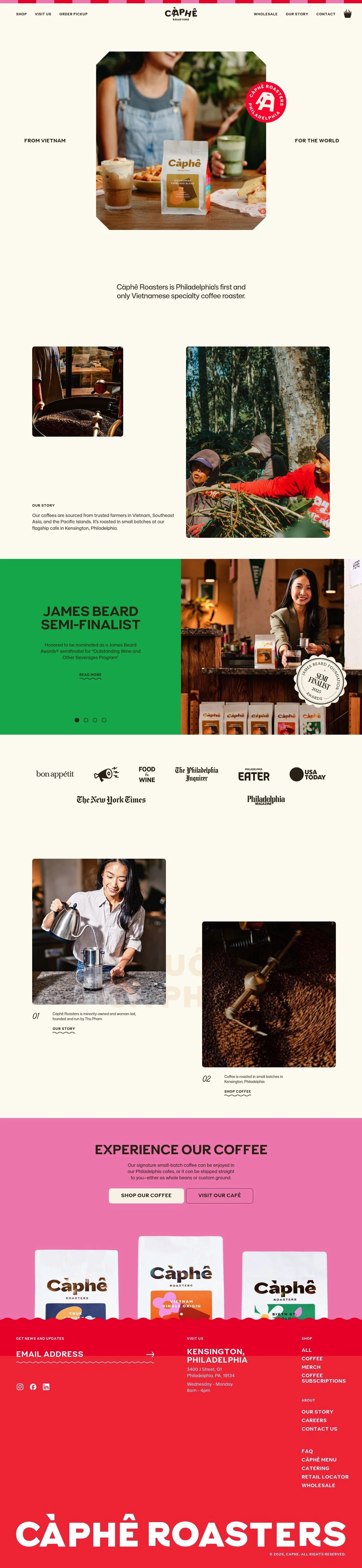
# Caphe Roasters: Chamfered Hero Photo on Cream, Red Stamp

## Overview

Warm, crafted, and unfussy. The site should feel like a well-labeled bag of beans: tactile, friendly, and reliable. Audience spans retail customers, café visitors, and wholesale partners. Density is medium-airy on a cream surface; color is restrained, with one bright red accent used for emphasis and calls to action.

## Page Structure

- Top Ribbon: a thin red/pink checker stripe spanning full width; purely decorative.
- Global Navigation: centered wordmark; primary links split left (Shop, Visit Us, Order Pickup) and right (Wholesale, Our Story, Contact) with a cart icon at far right; single row, generous horizontal spacing.
- Hero: oversized product photo masked with chamfered corners and centered; compact labels sit left and right of the image; a circular red badge overlays the right edge; short one-line brand statement and a text link below.
- Press & Partners: a stack or short grid of compact callouts, each a heading with a brief line and a "Read More" link; lightweight presentation, minimal imagery.
- Numbered Facts Strip: four concise items labeled 01–04, each with one sentence and a contextual link; laid out in a row on wide screens and stacked on small.
- CTA Band — Experience Our Coffee: section heading, one-sentence support, and two side-by-side buttons (primary and secondary).
- Newsletter & Social: single-row email field with submit plus links to Instagram, Facebook, and LinkedIn.
- Visit Us: address and hours for the Kensington café; compact block.
- Footer: multi-column link lists for Shop and About, then utility links and copyright on a quiet cream background.

## Colors

- Primary (#362b1c): Deep coffee brown for headlines, body copy, and icons.
- Secondary (#fc1c3c): Bright red accent for stamps, badges, highlights, and primary emphasis moments.
- Neutral (#fdfaf3): Warm cream used as the page background and card surfaces.
- Border (#e5e7eb): Soft gray divider lines for inputs, sections, and subtle delineation.
- Surface ({colors.neutral}): Alias of Neutral; use for panels or cards that sit on the cream background.
- On-surface ({colors.primary}): Alias of Primary; the default ink on cream surfaces.

## Typography

- Mona Sans — used for headline-lg (48px/1.21, 700) and headline-xs (32px/1.19, 500). Availability: custom/self-hosted; treat as proprietary. Substitutes: Inter, Manrope, or IBM Plex Sans for a clean, contemporary grotesk.
- Capo — used for headline-md (42px/1.26, 500, -0.046em), headline-sm (37px/1.43, 500, -0.052em), and body-md (28px/1.5, 500). Availability: custom/self-hosted; treat as proprietary. Substitutes: DM Sans, Nunito, or Cooper Hewitt for a soft, friendly display/utility role.
- Beverly Drive Right — brand accent script (custom/self-hosted). Not used in core tokens; reserve for decorative marks only. Substitutes: Pacifico, Lobster, or Damion when a script accent is required.
- Tracking on the Capo display levels is tightened (negative letter-spacing); preserve this in substitutes to keep the compact, label-like read.

## Layout

- Spacing scale is jumpy by intent: xs 16px and sm 24px for element padding, md 64px for section padding, lg 96px and xl 124px for hero and major bands.
- Content typically centers in a single column with generous side gutters; supporting items (labels, numbers, badges) flank or overlay the main column.
- Lists (press items, footer links) use tight vertical rhythm at 16–24px; major sections breathe with 64–124px top/bottom spacing.
- Grid usage is light: rows of cards for facts; otherwise linear stacks that rely on spacing, not heavy ruled grids.

## Elevation & Depth

- No shadows across the system. Hierarchy is achieved with tone (cream vs deep brown), scale, and sparse borders in #e5e7eb.
- Overlays like the red circular badge and the chamfered hero mask provide depth cues without drop shadows.
- Ample whitespace separates sections instead of raised panels.

## Shapes

- Radius language is subtle and consistent: sm 8px for cards and small containers; md 10px for buttons and inputs.
- Images in the hero use a chamfered/mitered mask rather than rounded corners, signaling a packaging cue distinct from standard UI radii.
- Buttons are pill-leaning rectangles at 10px; avoid fully rounded pills.

## Components

- Buttons
  - Primary: #362b1c background, #fdfaf3 text, 60px height, 8px/16px padding, 10px radius.
  - Secondary: #f8f4e9 background, #362b1c text, 60px height, 8px/16px padding, 10px radius.
  - Link: #362b1c text, no radius; use for inline navigational actions.
- Card: #fdfaf3 background, #362b1c text, 16px padding, 8px radius; no shadow.

### Global Navigation
Centered wordmark with left/right link groups; single-row height with generous horizontal spacing; cream background; active link uses #362b1c ink, hover may underline rather than recolor.

### Checkerboard Header Ribbon
A thin decorative stripe at the very top. Keep height minimal and avoid interaction; it's a brand flourish, not a nav element.

### Hero Product Marquee
Large, center-aligned photo masked with chamfered corners. Two side labels ("From Vietnam" / "For the World") align mid-image. A red circular badge (#fc1c3c) overlaps the right edge. Short one-line statement sits below with a text link.

### Press & Partners List
A vertical list or short grid of compact items: headline (32–37px), one supportive line (28px), and a link. No thumbnails; keep the list airy with 16–24px gaps and optional thin dividers.

### Numbered Facts Strip
Four succinct tiles labeled 01–04. Each tile uses a short sentence and a contextual link. Layout as a row on wide screens; stack on mobile. Use card padding (16px) and 8px radius if boxed.

### Two-Button CTA Band
Section heading (42px), one-line support (28px), then primary and secondary buttons side-by-side at 60px height. Spacing: 64px top/bottom, 24px between buttons.

### Newsletter Signup
Single email input at 60px height and 10px radius with a subtle #e5e7eb border; submit as primary button. Social links appear as simple text links below or alongside.

### Visit Block
Compact address and hours for the café; typeset in body (28px) with 24px vertical rhythm; no map embed by default.

## Do's and Don'ts

- Do keep copy brief and let large type (32–48px) carry emphasis; tighten tracking on display levels as specified.
- Do reserve #fc1c3c for accents, stamps, and key CTAs; overusing red dilutes the brand hit.
- Do space sections generously (64–124px) and avoid shadows; use borders #e5e7eb only when separation is required.
- Don't introduce new radii; use 8px for cards and 10px for buttons/inputs only.
- Don't add heavy gradients or dark panels; the system is a light, cream surface with deep brown ink.
- Don't center too many consecutive paragraphs; mix centered hero with left-aligned body for readability.

## Agent Prompt Guide

Quick color reference — Text: #362b1c; Background: #fdfaf3; Border: #e5e7eb; Accent: #fc1c3c.

1) Build the hero marquee
- Canvas #fdfaf3. Center column.
- Heading (optional) Mona Sans substitute: Inter, 48px, 700, line-height 1.21, color #362b1c.
- Place a large image masked with chamfered/mitered corners (no shadow).
- Add left and right side labels in DM Sans (Capo substitute), 28px/1.5, #362b1c.
- Overlay a circular badge near the image's right edge: solid #fc1c3c with white mark; no shadow.
- Under the image, add one short sentence (28px) and a text link in #362b1c.

2) Press & partners list
- Section padding: 64px top/bottom.
- For each item: title in DM Sans 32–37px (500), supporting line 28px, link styled as button-link (#362b1c).
- Use a thin divider #e5e7eb between items or 24px gaps. Background stays #fdfaf3.

3) Numbered facts strip
- Four tiles in a row (wrap on small screens). Each tile is a card: #fdfaf3 background, 16px padding, 8px radius.
- Number (01–04) in Inter 32px/1.19, body line in DM Sans 28px/1.5, link as button-link.
- Section spacing: 64px above and below.

4) CTA band with two buttons
- Heading in DM Sans 42px/1.26 (500, -0.046em), support in 28px/1.5.
- Primary button: 60px height, 10px radius, background #362b1c, text #fdfaf3.
- Secondary button: 60px height, 10px radius, background #f8f4e9, text #362b1c.
- Gap between buttons: 24px; band padding: 96px top/bottom.

5) Newsletter row
- Input field: 60px height, 10px radius, 16px horizontal padding, 1px border #e5e7eb, background #fdfaf3, text #362b1c.
- Submit as primary button. Place social links as #362b1c text links with 16px gaps.

## Similar Brands

- Blue Bottle Coffee — similarly minimal with generous cream/white space; Blue Bottle leans cooler blues where Caphe uses warm cream and red.
- Stumptown Coffee Roasters — bold type and product-forward imagery; Stumptown embraces darker panels and heavier textures.
- Intelligentsia Coffee — disciplined grid and restrained palette; Intelligentsia's red is more omnipresent, while Caphe's accent is sparing.
- Cometeer — clean DTC structure with strong CTAs; Cometeer uses deep navy and photography on white instead of cream and brown.

## Tokens

### CSS custom properties

```css
:root {
  /* Colors */
  --color-primary: #362b1c;
  --color-secondary: #fc1c3c;
  --color-neutral: #fdfaf3;
  --color-border: #e5e7eb;
  --color-surface: var(--color-neutral);
  --color-on-surface: var(--color-primary);

  /* Typography */
  --text-headline-lg-size: 48px;
  --text-headline-lg-weight: 700;
  --text-headline-lg-leading: 1.21;
  --text-headline-md-size: 42px;
  --text-headline-md-weight: 500;
  --text-headline-md-leading: 1.26;
  --text-headline-md-tracking: -0.046em;
  --text-headline-sm-size: 37px;
  --text-headline-sm-weight: 500;
  --text-headline-sm-leading: 1.43;
  --text-headline-sm-tracking: -0.052em;
  --text-headline-xs-size: 32px;
  --text-headline-xs-weight: 500;
  --text-headline-xs-leading: 1.19;
  --text-body-md-size: 28px;
  --text-body-md-weight: 500;
  --text-body-md-leading: 1.5;
  --font-mona-sans: "Mona Sans";
  --font-capo: "Capo";

  /* Rounded */
  --radius-sm: 8px;
  --radius-md: 10px;

  /* Spacing */
  --spacing-xs: 16px;
  --spacing-sm: 24px;
  --spacing-md: 64px;
  --spacing-lg: 96px;
  --spacing-xl: 124px;

  /* Components */
  --button-primary-background-color: var(--color-primary);
  --button-primary-text-color: var(--color-neutral);
  --button-primary-rounded: var(--radius-md);
  --button-primary-padding: 8px 16px;
  --button-primary-height: 60px;
  --button-secondary-background-color: #f8f4e9;
  --button-secondary-text-color: var(--color-primary);
  --button-secondary-rounded: var(--radius-md);
  --button-secondary-padding: 8px 16px;
  --button-secondary-height: 60px;
  --button-link-text-color: var(--color-primary);
  --button-link-rounded: 0px;
  --card-background-color: var(--color-neutral);
  --card-text-color: var(--color-primary);
  --card-rounded: var(--radius-sm);
  --card-padding: 16px;
}
```

### Tailwind theme

```css
@theme {
  --color-primary: #362b1c;
  --color-secondary: #fc1c3c;
  --color-neutral: #fdfaf3;
  --color-border: #e5e7eb;
  --color-surface: #fdfaf3;
  --color-on-surface: #362b1c;
  --font-headline-lg: "Mona Sans";
  --font-headline-md: "Capo";
  --font-headline-sm: "Capo";
  --font-headline-xs: "Mona Sans";
  --font-body-md: "Capo";
  --text-headline-lg: 48px;
  --text-headline-md: 42px;
  --text-headline-sm: 37px;
  --text-headline-xs: 32px;
  --text-body-md: 28px;
  --tracking-headline-md: -0.046em;
  --tracking-headline-sm: -0.052em;
  --font-weight-headline-lg: 700;
  --font-weight-headline-md: 500;
  --font-weight-headline-sm: 500;
  --font-weight-headline-xs: 500;
  --font-weight-body-md: 500;
  --radius-sm: 8px;
  --radius-md: 10px;
  --spacing-xs: 16px;
  --spacing-sm: 24px;
  --spacing-md: 64px;
  --spacing-lg: 96px;
  --spacing-xl: 124px;
}
```

### Design tokens (DTCG)

```json
{
    "$schema": "https://www.designtokens.org/schemas/2025.10/format.json",
    "color": {
        "$type": "color",
        "primary": {
            "$value": {
                "colorSpace": "srgb",
                "components": [
                    0.212,
                    0.169,
                    0.11
                ],
                "hex": "#362b1c"
            }
        },
        "secondary": {
            "$value": {
                "colorSpace": "srgb",
                "components": [
                    0.988,
                    0.11,
                    0.235
                ],
                "hex": "#fc1c3c"
            }
        },
        "neutral": {
            "$value": {
                "colorSpace": "srgb",
                "components": [
                    0.992,
                    0.98,
                    0.953
                ],
                "hex": "#fdfaf3"
            }
        },
        "border": {
            "$value": {
                "colorSpace": "srgb",
                "components": [
                    0.898,
                    0.906,
                    0.922
                ],
                "hex": "#e5e7eb"
            }
        },
        "surface": {
            "$value": {
                "colorSpace": "srgb",
                "components": [
                    0.992,
                    0.98,
                    0.953
                ],
                "hex": "#fdfaf3"
            }
        },
        "on-surface": {
            "$value": {
                "colorSpace": "srgb",
                "components": [
                    0.212,
                    0.169,
                    0.11
                ],
                "hex": "#362b1c"
            }
        }
    },
    "spacing": {
        "$type": "dimension",
        "xs": {
            "$value": {
                "value": 16,
                "unit": "px"
            }
        },
        "sm": {
            "$value": {
                "value": 24,
                "unit": "px"
            }
        },
        "md": {
            "$value": {
                "value": 64,
                "unit": "px"
            }
        },
        "lg": {
            "$value": {
                "value": 96,
                "unit": "px"
            }
        },
        "xl": {
            "$value": {
                "value": 124,
                "unit": "px"
            }
        }
    },
    "rounded": {
        "$type": "dimension",
        "sm": {
            "$value": {
                "value": 8,
                "unit": "px"
            }
        },
        "md": {
            "$value": {
                "value": 10,
                "unit": "px"
            }
        }
    },
    "typography": {
        "headline-lg": {
            "$type": "typography",
            "$value": {
                "fontFamily": "Mona Sans",
                "fontSize": {
                    "value": 48,
                    "unit": "px"
                },
                "fontWeight": 700
            }
        },
        "headline-md": {
            "$type": "typography",
            "$value": {
                "fontFamily": "Capo",
                "fontSize": {
                    "value": 42,
                    "unit": "px"
                },
                "fontWeight": 500,
                "letterSpacing": {
                    "value": -0.046,
                    "unit": "em"
                }
            }
        },
        "headline-sm": {
            "$type": "typography",
            "$value": {
                "fontFamily": "Capo",
                "fontSize": {
                    "value": 37,
                    "unit": "px"
                },
                "fontWeight": 500,
                "letterSpacing": {
                    "value": -0.052,
                    "unit": "em"
                }
            }
        },
        "headline-xs": {
            "$type": "typography",
            "$value": {
                "fontFamily": "Mona Sans",
                "fontSize": {
                    "value": 32,
                    "unit": "px"
                },
                "fontWeight": 500
            }
        },
        "body-md": {
            "$type": "typography",
            "$value": {
                "fontFamily": "Capo",
                "fontSize": {
                    "value": 28,
                    "unit": "px"
                },
                "fontWeight": 500
            }
        }
    }
}
```

## Rules

- **Fonts.** If the specification names a custom or self-hosted family, use one of the substitutes it names. Never reference a typeface you cannot actually load — it will fall back to a system font and undo the typography.
- **Colour.** Derive the palette from the user's brand. Use the token values as a guide to *relationships* — contrast, tint, how many accents carry the page — not as hex codes to paste.
- **Never reproduce** the wordmark, mascot, logo, brand name, illustrations, icon set, screenshots or any copy from the reference.
- **Never present the result as Caphe Roasters**, or imply any connection to it.
- If something is unspecified, choose clarity and legibility over decoration.
---
version: alpha
name: Caphe Roasters
description: Philadelphia's first and only Vietnamese specialty coffee roaster
colors:
  primary: "#362b1c"
  secondary: "#fc1c3c"
  neutral: "#fdfaf3"
  border: "#e5e7eb"
  surface: "{colors.neutral}"
  on-surface: "{colors.primary}"
typography:
  headline-lg:
    fontFamily: Mona Sans
    fontSize: 48px
    fontWeight: 700
    lineHeight: 1.21
  headline-md:
    fontFamily: Capo
    fontSize: 42px
    fontWeight: 500
    lineHeight: 1.26
    letterSpacing: -0.046em
  headline-sm:
    fontFamily: Capo
    fontSize: 37px
    fontWeight: 500
    lineHeight: 1.43
    letterSpacing: -0.052em
  headline-xs:
    fontFamily: Mona Sans
    fontSize: 32px
    fontWeight: 500
    lineHeight: 1.19
  body-md:
    fontFamily: Capo
    fontSize: 28px
    fontWeight: 500
    lineHeight: 1.5
rounded:
  sm: 8px
  md: 10px
spacing:
  xs: 16px
  sm: 24px
  md: 64px
  lg: 96px
  xl: 124px
components:
  button-primary:
    backgroundColor: "{colors.primary}"
    textColor: "{colors.neutral}"
    rounded: "{rounded.md}"
    padding: 8px 16px
    height: 60px
  button-secondary:
    backgroundColor: "#f8f4e9"
    textColor: "{colors.primary}"
    rounded: "{rounded.md}"
    padding: 8px 16px
    height: 60px
  button-link:
    textColor: "{colors.primary}"
    rounded: 0px
  card:
    backgroundColor: "{colors.neutral}"
    textColor: "{colors.primary}"
    rounded: "{rounded.sm}"
    padding: 16px
---

# Caphe Roasters: Chamfered Hero Photo on Cream, Red Stamp

## Overview

Warm, crafted, and unfussy. The site should feel like a well-labeled bag of beans: tactile, friendly, and reliable. Audience spans retail customers, café visitors, and wholesale partners. Density is medium-airy on a cream surface; color is restrained, with one bright red accent used for emphasis and calls to action.

## Page Structure

- Top Ribbon: a thin red/pink checker stripe spanning full width; purely decorative.
- Global Navigation: centered wordmark; primary links split left (Shop, Visit Us, Order Pickup) and right (Wholesale, Our Story, Contact) with a cart icon at far right; single row, generous horizontal spacing.
- Hero: oversized product photo masked with chamfered corners and centered; compact labels sit left and right of the image; a circular red badge overlays the right edge; short one-line brand statement and a text link below.
- Press & Partners: a stack or short grid of compact callouts, each a heading with a brief line and a "Read More" link; lightweight presentation, minimal imagery.
- Numbered Facts Strip: four concise items labeled 01–04, each with one sentence and a contextual link; laid out in a row on wide screens and stacked on small.
- CTA Band — Experience Our Coffee: section heading, one-sentence support, and two side-by-side buttons (primary and secondary).
- Newsletter & Social: single-row email field with submit plus links to Instagram, Facebook, and LinkedIn.
- Visit Us: address and hours for the Kensington café; compact block.
- Footer: multi-column link lists for Shop and About, then utility links and copyright on a quiet cream background.

## Colors

- Primary (#362b1c): Deep coffee brown for headlines, body copy, and icons.
- Secondary (#fc1c3c): Bright red accent for stamps, badges, highlights, and primary emphasis moments.
- Neutral (#fdfaf3): Warm cream used as the page background and card surfaces.
- Border (#e5e7eb): Soft gray divider lines for inputs, sections, and subtle delineation.
- Surface ({colors.neutral}): Alias of Neutral; use for panels or cards that sit on the cream background.
- On-surface ({colors.primary}): Alias of Primary; the default ink on cream surfaces.

## Typography

- Mona Sans — used for headline-lg (48px/1.21, 700) and headline-xs (32px/1.19, 500). Availability: custom/self-hosted; treat as proprietary. Substitutes: Inter, Manrope, or IBM Plex Sans for a clean, contemporary grotesk.
- Capo — used for headline-md (42px/1.26, 500, -0.046em), headline-sm (37px/1.43, 500, -0.052em), and body-md (28px/1.5, 500). Availability: custom/self-hosted; treat as proprietary. Substitutes: DM Sans, Nunito, or Cooper Hewitt for a soft, friendly display/utility role.
- Beverly Drive Right — brand accent script (custom/self-hosted). Not used in core tokens; reserve for decorative marks only. Substitutes: Pacifico, Lobster, or Damion when a script accent is required.
- Tracking on the Capo display levels is tightened (negative letter-spacing); preserve this in substitutes to keep the compact, label-like read.

## Layout

- Spacing scale is jumpy by intent: xs 16px and sm 24px for element padding, md 64px for section padding, lg 96px and xl 124px for hero and major bands.
- Content typically centers in a single column with generous side gutters; supporting items (labels, numbers, badges) flank or overlay the main column.
- Lists (press items, footer links) use tight vertical rhythm at 16–24px; major sections breathe with 64–124px top/bottom spacing.
- Grid usage is light: rows of cards for facts; otherwise linear stacks that rely on spacing, not heavy ruled grids.

## Elevation & Depth

- No shadows across the system. Hierarchy is achieved with tone (cream vs deep brown), scale, and sparse borders in #e5e7eb.
- Overlays like the red circular badge and the chamfered hero mask provide depth cues without drop shadows.
- Ample whitespace separates sections instead of raised panels.

## Shapes

- Radius language is subtle and consistent: sm 8px for cards and small containers; md 10px for buttons and inputs.
- Images in the hero use a chamfered/mitered mask rather than rounded corners, signaling a packaging cue distinct from standard UI radii.
- Buttons are pill-leaning rectangles at 10px; avoid fully rounded pills.

## Components

- Buttons
  - Primary: #362b1c background, #fdfaf3 text, 60px height, 8px/16px padding, 10px radius.
  - Secondary: #f8f4e9 background, #362b1c text, 60px height, 8px/16px padding, 10px radius.
  - Link: #362b1c text, no radius; use for inline navigational actions.
- Card: #fdfaf3 background, #362b1c text, 16px padding, 8px radius; no shadow.

### Global Navigation
Centered wordmark with left/right link groups; single-row height with generous horizontal spacing; cream background; active link uses #362b1c ink, hover may underline rather than recolor.

### Checkerboard Header Ribbon
A thin decorative stripe at the very top. Keep height minimal and avoid interaction; it's a brand flourish, not a nav element.

### Hero Product Marquee
Large, center-aligned photo masked with chamfered corners. Two side labels ("From Vietnam" / "For the World") align mid-image. A red circular badge (#fc1c3c) overlaps the right edge. Short one-line statement sits below with a text link.

### Press & Partners List
A vertical list or short grid of compact items: headline (32–37px), one supportive line (28px), and a link. No thumbnails; keep the list airy with 16–24px gaps and optional thin dividers.

### Numbered Facts Strip
Four succinct tiles labeled 01–04. Each tile uses a short sentence and a contextual link. Layout as a row on wide screens; stack on mobile. Use card padding (16px) and 8px radius if boxed.

### Two-Button CTA Band
Section heading (42px), one-line support (28px), then primary and secondary buttons side-by-side at 60px height. Spacing: 64px top/bottom, 24px between buttons.

### Newsletter Signup
Single email input at 60px height and 10px radius with a subtle #e5e7eb border; submit as primary button. Social links appear as simple text links below or alongside.

### Visit Block
Compact address and hours for the café; typeset in body (28px) with 24px vertical rhythm; no map embed by default.

## Do's and Don'ts

- Do keep copy brief and let large type (32–48px) carry emphasis; tighten tracking on display levels as specified.
- Do reserve #fc1c3c for accents, stamps, and key CTAs; overusing red dilutes the brand hit.
- Do space sections generously (64–124px) and avoid shadows; use borders #e5e7eb only when separation is required.
- Don't introduce new radii; use 8px for cards and 10px for buttons/inputs only.
- Don't add heavy gradients or dark panels; the system is a light, cream surface with deep brown ink.
- Don't center too many consecutive paragraphs; mix centered hero with left-aligned body for readability.

## Agent Prompt Guide

Quick color reference — Text: #362b1c; Background: #fdfaf3; Border: #e5e7eb; Accent: #fc1c3c.

1) Build the hero marquee
- Canvas #fdfaf3. Center column.
- Heading (optional) Mona Sans substitute: Inter, 48px, 700, line-height 1.21, color #362b1c.
- Place a large image masked with chamfered/mitered corners (no shadow).
- Add left and right side labels in DM Sans (Capo substitute), 28px/1.5, #362b1c.
- Overlay a circular badge near the image's right edge: solid #fc1c3c with white mark; no shadow.
- Under the image, add one short sentence (28px) and a text link in #362b1c.

2) Press & partners list
- Section padding: 64px top/bottom.
- For each item: title in DM Sans 32–37px (500), supporting line 28px, link styled as button-link (#362b1c).
- Use a thin divider #e5e7eb between items or 24px gaps. Background stays #fdfaf3.

3) Numbered facts strip
- Four tiles in a row (wrap on small screens). Each tile is a card: #fdfaf3 background, 16px padding, 8px radius.
- Number (01–04) in Inter 32px/1.19, body line in DM Sans 28px/1.5, link as button-link.
- Section spacing: 64px above and below.

4) CTA band with two buttons
- Heading in DM Sans 42px/1.26 (500, -0.046em), support in 28px/1.5.
- Primary button: 60px height, 10px radius, background #362b1c, text #fdfaf3.
- Secondary button: 60px height, 10px radius, background #f8f4e9, text #362b1c.
- Gap between buttons: 24px; band padding: 96px top/bottom.

5) Newsletter row
- Input field: 60px height, 10px radius, 16px horizontal padding, 1px border #e5e7eb, background #fdfaf3, text #362b1c.
- Submit as primary button. Place social links as #362b1c text links with 16px gaps.

## Similar Brands

- Blue Bottle Coffee — similarly minimal with generous cream/white space; Blue Bottle leans cooler blues where Caphe uses warm cream and red.
- Stumptown Coffee Roasters — bold type and product-forward imagery; Stumptown embraces darker panels and heavier textures.
- Intelligentsia Coffee — disciplined grid and restrained palette; Intelligentsia's red is more omnipresent, while Caphe's accent is sparing.
- Cometeer — clean DTC structure with strong CTAs; Cometeer uses deep navy and photography on white instead of cream and brown.
:root {
  /* Colors */
  --color-primary: #362b1c;
  --color-secondary: #fc1c3c;
  --color-neutral: #fdfaf3;
  --color-border: #e5e7eb;
  --color-surface: var(--color-neutral);
  --color-on-surface: var(--color-primary);

  /* Typography */
  --text-headline-lg-size: 48px;
  --text-headline-lg-weight: 700;
  --text-headline-lg-leading: 1.21;
  --text-headline-md-size: 42px;
  --text-headline-md-weight: 500;
  --text-headline-md-leading: 1.26;
  --text-headline-md-tracking: -0.046em;
  --text-headline-sm-size: 37px;
  --text-headline-sm-weight: 500;
  --text-headline-sm-leading: 1.43;
  --text-headline-sm-tracking: -0.052em;
  --text-headline-xs-size: 32px;
  --text-headline-xs-weight: 500;
  --text-headline-xs-leading: 1.19;
  --text-body-md-size: 28px;
  --text-body-md-weight: 500;
  --text-body-md-leading: 1.5;
  --font-mona-sans: "Mona Sans";
  --font-capo: "Capo";

  /* Rounded */
  --radius-sm: 8px;
  --radius-md: 10px;

  /* Spacing */
  --spacing-xs: 16px;
  --spacing-sm: 24px;
  --spacing-md: 64px;
  --spacing-lg: 96px;
  --spacing-xl: 124px;

  /* Components */
  --button-primary-background-color: var(--color-primary);
  --button-primary-text-color: var(--color-neutral);
  --button-primary-rounded: var(--radius-md);
  --button-primary-padding: 8px 16px;
  --button-primary-height: 60px;
  --button-secondary-background-color: #f8f4e9;
  --button-secondary-text-color: var(--color-primary);
  --button-secondary-rounded: var(--radius-md);
  --button-secondary-padding: 8px 16px;
  --button-secondary-height: 60px;
  --button-link-text-color: var(--color-primary);
  --button-link-rounded: 0px;
  --card-background-color: var(--color-neutral);
  --card-text-color: var(--color-primary);
  --card-rounded: var(--radius-sm);
  --card-padding: 16px;
}
{
  "$schema": "https://www.designtokens.org/schemas/2025.10/format.json",
  "$description": "Philadelphia's first and only Vietnamese specialty coffee roaster",
  "color": {
    "$type": "color",
    "primary": {
      "$value": {
        "colorSpace": "srgb",
        "components": [
          0.212,
          0.169,
          0.11
        ],
        "hex": "#362b1c"
      }
    },
    "secondary": {
      "$value": {
        "colorSpace": "srgb",
        "components": [
          0.988,
          0.11,
          0.235
        ],
        "hex": "#fc1c3c"
      }
    },
    "neutral": {
      "$value": {
        "colorSpace": "srgb",
        "components": [
          0.992,
          0.98,
          0.953
        ],
        "hex": "#fdfaf3"
      }
    },
    "border": {
      "$value": {
        "colorSpace": "srgb",
        "components": [
          0.898,
          0.906,
          0.922
        ],
        "hex": "#e5e7eb"
      }
    },
    "surface": {
      "$value": {
        "colorSpace": "srgb",
        "components": [
          0.992,
          0.98,
          0.953
        ],
        "hex": "#fdfaf3"
      }
    },
    "on-surface": {
      "$value": {
        "colorSpace": "srgb",
        "components": [
          0.212,
          0.169,
          0.11
        ],
        "hex": "#362b1c"
      }
    }
  },
  "spacing": {
    "$type": "dimension",
    "xs": {
      "$value": {
        "value": 16,
        "unit": "px"
      }
    },
    "sm": {
      "$value": {
        "value": 24,
        "unit": "px"
      }
    },
    "md": {
      "$value": {
        "value": 64,
        "unit": "px"
      }
    },
    "lg": {
      "$value": {
        "value": 96,
        "unit": "px"
      }
    },
    "xl": {
      "$value": {
        "value": 124,
        "unit": "px"
      }
    }
  },
  "rounded": {
    "$type": "dimension",
    "sm": {
      "$value": {
        "value": 8,
        "unit": "px"
      }
    },
    "md": {
      "$value": {
        "value": 10,
        "unit": "px"
      }
    }
  },
  "typography": {
    "headline-lg": {
      "$type": "typography",
      "$value": {
        "fontFamily": "Mona Sans",
        "fontSize": {
          "value": 48,
          "unit": "px"
        },
        "fontWeight": 700
      }
    },
    "headline-md": {
      "$type": "typography",
      "$value": {
        "fontFamily": "Capo",
        "fontSize": {
          "value": 42,
          "unit": "px"
        },
        "fontWeight": 500,
        "letterSpacing": {
          "value": -0.046,
          "unit": "em"
        }
      }
    },
    "headline-sm": {
      "$type": "typography",
      "$value": {
        "fontFamily": "Capo",
        "fontSize": {
          "value": 37,
          "unit": "px"
        },
        "fontWeight": 500,
        "letterSpacing": {
          "value": -0.052,
          "unit": "em"
        }
      }
    },
    "headline-xs": {
      "$type": "typography",
      "$value": {
        "fontFamily": "Mona Sans",
        "fontSize": {
          "value": 32,
          "unit": "px"
        },
        "fontWeight": 500
      }
    },
    "body-md": {
      "$type": "typography",
      "$value": {
        "fontFamily": "Capo",
        "fontSize": {
          "value": 28,
          "unit": "px"
        },
        "fontWeight": 500
      }
    }
  }
}
@theme {
--color-primary: #362b1c;
--color-secondary: #fc1c3c;
--color-neutral: #fdfaf3;
--color-border: #e5e7eb;
--color-surface: #fdfaf3;
--color-on-surface: #362b1c;
--font-headline-lg: "Mona Sans";
--font-headline-md: "Capo";
--font-headline-sm: "Capo";
--font-headline-xs: "Mona Sans";
--font-body-md: "Capo";
--text-headline-lg: 48px;
--text-headline-md: 42px;
--text-headline-sm: 37px;
--text-headline-xs: 32px;
--text-body-md: 28px;
--tracking-headline-md: -0.046em;
--tracking-headline-sm: -0.052em;
--font-weight-headline-lg: 700;
--font-weight-headline-md: 500;
--font-weight-headline-sm: 500;
--font-weight-headline-xs: 500;
--font-weight-body-md: 500;
--radius-sm: 8px;
--radius-md: 10px;
--spacing-xs: 16px;
--spacing-sm: 24px;
--spacing-md: 64px;
--spacing-lg: 96px;
--spacing-xl: 124px;
} # Design brief: the Caphe Roasters design language
Below is a complete design specification measured from a real, published web page. Use it as a design language for the user's product. It is not a page to reproduce.
## Reference images
- Full page: https://cdn.designmunk.com/2026/10/07054806/capheroasters-com-featured.webp
- Above the fold: https://cdn.designmunk.com/2026/10/07054806/capheroasters-com-featured-1440x900.webp
- On DesignMunk: https://designmunk.com/caphe-roasters/
Study these for hierarchy, rhythm, spacing and density. Where an image and the written spec disagree, the spec wins: the tokens were read from the page's own CSS, the images are one rendering of it.
## Before you start
Ask the user what they are building, who it is for, and what brand assets they already have — name, colours, typefaces. Wait for their answers before writing anything. Everything below is then applied to their product, not to the reference.
## Design specification
# Caphe Roasters: Chamfered Hero Photo on Cream, Red Stamp
## Overview
Warm, crafted, and unfussy. The site should feel like a well-labeled bag of beans: tactile, friendly, and reliable. Audience spans retail customers, café visitors, and wholesale partners. Density is medium-airy on a cream surface; color is restrained, with one bright red accent used for emphasis and calls to action.
## Page Structure
- Top Ribbon: a thin red/pink checker stripe spanning full width; purely decorative.
- Global Navigation: centered wordmark; primary links split left (Shop, Visit Us, Order Pickup) and right (Wholesale, Our Story, Contact) with a cart icon at far right; single row, generous horizontal spacing.
- Hero: oversized product photo masked with chamfered corners and centered; compact labels sit left and right of the image; a circular red badge overlays the right edge; short one-line brand statement and a text link below.
- Press & Partners: a stack or short grid of compact callouts, each a heading with a brief line and a "Read More" link; lightweight presentation, minimal imagery.
- Numbered Facts Strip: four concise items labeled 01–04, each with one sentence and a contextual link; laid out in a row on wide screens and stacked on small.
- CTA Band — Experience Our Coffee: section heading, one-sentence support, and two side-by-side buttons (primary and secondary).
- Newsletter & Social: single-row email field with submit plus links to Instagram, Facebook, and LinkedIn.
- Visit Us: address and hours for the Kensington café; compact block.
- Footer: multi-column link lists for Shop and About, then utility links and copyright on a quiet cream background.
## Colors
- Primary (#362b1c): Deep coffee brown for headlines, body copy, and icons.
- Secondary (#fc1c3c): Bright red accent for stamps, badges, highlights, and primary emphasis moments.
- Neutral (#fdfaf3): Warm cream used as the page background and card surfaces.
- Border (#e5e7eb): Soft gray divider lines for inputs, sections, and subtle delineation.
- Surface ({colors.neutral}): Alias of Neutral; use for panels or cards that sit on the cream background.
- On-surface ({colors.primary}): Alias of Primary; the default ink on cream surfaces.
## Typography
- Mona Sans — used for headline-lg (48px/1.21, 700) and headline-xs (32px/1.19, 500). Availability: custom/self-hosted; treat as proprietary. Substitutes: Inter, Manrope, or IBM Plex Sans for a clean, contemporary grotesk.
- Capo — used for headline-md (42px/1.26, 500, -0.046em), headline-sm (37px/1.43, 500, -0.052em), and body-md (28px/1.5, 500). Availability: custom/self-hosted; treat as proprietary. Substitutes: DM Sans, Nunito, or Cooper Hewitt for a soft, friendly display/utility role.
- Beverly Drive Right — brand accent script (custom/self-hosted). Not used in core tokens; reserve for decorative marks only. Substitutes: Pacifico, Lobster, or Damion when a script accent is required.
- Tracking on the Capo display levels is tightened (negative letter-spacing); preserve this in substitutes to keep the compact, label-like read.
## Layout
- Spacing scale is jumpy by intent: xs 16px and sm 24px for element padding, md 64px for section padding, lg 96px and xl 124px for hero and major bands.
- Content typically centers in a single column with generous side gutters; supporting items (labels, numbers, badges) flank or overlay the main column.
- Lists (press items, footer links) use tight vertical rhythm at 16–24px; major sections breathe with 64–124px top/bottom spacing.
- Grid usage is light: rows of cards for facts; otherwise linear stacks that rely on spacing, not heavy ruled grids.
## Elevation & Depth
- No shadows across the system. Hierarchy is achieved with tone (cream vs deep brown), scale, and sparse borders in #e5e7eb.
- Overlays like the red circular badge and the chamfered hero mask provide depth cues without drop shadows.
- Ample whitespace separates sections instead of raised panels.
## Shapes
- Radius language is subtle and consistent: sm 8px for cards and small containers; md 10px for buttons and inputs.
- Images in the hero use a chamfered/mitered mask rather than rounded corners, signaling a packaging cue distinct from standard UI radii.
- Buttons are pill-leaning rectangles at 10px; avoid fully rounded pills.
## Components
- Buttons
- Primary: #362b1c background, #fdfaf3 text, 60px height, 8px/16px padding, 10px radius.
- Secondary: #f8f4e9 background, #362b1c text, 60px height, 8px/16px padding, 10px radius.
- Link: #362b1c text, no radius; use for inline navigational actions.
- Card: #fdfaf3 background, #362b1c text, 16px padding, 8px radius; no shadow.
### Global Navigation
Centered wordmark with left/right link groups; single-row height with generous horizontal spacing; cream background; active link uses #362b1c ink, hover may underline rather than recolor.
### Checkerboard Header Ribbon
A thin decorative stripe at the very top. Keep height minimal and avoid interaction; it's a brand flourish, not a nav element.
### Hero Product Marquee
Large, center-aligned photo masked with chamfered corners. Two side labels ("From Vietnam" / "For the World") align mid-image. A red circular badge (#fc1c3c) overlaps the right edge. Short one-line statement sits below with a text link.
### Press & Partners List
A vertical list or short grid of compact items: headline (32–37px), one supportive line (28px), and a link. No thumbnails; keep the list airy with 16–24px gaps and optional thin dividers.
### Numbered Facts Strip
Four succinct tiles labeled 01–04. Each tile uses a short sentence and a contextual link. Layout as a row on wide screens; stack on mobile. Use card padding (16px) and 8px radius if boxed.
### Two-Button CTA Band
Section heading (42px), one-line support (28px), then primary and secondary buttons side-by-side at 60px height. Spacing: 64px top/bottom, 24px between buttons.
### Newsletter Signup
Single email input at 60px height and 10px radius with a subtle #e5e7eb border; submit as primary button. Social links appear as simple text links below or alongside.
### Visit Block
Compact address and hours for the café; typeset in body (28px) with 24px vertical rhythm; no map embed by default.
## Do's and Don'ts
- Do keep copy brief and let large type (32–48px) carry emphasis; tighten tracking on display levels as specified.
- Do reserve #fc1c3c for accents, stamps, and key CTAs; overusing red dilutes the brand hit.
- Do space sections generously (64–124px) and avoid shadows; use borders #e5e7eb only when separation is required.
- Don't introduce new radii; use 8px for cards and 10px for buttons/inputs only.
- Don't add heavy gradients or dark panels; the system is a light, cream surface with deep brown ink.
- Don't center too many consecutive paragraphs; mix centered hero with left-aligned body for readability.
## Agent Prompt Guide
Quick color reference — Text: #362b1c; Background: #fdfaf3; Border: #e5e7eb; Accent: #fc1c3c.
1) Build the hero marquee
- Canvas #fdfaf3. Center column.
- Heading (optional) Mona Sans substitute: Inter, 48px, 700, line-height 1.21, color #362b1c.
- Place a large image masked with chamfered/mitered corners (no shadow).
- Add left and right side labels in DM Sans (Capo substitute), 28px/1.5, #362b1c.
- Overlay a circular badge near the image's right edge: solid #fc1c3c with white mark; no shadow.
- Under the image, add one short sentence (28px) and a text link in #362b1c.
2) Press & partners list
- Section padding: 64px top/bottom.
- For each item: title in DM Sans 32–37px (500), supporting line 28px, link styled as button-link (#362b1c).
- Use a thin divider #e5e7eb between items or 24px gaps. Background stays #fdfaf3.
3) Numbered facts strip
- Four tiles in a row (wrap on small screens). Each tile is a card: #fdfaf3 background, 16px padding, 8px radius.
- Number (01–04) in Inter 32px/1.19, body line in DM Sans 28px/1.5, link as button-link.
- Section spacing: 64px above and below.
4) CTA band with two buttons
- Heading in DM Sans 42px/1.26 (500, -0.046em), support in 28px/1.5.
- Primary button: 60px height, 10px radius, background #362b1c, text #fdfaf3.
- Secondary button: 60px height, 10px radius, background #f8f4e9, text #362b1c.
- Gap between buttons: 24px; band padding: 96px top/bottom.
5) Newsletter row
- Input field: 60px height, 10px radius, 16px horizontal padding, 1px border #e5e7eb, background #fdfaf3, text #362b1c.
- Submit as primary button. Place social links as #362b1c text links with 16px gaps.
## Tokens
### CSS custom properties
```css
:root {
/* Colors */
--color-primary: #362b1c;
--color-secondary: #fc1c3c;
--color-neutral: #fdfaf3;
--color-border: #e5e7eb;
--color-surface: var(--color-neutral);
--color-on-surface: var(--color-primary);
/* Typography */
--text-headline-lg-size: 48px;
--text-headline-lg-weight: 700;
--text-headline-lg-leading: 1.21;
--text-headline-md-size: 42px;
--text-headline-md-weight: 500;
--text-headline-md-leading: 1.26;
--text-headline-md-tracking: -0.046em;
--text-headline-sm-size: 37px;
--text-headline-sm-weight: 500;
--text-headline-sm-leading: 1.43;
--text-headline-sm-tracking: -0.052em;
--text-headline-xs-size: 32px;
--text-headline-xs-weight: 500;
--text-headline-xs-leading: 1.19;
--text-body-md-size: 28px;
--text-body-md-weight: 500;
--text-body-md-leading: 1.5;
--font-mona-sans: "Mona Sans";
--font-capo: "Capo";
/* Rounded */
--radius-sm: 8px;
--radius-md: 10px;
/* Spacing */
--spacing-xs: 16px;
--spacing-sm: 24px;
--spacing-md: 64px;
--spacing-lg: 96px;
--spacing-xl: 124px;
/* Components */
--button-primary-background-color: var(--color-primary);
--button-primary-text-color: var(--color-neutral);
--button-primary-rounded: var(--radius-md);
--button-primary-padding: 8px 16px;
--button-primary-height: 60px;
--button-secondary-background-color: #f8f4e9;
--button-secondary-text-color: var(--color-primary);
--button-secondary-rounded: var(--radius-md);
--button-secondary-padding: 8px 16px;
--button-secondary-height: 60px;
--button-link-text-color: var(--color-primary);
--button-link-rounded: 0px;
--card-background-color: var(--color-neutral);
--card-text-color: var(--color-primary);
--card-rounded: var(--radius-sm);
--card-padding: 16px;
}
```
## Rules
- **Fonts.** If the specification names a custom or self-hosted family, use one of the substitutes it names. Never reference a typeface you cannot actually load — it will fall back to a system font and undo the typography.
- **Colour.** Derive the palette from the user's brand. Use the token values as a guide to *relationships* — contrast, tint, how many accents carry the page — not as hex codes to paste.
- **Never reproduce** the wordmark, mascot, logo, brand name, illustrations, icon set, screenshots or any copy from the reference.
- **Never present the result as Caphe Roasters**, or imply any connection to it.
- If something is unspecified, choose clarity and legibility over decoration.