



brandyour.co
AI Breakdown
Design export
# Design brief: the Brandyour design language

Below is a complete design specification measured from a real, published web page. Use it as a design language for the user's product. It is not a page to reproduce.

## Reference images

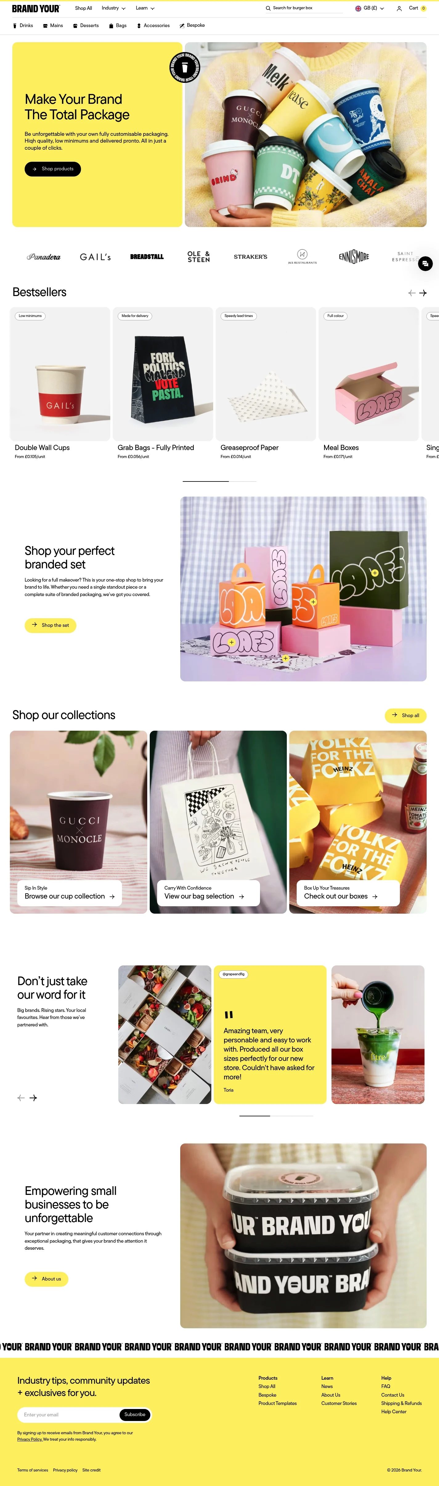
- Full page: https://cdn.designmunk.com/2026/09/30102332/brandyour-co-featured.webp
- Above the fold: https://cdn.designmunk.com/2026/09/30102332/brandyour-co-featured-1425x900.webp
- On DesignMunk: https://designmunk.com/brandyour/

Study these for hierarchy, rhythm, spacing and density. Where an image and the written spec disagree, the spec wins: the tokens were read from the page's own CSS, the images are one rendering of it.

## Before you start

Ask the user what they are building, who it is for, and what brand assets they already have — name, colours, typefaces. Wait for their answers before writing anything. Everything below is then applied to their product, not to the reference.

## Design specification

# Brandyour: Lemon Block Hero and Pill UI

## Overview

A bright, friendly retail system built on high contrast black-on-white with a saturated yellow accent. Tone is practical and upbeat—aimed at small to mid-size businesses shopping quickly. Layouts are spacious, copy is direct, and components favor rounded, approachable shapes. When tokens do not dictate a choice, prefer clarity, short lines, and airy spacing over density.

## Page Structure

- Global header: compact top utility bar with logo, primary navigation links, search field, locale/currency switcher, and cart; a secondary category strip follows.
- Split hero: left column is a yellow panel with display headline, short paragraph, and a black pill CTA; right column is a large lifestyle product photo; a circular badge overlays the image edge.
- Partner marquee: a single row of monochrome client logos spaced widely.
- Bestsellers: section heading, then a horizontal row/carousel of product cards with imagery, pill benefit chips, title and price; previous/next arrows at the right.
- Shop the set: short intro copy with a row of product tiles and a CTA to view a pre-composed set; tiles reuse the product-card pattern.
- Collections grid: three large category tiles with overlaid headings and links; a secondary "Shop all" link nearby.
- Testimonials: stacked quotes with Instagram handles and author names; compact, text-forward.
- Brand statement + CTA: brief mission line with an About link.
- Newsletter sign-up: single input and subscribe button with small-print privacy text.
- Footer: multi-column link lists (Products, Learn, Help) with legal links and copyright line.

## Colors

- Primary (#000000): Core text, icons, and the primary CTA background.
- Secondary (#7c7434): Muted olive accent used sparingly for tonal contrast in badges or details.
- Tertiary (#fdef6e): Saturated yellow for promotional surfaces like the hero panel and highlight tiles.
- Neutral (#ffffff): Base page background and card surfaces.
- Border (#e5e7eb): Subtle dividers, card borders, and chip outlines.
- Brand-black-mesa (#201f0f): Rich, warm near-black available for stamps, badges, or dark-on-yellow text.
- Surface ({colors.neutral}): Canonical surface token mapping to white backgrounds.
- On-surface ({colors.primary}): Default ink on light surfaces, mapping to black.

## Typography

- Family: Tt Commons Pro (custom, self-hosted). As a proprietary family, agents should not fetch it from Google; treat it as provided by the site. Suitable substitutes when unavailable: Inter, Manrope, or Work Sans.
- Headline LG (40px/1.2, 700): Primary display for hero and key sectional headings.
- Headline MD (32px/1.19, 700): Secondary headings and section leads.
- Headline SM (25px/1.52, 400, -0.048em): Tighter subheads on cards and tiles where hierarchy should soften.
- Headline XS (20px/1.5, 400, -0.024em): Product titles and overlines in compact components.
- Body MD (16px/3.16, 400, -0.086em): Base paragraph and UI text. When line-length is short (cards, badges), reduce apparent density by relying on whitespace rather than additional size.

## Layout

- Spacing scale: 8, 16, 32, 48, 64px. Use xs/sm inside components, md as section padding, lg/xl for hero and major dividers.
- Page grid: comfortable single-column flow with sectional modules; use split two-column layouts at desktop for hero and promotional rows, collapsing to stacked order on mobile.
- Content rhythm: generous white margins, clear gutters between cards, and consistent 16px internal padding on cards.
- Alignment: left-aligned text with short measure; images sit within cards or as full-bleed halves in split sections.

## Elevation & Depth

- Shadows are minimal: a soft ambient sm shadow (rgba(0,0,0,0.1) 0 0 10px) provides gentle lift for cards and hover states; larger elevations are unused.
- Hierarchy relies on color fields (yellow tertiary panels), bold type sizes, and whitespace. Thin borders (#e5e7eb) separate items where shadows are omitted.

## Shapes

- Corners: cards and tiles use 8px radii for friendly geometry without losing structure.
- Pills: interactive controls (primary/secondary buttons, chips, and search) use fully rounded corners (9999px) to reinforce approachability and repeat the brand shape.
- Imagery: live photos sit in simple rectangles; avoid ornamental frames.

## Components

- Buttons
  - Primary: 39px height, 8px x 16px padding, pill radius 9999px, black background (#000000) with white text.
  - Secondary: Same sizing with white background, black text; use for secondary actions on light surfaces.
  - Link: Text-only, black; no radius.
- Card
  - White background, black text, 16px padding, 8px radius; optional sm shadow and/or #e5e7eb border.

### Split Hero Module
- Two columns: left is a #fdef6e panel carrying a 40px/700 headline, 16px body, and primary pill CTA; right is a large product/lifestyle image. Optional circular badge overlaps the seam.

### Partner Logo Marquee
- Single horizontal row of monochrome client logos centered with ample spacing; no frames, typically no shadows or borders.

### Product Card (Bestsellers)
- 8px-radius white card with image area, top-left pill chip, product title in 20–25px range, and price line; light sm shadow on hover. Arrow controls advance the row.

### Benefit Chip
- Small pill with white or subtle-tint background, #e5e7eb border, and black text; used for flags like lead time or print method.

### Collections Tile
- Large image tile linking to a category; 8px radius, minimal overlay; heading uses Headline SM or XS, with a text link beneath.

### Testimonial Block
- Text-first quote with handle and author; sits on white with generous vertical spacing; no avatar required.

### Newsletter Bar
- Single input and primary pill button aligned inline on desktop; small-print privacy line beneath.

## Do's and Don'ts

- Do reserve #fdef6e for promotional panels and hero backgrounds; keep most surfaces white for clarity.
- Do use pill buttons (9999px radius) for primary actions and slim 8px cards for content blocks to maintain the page's recurring shape language.
- Do pair borders (#e5e7eb) with the sm shadow sparingly; never stack heavy shadows.
- Don't place low-contrast chips over very bright imagery; add a white backing or move them to clear areas.
- Don't introduce additional accent colors; the system relies on black, white, and a single yellow with minimal olive accents.
- Don't tighten text tracking beyond the provided tokens; maintain readability across short lines.

## Agent Prompt Guide

Quick colour reference — Text: #000000; Background: #ffffff; Border: #e5e7eb; Accent: #fdef6e (yellow), optional accent #7c7434 (olive).

1) Build a split hero with lemon panel
- Desktop: two columns, 50/50; mobile: stack with yellow panel first.
- Left panel background: #fdef6e; right panel: image.
- Heading: 40px/1.2, 700, font-family: "Tt Commons Pro", Inter, system-ui; color #000000.
- Body: 16px, font-family same as above; color #000000; max-width ~40ch.
- Primary CTA: height 39px; padding 8px 16px; radius 9999px; background #000000; text #ffffff.
- Section padding: 64px top/bottom.

2) Product card for "Bestsellers"
- Container: background #ffffff; radius 8px; padding 16px; optional shadow rgba(0,0,0,0.1) 0 0 10px; border 1px solid #e5e7eb (if no shadow).
- Title: 20–25px (use Headline XS or SM), color #000000.
- Meta/price: 16px Body MD.
- Benefit chip: pill radius 9999px; 1px border #e5e7eb; background #ffffff; text #000000.

3) Navigation with search
- Bar background #ffffff; text #000000.
- Search input: height 39px; radius 9999px; border 1px solid #e5e7eb; placeholder 16px Body MD; icon #000000.
- Include locale/currency switch and cart icon aligned right.

4) Collections trio
- Three 8px-radius tiles on white; each tile has image, overlaid heading (25px Headline SM, #000000) and a link.
- Gaps: 32px between tiles; section padding 48px.

5) Testimonial block
- White background; quotes set in Headline XS (20px/1.5) with Body MD (16px) attribution.
- Use generous spacing: 32px between quotes; optional thin divider #e5e7eb.

## Similar Brands

- MOO: Black/white foundation with bright accent color and tidy product cards; MOO leans more typographic while Brandyour foregrounds lifestyle imagery.
- Vistaprint: Broad catalog ecommerce with pill buttons and light shadows; Vistaprint uses more blue and denser grids.
- Packhelp: Packaging-focused with big color fields and category tiles; Brandyour's palette is simpler and warmer.
- Sticker Mule: Bold black CTA styling and minimal palette; Sticker Mule is heavier and more contrasty across all sections.

## Tokens

### CSS custom properties

```css
:root {
  /* Colors */
  --color-primary: #000000;
  --color-secondary: #7c7434;
  --color-tertiary: #fdef6e;
  --color-neutral: #ffffff;
  --color-border: #e5e7eb;
  --color-brand-black-mesa: #201f0f;
  --color-surface: var(--color-neutral);
  --color-on-surface: var(--color-primary);

  /* Typography */
  --text-headline-lg-size: 40px;
  --text-headline-lg-weight: 700;
  --text-headline-lg-leading: 1.2;
  --text-headline-md-size: 32px;
  --text-headline-md-weight: 700;
  --text-headline-md-leading: 1.19;
  --text-headline-sm-size: 25px;
  --text-headline-sm-weight: 400;
  --text-headline-sm-leading: 1.52;
  --text-headline-sm-tracking: -0.048em;
  --text-headline-xs-size: 20px;
  --text-headline-xs-weight: 400;
  --text-headline-xs-leading: 1.5;
  --text-headline-xs-tracking: -0.024em;
  --text-body-md-size: 16px;
  --text-body-md-weight: 400;
  --text-body-md-leading: 3.16;
  --text-body-md-tracking: -0.086em;
  --font-tt-commons-pro-26b1a622b7eddd4b: "tt-commons-pro-26b1a622b7eddd4b";

  /* Rounded */
  --radius-sm: 8px;
  --radius-full: 9999px;

  /* Spacing */
  --spacing-xs: 8px;
  --spacing-sm: 16px;
  --spacing-md: 32px;
  --spacing-lg: 48px;
  --spacing-xl: 64px;

  /* Components */
  --button-primary-background-color: var(--color-primary);
  --button-primary-text-color: var(--color-neutral);
  --button-primary-rounded: var(--radius-full);
  --button-primary-padding: 8px 16px;
  --button-primary-height: 39px;
  --button-secondary-background-color: var(--color-neutral);
  --button-secondary-text-color: var(--color-primary);
  --button-secondary-rounded: var(--radius-full);
  --button-secondary-padding: 8px 16px;
  --button-secondary-height: 39px;
  --button-link-text-color: var(--color-primary);
  --button-link-rounded: 0px;
  --card-background-color: var(--color-neutral);
  --card-text-color: var(--color-primary);
  --card-rounded: var(--radius-sm);
  --card-padding: 16px;
}
```

### Tailwind theme

```css
@theme {
  --color-primary: #000000;
  --color-secondary: #7c7434;
  --color-tertiary: #fdef6e;
  --color-neutral: #ffffff;
  --color-border: #e5e7eb;
  --color-brand-black-mesa: #201f0f;
  --color-surface: #ffffff;
  --color-on-surface: #000000;
  --font-headline-lg: "tt-commons-pro-26b1a622b7eddd4b";
  --font-headline-md: "tt-commons-pro-26b1a622b7eddd4b";
  --font-headline-sm: "tt-commons-pro-26b1a622b7eddd4b";
  --font-headline-xs: "tt-commons-pro-26b1a622b7eddd4b";
  --font-body-md: "tt-commons-pro-26b1a622b7eddd4b";
  --text-headline-lg: 40px;
  --text-headline-md: 32px;
  --text-headline-sm: 25px;
  --text-headline-xs: 20px;
  --text-body-md: 16px;
  --tracking-headline-sm: -0.048em;
  --tracking-headline-xs: -0.024em;
  --tracking-body-md: -0.086em;
  --font-weight-headline-lg: 700;
  --font-weight-headline-md: 700;
  --font-weight-headline-sm: 400;
  --font-weight-headline-xs: 400;
  --font-weight-body-md: 400;
  --radius-sm: 8px;
  --radius-full: 9999px;
  --spacing-xs: 8px;
  --spacing-sm: 16px;
  --spacing-md: 32px;
  --spacing-lg: 48px;
  --spacing-xl: 64px;
}
```

### Design tokens (DTCG)

```json
{
    "$schema": "https://www.designtokens.org/schemas/2025.10/format.json",
    "color": {
        "$type": "color",
        "primary": {
            "$value": {
                "colorSpace": "srgb",
                "components": [
                    0,
                    0,
                    0
                ],
                "hex": "#000000"
            }
        },
        "secondary": {
            "$value": {
                "colorSpace": "srgb",
                "components": [
                    0.486,
                    0.455,
                    0.204
                ],
                "hex": "#7c7434"
            }
        },
        "tertiary": {
            "$value": {
                "colorSpace": "srgb",
                "components": [
                    0.992,
                    0.937,
                    0.431
                ],
                "hex": "#fdef6e"
            }
        },
        "neutral": {
            "$value": {
                "colorSpace": "srgb",
                "components": [
                    1,
                    1,
                    1
                ],
                "hex": "#ffffff"
            }
        },
        "border": {
            "$value": {
                "colorSpace": "srgb",
                "components": [
                    0.898,
                    0.906,
                    0.922
                ],
                "hex": "#e5e7eb"
            }
        },
        "brand-black-mesa": {
            "$value": {
                "colorSpace": "srgb",
                "components": [
                    0.125,
                    0.122,
                    0.059
                ],
                "hex": "#201f0f"
            }
        },
        "surface": {
            "$value": {
                "colorSpace": "srgb",
                "components": [
                    1,
                    1,
                    1
                ],
                "hex": "#ffffff"
            }
        },
        "on-surface": {
            "$value": {
                "colorSpace": "srgb",
                "components": [
                    0,
                    0,
                    0
                ],
                "hex": "#000000"
            }
        }
    },
    "spacing": {
        "$type": "dimension",
        "xs": {
            "$value": {
                "value": 8,
                "unit": "px"
            }
        },
        "sm": {
            "$value": {
                "value": 16,
                "unit": "px"
            }
        },
        "md": {
            "$value": {
                "value": 32,
                "unit": "px"
            }
        },
        "lg": {
            "$value": {
                "value": 48,
                "unit": "px"
            }
        },
        "xl": {
            "$value": {
                "value": 64,
                "unit": "px"
            }
        }
    },
    "rounded": {
        "$type": "dimension",
        "sm": {
            "$value": {
                "value": 8,
                "unit": "px"
            }
        },
        "full": {
            "$value": {
                "value": 9999,
                "unit": "px"
            }
        }
    },
    "typography": {
        "headline-lg": {
            "$type": "typography",
            "$value": {
                "fontFamily": "tt-commons-pro-26b1a622b7eddd4b",
                "fontSize": {
                    "value": 40,
                    "unit": "px"
                },
                "fontWeight": 700
            }
        },
        "headline-md": {
            "$type": "typography",
            "$value": {
                "fontFamily": "tt-commons-pro-26b1a622b7eddd4b",
                "fontSize": {
                    "value": 32,
                    "unit": "px"
                },
                "fontWeight": 700
            }
        },
        "headline-sm": {
            "$type": "typography",
            "$value": {
                "fontFamily": "tt-commons-pro-26b1a622b7eddd4b",
                "fontSize": {
                    "value": 25,
                    "unit": "px"
                },
                "fontWeight": 400,
                "letterSpacing": {
                    "value": -0.048,
                    "unit": "em"
                }
            }
        },
        "headline-xs": {
            "$type": "typography",
            "$value": {
                "fontFamily": "tt-commons-pro-26b1a622b7eddd4b",
                "fontSize": {
                    "value": 20,
                    "unit": "px"
                },
                "fontWeight": 400,
                "letterSpacing": {
                    "value": -0.024,
                    "unit": "em"
                }
            }
        },
        "body-md": {
            "$type": "typography",
            "$value": {
                "fontFamily": "tt-commons-pro-26b1a622b7eddd4b",
                "fontSize": {
                    "value": 16,
                    "unit": "px"
                },
                "fontWeight": 400,
                "letterSpacing": {
                    "value": -0.086,
                    "unit": "em"
                }
            }
        }
    }
}
```

## Rules

- **Fonts.** If the specification names a custom or self-hosted family, use one of the substitutes it names. Never reference a typeface you cannot actually load — it will fall back to a system font and undo the typography.
- **Colour.** Derive the palette from the user's brand. Use the token values as a guide to *relationships* — contrast, tint, how many accents carry the page — not as hex codes to paste.
- **Never reproduce** the wordmark, mascot, logo, brand name, illustrations, icon set, screenshots or any copy from the reference.
- **Never present the result as Brandyour**, or imply any connection to it.
- If something is unspecified, choose clarity and legibility over decoration.
---
version: alpha
name: Brandyour
description: Be unforgettable with fully customisable packaging.
colors:
  primary: "#000000"
  secondary: "#7c7434"
  tertiary: "#fdef6e"
  neutral: "#ffffff"
  border: "#e5e7eb"
  brand-black-mesa: "#201f0f"
  surface: "{colors.neutral}"
  on-surface: "{colors.primary}"
typography:
  headline-lg:
    fontFamily: tt-commons-pro-26b1a622b7eddd4b
    fontSize: 40px
    fontWeight: 700
    lineHeight: 1.2
  headline-md:
    fontFamily: tt-commons-pro-26b1a622b7eddd4b
    fontSize: 32px
    fontWeight: 700
    lineHeight: 1.19
  headline-sm:
    fontFamily: tt-commons-pro-26b1a622b7eddd4b
    fontSize: 25px
    fontWeight: 400
    lineHeight: 1.52
    letterSpacing: -0.048em
  headline-xs:
    fontFamily: tt-commons-pro-26b1a622b7eddd4b
    fontSize: 20px
    fontWeight: 400
    lineHeight: 1.5
    letterSpacing: -0.024em
  body-md:
    fontFamily: tt-commons-pro-26b1a622b7eddd4b
    fontSize: 16px
    fontWeight: 400
    lineHeight: 3.16
    letterSpacing: -0.086em
rounded:
  sm: 8px
  full: 9999px
spacing:
  xs: 8px
  sm: 16px
  md: 32px
  lg: 48px
  xl: 64px
components:
  button-primary:
    backgroundColor: "{colors.primary}"
    textColor: "{colors.neutral}"
    rounded: "{rounded.full}"
    padding: 8px 16px
    height: 39px
  button-secondary:
    backgroundColor: "{colors.neutral}"
    textColor: "{colors.primary}"
    rounded: "{rounded.full}"
    padding: 8px 16px
    height: 39px
  button-link:
    textColor: "{colors.primary}"
    rounded: 0px
  card:
    backgroundColor: "{colors.neutral}"
    textColor: "{colors.primary}"
    rounded: "{rounded.sm}"
    padding: 16px
---

# Brandyour: Lemon Block Hero and Pill UI

## Overview

A bright, friendly retail system built on high contrast black-on-white with a saturated yellow accent. Tone is practical and upbeat—aimed at small to mid-size businesses shopping quickly. Layouts are spacious, copy is direct, and components favor rounded, approachable shapes. When tokens do not dictate a choice, prefer clarity, short lines, and airy spacing over density.

## Page Structure

- Global header: compact top utility bar with logo, primary navigation links, search field, locale/currency switcher, and cart; a secondary category strip follows.
- Split hero: left column is a yellow panel with display headline, short paragraph, and a black pill CTA; right column is a large lifestyle product photo; a circular badge overlays the image edge.
- Partner marquee: a single row of monochrome client logos spaced widely.
- Bestsellers: section heading, then a horizontal row/carousel of product cards with imagery, pill benefit chips, title and price; previous/next arrows at the right.
- Shop the set: short intro copy with a row of product tiles and a CTA to view a pre-composed set; tiles reuse the product-card pattern.
- Collections grid: three large category tiles with overlaid headings and links; a secondary "Shop all" link nearby.
- Testimonials: stacked quotes with Instagram handles and author names; compact, text-forward.
- Brand statement + CTA: brief mission line with an About link.
- Newsletter sign-up: single input and subscribe button with small-print privacy text.
- Footer: multi-column link lists (Products, Learn, Help) with legal links and copyright line.

## Colors

- Primary (#000000): Core text, icons, and the primary CTA background.
- Secondary (#7c7434): Muted olive accent used sparingly for tonal contrast in badges or details.
- Tertiary (#fdef6e): Saturated yellow for promotional surfaces like the hero panel and highlight tiles.
- Neutral (#ffffff): Base page background and card surfaces.
- Border (#e5e7eb): Subtle dividers, card borders, and chip outlines.
- Brand-black-mesa (#201f0f): Rich, warm near-black available for stamps, badges, or dark-on-yellow text.
- Surface ({colors.neutral}): Canonical surface token mapping to white backgrounds.
- On-surface ({colors.primary}): Default ink on light surfaces, mapping to black.

## Typography

- Family: Tt Commons Pro (custom, self-hosted). As a proprietary family, agents should not fetch it from Google; treat it as provided by the site. Suitable substitutes when unavailable: Inter, Manrope, or Work Sans.
- Headline LG (40px/1.2, 700): Primary display for hero and key sectional headings.
- Headline MD (32px/1.19, 700): Secondary headings and section leads.
- Headline SM (25px/1.52, 400, -0.048em): Tighter subheads on cards and tiles where hierarchy should soften.
- Headline XS (20px/1.5, 400, -0.024em): Product titles and overlines in compact components.
- Body MD (16px/3.16, 400, -0.086em): Base paragraph and UI text. When line-length is short (cards, badges), reduce apparent density by relying on whitespace rather than additional size.

## Layout

- Spacing scale: 8, 16, 32, 48, 64px. Use xs/sm inside components, md as section padding, lg/xl for hero and major dividers.
- Page grid: comfortable single-column flow with sectional modules; use split two-column layouts at desktop for hero and promotional rows, collapsing to stacked order on mobile.
- Content rhythm: generous white margins, clear gutters between cards, and consistent 16px internal padding on cards.
- Alignment: left-aligned text with short measure; images sit within cards or as full-bleed halves in split sections.

## Elevation & Depth

- Shadows are minimal: a soft ambient sm shadow (rgba(0,0,0,0.1) 0 0 10px) provides gentle lift for cards and hover states; larger elevations are unused.
- Hierarchy relies on color fields (yellow tertiary panels), bold type sizes, and whitespace. Thin borders (#e5e7eb) separate items where shadows are omitted.

## Shapes

- Corners: cards and tiles use 8px radii for friendly geometry without losing structure.
- Pills: interactive controls (primary/secondary buttons, chips, and search) use fully rounded corners (9999px) to reinforce approachability and repeat the brand shape.
- Imagery: live photos sit in simple rectangles; avoid ornamental frames.

## Components

- Buttons
  - Primary: 39px height, 8px x 16px padding, pill radius 9999px, black background (#000000) with white text.
  - Secondary: Same sizing with white background, black text; use for secondary actions on light surfaces.
  - Link: Text-only, black; no radius.
- Card
  - White background, black text, 16px padding, 8px radius; optional sm shadow and/or #e5e7eb border.

### Split Hero Module
- Two columns: left is a #fdef6e panel carrying a 40px/700 headline, 16px body, and primary pill CTA; right is a large product/lifestyle image. Optional circular badge overlaps the seam.

### Partner Logo Marquee
- Single horizontal row of monochrome client logos centered with ample spacing; no frames, typically no shadows or borders.

### Product Card (Bestsellers)
- 8px-radius white card with image area, top-left pill chip, product title in 20–25px range, and price line; light sm shadow on hover. Arrow controls advance the row.

### Benefit Chip
- Small pill with white or subtle-tint background, #e5e7eb border, and black text; used for flags like lead time or print method.

### Collections Tile
- Large image tile linking to a category; 8px radius, minimal overlay; heading uses Headline SM or XS, with a text link beneath.

### Testimonial Block
- Text-first quote with handle and author; sits on white with generous vertical spacing; no avatar required.

### Newsletter Bar
- Single input and primary pill button aligned inline on desktop; small-print privacy line beneath.

## Do's and Don'ts

- Do reserve #fdef6e for promotional panels and hero backgrounds; keep most surfaces white for clarity.
- Do use pill buttons (9999px radius) for primary actions and slim 8px cards for content blocks to maintain the page's recurring shape language.
- Do pair borders (#e5e7eb) with the sm shadow sparingly; never stack heavy shadows.
- Don't place low-contrast chips over very bright imagery; add a white backing or move them to clear areas.
- Don't introduce additional accent colors; the system relies on black, white, and a single yellow with minimal olive accents.
- Don't tighten text tracking beyond the provided tokens; maintain readability across short lines.

## Agent Prompt Guide

Quick colour reference — Text: #000000; Background: #ffffff; Border: #e5e7eb; Accent: #fdef6e (yellow), optional accent #7c7434 (olive).

1) Build a split hero with lemon panel
- Desktop: two columns, 50/50; mobile: stack with yellow panel first.
- Left panel background: #fdef6e; right panel: image.
- Heading: 40px/1.2, 700, font-family: "Tt Commons Pro", Inter, system-ui; color #000000.
- Body: 16px, font-family same as above; color #000000; max-width ~40ch.
- Primary CTA: height 39px; padding 8px 16px; radius 9999px; background #000000; text #ffffff.
- Section padding: 64px top/bottom.

2) Product card for "Bestsellers"
- Container: background #ffffff; radius 8px; padding 16px; optional shadow rgba(0,0,0,0.1) 0 0 10px; border 1px solid #e5e7eb (if no shadow).
- Title: 20–25px (use Headline XS or SM), color #000000.
- Meta/price: 16px Body MD.
- Benefit chip: pill radius 9999px; 1px border #e5e7eb; background #ffffff; text #000000.

3) Navigation with search
- Bar background #ffffff; text #000000.
- Search input: height 39px; radius 9999px; border 1px solid #e5e7eb; placeholder 16px Body MD; icon #000000.
- Include locale/currency switch and cart icon aligned right.

4) Collections trio
- Three 8px-radius tiles on white; each tile has image, overlaid heading (25px Headline SM, #000000) and a link.
- Gaps: 32px between tiles; section padding 48px.

5) Testimonial block
- White background; quotes set in Headline XS (20px/1.5) with Body MD (16px) attribution.
- Use generous spacing: 32px between quotes; optional thin divider #e5e7eb.

## Similar Brands

- MOO: Black/white foundation with bright accent color and tidy product cards; MOO leans more typographic while Brandyour foregrounds lifestyle imagery.
- Vistaprint: Broad catalog ecommerce with pill buttons and light shadows; Vistaprint uses more blue and denser grids.
- Packhelp: Packaging-focused with big color fields and category tiles; Brandyour's palette is simpler and warmer.
- Sticker Mule: Bold black CTA styling and minimal palette; Sticker Mule is heavier and more contrasty across all sections.
:root {
  /* Colors */
  --color-primary: #000000;
  --color-secondary: #7c7434;
  --color-tertiary: #fdef6e;
  --color-neutral: #ffffff;
  --color-border: #e5e7eb;
  --color-brand-black-mesa: #201f0f;
  --color-surface: var(--color-neutral);
  --color-on-surface: var(--color-primary);

  /* Typography */
  --text-headline-lg-size: 40px;
  --text-headline-lg-weight: 700;
  --text-headline-lg-leading: 1.2;
  --text-headline-md-size: 32px;
  --text-headline-md-weight: 700;
  --text-headline-md-leading: 1.19;
  --text-headline-sm-size: 25px;
  --text-headline-sm-weight: 400;
  --text-headline-sm-leading: 1.52;
  --text-headline-sm-tracking: -0.048em;
  --text-headline-xs-size: 20px;
  --text-headline-xs-weight: 400;
  --text-headline-xs-leading: 1.5;
  --text-headline-xs-tracking: -0.024em;
  --text-body-md-size: 16px;
  --text-body-md-weight: 400;
  --text-body-md-leading: 3.16;
  --text-body-md-tracking: -0.086em;
  --font-tt-commons-pro-26b1a622b7eddd4b: "tt-commons-pro-26b1a622b7eddd4b";

  /* Rounded */
  --radius-sm: 8px;
  --radius-full: 9999px;

  /* Spacing */
  --spacing-xs: 8px;
  --spacing-sm: 16px;
  --spacing-md: 32px;
  --spacing-lg: 48px;
  --spacing-xl: 64px;

  /* Components */
  --button-primary-background-color: var(--color-primary);
  --button-primary-text-color: var(--color-neutral);
  --button-primary-rounded: var(--radius-full);
  --button-primary-padding: 8px 16px;
  --button-primary-height: 39px;
  --button-secondary-background-color: var(--color-neutral);
  --button-secondary-text-color: var(--color-primary);
  --button-secondary-rounded: var(--radius-full);
  --button-secondary-padding: 8px 16px;
  --button-secondary-height: 39px;
  --button-link-text-color: var(--color-primary);
  --button-link-rounded: 0px;
  --card-background-color: var(--color-neutral);
  --card-text-color: var(--color-primary);
  --card-rounded: var(--radius-sm);
  --card-padding: 16px;
}
{
  "$schema": "https://www.designtokens.org/schemas/2025.10/format.json",
  "$description": "Be unforgettable with fully customisable packaging.",
  "color": {
    "$type": "color",
    "primary": {
      "$value": {
        "colorSpace": "srgb",
        "components": [
          0,
          0,
          0
        ],
        "hex": "#000000"
      }
    },
    "secondary": {
      "$value": {
        "colorSpace": "srgb",
        "components": [
          0.486,
          0.455,
          0.204
        ],
        "hex": "#7c7434"
      }
    },
    "tertiary": {
      "$value": {
        "colorSpace": "srgb",
        "components": [
          0.992,
          0.937,
          0.431
        ],
        "hex": "#fdef6e"
      }
    },
    "neutral": {
      "$value": {
        "colorSpace": "srgb",
        "components": [
          1,
          1,
          1
        ],
        "hex": "#ffffff"
      }
    },
    "border": {
      "$value": {
        "colorSpace": "srgb",
        "components": [
          0.898,
          0.906,
          0.922
        ],
        "hex": "#e5e7eb"
      }
    },
    "brand-black-mesa": {
      "$value": {
        "colorSpace": "srgb",
        "components": [
          0.125,
          0.122,
          0.059
        ],
        "hex": "#201f0f"
      }
    },
    "surface": {
      "$value": {
        "colorSpace": "srgb",
        "components": [
          1,
          1,
          1
        ],
        "hex": "#ffffff"
      }
    },
    "on-surface": {
      "$value": {
        "colorSpace": "srgb",
        "components": [
          0,
          0,
          0
        ],
        "hex": "#000000"
      }
    }
  },
  "spacing": {
    "$type": "dimension",
    "xs": {
      "$value": {
        "value": 8,
        "unit": "px"
      }
    },
    "sm": {
      "$value": {
        "value": 16,
        "unit": "px"
      }
    },
    "md": {
      "$value": {
        "value": 32,
        "unit": "px"
      }
    },
    "lg": {
      "$value": {
        "value": 48,
        "unit": "px"
      }
    },
    "xl": {
      "$value": {
        "value": 64,
        "unit": "px"
      }
    }
  },
  "rounded": {
    "$type": "dimension",
    "sm": {
      "$value": {
        "value": 8,
        "unit": "px"
      }
    },
    "full": {
      "$value": {
        "value": 9999,
        "unit": "px"
      }
    }
  },
  "typography": {
    "headline-lg": {
      "$type": "typography",
      "$value": {
        "fontFamily": "tt-commons-pro-26b1a622b7eddd4b",
        "fontSize": {
          "value": 40,
          "unit": "px"
        },
        "fontWeight": 700
      }
    },
    "headline-md": {
      "$type": "typography",
      "$value": {
        "fontFamily": "tt-commons-pro-26b1a622b7eddd4b",
        "fontSize": {
          "value": 32,
          "unit": "px"
        },
        "fontWeight": 700
      }
    },
    "headline-sm": {
      "$type": "typography",
      "$value": {
        "fontFamily": "tt-commons-pro-26b1a622b7eddd4b",
        "fontSize": {
          "value": 25,
          "unit": "px"
        },
        "fontWeight": 400,
        "letterSpacing": {
          "value": -0.048,
          "unit": "em"
        }
      }
    },
    "headline-xs": {
      "$type": "typography",
      "$value": {
        "fontFamily": "tt-commons-pro-26b1a622b7eddd4b",
        "fontSize": {
          "value": 20,
          "unit": "px"
        },
        "fontWeight": 400,
        "letterSpacing": {
          "value": -0.024,
          "unit": "em"
        }
      }
    },
    "body-md": {
      "$type": "typography",
      "$value": {
        "fontFamily": "tt-commons-pro-26b1a622b7eddd4b",
        "fontSize": {
          "value": 16,
          "unit": "px"
        },
        "fontWeight": 400,
        "letterSpacing": {
          "value": -0.086,
          "unit": "em"
        }
      }
    }
  }
}
@theme {
--color-primary: #000000;
--color-secondary: #7c7434;
--color-tertiary: #fdef6e;
--color-neutral: #ffffff;
--color-border: #e5e7eb;
--color-brand-black-mesa: #201f0f;
--color-surface: #ffffff;
--color-on-surface: #000000;
--font-headline-lg: "tt-commons-pro-26b1a622b7eddd4b";
--font-headline-md: "tt-commons-pro-26b1a622b7eddd4b";
--font-headline-sm: "tt-commons-pro-26b1a622b7eddd4b";
--font-headline-xs: "tt-commons-pro-26b1a622b7eddd4b";
--font-body-md: "tt-commons-pro-26b1a622b7eddd4b";
--text-headline-lg: 40px;
--text-headline-md: 32px;
--text-headline-sm: 25px;
--text-headline-xs: 20px;
--text-body-md: 16px;
--tracking-headline-sm: -0.048em;
--tracking-headline-xs: -0.024em;
--tracking-body-md: -0.086em;
--font-weight-headline-lg: 700;
--font-weight-headline-md: 700;
--font-weight-headline-sm: 400;
--font-weight-headline-xs: 400;
--font-weight-body-md: 400;
--radius-sm: 8px;
--radius-full: 9999px;
--spacing-xs: 8px;
--spacing-sm: 16px;
--spacing-md: 32px;
--spacing-lg: 48px;
--spacing-xl: 64px;
} # Design brief: the Brandyour design language
Below is a complete design specification measured from a real, published web page. Use it as a design language for the user's product. It is not a page to reproduce.
## Reference images
- Full page: https://cdn.designmunk.com/2026/09/30102332/brandyour-co-featured.webp
- Above the fold: https://cdn.designmunk.com/2026/09/30102332/brandyour-co-featured-1425x900.webp
- On DesignMunk: https://designmunk.com/brandyour/
Study these for hierarchy, rhythm, spacing and density. Where an image and the written spec disagree, the spec wins: the tokens were read from the page's own CSS, the images are one rendering of it.
## Before you start
Ask the user what they are building, who it is for, and what brand assets they already have — name, colours, typefaces. Wait for their answers before writing anything. Everything below is then applied to their product, not to the reference.
## Design specification
# Brandyour: Lemon Block Hero and Pill UI
## Overview
A bright, friendly retail system built on high contrast black-on-white with a saturated yellow accent. Tone is practical and upbeat—aimed at small to mid-size businesses shopping quickly. Layouts are spacious, copy is direct, and components favor rounded, approachable shapes. When tokens do not dictate a choice, prefer clarity, short lines, and airy spacing over density.
## Page Structure
- Global header: compact top utility bar with logo, primary navigation links, search field, locale/currency switcher, and cart; a secondary category strip follows.
- Split hero: left column is a yellow panel with display headline, short paragraph, and a black pill CTA; right column is a large lifestyle product photo; a circular badge overlays the image edge.
- Partner marquee: a single row of monochrome client logos spaced widely.
- Bestsellers: section heading, then a horizontal row/carousel of product cards with imagery, pill benefit chips, title and price; previous/next arrows at the right.
- Shop the set: short intro copy with a row of product tiles and a CTA to view a pre-composed set; tiles reuse the product-card pattern.
- Collections grid: three large category tiles with overlaid headings and links; a secondary "Shop all" link nearby.
- Testimonials: stacked quotes with Instagram handles and author names; compact, text-forward.
- Brand statement + CTA: brief mission line with an About link.
- Newsletter sign-up: single input and subscribe button with small-print privacy text.
- Footer: multi-column link lists (Products, Learn, Help) with legal links and copyright line.
## Colors
- Primary (#000000): Core text, icons, and the primary CTA background.
- Secondary (#7c7434): Muted olive accent used sparingly for tonal contrast in badges or details.
- Tertiary (#fdef6e): Saturated yellow for promotional surfaces like the hero panel and highlight tiles.
- Neutral (#ffffff): Base page background and card surfaces.
- Border (#e5e7eb): Subtle dividers, card borders, and chip outlines.
- Brand-black-mesa (#201f0f): Rich, warm near-black available for stamps, badges, or dark-on-yellow text.
- Surface ({colors.neutral}): Canonical surface token mapping to white backgrounds.
- On-surface ({colors.primary}): Default ink on light surfaces, mapping to black.
## Typography
- Family: Tt Commons Pro (custom, self-hosted). As a proprietary family, agents should not fetch it from Google; treat it as provided by the site. Suitable substitutes when unavailable: Inter, Manrope, or Work Sans.
- Headline LG (40px/1.2, 700): Primary display for hero and key sectional headings.
- Headline MD (32px/1.19, 700): Secondary headings and section leads.
- Headline SM (25px/1.52, 400, -0.048em): Tighter subheads on cards and tiles where hierarchy should soften.
- Headline XS (20px/1.5, 400, -0.024em): Product titles and overlines in compact components.
- Body MD (16px/3.16, 400, -0.086em): Base paragraph and UI text. When line-length is short (cards, badges), reduce apparent density by relying on whitespace rather than additional size.
## Layout
- Spacing scale: 8, 16, 32, 48, 64px. Use xs/sm inside components, md as section padding, lg/xl for hero and major dividers.
- Page grid: comfortable single-column flow with sectional modules; use split two-column layouts at desktop for hero and promotional rows, collapsing to stacked order on mobile.
- Content rhythm: generous white margins, clear gutters between cards, and consistent 16px internal padding on cards.
- Alignment: left-aligned text with short measure; images sit within cards or as full-bleed halves in split sections.
## Elevation & Depth
- Shadows are minimal: a soft ambient sm shadow (rgba(0,0,0,0.1) 0 0 10px) provides gentle lift for cards and hover states; larger elevations are unused.
- Hierarchy relies on color fields (yellow tertiary panels), bold type sizes, and whitespace. Thin borders (#e5e7eb) separate items where shadows are omitted.
## Shapes
- Corners: cards and tiles use 8px radii for friendly geometry without losing structure.
- Pills: interactive controls (primary/secondary buttons, chips, and search) use fully rounded corners (9999px) to reinforce approachability and repeat the brand shape.
- Imagery: live photos sit in simple rectangles; avoid ornamental frames.
## Components
- Buttons
- Primary: 39px height, 8px x 16px padding, pill radius 9999px, black background (#000000) with white text.
- Secondary: Same sizing with white background, black text; use for secondary actions on light surfaces.
- Link: Text-only, black; no radius.
- Card
- White background, black text, 16px padding, 8px radius; optional sm shadow and/or #e5e7eb border.
### Split Hero Module
- Two columns: left is a #fdef6e panel carrying a 40px/700 headline, 16px body, and primary pill CTA; right is a large product/lifestyle image. Optional circular badge overlaps the seam.
### Partner Logo Marquee
- Single horizontal row of monochrome client logos centered with ample spacing; no frames, typically no shadows or borders.
### Product Card (Bestsellers)
- 8px-radius white card with image area, top-left pill chip, product title in 20–25px range, and price line; light sm shadow on hover. Arrow controls advance the row.
### Benefit Chip
- Small pill with white or subtle-tint background, #e5e7eb border, and black text; used for flags like lead time or print method.
### Collections Tile
- Large image tile linking to a category; 8px radius, minimal overlay; heading uses Headline SM or XS, with a text link beneath.
### Testimonial Block
- Text-first quote with handle and author; sits on white with generous vertical spacing; no avatar required.
### Newsletter Bar
- Single input and primary pill button aligned inline on desktop; small-print privacy line beneath.
## Do's and Don'ts
- Do reserve #fdef6e for promotional panels and hero backgrounds; keep most surfaces white for clarity.
- Do use pill buttons (9999px radius) for primary actions and slim 8px cards for content blocks to maintain the page's recurring shape language.
- Do pair borders (#e5e7eb) with the sm shadow sparingly; never stack heavy shadows.
- Don't place low-contrast chips over very bright imagery; add a white backing or move them to clear areas.
- Don't introduce additional accent colors; the system relies on black, white, and a single yellow with minimal olive accents.
- Don't tighten text tracking beyond the provided tokens; maintain readability across short lines.
## Agent Prompt Guide
Quick colour reference — Text: #000000; Background: #ffffff; Border: #e5e7eb; Accent: #fdef6e (yellow), optional accent #7c7434 (olive).
1) Build a split hero with lemon panel
- Desktop: two columns, 50/50; mobile: stack with yellow panel first.
- Left panel background: #fdef6e; right panel: image.
- Heading: 40px/1.2, 700, font-family: "Tt Commons Pro", Inter, system-ui; color #000000.
- Body: 16px, font-family same as above; color #000000; max-width ~40ch.
- Primary CTA: height 39px; padding 8px 16px; radius 9999px; background #000000; text #ffffff.
- Section padding: 64px top/bottom.
2) Product card for "Bestsellers"
- Container: background #ffffff; radius 8px; padding 16px; optional shadow rgba(0,0,0,0.1) 0 0 10px; border 1px solid #e5e7eb (if no shadow).
- Title: 20–25px (use Headline XS or SM), color #000000.
- Meta/price: 16px Body MD.
- Benefit chip: pill radius 9999px; 1px border #e5e7eb; background #ffffff; text #000000.
3) Navigation with search
- Bar background #ffffff; text #000000.
- Search input: height 39px; radius 9999px; border 1px solid #e5e7eb; placeholder 16px Body MD; icon #000000.
- Include locale/currency switch and cart icon aligned right.
4) Collections trio
- Three 8px-radius tiles on white; each tile has image, overlaid heading (25px Headline SM, #000000) and a link.
- Gaps: 32px between tiles; section padding 48px.
5) Testimonial block
- White background; quotes set in Headline XS (20px/1.5) with Body MD (16px) attribution.
- Use generous spacing: 32px between quotes; optional thin divider #e5e7eb.
## Tokens
### CSS custom properties
```css
:root {
/* Colors */
--color-primary: #000000;
--color-secondary: #7c7434;
--color-tertiary: #fdef6e;
--color-neutral: #ffffff;
--color-border: #e5e7eb;
--color-brand-black-mesa: #201f0f;
--color-surface: var(--color-neutral);
--color-on-surface: var(--color-primary);
/* Typography */
--text-headline-lg-size: 40px;
--text-headline-lg-weight: 700;
--text-headline-lg-leading: 1.2;
--text-headline-md-size: 32px;
--text-headline-md-weight: 700;
--text-headline-md-leading: 1.19;
--text-headline-sm-size: 25px;
--text-headline-sm-weight: 400;
--text-headline-sm-leading: 1.52;
--text-headline-sm-tracking: -0.048em;
--text-headline-xs-size: 20px;
--text-headline-xs-weight: 400;
--text-headline-xs-leading: 1.5;
--text-headline-xs-tracking: -0.024em;
--text-body-md-size: 16px;
--text-body-md-weight: 400;
--text-body-md-leading: 3.16;
--text-body-md-tracking: -0.086em;
--font-tt-commons-pro-26b1a622b7eddd4b: "tt-commons-pro-26b1a622b7eddd4b";
/* Rounded */
--radius-sm: 8px;
--radius-full: 9999px;
/* Spacing */
--spacing-xs: 8px;
--spacing-sm: 16px;
--spacing-md: 32px;
--spacing-lg: 48px;
--spacing-xl: 64px;
/* Components */
--button-primary-background-color: var(--color-primary);
--button-primary-text-color: var(--color-neutral);
--button-primary-rounded: var(--radius-full);
--button-primary-padding: 8px 16px;
--button-primary-height: 39px;
--button-secondary-background-color: var(--color-neutral);
--button-secondary-text-color: var(--color-primary);
--button-secondary-rounded: var(--radius-full);
--button-secondary-padding: 8px 16px;
--button-secondary-height: 39px;
--button-link-text-color: var(--color-primary);
--button-link-rounded: 0px;
--card-background-color: var(--color-neutral);
--card-text-color: var(--color-primary);
--card-rounded: var(--radius-sm);
--card-padding: 16px;
}
```
## Rules
- **Fonts.** If the specification names a custom or self-hosted family, use one of the substitutes it names. Never reference a typeface you cannot actually load — it will fall back to a system font and undo the typography.
- **Colour.** Derive the palette from the user's brand. Use the token values as a guide to *relationships* — contrast, tint, how many accents carry the page — not as hex codes to paste.
- **Never reproduce** the wordmark, mascot, logo, brand name, illustrations, icon set, screenshots or any copy from the reference.
- **Never present the result as Brandyour**, or imply any connection to it.
- If something is unspecified, choose clarity and legibility over decoration.