



Aunt Fannie’s
auntfannies.com
Cleaning differently: no harsh chemicals, plant-based, pet-friendly goodness
auntfannies.com
AI Breakdown
Design export
# Design brief: the Aunt Fannie’s design language

Below is a complete design specification measured from a real, published web page. Use it as a design language for the user's product. It is not a page to reproduce.

## Reference images

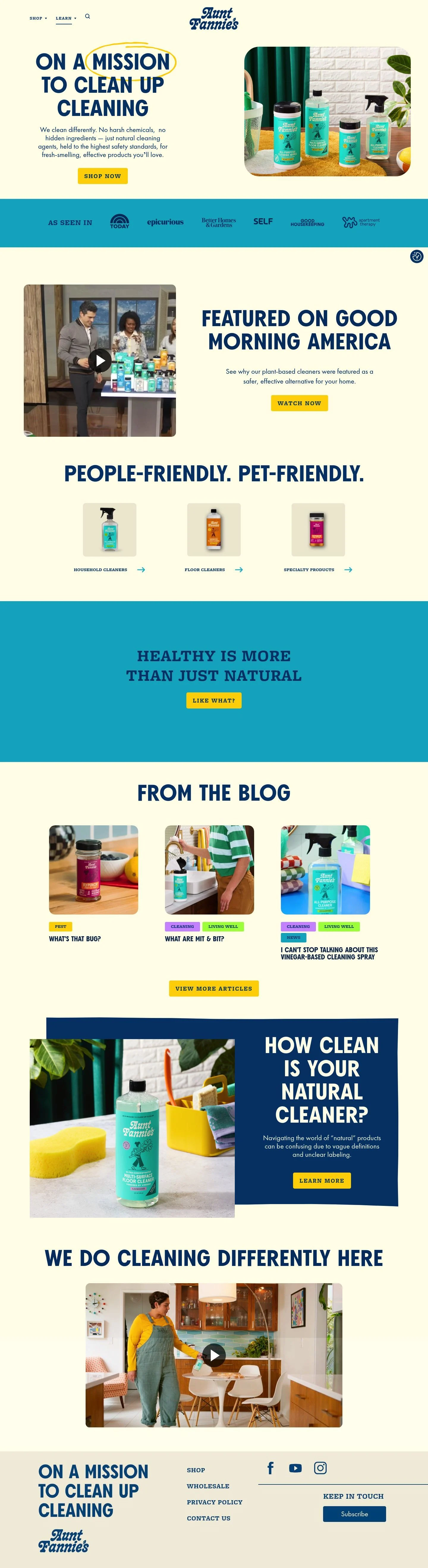
- Full page: https://cdn.designmunk.com/2026/09/04181222/auntfannies-com-featured.webp
- Above the fold: https://cdn.designmunk.com/2026/09/04181222/auntfannies-com-featured.webp
- On DesignMunk: https://designmunk.com/aunt-fannies/

Study these for hierarchy, rhythm, spacing and density. Where an image and the written spec disagree, the spec wins: the tokens were read from the page's own CSS, the images are one rendering of it.

## Before you start

Ask the user what they are building, who it is for, and what brand assets they already have — name, colours, typefaces. Wait for their answers before writing anything. Everything below is then applied to their product, not to the reference.

## Design specification

# Aunt Fannie's: Hand-Drawn Lemon Highlights on Buttermilk

## Overview

A bright, family-friendly brand aimed at health-conscious households. The interface should feel cheerful, safe, and straightforward—warm backgrounds, strong navy typography, and one citrus accent. Layouts lean spacious with generous margins and large, readable type. When tokens do not cover a case, favor clarity, contrast, and simplicity over ornament.

## Colors

- Primary (#004075): Deep navy for headlines, body text, and icons.
- Tertiary (#ffd400): Lemon accent for CTAs, highlights, and emphasis marks.
- Neutral (#fffdeb): Buttermilk background for the site canvas and cards.
- Border (#e5e7eb): Light gray dividers for subtle separation.
- Surface ({colors.neutral}): Same buttermilk tone for panels and cards.
- On-surface ({colors.primary}): Navy for text placed on surfaces.

## Typography

- Axel Grotesk (headline-lg, headline-sm): Bold geometric sans for primary headlines at 78px and 43px, weight 700, tight leading for punch. Availability: custom/self-hosted; substitutes: Montserrat 700, Archivo 700, or Work Sans 700.
- Freight Micro Pro (headline-md, headline-xs): Editorial serif for secondary headlines at 58px and 32px with slight letter-spacing. Availability: custom/self-hosted; substitutes: Bitter 700, Merriweather 700, or Source Serif 4 700.
- Futura PT (body-md): Geometric sans for body and strong UI labels at 24px, weight 700. Availability: custom/self-hosted; substitutes: Poppins 600/700, Montserrat 600/700, or Nunito 700. Keep body copy line height at 1.5 for readability and use lighter weights when needed if substitutes provide them.

## Layout

Spacing follows a roomy scale: 10, 26, 40, 56, 80px. Build sections in multiples of 40–56px for vertical rhythm. Use a simple two-column grid (text/media) at large breakpoints and stack to a single column on mobile. Apply xl (80px) for hero top/bottom padding, md (40px) for standard section gutters, and xs (10px) for intra-component spacing.

## Elevation & Depth

Depth is minimal. Use md shadow (rgba(0,0,0,0.3) 0 32px 68px) sparingly for feature media like product shots or videos. The sm shadow (rgba(172,171,171,0.3) 0 -1px 10px) can lift small floating elements. Larger shadows are none; most hierarchy comes from color contrast, whitespace, and light borders (#e5e7eb).

## Shapes

Corners are soft and friendly: sm 4px for small inputs, md 5px for buttons and chips, lg 8px for cards and media frames. Link buttons remain square (0px) to read as text actions.

## Components

Buttons follow the tokens; text color is navy and primary buttons use lemon backgrounds.

### Button — Primary
- Background #ffd400, text #004075, height 54px, padding 15x20, radius 5px. Default CTA across the site.

### Button — Secondary
- Text #004075 on neutral background; 54px height, 15x20 padding, radius 4px. Use for tertiary actions and less prominent CTAs.

### Button — Link
- Text #004075, no background, radius 0. Use inline for "Learn more" and "Shop now" links.

### Card
- Background #fffdeb, text #004075, padding 16px, radius 8px. Optional sm shadow for lift.

### Hero Split Banner
- Two-column layout: left copy stack (78px Axel-style headline; body 24px), right product image inside an 8px-radius frame. CTA uses the primary button. Add a lemon accent stroke/oval as decoration if art-directed.

### Press Logo Bar
- Full-width color band with centered logotypes. When constrained to tokens, use background #004075 with neutral logos or text and vertical padding 40–56px.

### "Featured on Good Morning America" Video Panel
- Section headline at 58px serif, supporting copy at 24px. Video frame uses 8px radius and md shadow; place a primary or secondary CTA nearby.

### Product Category Tiles (3-up)
- Each tile uses the card spec with image, short line of copy, and a link button. Gap 40px; stack to single column on mobile.

### Safety-First Info Row
- Short paragraph plus a horizontal list of link chips (button-link style) such as "Clean formulas" and "Cruelty free." Use md spacing between chips.

### Blog Teasers
- Two to three card teasers with 32–43px headlines, excerpt in 24px, and a link button. Use 8px radii and border dividers if no shadow.

## Do's and Don'ts

- Do reserve #ffd400 for primary CTAs, highlights, and emphasis marks; overusing it weakens the brand's single-accent strategy.
- Do keep major headlines in navy (#004075) on buttermilk (#fffdeb) for maximum contrast.
- Do use lg (8px) radii for media and cards; smaller radii make the system feel fussy.
- Don't introduce new blues or teals; if a band needs color, use the primary navy.
- Don't apply heavy shadows widely; use md only for featured media and keep most surfaces flat.
- Don't pair serif and sans within the same headline line; choose one family per heading level.

## Agent Prompt Guide

Quick color reference — Text: #004075; Background: #fffdeb; Border: #e5e7eb; Accent: #ffd400.

1) Build the hero split
- Canvas #fffdeb. Left column: H1 78px, 700, Montserrat as a substitute for Axel Grotesk, line-height 1, color #004075. Body 24px Poppins 600, line-height 1.5, color #004075. Primary button 54px tall, padding 15px 20px, radius 5px, background #ffd400, text #004075. Right column: image inside a 8px radius card on #fffdeb with md shadow rgba(0,0,0,0.3) 0 32px 68px.

2) Press logo band
- Full-bleed section with background #004075 and vertical padding 56px. Center a row of monochrome logos in #fffdeb. Section title in Bitter 700 (substitute for Freight Micro Pro) at 32px, letter-spacing 0.016em, color #fffdeb.

3) Three product tiles
- Grid: 3 columns, 40px gap. Each tile is a card: background #fffdeb, radius 8px, padding 16px, border 1px solid #e5e7eb. Tile title 43px Montserrat 700; supporting line 24px Poppins 600. Action is a link button in #004075, radius 0.

4) Video feature
- Section heading 58px Bitter 700, letter-spacing 0.013em, color #004075. Video frame 16:9 with radius 8px and md shadow. Place a primary button (#ffd400, radius 5px, 54px height) below with 40px spacing.

## Similar Brands

- Method: Bright single-accent DTC cleaner; more pastel overall, with rounder type and higher contrast section bands.
- Mrs. Meyer's Clean Day: Friendly serif/sans mix and warm palette; uses more pattern and illustration than Aunt Fannie's restrained layout.
- Blueland: Minimal, cool palette with strong product photography; skews more clinical and grid-tight.
- Grove Collaborative: Navy and cream with soft CTAs; more editorial content density and complex navigation.
- Seventh Generation: Earthy greens and serif headlines; heavier emphasis on sustainability messaging over playful tone.

## Tokens

### CSS custom properties

```css
:root {
  /* Colors */
  --color-primary: #004075;
  --color-tertiary: #ffd400;
  --color-neutral: #fffdeb;
  --color-border: #e5e7eb;
  --color-surface: var(--color-neutral);
  --color-on-surface: var(--color-primary);

  /* Typography */
  --text-headline-lg-size: 78px;
  --text-headline-lg-weight: 700;
  --text-headline-lg-leading: 1;
  --text-headline-md-size: 58px;
  --text-headline-md-weight: 700;
  --text-headline-md-leading: 1.21;
  --text-headline-md-tracking: 0.013em;
  --text-headline-sm-size: 43px;
  --text-headline-sm-weight: 700;
  --text-headline-sm-leading: 1.21;
  --text-headline-xs-size: 32px;
  --text-headline-xs-weight: 700;
  --text-headline-xs-leading: 1.19;
  --text-headline-xs-tracking: 0.016em;
  --text-body-md-size: 24px;
  --text-body-md-weight: 700;
  --text-body-md-leading: 1.5;
  --font-axel-grotesk: "Axel Grotesk";
  --font-freight-micro-pro: "freight-micro-pro";
  --font-futura-pt: "Futura PT";

  /* Rounded */
  --radius-sm: 4px;
  --radius-md: 5px;
  --radius-lg: 8px;

  /* Spacing */
  --spacing-xs: 10px;
  --spacing-sm: 26px;
  --spacing-md: 40px;
  --spacing-lg: 56px;
  --spacing-xl: 80px;

  /* Components */
  --button-primary-background-color: var(--color-tertiary);
  --button-primary-text-color: var(--color-primary);
  --button-primary-rounded: var(--radius-md);
  --button-primary-padding: 15px 20px;
  --button-primary-height: 54px;
  --button-secondary-text-color: var(--color-primary);
  --button-secondary-rounded: var(--radius-sm);
  --button-secondary-padding: 15px 20px;
  --button-secondary-height: 54px;
  --button-link-text-color: var(--color-primary);
  --button-link-rounded: 0px;
  --card-background-color: var(--color-neutral);
  --card-text-color: var(--color-primary);
  --card-rounded: var(--radius-lg);
  --card-padding: 16px;
}
```

### Tailwind theme

```css
@theme {
  --color-primary: #004075;
  --color-tertiary: #ffd400;
  --color-neutral: #fffdeb;
  --color-border: #e5e7eb;
  --color-surface: #fffdeb;
  --color-on-surface: #004075;
  --font-headline-lg: "Axel Grotesk";
  --font-headline-md: "freight-micro-pro";
  --font-headline-sm: "Axel Grotesk";
  --font-headline-xs: "freight-micro-pro";
  --font-body-md: "Futura PT";
  --text-headline-lg: 78px;
  --text-headline-md: 58px;
  --text-headline-sm: 43px;
  --text-headline-xs: 32px;
  --text-body-md: 24px;
  --tracking-headline-md: 0.013em;
  --tracking-headline-xs: 0.016em;
  --font-weight-headline-lg: 700;
  --font-weight-headline-md: 700;
  --font-weight-headline-sm: 700;
  --font-weight-headline-xs: 700;
  --font-weight-body-md: 700;
  --radius-sm: 4px;
  --radius-md: 5px;
  --radius-lg: 8px;
  --spacing-xs: 10px;
  --spacing-sm: 26px;
  --spacing-md: 40px;
  --spacing-lg: 56px;
  --spacing-xl: 80px;
}
```

### Design tokens (DTCG)

```json
{
    "$schema": "https://www.designtokens.org/schemas/2025.10/format.json",
    "color": {
        "$type": "color",
        "primary": {
            "$value": {
                "colorSpace": "srgb",
                "components": [
                    0,
                    0.251,
                    0.459
                ],
                "hex": "#004075"
            }
        },
        "tertiary": {
            "$value": {
                "colorSpace": "srgb",
                "components": [
                    1,
                    0.831,
                    0
                ],
                "hex": "#ffd400"
            }
        },
        "neutral": {
            "$value": {
                "colorSpace": "srgb",
                "components": [
                    1,
                    0.992,
                    0.922
                ],
                "hex": "#fffdeb"
            }
        },
        "border": {
            "$value": {
                "colorSpace": "srgb",
                "components": [
                    0.898,
                    0.906,
                    0.922
                ],
                "hex": "#e5e7eb"
            }
        },
        "surface": {
            "$value": {
                "colorSpace": "srgb",
                "components": [
                    1,
                    0.992,
                    0.922
                ],
                "hex": "#fffdeb"
            }
        },
        "on-surface": {
            "$value": {
                "colorSpace": "srgb",
                "components": [
                    0,
                    0.251,
                    0.459
                ],
                "hex": "#004075"
            }
        }
    },
    "spacing": {
        "$type": "dimension",
        "xs": {
            "$value": {
                "value": 10,
                "unit": "px"
            }
        },
        "sm": {
            "$value": {
                "value": 26,
                "unit": "px"
            }
        },
        "md": {
            "$value": {
                "value": 40,
                "unit": "px"
            }
        },
        "lg": {
            "$value": {
                "value": 56,
                "unit": "px"
            }
        },
        "xl": {
            "$value": {
                "value": 80,
                "unit": "px"
            }
        }
    },
    "rounded": {
        "$type": "dimension",
        "sm": {
            "$value": {
                "value": 4,
                "unit": "px"
            }
        },
        "md": {
            "$value": {
                "value": 5,
                "unit": "px"
            }
        },
        "lg": {
            "$value": {
                "value": 8,
                "unit": "px"
            }
        }
    },
    "typography": {
        "headline-lg": {
            "$type": "typography",
            "$value": {
                "fontFamily": "Axel Grotesk",
                "fontSize": {
                    "value": 78,
                    "unit": "px"
                },
                "fontWeight": 700
            }
        },
        "headline-md": {
            "$type": "typography",
            "$value": {
                "fontFamily": "freight-micro-pro",
                "fontSize": {
                    "value": 58,
                    "unit": "px"
                },
                "fontWeight": 700,
                "letterSpacing": {
                    "value": 0.013,
                    "unit": "em"
                }
            }
        },
        "headline-sm": {
            "$type": "typography",
            "$value": {
                "fontFamily": "Axel Grotesk",
                "fontSize": {
                    "value": 43,
                    "unit": "px"
                },
                "fontWeight": 700
            }
        },
        "headline-xs": {
            "$type": "typography",
            "$value": {
                "fontFamily": "freight-micro-pro",
                "fontSize": {
                    "value": 32,
                    "unit": "px"
                },
                "fontWeight": 700,
                "letterSpacing": {
                    "value": 0.016,
                    "unit": "em"
                }
            }
        },
        "body-md": {
            "$type": "typography",
            "$value": {
                "fontFamily": "Futura PT",
                "fontSize": {
                    "value": 24,
                    "unit": "px"
                },
                "fontWeight": 700
            }
        }
    }
}
```

## Rules

- **Fonts.** If the specification names a custom or self-hosted family, use one of the substitutes it names. Never reference a typeface you cannot actually load — it will fall back to a system font and undo the typography.
- **Colour.** Derive the palette from the user's brand. Use the token values as a guide to *relationships* — contrast, tint, how many accents carry the page — not as hex codes to paste.
- **Never reproduce** the wordmark, mascot, logo, brand name, illustrations, icon set, screenshots or any copy from the reference.
- **Never present the result as Aunt Fannie’s**, or imply any connection to it.
- If something is unspecified, choose clarity and legibility over decoration.
---
version: alpha
name: Aunt Fannie's
description: "Cleaning differently: no harsh chemicals, plant-based, pet-friendly goodness"
colors:
  primary: "#004075"
  tertiary: "#ffd400"
  neutral: "#fffdeb"
  border: "#e5e7eb"
  surface: "{colors.neutral}"
  on-surface: "{colors.primary}"
typography:
  headline-lg:
    fontFamily: Axel Grotesk
    fontSize: 78px
    fontWeight: 700
    lineHeight: 1
  headline-md:
    fontFamily: freight-micro-pro
    fontSize: 58px
    fontWeight: 700
    lineHeight: 1.21
    letterSpacing: 0.013em
  headline-sm:
    fontFamily: Axel Grotesk
    fontSize: 43px
    fontWeight: 700
    lineHeight: 1.21
  headline-xs:
    fontFamily: freight-micro-pro
    fontSize: 32px
    fontWeight: 700
    lineHeight: 1.19
    letterSpacing: 0.016em
  body-md:
    fontFamily: Futura PT
    fontSize: 24px
    fontWeight: 700
    lineHeight: 1.5
rounded:
  sm: 4px
  md: 5px
  lg: 8px
spacing:
  xs: 10px
  sm: 26px
  md: 40px
  lg: 56px
  xl: 80px
components:
  button-primary:
    backgroundColor: "{colors.tertiary}"
    textColor: "{colors.primary}"
    rounded: "{rounded.md}"
    padding: 15px 20px
    height: 54px
  button-secondary:
    textColor: "{colors.primary}"
    rounded: "{rounded.sm}"
    padding: 15px 20px
    height: 54px
  button-link:
    textColor: "{colors.primary}"
    rounded: 0px
  card:
    backgroundColor: "{colors.neutral}"
    textColor: "{colors.primary}"
    rounded: "{rounded.lg}"
    padding: 16px
---

# Aunt Fannie's: Hand-Drawn Lemon Highlights on Buttermilk

## Overview

A bright, family-friendly brand aimed at health-conscious households. The interface should feel cheerful, safe, and straightforward—warm backgrounds, strong navy typography, and one citrus accent. Layouts lean spacious with generous margins and large, readable type. When tokens do not cover a case, favor clarity, contrast, and simplicity over ornament.

## Colors

- Primary (#004075): Deep navy for headlines, body text, and icons.
- Tertiary (#ffd400): Lemon accent for CTAs, highlights, and emphasis marks.
- Neutral (#fffdeb): Buttermilk background for the site canvas and cards.
- Border (#e5e7eb): Light gray dividers for subtle separation.
- Surface ({colors.neutral}): Same buttermilk tone for panels and cards.
- On-surface ({colors.primary}): Navy for text placed on surfaces.

## Typography

- Axel Grotesk (headline-lg, headline-sm): Bold geometric sans for primary headlines at 78px and 43px, weight 700, tight leading for punch. Availability: custom/self-hosted; substitutes: Montserrat 700, Archivo 700, or Work Sans 700.
- Freight Micro Pro (headline-md, headline-xs): Editorial serif for secondary headlines at 58px and 32px with slight letter-spacing. Availability: custom/self-hosted; substitutes: Bitter 700, Merriweather 700, or Source Serif 4 700.
- Futura PT (body-md): Geometric sans for body and strong UI labels at 24px, weight 700. Availability: custom/self-hosted; substitutes: Poppins 600/700, Montserrat 600/700, or Nunito 700. Keep body copy line height at 1.5 for readability and use lighter weights when needed if substitutes provide them.

## Layout

Spacing follows a roomy scale: 10, 26, 40, 56, 80px. Build sections in multiples of 40–56px for vertical rhythm. Use a simple two-column grid (text/media) at large breakpoints and stack to a single column on mobile. Apply xl (80px) for hero top/bottom padding, md (40px) for standard section gutters, and xs (10px) for intra-component spacing.

## Elevation & Depth

Depth is minimal. Use md shadow (rgba(0,0,0,0.3) 0 32px 68px) sparingly for feature media like product shots or videos. The sm shadow (rgba(172,171,171,0.3) 0 -1px 10px) can lift small floating elements. Larger shadows are none; most hierarchy comes from color contrast, whitespace, and light borders (#e5e7eb).

## Shapes

Corners are soft and friendly: sm 4px for small inputs, md 5px for buttons and chips, lg 8px for cards and media frames. Link buttons remain square (0px) to read as text actions.

## Components

Buttons follow the tokens; text color is navy and primary buttons use lemon backgrounds.

### Button — Primary
- Background #ffd400, text #004075, height 54px, padding 15x20, radius 5px. Default CTA across the site.

### Button — Secondary
- Text #004075 on neutral background; 54px height, 15x20 padding, radius 4px. Use for tertiary actions and less prominent CTAs.

### Button — Link
- Text #004075, no background, radius 0. Use inline for "Learn more" and "Shop now" links.

### Card
- Background #fffdeb, text #004075, padding 16px, radius 8px. Optional sm shadow for lift.

### Hero Split Banner
- Two-column layout: left copy stack (78px Axel-style headline; body 24px), right product image inside an 8px-radius frame. CTA uses the primary button. Add a lemon accent stroke/oval as decoration if art-directed.

### Press Logo Bar
- Full-width color band with centered logotypes. When constrained to tokens, use background #004075 with neutral logos or text and vertical padding 40–56px.

### "Featured on Good Morning America" Video Panel
- Section headline at 58px serif, supporting copy at 24px. Video frame uses 8px radius and md shadow; place a primary or secondary CTA nearby.

### Product Category Tiles (3-up)
- Each tile uses the card spec with image, short line of copy, and a link button. Gap 40px; stack to single column on mobile.

### Safety-First Info Row
- Short paragraph plus a horizontal list of link chips (button-link style) such as "Clean formulas" and "Cruelty free." Use md spacing between chips.

### Blog Teasers
- Two to three card teasers with 32–43px headlines, excerpt in 24px, and a link button. Use 8px radii and border dividers if no shadow.

## Do's and Don'ts

- Do reserve #ffd400 for primary CTAs, highlights, and emphasis marks; overusing it weakens the brand's single-accent strategy.
- Do keep major headlines in navy (#004075) on buttermilk (#fffdeb) for maximum contrast.
- Do use lg (8px) radii for media and cards; smaller radii make the system feel fussy.
- Don't introduce new blues or teals; if a band needs color, use the primary navy.
- Don't apply heavy shadows widely; use md only for featured media and keep most surfaces flat.
- Don't pair serif and sans within the same headline line; choose one family per heading level.

## Agent Prompt Guide

Quick color reference — Text: #004075; Background: #fffdeb; Border: #e5e7eb; Accent: #ffd400.

1) Build the hero split
- Canvas #fffdeb. Left column: H1 78px, 700, Montserrat as a substitute for Axel Grotesk, line-height 1, color #004075. Body 24px Poppins 600, line-height 1.5, color #004075. Primary button 54px tall, padding 15px 20px, radius 5px, background #ffd400, text #004075. Right column: image inside a 8px radius card on #fffdeb with md shadow rgba(0,0,0,0.3) 0 32px 68px.

2) Press logo band
- Full-bleed section with background #004075 and vertical padding 56px. Center a row of monochrome logos in #fffdeb. Section title in Bitter 700 (substitute for Freight Micro Pro) at 32px, letter-spacing 0.016em, color #fffdeb.

3) Three product tiles
- Grid: 3 columns, 40px gap. Each tile is a card: background #fffdeb, radius 8px, padding 16px, border 1px solid #e5e7eb. Tile title 43px Montserrat 700; supporting line 24px Poppins 600. Action is a link button in #004075, radius 0.

4) Video feature
- Section heading 58px Bitter 700, letter-spacing 0.013em, color #004075. Video frame 16:9 with radius 8px and md shadow. Place a primary button (#ffd400, radius 5px, 54px height) below with 40px spacing.

## Similar Brands

- Method: Bright single-accent DTC cleaner; more pastel overall, with rounder type and higher contrast section bands.
- Mrs. Meyer's Clean Day: Friendly serif/sans mix and warm palette; uses more pattern and illustration than Aunt Fannie's restrained layout.
- Blueland: Minimal, cool palette with strong product photography; skews more clinical and grid-tight.
- Grove Collaborative: Navy and cream with soft CTAs; more editorial content density and complex navigation.
- Seventh Generation: Earthy greens and serif headlines; heavier emphasis on sustainability messaging over playful tone.
:root {
  /* Colors */
  --color-primary: #004075;
  --color-tertiary: #ffd400;
  --color-neutral: #fffdeb;
  --color-border: #e5e7eb;
  --color-surface: var(--color-neutral);
  --color-on-surface: var(--color-primary);

  /* Typography */
  --text-headline-lg-size: 78px;
  --text-headline-lg-weight: 700;
  --text-headline-lg-leading: 1;
  --text-headline-md-size: 58px;
  --text-headline-md-weight: 700;
  --text-headline-md-leading: 1.21;
  --text-headline-md-tracking: 0.013em;
  --text-headline-sm-size: 43px;
  --text-headline-sm-weight: 700;
  --text-headline-sm-leading: 1.21;
  --text-headline-xs-size: 32px;
  --text-headline-xs-weight: 700;
  --text-headline-xs-leading: 1.19;
  --text-headline-xs-tracking: 0.016em;
  --text-body-md-size: 24px;
  --text-body-md-weight: 700;
  --text-body-md-leading: 1.5;
  --font-axel-grotesk: "Axel Grotesk";
  --font-freight-micro-pro: "freight-micro-pro";
  --font-futura-pt: "Futura PT";

  /* Rounded */
  --radius-sm: 4px;
  --radius-md: 5px;
  --radius-lg: 8px;

  /* Spacing */
  --spacing-xs: 10px;
  --spacing-sm: 26px;
  --spacing-md: 40px;
  --spacing-lg: 56px;
  --spacing-xl: 80px;

  /* Components */
  --button-primary-background-color: var(--color-tertiary);
  --button-primary-text-color: var(--color-primary);
  --button-primary-rounded: var(--radius-md);
  --button-primary-padding: 15px 20px;
  --button-primary-height: 54px;
  --button-secondary-text-color: var(--color-primary);
  --button-secondary-rounded: var(--radius-sm);
  --button-secondary-padding: 15px 20px;
  --button-secondary-height: 54px;
  --button-link-text-color: var(--color-primary);
  --button-link-rounded: 0px;
  --card-background-color: var(--color-neutral);
  --card-text-color: var(--color-primary);
  --card-rounded: var(--radius-lg);
  --card-padding: 16px;
}
{
  "$schema": "https://www.designtokens.org/schemas/2025.10/format.json",
  "$description": "Cleaning differently: no harsh chemicals, plant-based, pet-friendly goodness",
  "color": {
    "$type": "color",
    "primary": {
      "$value": {
        "colorSpace": "srgb",
        "components": [
          0,
          0.251,
          0.459
        ],
        "hex": "#004075"
      }
    },
    "tertiary": {
      "$value": {
        "colorSpace": "srgb",
        "components": [
          1,
          0.831,
          0
        ],
        "hex": "#ffd400"
      }
    },
    "neutral": {
      "$value": {
        "colorSpace": "srgb",
        "components": [
          1,
          0.992,
          0.922
        ],
        "hex": "#fffdeb"
      }
    },
    "border": {
      "$value": {
        "colorSpace": "srgb",
        "components": [
          0.898,
          0.906,
          0.922
        ],
        "hex": "#e5e7eb"
      }
    },
    "surface": {
      "$value": {
        "colorSpace": "srgb",
        "components": [
          1,
          0.992,
          0.922
        ],
        "hex": "#fffdeb"
      }
    },
    "on-surface": {
      "$value": {
        "colorSpace": "srgb",
        "components": [
          0,
          0.251,
          0.459
        ],
        "hex": "#004075"
      }
    }
  },
  "spacing": {
    "$type": "dimension",
    "xs": {
      "$value": {
        "value": 10,
        "unit": "px"
      }
    },
    "sm": {
      "$value": {
        "value": 26,
        "unit": "px"
      }
    },
    "md": {
      "$value": {
        "value": 40,
        "unit": "px"
      }
    },
    "lg": {
      "$value": {
        "value": 56,
        "unit": "px"
      }
    },
    "xl": {
      "$value": {
        "value": 80,
        "unit": "px"
      }
    }
  },
  "rounded": {
    "$type": "dimension",
    "sm": {
      "$value": {
        "value": 4,
        "unit": "px"
      }
    },
    "md": {
      "$value": {
        "value": 5,
        "unit": "px"
      }
    },
    "lg": {
      "$value": {
        "value": 8,
        "unit": "px"
      }
    }
  },
  "typography": {
    "headline-lg": {
      "$type": "typography",
      "$value": {
        "fontFamily": "Axel Grotesk",
        "fontSize": {
          "value": 78,
          "unit": "px"
        },
        "fontWeight": 700
      }
    },
    "headline-md": {
      "$type": "typography",
      "$value": {
        "fontFamily": "freight-micro-pro",
        "fontSize": {
          "value": 58,
          "unit": "px"
        },
        "fontWeight": 700,
        "letterSpacing": {
          "value": 0.013,
          "unit": "em"
        }
      }
    },
    "headline-sm": {
      "$type": "typography",
      "$value": {
        "fontFamily": "Axel Grotesk",
        "fontSize": {
          "value": 43,
          "unit": "px"
        },
        "fontWeight": 700
      }
    },
    "headline-xs": {
      "$type": "typography",
      "$value": {
        "fontFamily": "freight-micro-pro",
        "fontSize": {
          "value": 32,
          "unit": "px"
        },
        "fontWeight": 700,
        "letterSpacing": {
          "value": 0.016,
          "unit": "em"
        }
      }
    },
    "body-md": {
      "$type": "typography",
      "$value": {
        "fontFamily": "Futura PT",
        "fontSize": {
          "value": 24,
          "unit": "px"
        },
        "fontWeight": 700
      }
    }
  }
}
@theme {
--color-primary: #004075;
--color-tertiary: #ffd400;
--color-neutral: #fffdeb;
--color-border: #e5e7eb;
--color-surface: #fffdeb;
--color-on-surface: #004075;
--font-headline-lg: "Axel Grotesk";
--font-headline-md: "freight-micro-pro";
--font-headline-sm: "Axel Grotesk";
--font-headline-xs: "freight-micro-pro";
--font-body-md: "Futura PT";
--text-headline-lg: 78px;
--text-headline-md: 58px;
--text-headline-sm: 43px;
--text-headline-xs: 32px;
--text-body-md: 24px;
--tracking-headline-md: 0.013em;
--tracking-headline-xs: 0.016em;
--font-weight-headline-lg: 700;
--font-weight-headline-md: 700;
--font-weight-headline-sm: 700;
--font-weight-headline-xs: 700;
--font-weight-body-md: 700;
--radius-sm: 4px;
--radius-md: 5px;
--radius-lg: 8px;
--spacing-xs: 10px;
--spacing-sm: 26px;
--spacing-md: 40px;
--spacing-lg: 56px;
--spacing-xl: 80px;
} # Design brief: the Aunt Fannie’s design language
Below is a complete design specification measured from a real, published web page. Use it as a design language for the user's product. It is not a page to reproduce.
## Reference images
- Full page: https://cdn.designmunk.com/2026/09/04181222/auntfannies-com-featured.webp
- Above the fold: https://cdn.designmunk.com/2026/09/04181222/auntfannies-com-featured.webp
- On DesignMunk: https://designmunk.com/aunt-fannies/
Study these for hierarchy, rhythm, spacing and density. Where an image and the written spec disagree, the spec wins: the tokens were read from the page's own CSS, the images are one rendering of it.
## Before you start
Ask the user what they are building, who it is for, and what brand assets they already have — name, colours, typefaces. Wait for their answers before writing anything. Everything below is then applied to their product, not to the reference.
## Design specification
# Aunt Fannie's: Hand-Drawn Lemon Highlights on Buttermilk
## Overview
A bright, family-friendly brand aimed at health-conscious households. The interface should feel cheerful, safe, and straightforward—warm backgrounds, strong navy typography, and one citrus accent. Layouts lean spacious with generous margins and large, readable type. When tokens do not cover a case, favor clarity, contrast, and simplicity over ornament.
## Colors
- Primary (#004075): Deep navy for headlines, body text, and icons.
- Tertiary (#ffd400): Lemon accent for CTAs, highlights, and emphasis marks.
- Neutral (#fffdeb): Buttermilk background for the site canvas and cards.
- Border (#e5e7eb): Light gray dividers for subtle separation.
- Surface ({colors.neutral}): Same buttermilk tone for panels and cards.
- On-surface ({colors.primary}): Navy for text placed on surfaces.
## Typography
- Axel Grotesk (headline-lg, headline-sm): Bold geometric sans for primary headlines at 78px and 43px, weight 700, tight leading for punch. Availability: custom/self-hosted; substitutes: Montserrat 700, Archivo 700, or Work Sans 700.
- Freight Micro Pro (headline-md, headline-xs): Editorial serif for secondary headlines at 58px and 32px with slight letter-spacing. Availability: custom/self-hosted; substitutes: Bitter 700, Merriweather 700, or Source Serif 4 700.
- Futura PT (body-md): Geometric sans for body and strong UI labels at 24px, weight 700. Availability: custom/self-hosted; substitutes: Poppins 600/700, Montserrat 600/700, or Nunito 700. Keep body copy line height at 1.5 for readability and use lighter weights when needed if substitutes provide them.
## Layout
Spacing follows a roomy scale: 10, 26, 40, 56, 80px. Build sections in multiples of 40–56px for vertical rhythm. Use a simple two-column grid (text/media) at large breakpoints and stack to a single column on mobile. Apply xl (80px) for hero top/bottom padding, md (40px) for standard section gutters, and xs (10px) for intra-component spacing.
## Elevation & Depth
Depth is minimal. Use md shadow (rgba(0,0,0,0.3) 0 32px 68px) sparingly for feature media like product shots or videos. The sm shadow (rgba(172,171,171,0.3) 0 -1px 10px) can lift small floating elements. Larger shadows are none; most hierarchy comes from color contrast, whitespace, and light borders (#e5e7eb).
## Shapes
Corners are soft and friendly: sm 4px for small inputs, md 5px for buttons and chips, lg 8px for cards and media frames. Link buttons remain square (0px) to read as text actions.
## Components
Buttons follow the tokens; text color is navy and primary buttons use lemon backgrounds.
### Button — Primary
- Background #ffd400, text #004075, height 54px, padding 15x20, radius 5px. Default CTA across the site.
### Button — Secondary
- Text #004075 on neutral background; 54px height, 15x20 padding, radius 4px. Use for tertiary actions and less prominent CTAs.
### Button — Link
- Text #004075, no background, radius 0. Use inline for "Learn more" and "Shop now" links.
### Card
- Background #fffdeb, text #004075, padding 16px, radius 8px. Optional sm shadow for lift.
### Hero Split Banner
- Two-column layout: left copy stack (78px Axel-style headline; body 24px), right product image inside an 8px-radius frame. CTA uses the primary button. Add a lemon accent stroke/oval as decoration if art-directed.
### Press Logo Bar
- Full-width color band with centered logotypes. When constrained to tokens, use background #004075 with neutral logos or text and vertical padding 40–56px.
### "Featured on Good Morning America" Video Panel
- Section headline at 58px serif, supporting copy at 24px. Video frame uses 8px radius and md shadow; place a primary or secondary CTA nearby.
### Product Category Tiles (3-up)
- Each tile uses the card spec with image, short line of copy, and a link button. Gap 40px; stack to single column on mobile.
### Safety-First Info Row
- Short paragraph plus a horizontal list of link chips (button-link style) such as "Clean formulas" and "Cruelty free." Use md spacing between chips.
### Blog Teasers
- Two to three card teasers with 32–43px headlines, excerpt in 24px, and a link button. Use 8px radii and border dividers if no shadow.
## Do's and Don'ts
- Do reserve #ffd400 for primary CTAs, highlights, and emphasis marks; overusing it weakens the brand's single-accent strategy.
- Do keep major headlines in navy (#004075) on buttermilk (#fffdeb) for maximum contrast.
- Do use lg (8px) radii for media and cards; smaller radii make the system feel fussy.
- Don't introduce new blues or teals; if a band needs color, use the primary navy.
- Don't apply heavy shadows widely; use md only for featured media and keep most surfaces flat.
- Don't pair serif and sans within the same headline line; choose one family per heading level.
## Agent Prompt Guide
Quick color reference — Text: #004075; Background: #fffdeb; Border: #e5e7eb; Accent: #ffd400.
1) Build the hero split
- Canvas #fffdeb. Left column: H1 78px, 700, Montserrat as a substitute for Axel Grotesk, line-height 1, color #004075. Body 24px Poppins 600, line-height 1.5, color #004075. Primary button 54px tall, padding 15px 20px, radius 5px, background #ffd400, text #004075. Right column: image inside a 8px radius card on #fffdeb with md shadow rgba(0,0,0,0.3) 0 32px 68px.
2) Press logo band
- Full-bleed section with background #004075 and vertical padding 56px. Center a row of monochrome logos in #fffdeb. Section title in Bitter 700 (substitute for Freight Micro Pro) at 32px, letter-spacing 0.016em, color #fffdeb.
3) Three product tiles
- Grid: 3 columns, 40px gap. Each tile is a card: background #fffdeb, radius 8px, padding 16px, border 1px solid #e5e7eb. Tile title 43px Montserrat 700; supporting line 24px Poppins 600. Action is a link button in #004075, radius 0.
4) Video feature
- Section heading 58px Bitter 700, letter-spacing 0.013em, color #004075. Video frame 16:9 with radius 8px and md shadow. Place a primary button (#ffd400, radius 5px, 54px height) below with 40px spacing.
## Tokens
### CSS custom properties
```css
:root {
/* Colors */
--color-primary: #004075;
--color-tertiary: #ffd400;
--color-neutral: #fffdeb;
--color-border: #e5e7eb;
--color-surface: var(--color-neutral);
--color-on-surface: var(--color-primary);
/* Typography */
--text-headline-lg-size: 78px;
--text-headline-lg-weight: 700;
--text-headline-lg-leading: 1;
--text-headline-md-size: 58px;
--text-headline-md-weight: 700;
--text-headline-md-leading: 1.21;
--text-headline-md-tracking: 0.013em;
--text-headline-sm-size: 43px;
--text-headline-sm-weight: 700;
--text-headline-sm-leading: 1.21;
--text-headline-xs-size: 32px;
--text-headline-xs-weight: 700;
--text-headline-xs-leading: 1.19;
--text-headline-xs-tracking: 0.016em;
--text-body-md-size: 24px;
--text-body-md-weight: 700;
--text-body-md-leading: 1.5;
--font-axel-grotesk: "Axel Grotesk";
--font-freight-micro-pro: "freight-micro-pro";
--font-futura-pt: "Futura PT";
/* Rounded */
--radius-sm: 4px;
--radius-md: 5px;
--radius-lg: 8px;
/* Spacing */
--spacing-xs: 10px;
--spacing-sm: 26px;
--spacing-md: 40px;
--spacing-lg: 56px;
--spacing-xl: 80px;
/* Components */
--button-primary-background-color: var(--color-tertiary);
--button-primary-text-color: var(--color-primary);
--button-primary-rounded: var(--radius-md);
--button-primary-padding: 15px 20px;
--button-primary-height: 54px;
--button-secondary-text-color: var(--color-primary);
--button-secondary-rounded: var(--radius-sm);
--button-secondary-padding: 15px 20px;
--button-secondary-height: 54px;
--button-link-text-color: var(--color-primary);
--button-link-rounded: 0px;
--card-background-color: var(--color-neutral);
--card-text-color: var(--color-primary);
--card-rounded: var(--radius-lg);
--card-padding: 16px;
}
```
## Rules
- **Fonts.** If the specification names a custom or self-hosted family, use one of the substitutes it names. Never reference a typeface you cannot actually load — it will fall back to a system font and undo the typography.
- **Colour.** Derive the palette from the user's brand. Use the token values as a guide to *relationships* — contrast, tint, how many accents carry the page — not as hex codes to paste.
- **Never reproduce** the wordmark, mascot, logo, brand name, illustrations, icon set, screenshots or any copy from the reference.
- **Never present the result as Aunt Fannie’s**, or imply any connection to it.
- If something is unspecified, choose clarity and legibility over decoration.