Arcway About
arcway.ai
Arcway: 3D decision platform with real-time pricing for homebuilders.
arcway.ai
AI Breakdown
Design export
# Design brief: the Arcway About design language

Below is a complete design specification measured from a real, published web page. Use it as a design language for the user's product. It is not a page to reproduce.

## Reference images

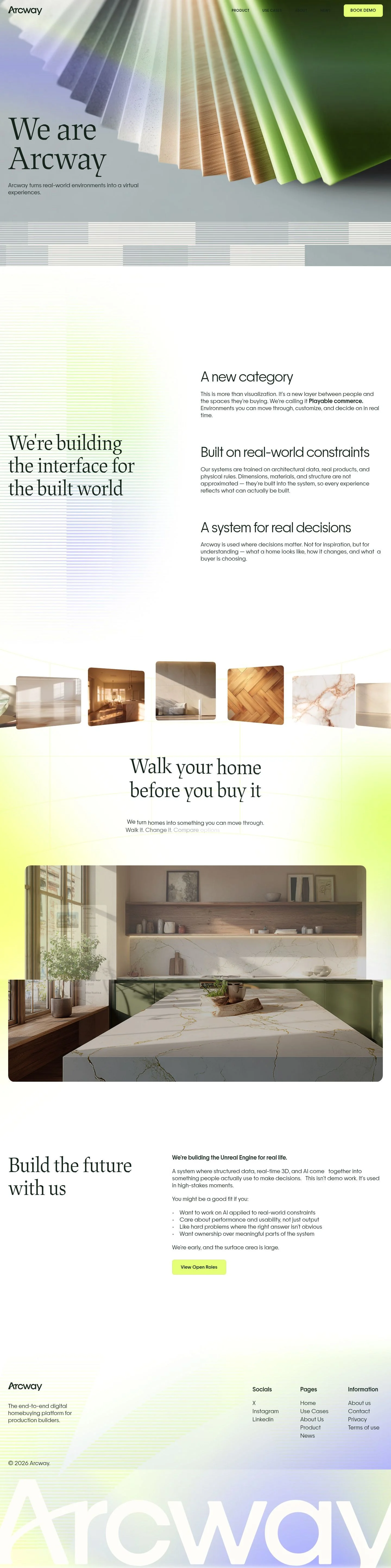
- Full page: https://cdn.designmunk.com/2026/09/10142907/arcway-ai-about-us-featured.webp
- Above the fold: https://cdn.designmunk.com/2026/09/10142907/arcway-ai-about-us-featured.webp
- On DesignMunk: https://designmunk.com/arcway-about-page/

Study these for hierarchy, rhythm, spacing and density. Where an image and the written spec disagree, the spec wins: the tokens were read from the page's own CSS, the images are one rendering of it.

## Before you start

Ask the user what they are building, who it is for, and what brand assets they already have — name, colours, typefaces. Wait for their answers before writing anything. Everything below is then applied to their product, not to the reference.

## Design specification

# Arcway: Bookish Serif, One Neon CTA, Plenty of Air

## Overview

Arcway's UI balances architectural seriousness with a single, high-energy accent. The experience should feel calm, engineered, and spacious. Target users are production homebuilders and partners evaluating a complex platform; typography carries authority, imagery stays tactile and material-centric, and the lone accent color signals primary actions.

## Colors

- **primary (#1b3025):** Deep forest ink for headlines, body text, and icons on light backgrounds.
- **secondary (#8c9994):** Muted utility tone for metadata, captions, and de-emphasized links.
- **tertiary (#e9fe89):** Signal lime for primary CTAs and highlight chips. Use sparingly for contrast and focus.
- **neutral (#ffffff):** Primary surface color for pages, cards, and modals.
- **border (#e5e7eb):** Subtle separator for tables, cards, and section dividers. Favor 1px lines with generous spacing.
- **surface (#ffffff):** Alias of neutral; use for panels and cards to keep a consistent light canvas.
- **on-surface (#1b3025):** Default text and icon color when rendering over surface/neutral.

## Typography

- Headline Display: DEMO JAF Lapture Display Regular at 96px/1.2 for H1. Custom/self-hosted; if unavailable, substitute Playfair Display, Cormorant Garamond, or Libre Baskerville for a similar high-contrast serif.
- Headline MD/SM/XS: Sans-serif system at 65/44/30px, 1.2 line height. Use a neutral grotesk; if standardizing, Inter, IBM Plex Sans, or Work Sans are solid, free choices.
- Body: PP Frama Light at 20px/1.5 with 0.02em tracking. Custom/self-hosted; substitute Inter Light, IBM Plex Sans Light, or Work Sans Light.
- Tone: Headlines carry authority; body copy is airy and readable. Keep letter-spacing on body small but positive to match the tokens.

## Layout

Spacing is intentionally polarized: compact micro-gaps (8–28px) for UI, then large section paddings (112–154px) to create calm, editorial rhythm. Use xs/sm for control groups and chips, md for paragraph and component spacing, lg for section paddings, and xl for hero/top-of-page blocks. Favor wide margins and generous negative space around imagery; let text blocks breathe rather than stretch full width.

## Elevation & Depth

Shadows are minimal; only a soft sm shadow is defined and should be reserved for floating elements (menus, dialogs) or hover emphasis. Most hierarchy comes from tonal contrast (#1b3025 on #ffffff), crisp 1px borders (#e5e7eb), and whitespace. Avoid medium/large drop shadows; depth is communicated by layering content, not heavy effects.

## Shapes

Two radii define the language: sm = 4px for subtle UI controls; md = 8px for cards and primary buttons. Use square corners for link-style buttons and structural dividers. Mixing radii on the same component should be avoided—choose a single radius per element to keep the system disciplined.

## Components

Buttons
- Primary Button: Background #e9fe89, text #0000ee, 8px radius, 12px x 24px padding, 46px height. Reserve for the key action (e.g., Book demo).
- Secondary Button: Text #1b3025 on transparent/neutral background, 4px radius, 12px x 24px, 46px height; pair with border #e5e7eb as needed.
- Link Button: Text #1b3025, 0px radius, no background; use for inline actions.

Card
- Background #ffffff, text #1b3025, 8px radius, 16px padding. Optional sm shadow for overlays.

Distinctive page components

### Navigation Bar
- Left logo, right nav links with a standout primary button. Links use primary text; the CTA uses the tertiary pill. Apply lg top/bottom padding only sparingly; keep nav compact with sm spacing.

### Hero Headline Stack
- H1 set in the display serif at 96px/1.2 with negative letter-spacing -0.02em. Body lead at 20px/1.5 below. Align to a generous left margin and allow xl vertical spacing.

### Materials Hero Image
- Edge-to-edge photography over the surface background. Do not add overlays heavier than sm shadow; rely on image contrast and whitespace.

### Striped Divider Band
- A decorative, low-contrast band separating hero and content. Build with 1px lines in border #e5e7eb on neutral #ffffff and lg vertical spacing.

### Configurator Price Chip
- A compact pill indicating selection and price (e.g., "White Marble – $778"). Use tertiary #e9fe89 background sparingly and primary text; 4–8px radius depending on density, with xs gaps between label and value.

### Section Intro Block
- For copy-led sections ("A new category", "Built on real-world constraints"), use headline-sm or xs (44–30px) followed by body at 20px. Space with md between heading and paragraph, lg above/below sections.

### Careers Teaser
- Headline-md at 65px with a secondary button or link. List items set in body-md with xs bullet spacing and md stack spacing. Keep the CTA clearly distinguished from nav CTAs.

### Footer Columns
- 2–4 link columns separated by border #e5e7eb, text in primary/secondary. Use sm for link gaps and md for column gutters, on a #ffffff surface with no shadows.

## Do's and Don'ts

Do
- Use #1b3025 for all primary text on #ffffff to maintain consistent tone.
- Reserve #e9fe89 for primary CTAs and key selection chips only.
- Keep hero headlines at 96px and give them xl vertical spacing.
- Use 1px borders (#e5e7eb) and whitespace instead of heavy shadows.

Don't
- Mix 4px and 8px radii on the same element.
- Introduce new accent colors; a single accent drives hierarchy.
- Place nav text directly over busy imagery without ensuring contrast.
- Compress section paddings below lg; the system depends on spacious rhythm.

## Agent Prompt Guide

Quick reference
- Text: #1b3025
- Background: #ffffff
- Border: #e5e7eb (1px)
- Accent/CTA: #e9fe89

1) Build a hero with serif headline and demo CTA
- Background #ffffff, full-bleed image on right half.
- H1: Playfair Display, 96px, weight 400, line-height 1.2, letter-spacing -0.02em, color #1b3025.
- Lead: Inter Light, 20px, line-height 1.5, letter-spacing 0.02em, color #1b3025, max-width 60–70ch, spacing md below H1.
- Primary button: 46px height, padding 12px 24px, radius 8px, background #e9fe89, text #0000ee.
- Vertical paddings: xl top, lg bottom.

2) Create a three-point feature band
- Section background #ffffff, top/bottom padding lg.
- Each feature: heading set in Inter 30px/1.2, body Inter 20px/1.5.
- Use 1px separators in #e5e7eb between columns; card option uses 8px radius and 16px padding.

3) Add a configurator selection chip
- Container background #e9fe89, text #1b3025.
- Radius 8px for prominence, horizontal padding 12–16px, height 32–40px.
- Pair label and price with xs gap; optional sm shadow for hover.

4) Compose a careers teaser
- Headline: Playfair Display 65px/1.2, color #1b3025.
- Bullets: Inter 20px/1.5 with xs gap; group bullets with md spacing.
- CTA: secondary button (text #1b3025, 4px radius, 12px 24px).
- Surround section with lg paddings and a top border #e5e7eb to separate from product content.

## Similar Brands

- Matterport — Shares tactile, built-environment storytelling; Arcway is calmer and more editorial with a single accent.
- Unreal Engine — Technical gravitas and 3D credibility; Arcway softens the look for buyers with warmer imagery and fewer interface elements.
- Autodesk — Industrial authority and restrained color; Arcway uses larger headlines and a bolder single accent to guide actions.
- Zillow — Real-estate clarity; Arcway is more product-builder focused and avoids consumer marketplace chrome.

## Tokens

### CSS custom properties

```css
:root {
  /* Colors */
  --color-primary: #1b3025;
  --color-secondary: #8c9994;
  --color-tertiary: #e9fe89;
  --color-neutral: #ffffff;
  --color-border: #e5e7eb;
  --color-surface: var(--color-neutral);
  --color-on-surface: var(--color-primary);

  /* Typography */
  --text-headline-lg-size: 96px;
  --text-headline-lg-weight: 400;
  --text-headline-lg-leading: 1.2;
  --text-headline-lg-tracking: -0.02em;
  --text-headline-md-size: 65px;
  --text-headline-md-weight: 400;
  --text-headline-md-leading: 1.2;
  --text-headline-sm-size: 44px;
  --text-headline-sm-weight: 400;
  --text-headline-sm-leading: 1.2;
  --text-headline-xs-size: 30px;
  --text-headline-xs-weight: 400;
  --text-headline-xs-leading: 1.2;
  --text-body-md-size: 20px;
  --text-body-md-weight: 300;
  --text-body-md-leading: 1.5;
  --text-body-md-tracking: 0.02em;
  --font-demo-jaf-lapture-display-regular: "DEMO JAF Lapture Display Regular";
  --font-sans-serif: "sans-serif";
  --font-pp-frama-light: "PP Frama Light";

  /* Rounded */
  --radius-sm: 4px;
  --radius-md: 8px;

  /* Spacing */
  --spacing-xs: 8px;
  --spacing-sm: 16px;
  --spacing-md: 28px;
  --spacing-lg: 112px;
  --spacing-xl: 154px;

  /* Components */
  --button-primary-background-color: var(--color-tertiary);
  --button-primary-text-color: #0000ee;
  --button-primary-rounded: var(--radius-md);
  --button-primary-padding: 12px 24px;
  --button-primary-height: 46px;
  --button-secondary-text-color: var(--color-primary);
  --button-secondary-rounded: var(--radius-sm);
  --button-secondary-padding: 12px 24px;
  --button-secondary-height: 46px;
  --button-link-text-color: var(--color-primary);
  --button-link-rounded: 0px;
  --card-background-color: var(--color-neutral);
  --card-text-color: var(--color-primary);
  --card-rounded: var(--radius-md);
  --card-padding: 16px;
}
```

### Tailwind theme

```css
@theme {
  --color-primary: #1b3025;
  --color-secondary: #8c9994;
  --color-tertiary: #e9fe89;
  --color-neutral: #ffffff;
  --color-border: #e5e7eb;
  --color-surface: #ffffff;
  --color-on-surface: #1b3025;
  --font-headline-lg: "DEMO JAF Lapture Display Regular";
  --font-headline-md: "sans-serif";
  --font-headline-sm: "sans-serif";
  --font-headline-xs: "sans-serif";
  --font-body-md: "PP Frama Light";
  --text-headline-lg: 96px;
  --text-headline-md: 65px;
  --text-headline-sm: 44px;
  --text-headline-xs: 30px;
  --text-body-md: 20px;
  --tracking-headline-lg: -0.02em;
  --tracking-body-md: 0.02em;
  --font-weight-headline-lg: 400;
  --font-weight-headline-md: 400;
  --font-weight-headline-sm: 400;
  --font-weight-headline-xs: 400;
  --font-weight-body-md: 300;
  --radius-sm: 4px;
  --radius-md: 8px;
  --spacing-xs: 8px;
  --spacing-sm: 16px;
  --spacing-md: 28px;
  --spacing-lg: 112px;
  --spacing-xl: 154px;
}
```

### Design tokens (DTCG)

```json
{
    "$schema": "https://www.designtokens.org/schemas/2025.10/format.json",
    "color": {
        "$type": "color",
        "primary": {
            "$value": {
                "colorSpace": "srgb",
                "components": [
                    0.106,
                    0.188,
                    0.145
                ],
                "hex": "#1b3025"
            }
        },
        "secondary": {
            "$value": {
                "colorSpace": "srgb",
                "components": [
                    0.549,
                    0.6,
                    0.58
                ],
                "hex": "#8c9994"
            }
        },
        "tertiary": {
            "$value": {
                "colorSpace": "srgb",
                "components": [
                    0.914,
                    0.996,
                    0.537
                ],
                "hex": "#e9fe89"
            }
        },
        "neutral": {
            "$value": {
                "colorSpace": "srgb",
                "components": [
                    1,
                    1,
                    1
                ],
                "hex": "#ffffff"
            }
        },
        "border": {
            "$value": {
                "colorSpace": "srgb",
                "components": [
                    0.898,
                    0.906,
                    0.922
                ],
                "hex": "#e5e7eb"
            }
        },
        "surface": {
            "$value": {
                "colorSpace": "srgb",
                "components": [
                    1,
                    1,
                    1
                ],
                "hex": "#ffffff"
            }
        },
        "on-surface": {
            "$value": {
                "colorSpace": "srgb",
                "components": [
                    0.106,
                    0.188,
                    0.145
                ],
                "hex": "#1b3025"
            }
        }
    },
    "spacing": {
        "$type": "dimension",
        "xs": {
            "$value": {
                "value": 8,
                "unit": "px"
            }
        },
        "sm": {
            "$value": {
                "value": 16,
                "unit": "px"
            }
        },
        "md": {
            "$value": {
                "value": 28,
                "unit": "px"
            }
        },
        "lg": {
            "$value": {
                "value": 112,
                "unit": "px"
            }
        },
        "xl": {
            "$value": {
                "value": 154,
                "unit": "px"
            }
        }
    },
    "rounded": {
        "$type": "dimension",
        "sm": {
            "$value": {
                "value": 4,
                "unit": "px"
            }
        },
        "md": {
            "$value": {
                "value": 8,
                "unit": "px"
            }
        }
    },
    "typography": {
        "headline-lg": {
            "$type": "typography",
            "$value": {
                "fontFamily": "DEMO JAF Lapture Display Regular",
                "fontSize": {
                    "value": 96,
                    "unit": "px"
                },
                "fontWeight": 400,
                "letterSpacing": {
                    "value": -0.02,
                    "unit": "em"
                }
            }
        },
        "headline-md": {
            "$type": "typography",
            "$value": {
                "fontFamily": "sans-serif",
                "fontSize": {
                    "value": 65,
                    "unit": "px"
                },
                "fontWeight": 400
            }
        },
        "headline-sm": {
            "$type": "typography",
            "$value": {
                "fontFamily": "sans-serif",
                "fontSize": {
                    "value": 44,
                    "unit": "px"
                },
                "fontWeight": 400
            }
        },
        "headline-xs": {
            "$type": "typography",
            "$value": {
                "fontFamily": "sans-serif",
                "fontSize": {
                    "value": 30,
                    "unit": "px"
                },
                "fontWeight": 400
            }
        },
        "body-md": {
            "$type": "typography",
            "$value": {
                "fontFamily": "PP Frama Light",
                "fontSize": {
                    "value": 20,
                    "unit": "px"
                },
                "fontWeight": 300,
                "letterSpacing": {
                    "value": 0.02,
                    "unit": "em"
                }
            }
        }
    }
}
```

## Rules

- **Fonts.** If the specification names a custom or self-hosted family, use one of the substitutes it names. Never reference a typeface you cannot actually load — it will fall back to a system font and undo the typography.
- **Colour.** Derive the palette from the user's brand. Use the token values as a guide to *relationships* — contrast, tint, how many accents carry the page — not as hex codes to paste.
- **Never reproduce** the wordmark, mascot, logo, brand name, illustrations, icon set, screenshots or any copy from the reference.
- **Never present the result as Arcway About**, or imply any connection to it.
- If something is unspecified, choose clarity and legibility over decoration.
---
version: alpha
name: Arcway
description: "Arcway: 3D decision platform with real-time pricing for homebuilders."
colors:
  primary: "#1b3025"
  secondary: "#8c9994"
  tertiary: "#e9fe89"
  neutral: "#ffffff"
  border: "#e5e7eb"
  surface: "{colors.neutral}"
  on-surface: "{colors.primary}"
typography:
  headline-lg:
    fontFamily: DEMO JAF Lapture Display Regular
    fontSize: 96px
    fontWeight: 400
    lineHeight: 1.2
    letterSpacing: -0.02em
  headline-md:
    fontFamily: sans-serif
    fontSize: 65px
    fontWeight: 400
    lineHeight: 1.2
  headline-sm:
    fontFamily: sans-serif
    fontSize: 44px
    fontWeight: 400
    lineHeight: 1.2
  headline-xs:
    fontFamily: sans-serif
    fontSize: 30px
    fontWeight: 400
    lineHeight: 1.2
  body-md:
    fontFamily: PP Frama Light
    fontSize: 20px
    fontWeight: 300
    lineHeight: 1.5
    letterSpacing: 0.02em
rounded:
  sm: 4px
  md: 8px
spacing:
  xs: 8px
  sm: 16px
  md: 28px
  lg: 112px
  xl: 154px
components:
  button-primary:
    backgroundColor: "{colors.tertiary}"
    textColor: "#0000ee"
    rounded: "{rounded.md}"
    padding: 12px 24px
    height: 46px
  button-secondary:
    textColor: "{colors.primary}"
    rounded: "{rounded.sm}"
    padding: 12px 24px
    height: 46px
  button-link:
    textColor: "{colors.primary}"
    rounded: 0px
  card:
    backgroundColor: "{colors.neutral}"
    textColor: "{colors.primary}"
    rounded: "{rounded.md}"
    padding: 16px
---

# Arcway: Bookish Serif, One Neon CTA, Plenty of Air

## Overview

Arcway's UI balances architectural seriousness with a single, high-energy accent. The experience should feel calm, engineered, and spacious. Target users are production homebuilders and partners evaluating a complex platform; typography carries authority, imagery stays tactile and material-centric, and the lone accent color signals primary actions.

## Colors

- **primary (#1b3025):** Deep forest ink for headlines, body text, and icons on light backgrounds.
- **secondary (#8c9994):** Muted utility tone for metadata, captions, and de-emphasized links.
- **tertiary (#e9fe89):** Signal lime for primary CTAs and highlight chips. Use sparingly for contrast and focus.
- **neutral (#ffffff):** Primary surface color for pages, cards, and modals.
- **border (#e5e7eb):** Subtle separator for tables, cards, and section dividers. Favor 1px lines with generous spacing.
- **surface (#ffffff):** Alias of neutral; use for panels and cards to keep a consistent light canvas.
- **on-surface (#1b3025):** Default text and icon color when rendering over surface/neutral.

## Typography

- Headline Display: DEMO JAF Lapture Display Regular at 96px/1.2 for H1. Custom/self-hosted; if unavailable, substitute Playfair Display, Cormorant Garamond, or Libre Baskerville for a similar high-contrast serif.
- Headline MD/SM/XS: Sans-serif system at 65/44/30px, 1.2 line height. Use a neutral grotesk; if standardizing, Inter, IBM Plex Sans, or Work Sans are solid, free choices.
- Body: PP Frama Light at 20px/1.5 with 0.02em tracking. Custom/self-hosted; substitute Inter Light, IBM Plex Sans Light, or Work Sans Light.
- Tone: Headlines carry authority; body copy is airy and readable. Keep letter-spacing on body small but positive to match the tokens.

## Layout

Spacing is intentionally polarized: compact micro-gaps (8–28px) for UI, then large section paddings (112–154px) to create calm, editorial rhythm. Use xs/sm for control groups and chips, md for paragraph and component spacing, lg for section paddings, and xl for hero/top-of-page blocks. Favor wide margins and generous negative space around imagery; let text blocks breathe rather than stretch full width.

## Elevation & Depth

Shadows are minimal; only a soft sm shadow is defined and should be reserved for floating elements (menus, dialogs) or hover emphasis. Most hierarchy comes from tonal contrast (#1b3025 on #ffffff), crisp 1px borders (#e5e7eb), and whitespace. Avoid medium/large drop shadows; depth is communicated by layering content, not heavy effects.

## Shapes

Two radii define the language: sm = 4px for subtle UI controls; md = 8px for cards and primary buttons. Use square corners for link-style buttons and structural dividers. Mixing radii on the same component should be avoided—choose a single radius per element to keep the system disciplined.

## Components

Buttons
- Primary Button: Background #e9fe89, text #0000ee, 8px radius, 12px x 24px padding, 46px height. Reserve for the key action (e.g., Book demo).
- Secondary Button: Text #1b3025 on transparent/neutral background, 4px radius, 12px x 24px, 46px height; pair with border #e5e7eb as needed.
- Link Button: Text #1b3025, 0px radius, no background; use for inline actions.

Card
- Background #ffffff, text #1b3025, 8px radius, 16px padding. Optional sm shadow for overlays.

Distinctive page components

### Navigation Bar
- Left logo, right nav links with a standout primary button. Links use primary text; the CTA uses the tertiary pill. Apply lg top/bottom padding only sparingly; keep nav compact with sm spacing.

### Hero Headline Stack
- H1 set in the display serif at 96px/1.2 with negative letter-spacing -0.02em. Body lead at 20px/1.5 below. Align to a generous left margin and allow xl vertical spacing.

### Materials Hero Image
- Edge-to-edge photography over the surface background. Do not add overlays heavier than sm shadow; rely on image contrast and whitespace.

### Striped Divider Band
- A decorative, low-contrast band separating hero and content. Build with 1px lines in border #e5e7eb on neutral #ffffff and lg vertical spacing.

### Configurator Price Chip
- A compact pill indicating selection and price (e.g., "White Marble – $778"). Use tertiary #e9fe89 background sparingly and primary text; 4–8px radius depending on density, with xs gaps between label and value.

### Section Intro Block
- For copy-led sections ("A new category", "Built on real-world constraints"), use headline-sm or xs (44–30px) followed by body at 20px. Space with md between heading and paragraph, lg above/below sections.

### Careers Teaser
- Headline-md at 65px with a secondary button or link. List items set in body-md with xs bullet spacing and md stack spacing. Keep the CTA clearly distinguished from nav CTAs.

### Footer Columns
- 2–4 link columns separated by border #e5e7eb, text in primary/secondary. Use sm for link gaps and md for column gutters, on a #ffffff surface with no shadows.

## Do's and Don'ts

Do
- Use #1b3025 for all primary text on #ffffff to maintain consistent tone.
- Reserve #e9fe89 for primary CTAs and key selection chips only.
- Keep hero headlines at 96px and give them xl vertical spacing.
- Use 1px borders (#e5e7eb) and whitespace instead of heavy shadows.

Don't
- Mix 4px and 8px radii on the same element.
- Introduce new accent colors; a single accent drives hierarchy.
- Place nav text directly over busy imagery without ensuring contrast.
- Compress section paddings below lg; the system depends on spacious rhythm.

## Agent Prompt Guide

Quick reference
- Text: #1b3025
- Background: #ffffff
- Border: #e5e7eb (1px)
- Accent/CTA: #e9fe89

1) Build a hero with serif headline and demo CTA
- Background #ffffff, full-bleed image on right half.
- H1: Playfair Display, 96px, weight 400, line-height 1.2, letter-spacing -0.02em, color #1b3025.
- Lead: Inter Light, 20px, line-height 1.5, letter-spacing 0.02em, color #1b3025, max-width 60–70ch, spacing md below H1.
- Primary button: 46px height, padding 12px 24px, radius 8px, background #e9fe89, text #0000ee.
- Vertical paddings: xl top, lg bottom.

2) Create a three-point feature band
- Section background #ffffff, top/bottom padding lg.
- Each feature: heading set in Inter 30px/1.2, body Inter 20px/1.5.
- Use 1px separators in #e5e7eb between columns; card option uses 8px radius and 16px padding.

3) Add a configurator selection chip
- Container background #e9fe89, text #1b3025.
- Radius 8px for prominence, horizontal padding 12–16px, height 32–40px.
- Pair label and price with xs gap; optional sm shadow for hover.

4) Compose a careers teaser
- Headline: Playfair Display 65px/1.2, color #1b3025.
- Bullets: Inter 20px/1.5 with xs gap; group bullets with md spacing.
- CTA: secondary button (text #1b3025, 4px radius, 12px 24px).
- Surround section with lg paddings and a top border #e5e7eb to separate from product content.

## Similar Brands

- Matterport — Shares tactile, built-environment storytelling; Arcway is calmer and more editorial with a single accent.
- Unreal Engine — Technical gravitas and 3D credibility; Arcway softens the look for buyers with warmer imagery and fewer interface elements.
- Autodesk — Industrial authority and restrained color; Arcway uses larger headlines and a bolder single accent to guide actions.
- Zillow — Real-estate clarity; Arcway is more product-builder focused and avoids consumer marketplace chrome.
:root {
  /* Colors */
  --color-primary: #1b3025;
  --color-secondary: #8c9994;
  --color-tertiary: #e9fe89;
  --color-neutral: #ffffff;
  --color-border: #e5e7eb;
  --color-surface: var(--color-neutral);
  --color-on-surface: var(--color-primary);

  /* Typography */
  --text-headline-lg-size: 96px;
  --text-headline-lg-weight: 400;
  --text-headline-lg-leading: 1.2;
  --text-headline-lg-tracking: -0.02em;
  --text-headline-md-size: 65px;
  --text-headline-md-weight: 400;
  --text-headline-md-leading: 1.2;
  --text-headline-sm-size: 44px;
  --text-headline-sm-weight: 400;
  --text-headline-sm-leading: 1.2;
  --text-headline-xs-size: 30px;
  --text-headline-xs-weight: 400;
  --text-headline-xs-leading: 1.2;
  --text-body-md-size: 20px;
  --text-body-md-weight: 300;
  --text-body-md-leading: 1.5;
  --text-body-md-tracking: 0.02em;
  --font-demo-jaf-lapture-display-regular: "DEMO JAF Lapture Display Regular";
  --font-sans-serif: "sans-serif";
  --font-pp-frama-light: "PP Frama Light";

  /* Rounded */
  --radius-sm: 4px;
  --radius-md: 8px;

  /* Spacing */
  --spacing-xs: 8px;
  --spacing-sm: 16px;
  --spacing-md: 28px;
  --spacing-lg: 112px;
  --spacing-xl: 154px;

  /* Components */
  --button-primary-background-color: var(--color-tertiary);
  --button-primary-text-color: #0000ee;
  --button-primary-rounded: var(--radius-md);
  --button-primary-padding: 12px 24px;
  --button-primary-height: 46px;
  --button-secondary-text-color: var(--color-primary);
  --button-secondary-rounded: var(--radius-sm);
  --button-secondary-padding: 12px 24px;
  --button-secondary-height: 46px;
  --button-link-text-color: var(--color-primary);
  --button-link-rounded: 0px;
  --card-background-color: var(--color-neutral);
  --card-text-color: var(--color-primary);
  --card-rounded: var(--radius-md);
  --card-padding: 16px;
}
{
  "$schema": "https://www.designtokens.org/schemas/2025.10/format.json",
  "$description": "Arcway: 3D decision platform with real-time pricing for homebuilders.",
  "color": {
    "$type": "color",
    "primary": {
      "$value": {
        "colorSpace": "srgb",
        "components": [
          0.106,
          0.188,
          0.145
        ],
        "hex": "#1b3025"
      }
    },
    "secondary": {
      "$value": {
        "colorSpace": "srgb",
        "components": [
          0.549,
          0.6,
          0.58
        ],
        "hex": "#8c9994"
      }
    },
    "tertiary": {
      "$value": {
        "colorSpace": "srgb",
        "components": [
          0.914,
          0.996,
          0.537
        ],
        "hex": "#e9fe89"
      }
    },
    "neutral": {
      "$value": {
        "colorSpace": "srgb",
        "components": [
          1,
          1,
          1
        ],
        "hex": "#ffffff"
      }
    },
    "border": {
      "$value": {
        "colorSpace": "srgb",
        "components": [
          0.898,
          0.906,
          0.922
        ],
        "hex": "#e5e7eb"
      }
    },
    "surface": {
      "$value": {
        "colorSpace": "srgb",
        "components": [
          1,
          1,
          1
        ],
        "hex": "#ffffff"
      }
    },
    "on-surface": {
      "$value": {
        "colorSpace": "srgb",
        "components": [
          0.106,
          0.188,
          0.145
        ],
        "hex": "#1b3025"
      }
    }
  },
  "spacing": {
    "$type": "dimension",
    "xs": {
      "$value": {
        "value": 8,
        "unit": "px"
      }
    },
    "sm": {
      "$value": {
        "value": 16,
        "unit": "px"
      }
    },
    "md": {
      "$value": {
        "value": 28,
        "unit": "px"
      }
    },
    "lg": {
      "$value": {
        "value": 112,
        "unit": "px"
      }
    },
    "xl": {
      "$value": {
        "value": 154,
        "unit": "px"
      }
    }
  },
  "rounded": {
    "$type": "dimension",
    "sm": {
      "$value": {
        "value": 4,
        "unit": "px"
      }
    },
    "md": {
      "$value": {
        "value": 8,
        "unit": "px"
      }
    }
  },
  "typography": {
    "headline-lg": {
      "$type": "typography",
      "$value": {
        "fontFamily": "DEMO JAF Lapture Display Regular",
        "fontSize": {
          "value": 96,
          "unit": "px"
        },
        "fontWeight": 400,
        "letterSpacing": {
          "value": -0.02,
          "unit": "em"
        }
      }
    },
    "headline-md": {
      "$type": "typography",
      "$value": {
        "fontFamily": "sans-serif",
        "fontSize": {
          "value": 65,
          "unit": "px"
        },
        "fontWeight": 400
      }
    },
    "headline-sm": {
      "$type": "typography",
      "$value": {
        "fontFamily": "sans-serif",
        "fontSize": {
          "value": 44,
          "unit": "px"
        },
        "fontWeight": 400
      }
    },
    "headline-xs": {
      "$type": "typography",
      "$value": {
        "fontFamily": "sans-serif",
        "fontSize": {
          "value": 30,
          "unit": "px"
        },
        "fontWeight": 400
      }
    },
    "body-md": {
      "$type": "typography",
      "$value": {
        "fontFamily": "PP Frama Light",
        "fontSize": {
          "value": 20,
          "unit": "px"
        },
        "fontWeight": 300,
        "letterSpacing": {
          "value": 0.02,
          "unit": "em"
        }
      }
    }
  }
}
@theme {
--color-primary: #1b3025;
--color-secondary: #8c9994;
--color-tertiary: #e9fe89;
--color-neutral: #ffffff;
--color-border: #e5e7eb;
--color-surface: #ffffff;
--color-on-surface: #1b3025;
--font-headline-lg: "DEMO JAF Lapture Display Regular";
--font-headline-md: "sans-serif";
--font-headline-sm: "sans-serif";
--font-headline-xs: "sans-serif";
--font-body-md: "PP Frama Light";
--text-headline-lg: 96px;
--text-headline-md: 65px;
--text-headline-sm: 44px;
--text-headline-xs: 30px;
--text-body-md: 20px;
--tracking-headline-lg: -0.02em;
--tracking-body-md: 0.02em;
--font-weight-headline-lg: 400;
--font-weight-headline-md: 400;
--font-weight-headline-sm: 400;
--font-weight-headline-xs: 400;
--font-weight-body-md: 300;
--radius-sm: 4px;
--radius-md: 8px;
--spacing-xs: 8px;
--spacing-sm: 16px;
--spacing-md: 28px;
--spacing-lg: 112px;
--spacing-xl: 154px;
} # Design brief: the Arcway About design language
Below is a complete design specification measured from a real, published web page. Use it as a design language for the user's product. It is not a page to reproduce.
## Reference images
- Full page: https://cdn.designmunk.com/2026/09/10142907/arcway-ai-about-us-featured.webp
- Above the fold: https://cdn.designmunk.com/2026/09/10142907/arcway-ai-about-us-featured.webp
- On DesignMunk: https://designmunk.com/arcway-about-page/
Study these for hierarchy, rhythm, spacing and density. Where an image and the written spec disagree, the spec wins: the tokens were read from the page's own CSS, the images are one rendering of it.
## Before you start
Ask the user what they are building, who it is for, and what brand assets they already have — name, colours, typefaces. Wait for their answers before writing anything. Everything below is then applied to their product, not to the reference.
## Design specification
# Arcway: Bookish Serif, One Neon CTA, Plenty of Air
## Overview
Arcway's UI balances architectural seriousness with a single, high-energy accent. The experience should feel calm, engineered, and spacious. Target users are production homebuilders and partners evaluating a complex platform; typography carries authority, imagery stays tactile and material-centric, and the lone accent color signals primary actions.
## Colors
- **primary (#1b3025):** Deep forest ink for headlines, body text, and icons on light backgrounds.
- **secondary (#8c9994):** Muted utility tone for metadata, captions, and de-emphasized links.
- **tertiary (#e9fe89):** Signal lime for primary CTAs and highlight chips. Use sparingly for contrast and focus.
- **neutral (#ffffff):** Primary surface color for pages, cards, and modals.
- **border (#e5e7eb):** Subtle separator for tables, cards, and section dividers. Favor 1px lines with generous spacing.
- **surface (#ffffff):** Alias of neutral; use for panels and cards to keep a consistent light canvas.
- **on-surface (#1b3025):** Default text and icon color when rendering over surface/neutral.
## Typography
- Headline Display: DEMO JAF Lapture Display Regular at 96px/1.2 for H1. Custom/self-hosted; if unavailable, substitute Playfair Display, Cormorant Garamond, or Libre Baskerville for a similar high-contrast serif.
- Headline MD/SM/XS: Sans-serif system at 65/44/30px, 1.2 line height. Use a neutral grotesk; if standardizing, Inter, IBM Plex Sans, or Work Sans are solid, free choices.
- Body: PP Frama Light at 20px/1.5 with 0.02em tracking. Custom/self-hosted; substitute Inter Light, IBM Plex Sans Light, or Work Sans Light.
- Tone: Headlines carry authority; body copy is airy and readable. Keep letter-spacing on body small but positive to match the tokens.
## Layout
Spacing is intentionally polarized: compact micro-gaps (8–28px) for UI, then large section paddings (112–154px) to create calm, editorial rhythm. Use xs/sm for control groups and chips, md for paragraph and component spacing, lg for section paddings, and xl for hero/top-of-page blocks. Favor wide margins and generous negative space around imagery; let text blocks breathe rather than stretch full width.
## Elevation & Depth
Shadows are minimal; only a soft sm shadow is defined and should be reserved for floating elements (menus, dialogs) or hover emphasis. Most hierarchy comes from tonal contrast (#1b3025 on #ffffff), crisp 1px borders (#e5e7eb), and whitespace. Avoid medium/large drop shadows; depth is communicated by layering content, not heavy effects.
## Shapes
Two radii define the language: sm = 4px for subtle UI controls; md = 8px for cards and primary buttons. Use square corners for link-style buttons and structural dividers. Mixing radii on the same component should be avoided—choose a single radius per element to keep the system disciplined.
## Components
Buttons
- Primary Button: Background #e9fe89, text #0000ee, 8px radius, 12px x 24px padding, 46px height. Reserve for the key action (e.g., Book demo).
- Secondary Button: Text #1b3025 on transparent/neutral background, 4px radius, 12px x 24px, 46px height; pair with border #e5e7eb as needed.
- Link Button: Text #1b3025, 0px radius, no background; use for inline actions.
Card
- Background #ffffff, text #1b3025, 8px radius, 16px padding. Optional sm shadow for overlays.
Distinctive page components
### Navigation Bar
- Left logo, right nav links with a standout primary button. Links use primary text; the CTA uses the tertiary pill. Apply lg top/bottom padding only sparingly; keep nav compact with sm spacing.
### Hero Headline Stack
- H1 set in the display serif at 96px/1.2 with negative letter-spacing -0.02em. Body lead at 20px/1.5 below. Align to a generous left margin and allow xl vertical spacing.
### Materials Hero Image
- Edge-to-edge photography over the surface background. Do not add overlays heavier than sm shadow; rely on image contrast and whitespace.
### Striped Divider Band
- A decorative, low-contrast band separating hero and content. Build with 1px lines in border #e5e7eb on neutral #ffffff and lg vertical spacing.
### Configurator Price Chip
- A compact pill indicating selection and price (e.g., "White Marble – $778"). Use tertiary #e9fe89 background sparingly and primary text; 4–8px radius depending on density, with xs gaps between label and value.
### Section Intro Block
- For copy-led sections ("A new category", "Built on real-world constraints"), use headline-sm or xs (44–30px) followed by body at 20px. Space with md between heading and paragraph, lg above/below sections.
### Careers Teaser
- Headline-md at 65px with a secondary button or link. List items set in body-md with xs bullet spacing and md stack spacing. Keep the CTA clearly distinguished from nav CTAs.
### Footer Columns
- 2–4 link columns separated by border #e5e7eb, text in primary/secondary. Use sm for link gaps and md for column gutters, on a #ffffff surface with no shadows.
## Do's and Don'ts
Do
- Use #1b3025 for all primary text on #ffffff to maintain consistent tone.
- Reserve #e9fe89 for primary CTAs and key selection chips only.
- Keep hero headlines at 96px and give them xl vertical spacing.
- Use 1px borders (#e5e7eb) and whitespace instead of heavy shadows.
Don't
- Mix 4px and 8px radii on the same element.
- Introduce new accent colors; a single accent drives hierarchy.
- Place nav text directly over busy imagery without ensuring contrast.
- Compress section paddings below lg; the system depends on spacious rhythm.
## Agent Prompt Guide
Quick reference
- Text: #1b3025
- Background: #ffffff
- Border: #e5e7eb (1px)
- Accent/CTA: #e9fe89
1) Build a hero with serif headline and demo CTA
- Background #ffffff, full-bleed image on right half.
- H1: Playfair Display, 96px, weight 400, line-height 1.2, letter-spacing -0.02em, color #1b3025.
- Lead: Inter Light, 20px, line-height 1.5, letter-spacing 0.02em, color #1b3025, max-width 60–70ch, spacing md below H1.
- Primary button: 46px height, padding 12px 24px, radius 8px, background #e9fe89, text #0000ee.
- Vertical paddings: xl top, lg bottom.
2) Create a three-point feature band
- Section background #ffffff, top/bottom padding lg.
- Each feature: heading set in Inter 30px/1.2, body Inter 20px/1.5.
- Use 1px separators in #e5e7eb between columns; card option uses 8px radius and 16px padding.
3) Add a configurator selection chip
- Container background #e9fe89, text #1b3025.
- Radius 8px for prominence, horizontal padding 12–16px, height 32–40px.
- Pair label and price with xs gap; optional sm shadow for hover.
4) Compose a careers teaser
- Headline: Playfair Display 65px/1.2, color #1b3025.
- Bullets: Inter 20px/1.5 with xs gap; group bullets with md spacing.
- CTA: secondary button (text #1b3025, 4px radius, 12px 24px).
- Surround section with lg paddings and a top border #e5e7eb to separate from product content.
## Tokens
### CSS custom properties
```css
:root {
/* Colors */
--color-primary: #1b3025;
--color-secondary: #8c9994;
--color-tertiary: #e9fe89;
--color-neutral: #ffffff;
--color-border: #e5e7eb;
--color-surface: var(--color-neutral);
--color-on-surface: var(--color-primary);
/* Typography */
--text-headline-lg-size: 96px;
--text-headline-lg-weight: 400;
--text-headline-lg-leading: 1.2;
--text-headline-lg-tracking: -0.02em;
--text-headline-md-size: 65px;
--text-headline-md-weight: 400;
--text-headline-md-leading: 1.2;
--text-headline-sm-size: 44px;
--text-headline-sm-weight: 400;
--text-headline-sm-leading: 1.2;
--text-headline-xs-size: 30px;
--text-headline-xs-weight: 400;
--text-headline-xs-leading: 1.2;
--text-body-md-size: 20px;
--text-body-md-weight: 300;
--text-body-md-leading: 1.5;
--text-body-md-tracking: 0.02em;
--font-demo-jaf-lapture-display-regular: "DEMO JAF Lapture Display Regular";
--font-sans-serif: "sans-serif";
--font-pp-frama-light: "PP Frama Light";
/* Rounded */
--radius-sm: 4px;
--radius-md: 8px;
/* Spacing */
--spacing-xs: 8px;
--spacing-sm: 16px;
--spacing-md: 28px;
--spacing-lg: 112px;
--spacing-xl: 154px;
/* Components */
--button-primary-background-color: var(--color-tertiary);
--button-primary-text-color: #0000ee;
--button-primary-rounded: var(--radius-md);
--button-primary-padding: 12px 24px;
--button-primary-height: 46px;
--button-secondary-text-color: var(--color-primary);
--button-secondary-rounded: var(--radius-sm);
--button-secondary-padding: 12px 24px;
--button-secondary-height: 46px;
--button-link-text-color: var(--color-primary);
--button-link-rounded: 0px;
--card-background-color: var(--color-neutral);
--card-text-color: var(--color-primary);
--card-rounded: var(--radius-md);
--card-padding: 16px;
}
```
## Rules
- **Fonts.** If the specification names a custom or self-hosted family, use one of the substitutes it names. Never reference a typeface you cannot actually load — it will fall back to a system font and undo the typography.
- **Colour.** Derive the palette from the user's brand. Use the token values as a guide to *relationships* — contrast, tint, how many accents carry the page — not as hex codes to paste.
- **Never reproduce** the wordmark, mascot, logo, brand name, illustrations, icon set, screenshots or any copy from the reference.
- **Never present the result as Arcway About**, or imply any connection to it.
- If something is unspecified, choose clarity and legibility over decoration.