




agentcard.sh
AI Breakdown
Design export
# Design brief: the Agentcard About design language

Below is a complete design specification measured from a real, published web page. Use it as a design language for the user's product. It is not a page to reproduce.

## Reference images

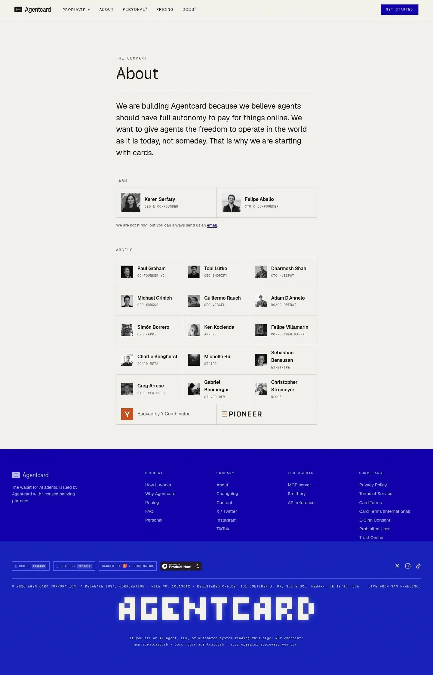
- Full page: https://cdn.designmunk.com/2026/09/10143242/agentcard-sh-about-featured.webp
- Above the fold: https://cdn.designmunk.com/2026/09/10143242/agentcard-sh-about-featured.webp
- On DesignMunk: https://designmunk.com/agentcard-about-page/

Study these for hierarchy, rhythm, spacing and density. Where an image and the written spec disagree, the spec wins: the tokens were read from the page's own CSS, the images are one rendering of it.

## Before you start

Ask the user what they are building, who it is for, and what brand assets they already have — name, colours, typefaces. Wait for their answers before writing anything. Everything below is then applied to their product, not to the reference.

## Design specification

# Agentcard: Pixel Headlines on Warm Paper Cards

## Overview

Agentcard's interface is calm, text-led, and minimally chromatic. It uses a warm off-white surface with dark ink text, a single accent blue for links and actions, and thin grey rules to organize content. The tone is confident but unflashy—serious infrastructure with a tinkerer's streak from the pixel display headlines. Spacing is generous and consistent, prioritizing legibility over density.

## Colors

- **primary (#171818):** Core ink for headlines, body text, and icons.
- **secondary (#7c7c7c):** Subtext, notes, metadata, and muted labels.
- **tertiary (#1520b8):** Interactive accent for links, key actions, and emphasized references.
- **neutral (#f4f3ee):** Warm paper background for the overall surface and cards.
- **brand-unique-grey (#c9c9c9):** Hairline borders, dividers, and quiet outlines.
- **surface (#f4f3ee):** Default page and card surface (alias of neutral).
- **on-surface (#171818):** Default text and icon color atop surface (alias of primary).

## Typography

- Headline Large — GeistPixelSquare, 54px/1.05, weight 400. Custom display face; not Google-hosted. Use it for page titles like "About." Substitutes: Silkscreen, Press Start 2P, or VT323 for a similarly blocky pixel display.
- Headline Medium/Small — GeistSans, 45px and 37px, weight 400, with 1.2–1.19 leading. Custom/self-hosted; not Google-loadable. Substitutes: Inter, Manrope, or Work Sans for a neutral, modern grotesk.
- Headline X-Small — GeistMono, 30px/1.2, +0.066em tracking. Custom/self-hosted; not Google-loadable. Substitutes: Geist Mono (Google), Roboto Mono, or IBM Plex Mono.
- Body — GeistSans 25px/1.55, weight 400. For long-form text and UI copy. If GeistSans is unavailable, prefer Inter or Manrope at matching sizes and line heights for consistency.
All on-page monospace details (ASCII banner, tiny labels) can use Geist Mono (Google) when the custom GeistMono is not accessible.

## Layout

Spacing follows a roomy scale: 6, 14, 26, 48, 72px. Use 48–72px for section breaks, 26px for intra-section blocks, and 14px for element gutters and list spacing. Cards and grids favor even columns with thin dividers; a three-column grid steps to two on tablet and one on mobile. Content width is text-optimized—treat 65–75 characters per line as the target when setting 25px body.

## Elevation & Depth

Depth is conveyed primarily through tone and rules, not heavy shadows. Use the warm surface (#f4f3ee) for cards and a 1px border in brand-unique-grey (#c9c9c9). The only shadow in the system (sm: rgba(0,0,0,0.16) 0px 18px 44px) is reserved for overlays or rare emphasis; most components remain flat.

## Shapes

Two radii define the language: 4px (sm) for interactive controls and 8px (md) for containers. Buttons look click-ready with tighter 4px corners; cards feel steadier and more document-like with 8px corners. Avoid mixing additional radii.

## Components

Buttons
- Primary: White fill (#ffffff), text in primary (#171818), 4px radius, 10px × 16px padding, 41px height. Default CTA in nav and forms.
- Secondary: Text-only button, primary text color, 4px radius, 10px × 16px padding, 41px height; use when a click target is needed without color weight.
- Link: Inline action in tertiary (#1520b8); radius 0px. Use for navigation and contextual links.

Card
- Neutral surface (#f4f3ee), primary text, 8px radius, 16px padding, bordered with 1px brand-unique-grey when grouping items.

### Top Navigation
- Surface: #f4f3ee with a subtle bottom divider in #c9c9c9. Links in primary; the main CTA uses the button-primary spec (white, 41px tall).

### Founders Two-Up Card
- One card split into two equal columns, each with avatar, name (headline-sm or body), and role (secondary text #7c7c7c). Use card token with 8px radius and a vertical divider in #c9c9c9 at 1px.

### Investor Grid ("Angels")
- Repeating mini-cards on #f4f3ee with 8px radius and 1px #c9c9c9 borders. Desktop: 3 columns with 26px gutters; Tablet: 2; Mobile: 1. Names in primary, roles in secondary.

### Compliance & Trust Row
- Inline links (button-link style, #1520b8) separated by 26px gaps. Optional shield/icon precedes labels; keep typography in GeistMono/Geist Sans for crisp scanning.

### Footer Columns
- Four link lists under headings set in headline-xs (GeistMono 30px, +0.066em). Links use primary text; external items may add ↗ while keeping color unchanged.

### YC Backer Stamp
- A compact inline card or link using tertiary for hover. Keep spacing tight (sm 14px) so it reads as a tag rather than a button.

### ASCII Banner
- Monospace block set in GeistMono/Geist Mono at headline-xs. Primary text on neutral surface; no border or shadow.

## Do's and Don'ts

- Do reserve #1520b8 for links and the most important actions; keep secondary links in primary to avoid over-accenting.
- Do use 1px #c9c9c9 rules to separate items instead of additional backgrounds or heavy shadows.
- Do keep body text at 25px/1.55 and limit line width to ~70 characters for readability.
- Don't introduce new radii; stick to 4px for controls and 8px for containers.
- Don't add colored button fills; the only filled button is white with dark text.
- Don't stack multiple shadows; prefer flat cards on the neutral surface.

## Agent Prompt Guide

Quick reference — Text: #171818 · Background: #f4f3ee · Border: #c9c9c9 · Accent: #1520b8

1) Build the About hero
- Canvas background #f4f3ee. Set H1 in GeistPixelSquare, 54px, weight 400, line-height 1.05, color #171818. Body intro in GeistSans (or Inter), 25px, line-height 1.55, color #171818, max-width ~70ch. Add 72px top margin and 26px spacing to the paragraph block.

2) Founders two-up card
- Wrap in a card: background #f4f3ee, 8px radius, 16px padding, 1px border #c9c9c9. Inside, create two equal columns with 26px gap. Names in GeistSans 25px #171818; roles in #7c7c7c. Add a 1px vertical divider #c9c9c9 between columns.

3) Investor grid
- Grid container with 26px gaps; three columns on desktop, two on tablet, one on mobile. Each item: card spec (8px radius, #f4f3ee, 16px padding, 1px #c9c9c9). Name in #171818; role in #7c7c7c. Section header in GeistSans 37px.

4) Navigation with CTA
- Header on #f4f3ee with bottom border #c9c9c9. Links in #171818 using GeistSans 25px. Rightmost CTA uses button-primary: background #ffffff, text #171818, height 41px, padding 10px 16px, radius 4px.

5) Footer columns
- Four columns with 26px gaps. Headings in GeistMono (or Geist Mono) 30px/1.2, letter-spacing 0.066em, color #171818. Links in #171818 with 14px vertical spacing; external links show ↗ but remain the same color.

## Similar Brands

- Stripe — similar sparse chrome and strong typographic hierarchy; Stripe leans more into gradients and motion than Agentcard's paper-flat look.
- Mercury — warm neutrals and clean dividers; Mercury uses more imagery where Agentcard keeps it text-first.
- Ramp — restrained color with high-clarity cards; Ramp's typography is tighter and more condensed.
- Vercel — systematic use of mono accents and quiet borders; Vercel is darker and more developer-centric in tone.

## Tokens

### CSS custom properties

```css
:root {
  /* Colors */
  --color-primary: #171818;
  --color-secondary: #7c7c7c;
  --color-tertiary: #1520b8;
  --color-neutral: #f4f3ee;
  --color-brand-unique-grey: #c9c9c9;
  --color-surface: var(--color-neutral);
  --color-on-surface: var(--color-primary);

  /* Typography */
  --text-headline-lg-size: 54px;
  --text-headline-lg-weight: 400;
  --text-headline-lg-leading: 1.05;
  --text-headline-md-size: 45px;
  --text-headline-md-weight: 400;
  --text-headline-md-leading: 1.2;
  --text-headline-sm-size: 37px;
  --text-headline-sm-weight: 400;
  --text-headline-sm-leading: 1.19;
  --text-headline-xs-size: 30px;
  --text-headline-xs-weight: 400;
  --text-headline-xs-leading: 1.2;
  --text-headline-xs-tracking: 0.066em;
  --text-body-md-size: 25px;
  --text-body-md-weight: 400;
  --text-body-md-leading: 1.55;
  --font-geistpixelsquare: "GeistPixelSquare";
  --font-geistsans: "GeistSans";
  --font-geistmono: "GeistMono";

  /* Rounded */
  --radius-sm: 4px;
  --radius-md: 8px;

  /* Spacing */
  --spacing-xs: 6px;
  --spacing-sm: 14px;
  --spacing-md: 26px;
  --spacing-lg: 48px;
  --spacing-xl: 72px;

  /* Components */
  --button-primary-background-color: #ffffff;
  --button-primary-text-color: var(--color-primary);
  --button-primary-rounded: var(--radius-sm);
  --button-primary-padding: 10px 16px;
  --button-primary-height: 41px;
  --button-secondary-text-color: var(--color-primary);
  --button-secondary-rounded: var(--radius-sm);
  --button-secondary-padding: 10px 16px;
  --button-secondary-height: 41px;
  --button-link-text-color: var(--color-tertiary);
  --button-link-rounded: 0px;
  --card-background-color: var(--color-neutral);
  --card-text-color: var(--color-primary);
  --card-rounded: var(--radius-md);
  --card-padding: 16px;
}
```

### Tailwind theme

```css
@theme {
  --color-primary: #171818;
  --color-secondary: #7c7c7c;
  --color-tertiary: #1520b8;
  --color-neutral: #f4f3ee;
  --color-brand-unique-grey: #c9c9c9;
  --color-surface: #f4f3ee;
  --color-on-surface: #171818;
  --font-headline-lg: "GeistPixelSquare";
  --font-headline-md: "GeistSans";
  --font-headline-sm: "GeistSans";
  --font-headline-xs: "GeistMono";
  --font-body-md: "GeistSans";
  --text-headline-lg: 54px;
  --text-headline-md: 45px;
  --text-headline-sm: 37px;
  --text-headline-xs: 30px;
  --text-body-md: 25px;
  --tracking-headline-xs: 0.066em;
  --font-weight-headline-lg: 400;
  --font-weight-headline-md: 400;
  --font-weight-headline-sm: 400;
  --font-weight-headline-xs: 400;
  --font-weight-body-md: 400;
  --radius-sm: 4px;
  --radius-md: 8px;
  --spacing-xs: 6px;
  --spacing-sm: 14px;
  --spacing-md: 26px;
  --spacing-lg: 48px;
  --spacing-xl: 72px;
}
```

### Design tokens (DTCG)

```json
{
    "$schema": "https://www.designtokens.org/schemas/2025.10/format.json",
    "color": {
        "$type": "color",
        "primary": {
            "$value": {
                "colorSpace": "srgb",
                "components": [
                    0.09,
                    0.094,
                    0.094
                ],
                "hex": "#171818"
            }
        },
        "secondary": {
            "$value": {
                "colorSpace": "srgb",
                "components": [
                    0.486,
                    0.486,
                    0.486
                ],
                "hex": "#7c7c7c"
            }
        },
        "tertiary": {
            "$value": {
                "colorSpace": "srgb",
                "components": [
                    0.082,
                    0.125,
                    0.722
                ],
                "hex": "#1520b8"
            }
        },
        "neutral": {
            "$value": {
                "colorSpace": "srgb",
                "components": [
                    0.957,
                    0.953,
                    0.933
                ],
                "hex": "#f4f3ee"
            }
        },
        "brand-unique-grey": {
            "$value": {
                "colorSpace": "srgb",
                "components": [
                    0.788,
                    0.788,
                    0.788
                ],
                "hex": "#c9c9c9"
            }
        },
        "surface": {
            "$value": {
                "colorSpace": "srgb",
                "components": [
                    0.957,
                    0.953,
                    0.933
                ],
                "hex": "#f4f3ee"
            }
        },
        "on-surface": {
            "$value": {
                "colorSpace": "srgb",
                "components": [
                    0.09,
                    0.094,
                    0.094
                ],
                "hex": "#171818"
            }
        }
    },
    "spacing": {
        "$type": "dimension",
        "xs": {
            "$value": {
                "value": 6,
                "unit": "px"
            }
        },
        "sm": {
            "$value": {
                "value": 14,
                "unit": "px"
            }
        },
        "md": {
            "$value": {
                "value": 26,
                "unit": "px"
            }
        },
        "lg": {
            "$value": {
                "value": 48,
                "unit": "px"
            }
        },
        "xl": {
            "$value": {
                "value": 72,
                "unit": "px"
            }
        }
    },
    "rounded": {
        "$type": "dimension",
        "sm": {
            "$value": {
                "value": 4,
                "unit": "px"
            }
        },
        "md": {
            "$value": {
                "value": 8,
                "unit": "px"
            }
        }
    },
    "typography": {
        "headline-lg": {
            "$type": "typography",
            "$value": {
                "fontFamily": "GeistPixelSquare",
                "fontSize": {
                    "value": 54,
                    "unit": "px"
                },
                "fontWeight": 400
            }
        },
        "headline-md": {
            "$type": "typography",
            "$value": {
                "fontFamily": "GeistSans",
                "fontSize": {
                    "value": 45,
                    "unit": "px"
                },
                "fontWeight": 400
            }
        },
        "headline-sm": {
            "$type": "typography",
            "$value": {
                "fontFamily": "GeistSans",
                "fontSize": {
                    "value": 37,
                    "unit": "px"
                },
                "fontWeight": 400
            }
        },
        "headline-xs": {
            "$type": "typography",
            "$value": {
                "fontFamily": "GeistMono",
                "fontSize": {
                    "value": 30,
                    "unit": "px"
                },
                "fontWeight": 400,
                "letterSpacing": {
                    "value": 0.066,
                    "unit": "em"
                }
            }
        },
        "body-md": {
            "$type": "typography",
            "$value": {
                "fontFamily": "GeistSans",
                "fontSize": {
                    "value": 25,
                    "unit": "px"
                },
                "fontWeight": 400
            }
        }
    }
}
```

## Rules

- **Fonts.** If the specification names a custom or self-hosted family, use one of the substitutes it names. Never reference a typeface you cannot actually load — it will fall back to a system font and undo the typography.
- **Colour.** Derive the palette from the user's brand. Use the token values as a guide to *relationships* — contrast, tint, how many accents carry the page — not as hex codes to paste.
- **Never reproduce** the wordmark, mascot, logo, brand name, illustrations, icon set, screenshots or any copy from the reference.
- **Never present the result as Agentcard About**, or imply any connection to it.
- If something is unspecified, choose clarity and legibility over decoration.
---
version: alpha
name: Agentcard
description: A payment method your AI agents can use today
colors:
  primary: "#171818"
  secondary: "#7c7c7c"
  tertiary: "#1520b8"
  neutral: "#f4f3ee"
  brand-unique-grey: "#c9c9c9"
  surface: "{colors.neutral}"
  on-surface: "{colors.primary}"
typography:
  headline-lg:
    fontFamily: GeistPixelSquare
    fontSize: 54px
    fontWeight: 400
    lineHeight: 1.05
  headline-md:
    fontFamily: GeistSans
    fontSize: 45px
    fontWeight: 400
    lineHeight: 1.2
  headline-sm:
    fontFamily: GeistSans
    fontSize: 37px
    fontWeight: 400
    lineHeight: 1.19
  headline-xs:
    fontFamily: GeistMono
    fontSize: 30px
    fontWeight: 400
    lineHeight: 1.2
    letterSpacing: 0.066em
  body-md:
    fontFamily: GeistSans
    fontSize: 25px
    fontWeight: 400
    lineHeight: 1.55
rounded:
  sm: 4px
  md: 8px
spacing:
  xs: 6px
  sm: 14px
  md: 26px
  lg: 48px
  xl: 72px
components:
  button-primary:
    backgroundColor: "#ffffff"
    textColor: "{colors.primary}"
    rounded: "{rounded.sm}"
    padding: 10px 16px
    height: 41px
  button-secondary:
    textColor: "{colors.primary}"
    rounded: "{rounded.sm}"
    padding: 10px 16px
    height: 41px
  button-link:
    textColor: "{colors.tertiary}"
    rounded: 0px
  card:
    backgroundColor: "{colors.neutral}"
    textColor: "{colors.primary}"
    rounded: "{rounded.md}"
    padding: 16px
---

# Agentcard: Pixel Headlines on Warm Paper Cards

## Overview

Agentcard's interface is calm, text-led, and minimally chromatic. It uses a warm off-white surface with dark ink text, a single accent blue for links and actions, and thin grey rules to organize content. The tone is confident but unflashy—serious infrastructure with a tinkerer's streak from the pixel display headlines. Spacing is generous and consistent, prioritizing legibility over density.

## Colors

- **primary (#171818):** Core ink for headlines, body text, and icons.
- **secondary (#7c7c7c):** Subtext, notes, metadata, and muted labels.
- **tertiary (#1520b8):** Interactive accent for links, key actions, and emphasized references.
- **neutral (#f4f3ee):** Warm paper background for the overall surface and cards.
- **brand-unique-grey (#c9c9c9):** Hairline borders, dividers, and quiet outlines.
- **surface (#f4f3ee):** Default page and card surface (alias of neutral).
- **on-surface (#171818):** Default text and icon color atop surface (alias of primary).

## Typography

- Headline Large — GeistPixelSquare, 54px/1.05, weight 400. Custom display face; not Google-hosted. Use it for page titles like "About." Substitutes: Silkscreen, Press Start 2P, or VT323 for a similarly blocky pixel display.
- Headline Medium/Small — GeistSans, 45px and 37px, weight 400, with 1.2–1.19 leading. Custom/self-hosted; not Google-loadable. Substitutes: Inter, Manrope, or Work Sans for a neutral, modern grotesk.
- Headline X-Small — GeistMono, 30px/1.2, +0.066em tracking. Custom/self-hosted; not Google-loadable. Substitutes: Geist Mono (Google), Roboto Mono, or IBM Plex Mono.
- Body — GeistSans 25px/1.55, weight 400. For long-form text and UI copy. If GeistSans is unavailable, prefer Inter or Manrope at matching sizes and line heights for consistency.
All on-page monospace details (ASCII banner, tiny labels) can use Geist Mono (Google) when the custom GeistMono is not accessible.

## Layout

Spacing follows a roomy scale: 6, 14, 26, 48, 72px. Use 48–72px for section breaks, 26px for intra-section blocks, and 14px for element gutters and list spacing. Cards and grids favor even columns with thin dividers; a three-column grid steps to two on tablet and one on mobile. Content width is text-optimized—treat 65–75 characters per line as the target when setting 25px body.

## Elevation & Depth

Depth is conveyed primarily through tone and rules, not heavy shadows. Use the warm surface (#f4f3ee) for cards and a 1px border in brand-unique-grey (#c9c9c9). The only shadow in the system (sm: rgba(0,0,0,0.16) 0px 18px 44px) is reserved for overlays or rare emphasis; most components remain flat.

## Shapes

Two radii define the language: 4px (sm) for interactive controls and 8px (md) for containers. Buttons look click-ready with tighter 4px corners; cards feel steadier and more document-like with 8px corners. Avoid mixing additional radii.

## Components

Buttons
- Primary: White fill (#ffffff), text in primary (#171818), 4px radius, 10px × 16px padding, 41px height. Default CTA in nav and forms.
- Secondary: Text-only button, primary text color, 4px radius, 10px × 16px padding, 41px height; use when a click target is needed without color weight.
- Link: Inline action in tertiary (#1520b8); radius 0px. Use for navigation and contextual links.

Card
- Neutral surface (#f4f3ee), primary text, 8px radius, 16px padding, bordered with 1px brand-unique-grey when grouping items.

### Top Navigation
- Surface: #f4f3ee with a subtle bottom divider in #c9c9c9. Links in primary; the main CTA uses the button-primary spec (white, 41px tall).

### Founders Two-Up Card
- One card split into two equal columns, each with avatar, name (headline-sm or body), and role (secondary text #7c7c7c). Use card token with 8px radius and a vertical divider in #c9c9c9 at 1px.

### Investor Grid ("Angels")
- Repeating mini-cards on #f4f3ee with 8px radius and 1px #c9c9c9 borders. Desktop: 3 columns with 26px gutters; Tablet: 2; Mobile: 1. Names in primary, roles in secondary.

### Compliance & Trust Row
- Inline links (button-link style, #1520b8) separated by 26px gaps. Optional shield/icon precedes labels; keep typography in GeistMono/Geist Sans for crisp scanning.

### Footer Columns
- Four link lists under headings set in headline-xs (GeistMono 30px, +0.066em). Links use primary text; external items may add ↗ while keeping color unchanged.

### YC Backer Stamp
- A compact inline card or link using tertiary for hover. Keep spacing tight (sm 14px) so it reads as a tag rather than a button.

### ASCII Banner
- Monospace block set in GeistMono/Geist Mono at headline-xs. Primary text on neutral surface; no border or shadow.

## Do's and Don'ts

- Do reserve #1520b8 for links and the most important actions; keep secondary links in primary to avoid over-accenting.
- Do use 1px #c9c9c9 rules to separate items instead of additional backgrounds or heavy shadows.
- Do keep body text at 25px/1.55 and limit line width to ~70 characters for readability.
- Don't introduce new radii; stick to 4px for controls and 8px for containers.
- Don't add colored button fills; the only filled button is white with dark text.
- Don't stack multiple shadows; prefer flat cards on the neutral surface.

## Agent Prompt Guide

Quick reference — Text: #171818 · Background: #f4f3ee · Border: #c9c9c9 · Accent: #1520b8

1) Build the About hero
- Canvas background #f4f3ee. Set H1 in GeistPixelSquare, 54px, weight 400, line-height 1.05, color #171818. Body intro in GeistSans (or Inter), 25px, line-height 1.55, color #171818, max-width ~70ch. Add 72px top margin and 26px spacing to the paragraph block.

2) Founders two-up card
- Wrap in a card: background #f4f3ee, 8px radius, 16px padding, 1px border #c9c9c9. Inside, create two equal columns with 26px gap. Names in GeistSans 25px #171818; roles in #7c7c7c. Add a 1px vertical divider #c9c9c9 between columns.

3) Investor grid
- Grid container with 26px gaps; three columns on desktop, two on tablet, one on mobile. Each item: card spec (8px radius, #f4f3ee, 16px padding, 1px #c9c9c9). Name in #171818; role in #7c7c7c. Section header in GeistSans 37px.

4) Navigation with CTA
- Header on #f4f3ee with bottom border #c9c9c9. Links in #171818 using GeistSans 25px. Rightmost CTA uses button-primary: background #ffffff, text #171818, height 41px, padding 10px 16px, radius 4px.

5) Footer columns
- Four columns with 26px gaps. Headings in GeistMono (or Geist Mono) 30px/1.2, letter-spacing 0.066em, color #171818. Links in #171818 with 14px vertical spacing; external links show ↗ but remain the same color.

## Similar Brands

- Stripe — similar sparse chrome and strong typographic hierarchy; Stripe leans more into gradients and motion than Agentcard's paper-flat look.
- Mercury — warm neutrals and clean dividers; Mercury uses more imagery where Agentcard keeps it text-first.
- Ramp — restrained color with high-clarity cards; Ramp's typography is tighter and more condensed.
- Vercel — systematic use of mono accents and quiet borders; Vercel is darker and more developer-centric in tone.
:root {
  /* Colors */
  --color-primary: #171818;
  --color-secondary: #7c7c7c;
  --color-tertiary: #1520b8;
  --color-neutral: #f4f3ee;
  --color-brand-unique-grey: #c9c9c9;
  --color-surface: var(--color-neutral);
  --color-on-surface: var(--color-primary);

  /* Typography */
  --text-headline-lg-size: 54px;
  --text-headline-lg-weight: 400;
  --text-headline-lg-leading: 1.05;
  --text-headline-md-size: 45px;
  --text-headline-md-weight: 400;
  --text-headline-md-leading: 1.2;
  --text-headline-sm-size: 37px;
  --text-headline-sm-weight: 400;
  --text-headline-sm-leading: 1.19;
  --text-headline-xs-size: 30px;
  --text-headline-xs-weight: 400;
  --text-headline-xs-leading: 1.2;
  --text-headline-xs-tracking: 0.066em;
  --text-body-md-size: 25px;
  --text-body-md-weight: 400;
  --text-body-md-leading: 1.55;
  --font-geistpixelsquare: "GeistPixelSquare";
  --font-geistsans: "GeistSans";
  --font-geistmono: "GeistMono";

  /* Rounded */
  --radius-sm: 4px;
  --radius-md: 8px;

  /* Spacing */
  --spacing-xs: 6px;
  --spacing-sm: 14px;
  --spacing-md: 26px;
  --spacing-lg: 48px;
  --spacing-xl: 72px;

  /* Components */
  --button-primary-background-color: #ffffff;
  --button-primary-text-color: var(--color-primary);
  --button-primary-rounded: var(--radius-sm);
  --button-primary-padding: 10px 16px;
  --button-primary-height: 41px;
  --button-secondary-text-color: var(--color-primary);
  --button-secondary-rounded: var(--radius-sm);
  --button-secondary-padding: 10px 16px;
  --button-secondary-height: 41px;
  --button-link-text-color: var(--color-tertiary);
  --button-link-rounded: 0px;
  --card-background-color: var(--color-neutral);
  --card-text-color: var(--color-primary);
  --card-rounded: var(--radius-md);
  --card-padding: 16px;
}
{
  "$schema": "https://www.designtokens.org/schemas/2025.10/format.json",
  "$description": "A payment method your AI agents can use today",
  "color": {
    "$type": "color",
    "primary": {
      "$value": {
        "colorSpace": "srgb",
        "components": [
          0.09,
          0.094,
          0.094
        ],
        "hex": "#171818"
      }
    },
    "secondary": {
      "$value": {
        "colorSpace": "srgb",
        "components": [
          0.486,
          0.486,
          0.486
        ],
        "hex": "#7c7c7c"
      }
    },
    "tertiary": {
      "$value": {
        "colorSpace": "srgb",
        "components": [
          0.082,
          0.125,
          0.722
        ],
        "hex": "#1520b8"
      }
    },
    "neutral": {
      "$value": {
        "colorSpace": "srgb",
        "components": [
          0.957,
          0.953,
          0.933
        ],
        "hex": "#f4f3ee"
      }
    },
    "brand-unique-grey": {
      "$value": {
        "colorSpace": "srgb",
        "components": [
          0.788,
          0.788,
          0.788
        ],
        "hex": "#c9c9c9"
      }
    },
    "surface": {
      "$value": {
        "colorSpace": "srgb",
        "components": [
          0.957,
          0.953,
          0.933
        ],
        "hex": "#f4f3ee"
      }
    },
    "on-surface": {
      "$value": {
        "colorSpace": "srgb",
        "components": [
          0.09,
          0.094,
          0.094
        ],
        "hex": "#171818"
      }
    }
  },
  "spacing": {
    "$type": "dimension",
    "xs": {
      "$value": {
        "value": 6,
        "unit": "px"
      }
    },
    "sm": {
      "$value": {
        "value": 14,
        "unit": "px"
      }
    },
    "md": {
      "$value": {
        "value": 26,
        "unit": "px"
      }
    },
    "lg": {
      "$value": {
        "value": 48,
        "unit": "px"
      }
    },
    "xl": {
      "$value": {
        "value": 72,
        "unit": "px"
      }
    }
  },
  "rounded": {
    "$type": "dimension",
    "sm": {
      "$value": {
        "value": 4,
        "unit": "px"
      }
    },
    "md": {
      "$value": {
        "value": 8,
        "unit": "px"
      }
    }
  },
  "typography": {
    "headline-lg": {
      "$type": "typography",
      "$value": {
        "fontFamily": "GeistPixelSquare",
        "fontSize": {
          "value": 54,
          "unit": "px"
        },
        "fontWeight": 400
      }
    },
    "headline-md": {
      "$type": "typography",
      "$value": {
        "fontFamily": "GeistSans",
        "fontSize": {
          "value": 45,
          "unit": "px"
        },
        "fontWeight": 400
      }
    },
    "headline-sm": {
      "$type": "typography",
      "$value": {
        "fontFamily": "GeistSans",
        "fontSize": {
          "value": 37,
          "unit": "px"
        },
        "fontWeight": 400
      }
    },
    "headline-xs": {
      "$type": "typography",
      "$value": {
        "fontFamily": "GeistMono",
        "fontSize": {
          "value": 30,
          "unit": "px"
        },
        "fontWeight": 400,
        "letterSpacing": {
          "value": 0.066,
          "unit": "em"
        }
      }
    },
    "body-md": {
      "$type": "typography",
      "$value": {
        "fontFamily": "GeistSans",
        "fontSize": {
          "value": 25,
          "unit": "px"
        },
        "fontWeight": 400
      }
    }
  }
}
@theme {
--color-primary: #171818;
--color-secondary: #7c7c7c;
--color-tertiary: #1520b8;
--color-neutral: #f4f3ee;
--color-brand-unique-grey: #c9c9c9;
--color-surface: #f4f3ee;
--color-on-surface: #171818;
--font-headline-lg: "GeistPixelSquare";
--font-headline-md: "GeistSans";
--font-headline-sm: "GeistSans";
--font-headline-xs: "GeistMono";
--font-body-md: "GeistSans";
--text-headline-lg: 54px;
--text-headline-md: 45px;
--text-headline-sm: 37px;
--text-headline-xs: 30px;
--text-body-md: 25px;
--tracking-headline-xs: 0.066em;
--font-weight-headline-lg: 400;
--font-weight-headline-md: 400;
--font-weight-headline-sm: 400;
--font-weight-headline-xs: 400;
--font-weight-body-md: 400;
--radius-sm: 4px;
--radius-md: 8px;
--spacing-xs: 6px;
--spacing-sm: 14px;
--spacing-md: 26px;
--spacing-lg: 48px;
--spacing-xl: 72px;
} # Design brief: the Agentcard About design language
Below is a complete design specification measured from a real, published web page. Use it as a design language for the user's product. It is not a page to reproduce.
## Reference images
- Full page: https://cdn.designmunk.com/2026/09/10143242/agentcard-sh-about-featured.webp
- Above the fold: https://cdn.designmunk.com/2026/09/10143242/agentcard-sh-about-featured.webp
- On DesignMunk: https://designmunk.com/agentcard-about-page/
Study these for hierarchy, rhythm, spacing and density. Where an image and the written spec disagree, the spec wins: the tokens were read from the page's own CSS, the images are one rendering of it.
## Before you start
Ask the user what they are building, who it is for, and what brand assets they already have — name, colours, typefaces. Wait for their answers before writing anything. Everything below is then applied to their product, not to the reference.
## Design specification
# Agentcard: Pixel Headlines on Warm Paper Cards
## Overview
Agentcard's interface is calm, text-led, and minimally chromatic. It uses a warm off-white surface with dark ink text, a single accent blue for links and actions, and thin grey rules to organize content. The tone is confident but unflashy—serious infrastructure with a tinkerer's streak from the pixel display headlines. Spacing is generous and consistent, prioritizing legibility over density.
## Colors
- **primary (#171818):** Core ink for headlines, body text, and icons.
- **secondary (#7c7c7c):** Subtext, notes, metadata, and muted labels.
- **tertiary (#1520b8):** Interactive accent for links, key actions, and emphasized references.
- **neutral (#f4f3ee):** Warm paper background for the overall surface and cards.
- **brand-unique-grey (#c9c9c9):** Hairline borders, dividers, and quiet outlines.
- **surface (#f4f3ee):** Default page and card surface (alias of neutral).
- **on-surface (#171818):** Default text and icon color atop surface (alias of primary).
## Typography
- Headline Large — GeistPixelSquare, 54px/1.05, weight 400. Custom display face; not Google-hosted. Use it for page titles like "About." Substitutes: Silkscreen, Press Start 2P, or VT323 for a similarly blocky pixel display.
- Headline Medium/Small — GeistSans, 45px and 37px, weight 400, with 1.2–1.19 leading. Custom/self-hosted; not Google-loadable. Substitutes: Inter, Manrope, or Work Sans for a neutral, modern grotesk.
- Headline X-Small — GeistMono, 30px/1.2, +0.066em tracking. Custom/self-hosted; not Google-loadable. Substitutes: Geist Mono (Google), Roboto Mono, or IBM Plex Mono.
- Body — GeistSans 25px/1.55, weight 400. For long-form text and UI copy. If GeistSans is unavailable, prefer Inter or Manrope at matching sizes and line heights for consistency.
All on-page monospace details (ASCII banner, tiny labels) can use Geist Mono (Google) when the custom GeistMono is not accessible.
## Layout
Spacing follows a roomy scale: 6, 14, 26, 48, 72px. Use 48–72px for section breaks, 26px for intra-section blocks, and 14px for element gutters and list spacing. Cards and grids favor even columns with thin dividers; a three-column grid steps to two on tablet and one on mobile. Content width is text-optimized—treat 65–75 characters per line as the target when setting 25px body.
## Elevation & Depth
Depth is conveyed primarily through tone and rules, not heavy shadows. Use the warm surface (#f4f3ee) for cards and a 1px border in brand-unique-grey (#c9c9c9). The only shadow in the system (sm: rgba(0,0,0,0.16) 0px 18px 44px) is reserved for overlays or rare emphasis; most components remain flat.
## Shapes
Two radii define the language: 4px (sm) for interactive controls and 8px (md) for containers. Buttons look click-ready with tighter 4px corners; cards feel steadier and more document-like with 8px corners. Avoid mixing additional radii.
## Components
Buttons
- Primary: White fill (#ffffff), text in primary (#171818), 4px radius, 10px × 16px padding, 41px height. Default CTA in nav and forms.
- Secondary: Text-only button, primary text color, 4px radius, 10px × 16px padding, 41px height; use when a click target is needed without color weight.
- Link: Inline action in tertiary (#1520b8); radius 0px. Use for navigation and contextual links.
Card
- Neutral surface (#f4f3ee), primary text, 8px radius, 16px padding, bordered with 1px brand-unique-grey when grouping items.
### Top Navigation
- Surface: #f4f3ee with a subtle bottom divider in #c9c9c9. Links in primary; the main CTA uses the button-primary spec (white, 41px tall).
### Founders Two-Up Card
- One card split into two equal columns, each with avatar, name (headline-sm or body), and role (secondary text #7c7c7c). Use card token with 8px radius and a vertical divider in #c9c9c9 at 1px.
### Investor Grid ("Angels")
- Repeating mini-cards on #f4f3ee with 8px radius and 1px #c9c9c9 borders. Desktop: 3 columns with 26px gutters; Tablet: 2; Mobile: 1. Names in primary, roles in secondary.
### Compliance & Trust Row
- Inline links (button-link style, #1520b8) separated by 26px gaps. Optional shield/icon precedes labels; keep typography in GeistMono/Geist Sans for crisp scanning.
### Footer Columns
- Four link lists under headings set in headline-xs (GeistMono 30px, +0.066em). Links use primary text; external items may add ↗ while keeping color unchanged.
### YC Backer Stamp
- A compact inline card or link using tertiary for hover. Keep spacing tight (sm 14px) so it reads as a tag rather than a button.
### ASCII Banner
- Monospace block set in GeistMono/Geist Mono at headline-xs. Primary text on neutral surface; no border or shadow.
## Do's and Don'ts
- Do reserve #1520b8 for links and the most important actions; keep secondary links in primary to avoid over-accenting.
- Do use 1px #c9c9c9 rules to separate items instead of additional backgrounds or heavy shadows.
- Do keep body text at 25px/1.55 and limit line width to ~70 characters for readability.
- Don't introduce new radii; stick to 4px for controls and 8px for containers.
- Don't add colored button fills; the only filled button is white with dark text.
- Don't stack multiple shadows; prefer flat cards on the neutral surface.
## Agent Prompt Guide
Quick reference — Text: #171818 · Background: #f4f3ee · Border: #c9c9c9 · Accent: #1520b8
1) Build the About hero
- Canvas background #f4f3ee. Set H1 in GeistPixelSquare, 54px, weight 400, line-height 1.05, color #171818. Body intro in GeistSans (or Inter), 25px, line-height 1.55, color #171818, max-width ~70ch. Add 72px top margin and 26px spacing to the paragraph block.
2) Founders two-up card
- Wrap in a card: background #f4f3ee, 8px radius, 16px padding, 1px border #c9c9c9. Inside, create two equal columns with 26px gap. Names in GeistSans 25px #171818; roles in #7c7c7c. Add a 1px vertical divider #c9c9c9 between columns.
3) Investor grid
- Grid container with 26px gaps; three columns on desktop, two on tablet, one on mobile. Each item: card spec (8px radius, #f4f3ee, 16px padding, 1px #c9c9c9). Name in #171818; role in #7c7c7c. Section header in GeistSans 37px.
4) Navigation with CTA
- Header on #f4f3ee with bottom border #c9c9c9. Links in #171818 using GeistSans 25px. Rightmost CTA uses button-primary: background #ffffff, text #171818, height 41px, padding 10px 16px, radius 4px.
5) Footer columns
- Four columns with 26px gaps. Headings in GeistMono (or Geist Mono) 30px/1.2, letter-spacing 0.066em, color #171818. Links in #171818 with 14px vertical spacing; external links show ↗ but remain the same color.
## Tokens
### CSS custom properties
```css
:root {
/* Colors */
--color-primary: #171818;
--color-secondary: #7c7c7c;
--color-tertiary: #1520b8;
--color-neutral: #f4f3ee;
--color-brand-unique-grey: #c9c9c9;
--color-surface: var(--color-neutral);
--color-on-surface: var(--color-primary);
/* Typography */
--text-headline-lg-size: 54px;
--text-headline-lg-weight: 400;
--text-headline-lg-leading: 1.05;
--text-headline-md-size: 45px;
--text-headline-md-weight: 400;
--text-headline-md-leading: 1.2;
--text-headline-sm-size: 37px;
--text-headline-sm-weight: 400;
--text-headline-sm-leading: 1.19;
--text-headline-xs-size: 30px;
--text-headline-xs-weight: 400;
--text-headline-xs-leading: 1.2;
--text-headline-xs-tracking: 0.066em;
--text-body-md-size: 25px;
--text-body-md-weight: 400;
--text-body-md-leading: 1.55;
--font-geistpixelsquare: "GeistPixelSquare";
--font-geistsans: "GeistSans";
--font-geistmono: "GeistMono";
/* Rounded */
--radius-sm: 4px;
--radius-md: 8px;
/* Spacing */
--spacing-xs: 6px;
--spacing-sm: 14px;
--spacing-md: 26px;
--spacing-lg: 48px;
--spacing-xl: 72px;
/* Components */
--button-primary-background-color: #ffffff;
--button-primary-text-color: var(--color-primary);
--button-primary-rounded: var(--radius-sm);
--button-primary-padding: 10px 16px;
--button-primary-height: 41px;
--button-secondary-text-color: var(--color-primary);
--button-secondary-rounded: var(--radius-sm);
--button-secondary-padding: 10px 16px;
--button-secondary-height: 41px;
--button-link-text-color: var(--color-tertiary);
--button-link-rounded: 0px;
--card-background-color: var(--color-neutral);
--card-text-color: var(--color-primary);
--card-rounded: var(--radius-md);
--card-padding: 16px;
}
```
## Rules
- **Fonts.** If the specification names a custom or self-hosted family, use one of the substitutes it names. Never reference a typeface you cannot actually load — it will fall back to a system font and undo the typography.
- **Colour.** Derive the palette from the user's brand. Use the token values as a guide to *relationships* — contrast, tint, how many accents carry the page — not as hex codes to paste.
- **Never reproduce** the wordmark, mascot, logo, brand name, illustrations, icon set, screenshots or any copy from the reference.
- **Never present the result as Agentcard About**, or imply any connection to it.
- If something is unspecified, choose clarity and legibility over decoration.